| 1 | // Copyright 2014 The Flutter Authors. All rights reserved. |
| 2 | // Use of this source code is governed by a BSD-style license that can be |
|---|
| 3 | // found in the LICENSE file. |
|---|
| 4 | |
|---|
| 5 | import 'dart:math' as math; |
|---|
| 6 | |
|---|
| 7 | import 'package:flutter/gestures.dart'; |
|---|
| 8 | import 'package:flutter/rendering.dart'; |
|---|
| 9 | |
|---|
| 10 | import 'basic.dart'; |
|---|
| 11 | import 'debug.dart'; |
|---|
| 12 | import 'focus_manager.dart'; |
|---|
| 13 | import 'focus_scope.dart'; |
|---|
| 14 | import 'framework.dart'; |
|---|
| 15 | import 'media_query.dart'; |
|---|
| 16 | import 'notification_listener.dart'; |
|---|
| 17 | import 'primary_scroll_controller.dart'; |
|---|
| 18 | import 'scroll_configuration.dart'; |
|---|
| 19 | import 'scroll_controller.dart'; |
|---|
| 20 | import 'scroll_delegate.dart'; |
|---|
| 21 | import 'scroll_notification.dart'; |
|---|
| 22 | import 'scroll_physics.dart'; |
|---|
| 23 | import 'scrollable.dart'; |
|---|
| 24 | import 'scrollable_helpers.dart'; |
|---|
| 25 | import 'sliver.dart'; |
|---|
| 26 | import 'sliver_prototype_extent_list.dart'; |
|---|
| 27 | import 'sliver_varied_extent_list.dart'; |
|---|
| 28 | import 'viewport.dart'; |
|---|
| 29 | |
|---|
| 30 | // Examples can assume: |
|---|
| 31 | // late int itemCount; |
|---|
| 32 | |
|---|
| 33 | /// A representation of how a [ScrollView] should dismiss the on-screen |
|---|
| 34 | /// keyboard. |
|---|
| 35 | enum ScrollViewKeyboardDismissBehavior { |
|---|
| 36 | /// `manual` means there is no automatic dismissal of the on-screen keyboard. |
|---|
| 37 | /// It is up to the client to dismiss the keyboard. |
|---|
| 38 | manual, |
|---|
| 39 | /// `onDrag` means that the [ScrollView] will dismiss an on-screen keyboard |
|---|
| 40 | /// when a drag begins. |
|---|
| 41 | onDrag, |
|---|
| 42 | } |
|---|
| 43 | |
|---|
| 44 | /// A widget that combines a [Scrollable] and a [Viewport] to create an |
|---|
| 45 | /// interactive scrolling pane of content in one dimension. |
|---|
| 46 | /// |
|---|
| 47 | /// Scrollable widgets consist of three pieces: |
|---|
| 48 | /// |
|---|
| 49 | /// 1. A [Scrollable] widget, which listens for various user gestures and |
|---|
| 50 | /// implements the interaction design for scrolling. |
|---|
| 51 | /// 2. A viewport widget, such as [Viewport] or [ShrinkWrappingViewport], which |
|---|
| 52 | /// implements the visual design for scrolling by displaying only a portion |
|---|
| 53 | /// of the widgets inside the scroll view. |
|---|
| 54 | /// 3. One or more slivers, which are widgets that can be composed to created |
|---|
| 55 | /// various scrolling effects, such as lists, grids, and expanding headers. |
|---|
| 56 | /// |
|---|
| 57 | /// [ScrollView] helps orchestrate these pieces by creating the [Scrollable] and |
|---|
| 58 | /// the viewport and deferring to its subclass to create the slivers. |
|---|
| 59 | /// |
|---|
| 60 | /// To learn more about slivers, see [CustomScrollView.slivers]. |
|---|
| 61 | /// |
|---|
| 62 | /// To control the initial scroll offset of the scroll view, provide a |
|---|
| 63 | /// [controller] with its [ScrollController.initialScrollOffset] property set. |
|---|
| 64 | /// |
|---|
| 65 | /// {@template flutter.widgets.ScrollView.PageStorage} |
|---|
| 66 | /// ## Persisting the scroll position during a session |
|---|
| 67 | /// |
|---|
| 68 | /// Scroll views attempt to persist their scroll position using [PageStorage]. |
|---|
| 69 | /// This can be disabled by setting [ScrollController.keepScrollOffset] to false |
|---|
| 70 | /// on the [controller]. If it is enabled, using a [PageStorageKey] for the |
|---|
| 71 | /// [key] of this widget is recommended to help disambiguate different scroll |
|---|
| 72 | /// views from each other. |
|---|
| 73 | /// {@endtemplate} |
|---|
| 74 | /// |
|---|
| 75 | /// See also: |
|---|
| 76 | /// |
|---|
| 77 | /// * [ListView], which is a commonly used [ScrollView] that displays a |
|---|
| 78 | /// scrolling, linear list of child widgets. |
|---|
| 79 | /// * [PageView], which is a scrolling list of child widgets that are each the |
|---|
| 80 | /// size of the viewport. |
|---|
| 81 | /// * [GridView], which is a [ScrollView] that displays a scrolling, 2D array |
|---|
| 82 | /// of child widgets. |
|---|
| 83 | /// * [CustomScrollView], which is a [ScrollView] that creates custom scroll |
|---|
| 84 | /// effects using slivers. |
|---|
| 85 | /// * [ScrollNotification] and [NotificationListener], which can be used to watch |
|---|
| 86 | /// the scroll position without using a [ScrollController]. |
|---|
| 87 | /// * [TwoDimensionalScrollView], which is a similar widget [ScrollView] that |
|---|
| 88 | /// scrolls in two dimensions. |
|---|
| 89 | abstract class ScrollView extends StatelessWidget { |
|---|
| 90 | /// Creates a widget that scrolls. |
|---|
| 91 | /// |
|---|
| 92 | /// The [ScrollView.primary] argument defaults to true for vertical |
|---|
| 93 | /// scroll views if no [controller] has been provided. The [controller] argument |
|---|
| 94 | /// must be null if [primary] is explicitly set to true. If [primary] is true, |
|---|
| 95 | /// the nearest [PrimaryScrollController] surrounding the widget is attached |
|---|
| 96 | /// to this scroll view. |
|---|
| 97 | /// |
|---|
| 98 | /// If the [shrinkWrap] argument is true, the [center] argument must be null. |
|---|
| 99 | /// |
|---|
| 100 | /// The [anchor] argument must be in the range zero to one, inclusive. |
|---|
| 101 | const ScrollView({ |
|---|
| 102 | super.key, |
|---|
| 103 | this.scrollDirection = Axis.vertical, |
|---|
| 104 | this.reverse = false, |
|---|
| 105 | this.controller, |
|---|
| 106 | this.primary, |
|---|
| 107 | ScrollPhysics? physics, |
|---|
| 108 | this.scrollBehavior, |
|---|
| 109 | this.shrinkWrap = false, |
|---|
| 110 | this.center, |
|---|
| 111 | this.anchor = 0.0, |
|---|
| 112 | this.cacheExtent, |
|---|
| 113 | this.semanticChildCount, |
|---|
| 114 | this.dragStartBehavior = DragStartBehavior.start, |
|---|
| 115 | this.keyboardDismissBehavior = ScrollViewKeyboardDismissBehavior.manual, |
|---|
| 116 | this.restorationId, |
|---|
| 117 | this.clipBehavior = Clip.hardEdge, |
|---|
| 118 | }) : assert( |
|---|
| 119 | !(controller != null && (primary ?? false)), |
|---|
| 120 | 'Primary ScrollViews obtain their ScrollController via inheritance ' |
|---|
| 121 | 'from a PrimaryScrollController widget. You cannot both set primary to ' |
|---|
| 122 | 'true and pass an explicit controller.' , |
|---|
| 123 | ), |
|---|
| 124 | assert(!shrinkWrap || center == null), |
|---|
| 125 | assert(anchor >= 0.0 && anchor <= 1.0), |
|---|
| 126 | assert(semanticChildCount == null || semanticChildCount >= 0), |
|---|
| 127 | physics = physics ?? ((primary ?? false) || (primary == null && controller == null && identical(scrollDirection, Axis.vertical)) ? const AlwaysScrollableScrollPhysics() : null); |
|---|
| 128 | |
|---|
| 129 | /// {@template flutter.widgets.scroll_view.scrollDirection} |
|---|
| 130 | /// The [Axis] along which the scroll view's offset increases. |
|---|
| 131 | /// |
|---|
| 132 | /// For the direction in which active scrolling may be occurring, see |
|---|
| 133 | /// [ScrollDirection]. |
|---|
| 134 | /// |
|---|
| 135 | /// Defaults to [Axis.vertical]. |
|---|
| 136 | /// {@endtemplate} |
|---|
| 137 | final Axis scrollDirection; |
|---|
| 138 | |
|---|
| 139 | /// {@template flutter.widgets.scroll_view.reverse} |
|---|
| 140 | /// Whether the scroll view scrolls in the reading direction. |
|---|
| 141 | /// |
|---|
| 142 | /// For example, if the reading direction is left-to-right and |
|---|
| 143 | /// [scrollDirection] is [Axis.horizontal], then the scroll view scrolls from |
|---|
| 144 | /// left to right when [reverse] is false and from right to left when |
|---|
| 145 | /// [reverse] is true. |
|---|
| 146 | /// |
|---|
| 147 | /// Similarly, if [scrollDirection] is [Axis.vertical], then the scroll view |
|---|
| 148 | /// scrolls from top to bottom when [reverse] is false and from bottom to top |
|---|
| 149 | /// when [reverse] is true. |
|---|
| 150 | /// |
|---|
| 151 | /// Defaults to false. |
|---|
| 152 | /// {@endtemplate} |
|---|
| 153 | final bool reverse; |
|---|
| 154 | |
|---|
| 155 | /// {@template flutter.widgets.scroll_view.controller} |
|---|
| 156 | /// An object that can be used to control the position to which this scroll |
|---|
| 157 | /// view is scrolled. |
|---|
| 158 | /// |
|---|
| 159 | /// Must be null if [primary] is true. |
|---|
| 160 | /// |
|---|
| 161 | /// A [ScrollController] serves several purposes. It can be used to control |
|---|
| 162 | /// the initial scroll position (see [ScrollController.initialScrollOffset]). |
|---|
| 163 | /// It can be used to control whether the scroll view should automatically |
|---|
| 164 | /// save and restore its scroll position in the [PageStorage] (see |
|---|
| 165 | /// [ScrollController.keepScrollOffset]). It can be used to read the current |
|---|
| 166 | /// scroll position (see [ScrollController.offset]), or change it (see |
|---|
| 167 | /// [ScrollController.animateTo]). |
|---|
| 168 | /// {@endtemplate} |
|---|
| 169 | final ScrollController? controller; |
|---|
| 170 | |
|---|
| 171 | /// {@template flutter.widgets.scroll_view.primary} |
|---|
| 172 | /// Whether this is the primary scroll view associated with the parent |
|---|
| 173 | /// [PrimaryScrollController]. |
|---|
| 174 | /// |
|---|
| 175 | /// When this is true, the scroll view is scrollable even if it does not have |
|---|
| 176 | /// sufficient content to actually scroll. Otherwise, by default the user can |
|---|
| 177 | /// only scroll the view if it has sufficient content. See [physics]. |
|---|
| 178 | /// |
|---|
| 179 | /// Also when true, the scroll view is used for default [ScrollAction]s. If a |
|---|
| 180 | /// ScrollAction is not handled by an otherwise focused part of the application, |
|---|
| 181 | /// the ScrollAction will be evaluated using this scroll view, for example, |
|---|
| 182 | /// when executing [Shortcuts] key events like page up and down. |
|---|
| 183 | /// |
|---|
| 184 | /// On iOS, this also identifies the scroll view that will scroll to top in |
|---|
| 185 | /// response to a tap in the status bar. |
|---|
| 186 | /// |
|---|
| 187 | /// Cannot be true while a [ScrollController] is provided to `controller`, |
|---|
| 188 | /// only one ScrollController can be associated with a ScrollView. |
|---|
| 189 | /// |
|---|
| 190 | /// Setting to false will explicitly prevent inheriting any |
|---|
| 191 | /// [PrimaryScrollController]. |
|---|
| 192 | /// |
|---|
| 193 | /// Defaults to null. When null, and a controller is not provided, |
|---|
| 194 | /// [PrimaryScrollController.shouldInherit] is used to decide automatic |
|---|
| 195 | /// inheritance. |
|---|
| 196 | /// |
|---|
| 197 | /// By default, the [PrimaryScrollController] that is injected by each |
|---|
| 198 | /// [ModalRoute] is configured to automatically be inherited on |
|---|
| 199 | /// [TargetPlatformVariant.mobile] for ScrollViews in the [Axis.vertical] |
|---|
| 200 | /// scroll direction. Adding another to your app will override the |
|---|
| 201 | /// PrimaryScrollController above it. |
|---|
| 202 | /// |
|---|
| 203 | /// The following video contains more information about scroll controllers, |
|---|
| 204 | /// the PrimaryScrollController widget, and their impact on your apps: |
|---|
| 205 | /// |
|---|
| 206 | /// {@youtube 560 315 https://www.youtube.com/watch?v=33_0ABjFJUU} |
|---|
| 207 | /// |
|---|
| 208 | /// {@endtemplate} |
|---|
| 209 | final bool? primary; |
|---|
| 210 | |
|---|
| 211 | /// {@template flutter.widgets.scroll_view.physics} |
|---|
| 212 | /// How the scroll view should respond to user input. |
|---|
| 213 | /// |
|---|
| 214 | /// For example, determines how the scroll view continues to animate after the |
|---|
| 215 | /// user stops dragging the scroll view. |
|---|
| 216 | /// |
|---|
| 217 | /// Defaults to matching platform conventions. Furthermore, if [primary] is |
|---|
| 218 | /// false, then the user cannot scroll if there is insufficient content to |
|---|
| 219 | /// scroll, while if [primary] is true, they can always attempt to scroll. |
|---|
| 220 | /// |
|---|
| 221 | /// To force the scroll view to always be scrollable even if there is |
|---|
| 222 | /// insufficient content, as if [primary] was true but without necessarily |
|---|
| 223 | /// setting it to true, provide an [AlwaysScrollableScrollPhysics] physics |
|---|
| 224 | /// object, as in: |
|---|
| 225 | /// |
|---|
| 226 | /// ```dart |
|---|
| 227 | /// physics: const AlwaysScrollableScrollPhysics(), |
|---|
| 228 | /// ``` |
|---|
| 229 | /// |
|---|
| 230 | /// To force the scroll view to use the default platform conventions and not |
|---|
| 231 | /// be scrollable if there is insufficient content, regardless of the value of |
|---|
| 232 | /// [primary], provide an explicit [ScrollPhysics] object, as in: |
|---|
| 233 | /// |
|---|
| 234 | /// ```dart |
|---|
| 235 | /// physics: const ScrollPhysics(), |
|---|
| 236 | /// ``` |
|---|
| 237 | /// |
|---|
| 238 | /// The physics can be changed dynamically (by providing a new object in a |
|---|
| 239 | /// subsequent build), but new physics will only take effect if the _class_ of |
|---|
| 240 | /// the provided object changes. Merely constructing a new instance with a |
|---|
| 241 | /// different configuration is insufficient to cause the physics to be |
|---|
| 242 | /// reapplied. (This is because the final object used is generated |
|---|
| 243 | /// dynamically, which can be relatively expensive, and it would be |
|---|
| 244 | /// inefficient to speculatively create this object each frame to see if the |
|---|
| 245 | /// physics should be updated.) |
|---|
| 246 | /// {@endtemplate} |
|---|
| 247 | /// |
|---|
| 248 | /// If an explicit [ScrollBehavior] is provided to [scrollBehavior], the |
|---|
| 249 | /// [ScrollPhysics] provided by that behavior will take precedence after |
|---|
| 250 | /// [physics]. |
|---|
| 251 | final ScrollPhysics? physics; |
|---|
| 252 | |
|---|
| 253 | /// {@macro flutter.widgets.shadow.scrollBehavior} |
|---|
| 254 | /// |
|---|
| 255 | /// [ScrollBehavior]s also provide [ScrollPhysics]. If an explicit |
|---|
| 256 | /// [ScrollPhysics] is provided in [physics], it will take precedence, |
|---|
| 257 | /// followed by [scrollBehavior], and then the inherited ancestor |
|---|
| 258 | /// [ScrollBehavior]. |
|---|
| 259 | final ScrollBehavior? scrollBehavior; |
|---|
| 260 | |
|---|
| 261 | /// {@template flutter.widgets.scroll_view.shrinkWrap} |
|---|
| 262 | /// Whether the extent of the scroll view in the [scrollDirection] should be |
|---|
| 263 | /// determined by the contents being viewed. |
|---|
| 264 | /// |
|---|
| 265 | /// If the scroll view does not shrink wrap, then the scroll view will expand |
|---|
| 266 | /// to the maximum allowed size in the [scrollDirection]. If the scroll view |
|---|
| 267 | /// has unbounded constraints in the [scrollDirection], then [shrinkWrap] must |
|---|
| 268 | /// be true. |
|---|
| 269 | /// |
|---|
| 270 | /// Shrink wrapping the content of the scroll view is significantly more |
|---|
| 271 | /// expensive than expanding to the maximum allowed size because the content |
|---|
| 272 | /// can expand and contract during scrolling, which means the size of the |
|---|
| 273 | /// scroll view needs to be recomputed whenever the scroll position changes. |
|---|
| 274 | /// |
|---|
| 275 | /// Defaults to false. |
|---|
| 276 | /// |
|---|
| 277 | /// {@youtube 560 315 https://www.youtube.com/watch?v=LUqDNnv_dh0} |
|---|
| 278 | /// {@endtemplate} |
|---|
| 279 | final bool shrinkWrap; |
|---|
| 280 | |
|---|
| 281 | /// The first child in the [GrowthDirection.forward] growth direction. |
|---|
| 282 | /// |
|---|
| 283 | /// Children after [center] will be placed in the [AxisDirection] determined |
|---|
| 284 | /// by [scrollDirection] and [reverse] relative to the [center]. Children |
|---|
| 285 | /// before [center] will be placed in the opposite of the axis direction |
|---|
| 286 | /// relative to the [center]. This makes the [center] the inflection point of |
|---|
| 287 | /// the growth direction. |
|---|
| 288 | /// |
|---|
| 289 | /// The [center] must be the key of one of the slivers built by [buildSlivers]. |
|---|
| 290 | /// |
|---|
| 291 | /// Of the built-in subclasses of [ScrollView], only [CustomScrollView] |
|---|
| 292 | /// supports [center]; for that class, the given key must be the key of one of |
|---|
| 293 | /// the slivers in the [CustomScrollView.slivers] list. |
|---|
| 294 | /// |
|---|
| 295 | /// Most scroll views by default are ordered [GrowthDirection.forward]. |
|---|
| 296 | /// Changing the default values of [ScrollView.anchor], |
|---|
| 297 | /// [ScrollView.center], or both, can configure a scroll view for |
|---|
| 298 | /// [GrowthDirection.reverse]. |
|---|
| 299 | /// |
|---|
| 300 | /// {@tool dartpad} |
|---|
| 301 | /// This sample shows a [CustomScrollView], with [Radio] buttons in the |
|---|
| 302 | /// [AppBar.bottom] that change the [AxisDirection] to illustrate different |
|---|
| 303 | /// configurations. The [CustomScrollView.anchor] and [CustomScrollView.center] |
|---|
| 304 | /// properties are also set to have the 0 scroll offset positioned in the middle |
|---|
| 305 | /// of the viewport, with [GrowthDirection.forward] and [GrowthDirection.reverse] |
|---|
| 306 | /// illustrated on either side. The sliver that shares the |
|---|
| 307 | /// [CustomScrollView.center] key is positioned at the [CustomScrollView.anchor]. |
|---|
| 308 | /// |
|---|
| 309 | /// ** See code in examples/api/lib/rendering/growth_direction/growth_direction.0.dart ** |
|---|
| 310 | /// {@end-tool} |
|---|
| 311 | /// |
|---|
| 312 | /// See also: |
|---|
| 313 | /// |
|---|
| 314 | /// * [anchor], which controls where the [center] as aligned in the viewport. |
|---|
| 315 | final Key? center; |
|---|
| 316 | |
|---|
| 317 | /// {@template flutter.widgets.scroll_view.anchor} |
|---|
| 318 | /// The relative position of the zero scroll offset. |
|---|
| 319 | /// |
|---|
| 320 | /// For example, if [anchor] is 0.5 and the [AxisDirection] determined by |
|---|
| 321 | /// [scrollDirection] and [reverse] is [AxisDirection.down] or |
|---|
| 322 | /// [AxisDirection.up], then the zero scroll offset is vertically centered |
|---|
| 323 | /// within the viewport. If the [anchor] is 1.0, and the axis direction is |
|---|
| 324 | /// [AxisDirection.right], then the zero scroll offset is on the left edge of |
|---|
| 325 | /// the viewport. |
|---|
| 326 | /// |
|---|
| 327 | /// Most scroll views by default are ordered [GrowthDirection.forward]. |
|---|
| 328 | /// Changing the default values of [ScrollView.anchor], |
|---|
| 329 | /// [ScrollView.center], or both, can configure a scroll view for |
|---|
| 330 | /// [GrowthDirection.reverse]. |
|---|
| 331 | /// |
|---|
| 332 | /// {@tool dartpad} |
|---|
| 333 | /// This sample shows a [CustomScrollView], with [Radio] buttons in the |
|---|
| 334 | /// [AppBar.bottom] that change the [AxisDirection] to illustrate different |
|---|
| 335 | /// configurations. The [CustomScrollView.anchor] and [CustomScrollView.center] |
|---|
| 336 | /// properties are also set to have the 0 scroll offset positioned in the middle |
|---|
| 337 | /// of the viewport, with [GrowthDirection.forward] and [GrowthDirection.reverse] |
|---|
| 338 | /// illustrated on either side. The sliver that shares the |
|---|
| 339 | /// [CustomScrollView.center] key is positioned at the [CustomScrollView.anchor]. |
|---|
| 340 | /// |
|---|
| 341 | /// ** See code in examples/api/lib/rendering/growth_direction/growth_direction.0.dart ** |
|---|
| 342 | /// {@end-tool} |
|---|
| 343 | /// {@endtemplate} |
|---|
| 344 | final double anchor; |
|---|
| 345 | |
|---|
| 346 | /// {@macro flutter.rendering.RenderViewportBase.cacheExtent} |
|---|
| 347 | final double? cacheExtent; |
|---|
| 348 | |
|---|
| 349 | /// The number of children that will contribute semantic information. |
|---|
| 350 | /// |
|---|
| 351 | /// Some subtypes of [ScrollView] can infer this value automatically. For |
|---|
| 352 | /// example [ListView] will use the number of widgets in the child list, |
|---|
| 353 | /// while the [ListView.separated] constructor will use half that amount. |
|---|
| 354 | /// |
|---|
| 355 | /// For [CustomScrollView] and other types which do not receive a builder |
|---|
| 356 | /// or list of widgets, the child count must be explicitly provided. If the |
|---|
| 357 | /// number is unknown or unbounded this should be left unset or set to null. |
|---|
| 358 | /// |
|---|
| 359 | /// See also: |
|---|
| 360 | /// |
|---|
| 361 | /// * [SemanticsConfiguration.scrollChildCount], the corresponding semantics property. |
|---|
| 362 | final int? semanticChildCount; |
|---|
| 363 | |
|---|
| 364 | /// {@macro flutter.widgets.scrollable.dragStartBehavior} |
|---|
| 365 | final DragStartBehavior dragStartBehavior; |
|---|
| 366 | |
|---|
| 367 | /// {@template flutter.widgets.scroll_view.keyboardDismissBehavior} |
|---|
| 368 | /// [ScrollViewKeyboardDismissBehavior] the defines how this [ScrollView] will |
|---|
| 369 | /// dismiss the keyboard automatically. |
|---|
| 370 | /// {@endtemplate} |
|---|
| 371 | final ScrollViewKeyboardDismissBehavior keyboardDismissBehavior; |
|---|
| 372 | |
|---|
| 373 | /// {@macro flutter.widgets.scrollable.restorationId} |
|---|
| 374 | final String? restorationId; |
|---|
| 375 | |
|---|
| 376 | /// {@macro flutter.material.Material.clipBehavior} |
|---|
| 377 | /// |
|---|
| 378 | /// Defaults to [Clip.hardEdge]. |
|---|
| 379 | final Clip clipBehavior; |
|---|
| 380 | |
|---|
| 381 | /// Returns the [AxisDirection] in which the scroll view scrolls. |
|---|
| 382 | /// |
|---|
| 383 | /// Combines the [scrollDirection] with the [reverse] boolean to obtain the |
|---|
| 384 | /// concrete [AxisDirection]. |
|---|
| 385 | /// |
|---|
| 386 | /// If the [scrollDirection] is [Axis.horizontal], the ambient |
|---|
| 387 | /// [Directionality] is also considered when selecting the concrete |
|---|
| 388 | /// [AxisDirection]. For example, if the ambient [Directionality] is |
|---|
| 389 | /// [TextDirection.rtl], then the non-reversed [AxisDirection] is |
|---|
| 390 | /// [AxisDirection.left] and the reversed [AxisDirection] is |
|---|
| 391 | /// [AxisDirection.right]. |
|---|
| 392 | @protected |
|---|
| 393 | AxisDirection getDirection(BuildContext context) { |
|---|
| 394 | return getAxisDirectionFromAxisReverseAndDirectionality(context, scrollDirection, reverse); |
|---|
| 395 | } |
|---|
| 396 | |
|---|
| 397 | /// Build the list of widgets to place inside the viewport. |
|---|
| 398 | /// |
|---|
| 399 | /// Subclasses should override this method to build the slivers for the inside |
|---|
| 400 | /// of the viewport. |
|---|
| 401 | /// |
|---|
| 402 | /// To learn more about slivers, see [CustomScrollView.slivers]. |
|---|
| 403 | @protected |
|---|
| 404 | List<Widget> buildSlivers(BuildContext context); |
|---|
| 405 | |
|---|
| 406 | /// Build the viewport. |
|---|
| 407 | /// |
|---|
| 408 | /// Subclasses may override this method to change how the viewport is built. |
|---|
| 409 | /// The default implementation uses a [ShrinkWrappingViewport] if [shrinkWrap] |
|---|
| 410 | /// is true, and a regular [Viewport] otherwise. |
|---|
| 411 | /// |
|---|
| 412 | /// The `offset` argument is the value obtained from |
|---|
| 413 | /// [Scrollable.viewportBuilder]. |
|---|
| 414 | /// |
|---|
| 415 | /// The `axisDirection` argument is the value obtained from [getDirection], |
|---|
| 416 | /// which by default uses [scrollDirection] and [reverse]. |
|---|
| 417 | /// |
|---|
| 418 | /// The `slivers` argument is the value obtained from [buildSlivers]. |
|---|
| 419 | @protected |
|---|
| 420 | Widget buildViewport( |
|---|
| 421 | BuildContext context, |
|---|
| 422 | ViewportOffset offset, |
|---|
| 423 | AxisDirection axisDirection, |
|---|
| 424 | List<Widget> slivers, |
|---|
| 425 | ) { |
|---|
| 426 | assert(() { |
|---|
| 427 | switch (axisDirection) { |
|---|
| 428 | case AxisDirection.up: |
|---|
| 429 | case AxisDirection.down: |
|---|
| 430 | return debugCheckHasDirectionality( |
|---|
| 431 | context, |
|---|
| 432 | why: 'to determine the cross-axis direction of the scroll view' , |
|---|
| 433 | hint: 'Vertical scroll views create Viewport widgets that try to determine their cross axis direction ' |
|---|
| 434 | 'from the ambient Directionality.' , |
|---|
| 435 | ); |
|---|
| 436 | case AxisDirection.left: |
|---|
| 437 | case AxisDirection.right: |
|---|
| 438 | return true; |
|---|
| 439 | } |
|---|
| 440 | }()); |
|---|
| 441 | if (shrinkWrap) { |
|---|
| 442 | return ShrinkWrappingViewport( |
|---|
| 443 | axisDirection: axisDirection, |
|---|
| 444 | offset: offset, |
|---|
| 445 | slivers: slivers, |
|---|
| 446 | clipBehavior: clipBehavior, |
|---|
| 447 | ); |
|---|
| 448 | } |
|---|
| 449 | return Viewport( |
|---|
| 450 | axisDirection: axisDirection, |
|---|
| 451 | offset: offset, |
|---|
| 452 | slivers: slivers, |
|---|
| 453 | cacheExtent: cacheExtent, |
|---|
| 454 | center: center, |
|---|
| 455 | anchor: anchor, |
|---|
| 456 | clipBehavior: clipBehavior, |
|---|
| 457 | ); |
|---|
| 458 | } |
|---|
| 459 | |
|---|
| 460 | @override |
|---|
| 461 | Widget build(BuildContext context) { |
|---|
| 462 | final List<Widget> slivers = buildSlivers(context); |
|---|
| 463 | final AxisDirection axisDirection = getDirection(context); |
|---|
| 464 | |
|---|
| 465 | final bool effectivePrimary = primary |
|---|
| 466 | ?? controller == null && PrimaryScrollController.shouldInherit(context, scrollDirection); |
|---|
| 467 | |
|---|
| 468 | final ScrollController? scrollController = effectivePrimary |
|---|
| 469 | ? PrimaryScrollController.maybeOf(context) |
|---|
| 470 | : controller; |
|---|
| 471 | |
|---|
| 472 | final Scrollable scrollable = Scrollable( |
|---|
| 473 | dragStartBehavior: dragStartBehavior, |
|---|
| 474 | axisDirection: axisDirection, |
|---|
| 475 | controller: scrollController, |
|---|
| 476 | physics: physics, |
|---|
| 477 | scrollBehavior: scrollBehavior, |
|---|
| 478 | semanticChildCount: semanticChildCount, |
|---|
| 479 | restorationId: restorationId, |
|---|
| 480 | viewportBuilder: (BuildContext context, ViewportOffset offset) { |
|---|
| 481 | return buildViewport(context, offset, axisDirection, slivers); |
|---|
| 482 | }, |
|---|
| 483 | clipBehavior: clipBehavior, |
|---|
| 484 | ); |
|---|
| 485 | |
|---|
| 486 | final Widget scrollableResult = effectivePrimary && scrollController != null |
|---|
| 487 | // Further descendant ScrollViews will not inherit the same PrimaryScrollController |
|---|
| 488 | ? PrimaryScrollController.none(child: scrollable) |
|---|
| 489 | : scrollable; |
|---|
| 490 | |
|---|
| 491 | if (keyboardDismissBehavior == ScrollViewKeyboardDismissBehavior.onDrag) { |
|---|
| 492 | return NotificationListener<ScrollUpdateNotification>( |
|---|
| 493 | child: scrollableResult, |
|---|
| 494 | onNotification: (ScrollUpdateNotification notification) { |
|---|
| 495 | final FocusScopeNode focusScope = FocusScope.of(context); |
|---|
| 496 | if (notification.dragDetails != null && focusScope.hasFocus) { |
|---|
| 497 | focusScope.unfocus(); |
|---|
| 498 | } |
|---|
| 499 | return false; |
|---|
| 500 | }, |
|---|
| 501 | ); |
|---|
| 502 | } else { |
|---|
| 503 | return scrollableResult; |
|---|
| 504 | } |
|---|
| 505 | } |
|---|
| 506 | |
|---|
| 507 | @override |
|---|
| 508 | void debugFillProperties(DiagnosticPropertiesBuilder properties) { |
|---|
| 509 | super.debugFillProperties(properties); |
|---|
| 510 | properties.add(EnumProperty<Axis>('scrollDirection' , scrollDirection)); |
|---|
| 511 | properties.add(FlagProperty('reverse' , value: reverse, ifTrue: 'reversed' , showName: true)); |
|---|
| 512 | properties.add(DiagnosticsProperty<ScrollController>('controller' , controller, showName: false, defaultValue: null)); |
|---|
| 513 | properties.add(FlagProperty('primary' , value: primary, ifTrue: 'using primary controller' , showName: true)); |
|---|
| 514 | properties.add(DiagnosticsProperty<ScrollPhysics>('physics' , physics, showName: false, defaultValue: null)); |
|---|
| 515 | properties.add(FlagProperty('shrinkWrap' , value: shrinkWrap, ifTrue: 'shrink-wrapping' , showName: true)); |
|---|
| 516 | } |
|---|
| 517 | } |
|---|
| 518 | |
|---|
| 519 | /// A [ScrollView] that creates custom scroll effects using [slivers]. |
|---|
| 520 | /// |
|---|
| 521 | /// A [CustomScrollView] lets you supply [slivers] directly to create various |
|---|
| 522 | /// scrolling effects, such as lists, grids, and expanding headers. For example, |
|---|
| 523 | /// to create a scroll view that contains an expanding app bar followed by a |
|---|
| 524 | /// list and a grid, use a list of three slivers: [SliverAppBar], [SliverList], |
|---|
| 525 | /// and [SliverGrid]. |
|---|
| 526 | /// |
|---|
| 527 | /// [Widget]s in these [slivers] must produce [RenderSliver] objects. |
|---|
| 528 | /// |
|---|
| 529 | /// To control the initial scroll offset of the scroll view, provide a |
|---|
| 530 | /// [controller] with its [ScrollController.initialScrollOffset] property set. |
|---|
| 531 | /// |
|---|
| 532 | /// {@animation 400 376 https://flutter.github.io/assets-for-api-docs/assets/widgets/custom_scroll_view.mp4} |
|---|
| 533 | /// |
|---|
| 534 | /// {@tool snippet} |
|---|
| 535 | /// |
|---|
| 536 | /// This sample code shows a scroll view that contains a flexible pinned app |
|---|
| 537 | /// bar, a grid, and an infinite list. |
|---|
| 538 | /// |
|---|
| 539 | /// ```dart |
|---|
| 540 | /// CustomScrollView( |
|---|
| 541 | /// slivers: <Widget>[ |
|---|
| 542 | /// const SliverAppBar( |
|---|
| 543 | /// pinned: true, |
|---|
| 544 | /// expandedHeight: 250.0, |
|---|
| 545 | /// flexibleSpace: FlexibleSpaceBar( |
|---|
| 546 | /// title: Text('Demo'), |
|---|
| 547 | /// ), |
|---|
| 548 | /// ), |
|---|
| 549 | /// SliverGrid( |
|---|
| 550 | /// gridDelegate: const SliverGridDelegateWithMaxCrossAxisExtent( |
|---|
| 551 | /// maxCrossAxisExtent: 200.0, |
|---|
| 552 | /// mainAxisSpacing: 10.0, |
|---|
| 553 | /// crossAxisSpacing: 10.0, |
|---|
| 554 | /// childAspectRatio: 4.0, |
|---|
| 555 | /// ), |
|---|
| 556 | /// delegate: SliverChildBuilderDelegate( |
|---|
| 557 | /// (BuildContext context, int index) { |
|---|
| 558 | /// return Container( |
|---|
| 559 | /// alignment: Alignment.center, |
|---|
| 560 | /// color: Colors.teal[100 * (index % 9)], |
|---|
| 561 | /// child: Text('Grid Item $index'), |
|---|
| 562 | /// ); |
|---|
| 563 | /// }, |
|---|
| 564 | /// childCount: 20, |
|---|
| 565 | /// ), |
|---|
| 566 | /// ), |
|---|
| 567 | /// SliverFixedExtentList( |
|---|
| 568 | /// itemExtent: 50.0, |
|---|
| 569 | /// delegate: SliverChildBuilderDelegate( |
|---|
| 570 | /// (BuildContext context, int index) { |
|---|
| 571 | /// return Container( |
|---|
| 572 | /// alignment: Alignment.center, |
|---|
| 573 | /// color: Colors.lightBlue[100 * (index % 9)], |
|---|
| 574 | /// child: Text('List Item $index'), |
|---|
| 575 | /// ); |
|---|
| 576 | /// }, |
|---|
| 577 | /// ), |
|---|
| 578 | /// ), |
|---|
| 579 | /// ], |
|---|
| 580 | /// ) |
|---|
| 581 | /// ``` |
|---|
| 582 | /// {@end-tool} |
|---|
| 583 | /// |
|---|
| 584 | /// {@tool dartpad} |
|---|
| 585 | /// By default, if items are inserted at the "top" of a scrolling container like |
|---|
| 586 | /// [ListView] or [CustomScrollView], the top item and all of the items below it |
|---|
| 587 | /// are scrolled downwards. In some applications, it's preferable to have the |
|---|
| 588 | /// top of the list just grow upwards, without changing the scroll position. |
|---|
| 589 | /// This example demonstrates how to do that with a [CustomScrollView] with |
|---|
| 590 | /// two [SliverList] children, and the [CustomScrollView.center] set to the key |
|---|
| 591 | /// of the bottom SliverList. The top one SliverList will grow upwards, and the |
|---|
| 592 | /// bottom SliverList will grow downwards. |
|---|
| 593 | /// |
|---|
| 594 | /// ** See code in examples/api/lib/widgets/scroll_view/custom_scroll_view.1.dart ** |
|---|
| 595 | /// {@end-tool} |
|---|
| 596 | /// |
|---|
| 597 | /// ## Accessibility |
|---|
| 598 | /// |
|---|
| 599 | /// A [CustomScrollView] can allow Talkback/VoiceOver to make announcements |
|---|
| 600 | /// to the user when the scroll state changes. For example, on Android an |
|---|
| 601 | /// announcement might be read as "showing items 1 to 10 of 23". To produce |
|---|
| 602 | /// this announcement, the scroll view needs three pieces of information: |
|---|
| 603 | /// |
|---|
| 604 | /// * The first visible child index. |
|---|
| 605 | /// * The total number of children. |
|---|
| 606 | /// * The total number of visible children. |
|---|
| 607 | /// |
|---|
| 608 | /// The last value can be computed exactly by the framework, however the first |
|---|
| 609 | /// two must be provided. Most of the higher-level scrollable widgets provide |
|---|
| 610 | /// this information automatically. For example, [ListView] provides each child |
|---|
| 611 | /// widget with a semantic index automatically and sets the semantic child |
|---|
| 612 | /// count to the length of the list. |
|---|
| 613 | /// |
|---|
| 614 | /// To determine visible indexes, the scroll view needs a way to associate the |
|---|
| 615 | /// generated semantics of each scrollable item with a semantic index. This can |
|---|
| 616 | /// be done by wrapping the child widgets in an [IndexedSemantics]. |
|---|
| 617 | /// |
|---|
| 618 | /// This semantic index is not necessarily the same as the index of the widget in |
|---|
| 619 | /// the scrollable, because some widgets may not contribute semantic |
|---|
| 620 | /// information. Consider a [ListView.separated]: every other widget is a |
|---|
| 621 | /// divider with no semantic information. In this case, only odd numbered |
|---|
| 622 | /// widgets have a semantic index (equal to the index ~/ 2). Furthermore, the |
|---|
| 623 | /// total number of children in this example would be half the number of |
|---|
| 624 | /// widgets. (The [ListView.separated] constructor handles this |
|---|
| 625 | /// automatically; this is only used here as an example.) |
|---|
| 626 | /// |
|---|
| 627 | /// The total number of visible children can be provided by the constructor |
|---|
| 628 | /// parameter `semanticChildCount`. This should always be the same as the |
|---|
| 629 | /// number of widgets wrapped in [IndexedSemantics]. |
|---|
| 630 | /// |
|---|
| 631 | /// {@macro flutter.widgets.ScrollView.PageStorage} |
|---|
| 632 | /// |
|---|
| 633 | /// See also: |
|---|
| 634 | /// |
|---|
| 635 | /// * [SliverList], which is a sliver that displays linear list of children. |
|---|
| 636 | /// * [SliverFixedExtentList], which is a more efficient sliver that displays |
|---|
| 637 | /// linear list of children that have the same extent along the scroll axis. |
|---|
| 638 | /// * [SliverGrid], which is a sliver that displays a 2D array of children. |
|---|
| 639 | /// * [SliverPadding], which is a sliver that adds blank space around another |
|---|
| 640 | /// sliver. |
|---|
| 641 | /// * [SliverAppBar], which is a sliver that displays a header that can expand |
|---|
| 642 | /// and float as the scroll view scrolls. |
|---|
| 643 | /// * [ScrollNotification] and [NotificationListener], which can be used to watch |
|---|
| 644 | /// the scroll position without using a [ScrollController]. |
|---|
| 645 | /// * [IndexedSemantics], which allows annotating child lists with an index |
|---|
| 646 | /// for scroll announcements. |
|---|
| 647 | class CustomScrollView extends ScrollView { |
|---|
| 648 | /// Creates a [ScrollView] that creates custom scroll effects using slivers. |
|---|
| 649 | /// |
|---|
| 650 | /// See the [ScrollView] constructor for more details on these arguments. |
|---|
| 651 | const CustomScrollView({ |
|---|
| 652 | super.key, |
|---|
| 653 | super.scrollDirection, |
|---|
| 654 | super.reverse, |
|---|
| 655 | super.controller, |
|---|
| 656 | super.primary, |
|---|
| 657 | super.physics, |
|---|
| 658 | super.scrollBehavior, |
|---|
| 659 | super.shrinkWrap, |
|---|
| 660 | super.center, |
|---|
| 661 | super.anchor, |
|---|
| 662 | super.cacheExtent, |
|---|
| 663 | this.slivers = const <Widget>[], |
|---|
| 664 | super.semanticChildCount, |
|---|
| 665 | super.dragStartBehavior, |
|---|
| 666 | super.keyboardDismissBehavior, |
|---|
| 667 | super.restorationId, |
|---|
| 668 | super.clipBehavior, |
|---|
| 669 | }); |
|---|
| 670 | |
|---|
| 671 | /// The slivers to place inside the viewport. |
|---|
| 672 | /// |
|---|
| 673 | /// ## What is a sliver? |
|---|
| 674 | /// |
|---|
| 675 | /// > _**sliver** (noun): a small, thin piece of something._ |
|---|
| 676 | /// |
|---|
| 677 | /// A _sliver_ is a widget backed by a [RenderSliver] subclass, i.e. one that |
|---|
| 678 | /// implements the constraint/geometry protocol that uses [SliverConstraints] |
|---|
| 679 | /// and [SliverGeometry]. |
|---|
| 680 | /// |
|---|
| 681 | /// This is as distinct from those widgets that are backed by [RenderBox] |
|---|
| 682 | /// subclasses, which use [BoxConstraints] and [Size] respectively, and are |
|---|
| 683 | /// known as box widgets. (Widgets like [Container], [Row], and [SizedBox] are |
|---|
| 684 | /// box widgets.) |
|---|
| 685 | /// |
|---|
| 686 | /// While boxes are much more straightforward (implementing a simple |
|---|
| 687 | /// two-dimensional Cartesian layout system), slivers are much more powerful, |
|---|
| 688 | /// and are optimized for one-axis scrolling environments. |
|---|
| 689 | /// |
|---|
| 690 | /// Slivers are hosted in viewports, also known as scroll views, most notably |
|---|
| 691 | /// [CustomScrollView]. |
|---|
| 692 | /// |
|---|
| 693 | /// ## Examples of slivers |
|---|
| 694 | /// |
|---|
| 695 | /// The Flutter framework has many built-in sliver widgets, and custom widgets |
|---|
| 696 | /// can be created in the same manner. By convention, sliver widgets always |
|---|
| 697 | /// start with the prefix `Sliver` and are always used in properties called |
|---|
| 698 | /// `sliver` or `slivers` (as opposed to `child` and `children` which are used |
|---|
| 699 | /// for box widgets). |
|---|
| 700 | /// |
|---|
| 701 | /// Examples of widgets unique to the sliver world include: |
|---|
| 702 | /// |
|---|
| 703 | /// * [SliverList], a lazily-loading list of variably-sized box widgets. |
|---|
| 704 | /// * [SliverFixedExtentList], a lazily-loading list of box widgets that are |
|---|
| 705 | /// all forced to the same height. |
|---|
| 706 | /// * [SliverPrototypeExtentList], a lazily-loading list of box widgets that |
|---|
| 707 | /// are all forced to the same height as a given prototype widget. |
|---|
| 708 | /// * [SliverGrid], a lazily-loading grid of box widgets. |
|---|
| 709 | /// * [SliverAnimatedList] and [SliverAnimatedGrid], animated variants of |
|---|
| 710 | /// [SliverList] and [SliverGrid]. |
|---|
| 711 | /// * [SliverFillRemaining], a widget that fills all remaining space in a |
|---|
| 712 | /// scroll view, and lays a box widget out inside that space. |
|---|
| 713 | /// * [SliverFillViewport], a widget that lays a list of boxes out, each |
|---|
| 714 | /// being sized to fit the whole viewport. |
|---|
| 715 | /// * [SliverPersistentHeader], a sliver that implements pinned and floating |
|---|
| 716 | /// headers, e.g. used to implement [SliverAppBar]. |
|---|
| 717 | /// * [SliverToBoxAdapter], a sliver that wraps a box widget. |
|---|
| 718 | /// |
|---|
| 719 | /// Examples of sliver variants of common box widgets include: |
|---|
| 720 | /// |
|---|
| 721 | /// * [SliverOpacity], [SliverAnimatedOpacity], and [SliverFadeTransition], |
|---|
| 722 | /// sliver versions of [Opacity], [AnimatedOpacity], and [FadeTransition]. |
|---|
| 723 | /// * [SliverIgnorePointer], a sliver version of [IgnorePointer]. |
|---|
| 724 | /// * [SliverLayoutBuilder], a sliver version of [LayoutBuilder]. |
|---|
| 725 | /// * [SliverOffstage], a sliver version of [Offstage]. |
|---|
| 726 | /// * [SliverPadding], a sliver version of [Padding]. |
|---|
| 727 | /// * [SliverReorderableList], a sliver version of [ReorderableList] |
|---|
| 728 | /// * [SliverSafeArea], a sliver version of [SafeArea]. |
|---|
| 729 | /// * [SliverVisibility], a sliver version of [Visibility]. |
|---|
| 730 | /// |
|---|
| 731 | /// ## Benefits of slivers over boxes |
|---|
| 732 | /// |
|---|
| 733 | /// The sliver protocol ([SliverConstraints] and [SliverGeometry]) enables |
|---|
| 734 | /// _scroll effects_, such as floating app bars, widgets that expand and |
|---|
| 735 | /// shrink during scroll, section headers that are pinned only while the |
|---|
| 736 | /// section's children are visible, etc. |
|---|
| 737 | /// |
|---|
| 738 | /// {@youtube 560 315 https://www.youtube.com/watch?v=Mz3kHQxBjGg} |
|---|
| 739 | /// |
|---|
| 740 | /// ## Mixing slivers and boxes |
|---|
| 741 | /// |
|---|
| 742 | /// In general, slivers always wrap box widgets to actually render anything |
|---|
| 743 | /// (for example, there is no sliver equivalent of [Text] or [Container]); |
|---|
| 744 | /// the sliver part of the equation is mostly about how these boxes should |
|---|
| 745 | /// be laid out in a viewport (i.e. when scrolling). |
|---|
| 746 | /// |
|---|
| 747 | /// Typically, the simplest way to combine boxes into a sliver environment is |
|---|
| 748 | /// to use a [SliverList] (maybe using a [ListView, which is a convenient |
|---|
| 749 | /// combination of a [CustomScrollView] and a [SliverList]). In rare cases, |
|---|
| 750 | /// e.g. if a single [Divider] widget is needed between two [SliverGrid]s, |
|---|
| 751 | /// a [SliverToBoxAdapter] can be used to wrap the box widgets. |
|---|
| 752 | /// |
|---|
| 753 | /// ## Performance considerations |
|---|
| 754 | /// |
|---|
| 755 | /// Because the purpose of scroll views is to, well, scroll, it is common |
|---|
| 756 | /// for scroll views to contain more contents than are rendered on the screen |
|---|
| 757 | /// at any particular time. |
|---|
| 758 | /// |
|---|
| 759 | /// To improve the performance of scroll views, the content can be rendered in |
|---|
| 760 | /// _lazy_ widgets, notably [SliverList] and [SliverGrid] (and their variants, |
|---|
| 761 | /// such as [SliverFixedExtentList] and [SliverAnimatedGrid]). These widgets |
|---|
| 762 | /// ensure that only the portion of their child lists that are actually |
|---|
| 763 | /// visible get built, laid out, and painted. |
|---|
| 764 | /// |
|---|
| 765 | /// The [ListView] and [GridView] widgets provide a convenient way to combine |
|---|
| 766 | /// a [CustomScrollView] and a [SliverList] or [SliverGrid] (respectively). |
|---|
| 767 | final List<Widget> slivers; |
|---|
| 768 | |
|---|
| 769 | @override |
|---|
| 770 | List<Widget> buildSlivers(BuildContext context) => slivers; |
|---|
| 771 | } |
|---|
| 772 | |
|---|
| 773 | /// A [ScrollView] that uses a single child layout model. |
|---|
| 774 | /// |
|---|
| 775 | /// {@template flutter.widgets.BoxScroll.scrollBehaviour} |
|---|
| 776 | /// [ScrollView]s are often decorated with [Scrollbar]s and overscroll indicators, |
|---|
| 777 | /// which are managed by the inherited [ScrollBehavior]. Placing a |
|---|
| 778 | /// [ScrollConfiguration] above a ScrollView can modify these behaviors for that |
|---|
| 779 | /// ScrollView, or can be managed app-wide by providing a ScrollBehavior to |
|---|
| 780 | /// [MaterialApp.scrollBehavior] or [CupertinoApp.scrollBehavior]. |
|---|
| 781 | /// {@endtemplate} |
|---|
| 782 | /// |
|---|
| 783 | /// See also: |
|---|
| 784 | /// |
|---|
| 785 | /// * [ListView], which is a [BoxScrollView] that uses a linear layout model. |
|---|
| 786 | /// * [GridView], which is a [BoxScrollView] that uses a 2D layout model. |
|---|
| 787 | /// * [CustomScrollView], which can combine multiple child layout models into a |
|---|
| 788 | /// single scroll view. |
|---|
| 789 | abstract class BoxScrollView extends ScrollView { |
|---|
| 790 | /// Creates a [ScrollView] uses a single child layout model. |
|---|
| 791 | /// |
|---|
| 792 | /// If the [primary] argument is true, the [controller] must be null. |
|---|
| 793 | const BoxScrollView({ |
|---|
| 794 | super.key, |
|---|
| 795 | super.scrollDirection, |
|---|
| 796 | super.reverse, |
|---|
| 797 | super.controller, |
|---|
| 798 | super.primary, |
|---|
| 799 | super.physics, |
|---|
| 800 | super.shrinkWrap, |
|---|
| 801 | this.padding, |
|---|
| 802 | super.cacheExtent, |
|---|
| 803 | super.semanticChildCount, |
|---|
| 804 | super.dragStartBehavior, |
|---|
| 805 | super.keyboardDismissBehavior, |
|---|
| 806 | super.restorationId, |
|---|
| 807 | super.clipBehavior, |
|---|
| 808 | }); |
|---|
| 809 | |
|---|
| 810 | /// The amount of space by which to inset the children. |
|---|
| 811 | final EdgeInsetsGeometry? padding; |
|---|
| 812 | |
|---|
| 813 | @override |
|---|
| 814 | List<Widget> buildSlivers(BuildContext context) { |
|---|
| 815 | Widget sliver = buildChildLayout(context); |
|---|
| 816 | EdgeInsetsGeometry? effectivePadding = padding; |
|---|
| 817 | if (padding == null) { |
|---|
| 818 | final MediaQueryData? mediaQuery = MediaQuery.maybeOf(context); |
|---|
| 819 | if (mediaQuery != null) { |
|---|
| 820 | // Automatically pad sliver with padding from MediaQuery. |
|---|
| 821 | final EdgeInsets mediaQueryHorizontalPadding = |
|---|
| 822 | mediaQuery.padding.copyWith(top: 0.0, bottom: 0.0); |
|---|
| 823 | final EdgeInsets mediaQueryVerticalPadding = |
|---|
| 824 | mediaQuery.padding.copyWith(left: 0.0, right: 0.0); |
|---|
| 825 | // Consume the main axis padding with SliverPadding. |
|---|
| 826 | effectivePadding = scrollDirection == Axis.vertical |
|---|
| 827 | ? mediaQueryVerticalPadding |
|---|
| 828 | : mediaQueryHorizontalPadding; |
|---|
| 829 | // Leave behind the cross axis padding. |
|---|
| 830 | sliver = MediaQuery( |
|---|
| 831 | data: mediaQuery.copyWith( |
|---|
| 832 | padding: scrollDirection == Axis.vertical |
|---|
| 833 | ? mediaQueryHorizontalPadding |
|---|
| 834 | : mediaQueryVerticalPadding, |
|---|
| 835 | ), |
|---|
| 836 | child: sliver, |
|---|
| 837 | ); |
|---|
| 838 | } |
|---|
| 839 | } |
|---|
| 840 | |
|---|
| 841 | if (effectivePadding != null) { |
|---|
| 842 | sliver = SliverPadding(padding: effectivePadding, sliver: sliver); |
|---|
| 843 | } |
|---|
| 844 | return <Widget>[ sliver ]; |
|---|
| 845 | } |
|---|
| 846 | |
|---|
| 847 | /// Subclasses should override this method to build the layout model. |
|---|
| 848 | @protected |
|---|
| 849 | Widget buildChildLayout(BuildContext context); |
|---|
| 850 | |
|---|
| 851 | @override |
|---|
| 852 | void debugFillProperties(DiagnosticPropertiesBuilder properties) { |
|---|
| 853 | super.debugFillProperties(properties); |
|---|
| 854 | properties.add(DiagnosticsProperty<EdgeInsetsGeometry>('padding' , padding, defaultValue: null)); |
|---|
| 855 | } |
|---|
| 856 | } |
|---|
| 857 | |
|---|
| 858 | /// A scrollable list of widgets arranged linearly. |
|---|
| 859 | /// |
|---|
| 860 | /// {@youtube 560 315 https://www.youtube.com/watch?v=KJpkjHGiI5A} |
|---|
| 861 | /// |
|---|
| 862 | /// [ListView] is the most commonly used scrolling widget. It displays its |
|---|
| 863 | /// children one after another in the scroll direction. In the cross axis, the |
|---|
| 864 | /// children are required to fill the [ListView]. |
|---|
| 865 | /// |
|---|
| 866 | /// If non-null, the [itemExtent] forces the children to have the given extent |
|---|
| 867 | /// in the scroll direction. |
|---|
| 868 | /// |
|---|
| 869 | /// If non-null, the [prototypeItem] forces the children to have the same extent |
|---|
| 870 | /// as the given widget in the scroll direction. |
|---|
| 871 | /// |
|---|
| 872 | /// Specifying an [itemExtent] or an [prototypeItem] is more efficient than |
|---|
| 873 | /// letting the children determine their own extent because the scrolling |
|---|
| 874 | /// machinery can make use of the foreknowledge of the children's extent to save |
|---|
| 875 | /// work, for example when the scroll position changes drastically. |
|---|
| 876 | /// |
|---|
| 877 | /// You can't specify both [itemExtent] and [prototypeItem], only one or none of |
|---|
| 878 | /// them. |
|---|
| 879 | /// |
|---|
| 880 | /// There are four options for constructing a [ListView]: |
|---|
| 881 | /// |
|---|
| 882 | /// 1. The default constructor takes an explicit [List<Widget>] of children. This |
|---|
| 883 | /// constructor is appropriate for list views with a small number of |
|---|
| 884 | /// children because constructing the [List] requires doing work for every |
|---|
| 885 | /// child that could possibly be displayed in the list view instead of just |
|---|
| 886 | /// those children that are actually visible. |
|---|
| 887 | /// |
|---|
| 888 | /// 2. The [ListView.builder] constructor takes an [IndexedWidgetBuilder], which |
|---|
| 889 | /// builds the children on demand. This constructor is appropriate for list views |
|---|
| 890 | /// with a large (or infinite) number of children because the builder is called |
|---|
| 891 | /// only for those children that are actually visible. |
|---|
| 892 | /// |
|---|
| 893 | /// 3. The [ListView.separated] constructor takes two [IndexedWidgetBuilder]s: |
|---|
| 894 | /// `itemBuilder` builds child items on demand, and `separatorBuilder` |
|---|
| 895 | /// similarly builds separator children which appear in between the child items. |
|---|
| 896 | /// This constructor is appropriate for list views with a fixed number of children. |
|---|
| 897 | /// |
|---|
| 898 | /// 4. The [ListView.custom] constructor takes a [SliverChildDelegate], which provides |
|---|
| 899 | /// the ability to customize additional aspects of the child model. For example, |
|---|
| 900 | /// a [SliverChildDelegate] can control the algorithm used to estimate the |
|---|
| 901 | /// size of children that are not actually visible. |
|---|
| 902 | /// |
|---|
| 903 | /// To control the initial scroll offset of the scroll view, provide a |
|---|
| 904 | /// [controller] with its [ScrollController.initialScrollOffset] property set. |
|---|
| 905 | /// |
|---|
| 906 | /// By default, [ListView] will automatically pad the list's scrollable |
|---|
| 907 | /// extremities to avoid partial obstructions indicated by [MediaQuery]'s |
|---|
| 908 | /// padding. To avoid this behavior, override with a zero [padding] property. |
|---|
| 909 | /// |
|---|
| 910 | /// {@tool snippet} |
|---|
| 911 | /// This example uses the default constructor for [ListView] which takes an |
|---|
| 912 | /// explicit [List<Widget>] of children. This [ListView]'s children are made up |
|---|
| 913 | /// of [Container]s with [Text]. |
|---|
| 914 | /// |
|---|
| 915 | ///  |
|---|
| 916 | /// |
|---|
| 917 | /// ```dart |
|---|
| 918 | /// ListView( |
|---|
| 919 | /// padding: const EdgeInsets.all(8), |
|---|
| 920 | /// children: <Widget>[ |
|---|
| 921 | /// Container( |
|---|
| 922 | /// height: 50, |
|---|
| 923 | /// color: Colors.amber[600], |
|---|
| 924 | /// child: const Center(child: Text('Entry A')), |
|---|
| 925 | /// ), |
|---|
| 926 | /// Container( |
|---|
| 927 | /// height: 50, |
|---|
| 928 | /// color: Colors.amber[500], |
|---|
| 929 | /// child: const Center(child: Text('Entry B')), |
|---|
| 930 | /// ), |
|---|
| 931 | /// Container( |
|---|
| 932 | /// height: 50, |
|---|
| 933 | /// color: Colors.amber[100], |
|---|
| 934 | /// child: const Center(child: Text('Entry C')), |
|---|
| 935 | /// ), |
|---|
| 936 | /// ], |
|---|
| 937 | /// ) |
|---|
| 938 | /// ``` |
|---|
| 939 | /// {@end-tool} |
|---|
| 940 | /// |
|---|
| 941 | /// {@tool snippet} |
|---|
| 942 | /// This example mirrors the previous one, creating the same list using the |
|---|
| 943 | /// [ListView.builder] constructor. Using the [IndexedWidgetBuilder], children |
|---|
| 944 | /// are built lazily and can be infinite in number. |
|---|
| 945 | /// |
|---|
| 946 | /// 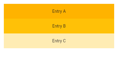 |
|---|
| 947 | /// |
|---|
| 948 | /// ```dart |
|---|
| 949 | /// final List<String> entries = <String>['A', 'B', 'C']; |
|---|
| 950 | /// final List<int> colorCodes = <int>[600, 500, 100]; |
|---|
| 951 | /// |
|---|
| 952 | /// Widget build(BuildContext context) { |
|---|
| 953 | /// return ListView.builder( |
|---|
| 954 | /// padding: const EdgeInsets.all(8), |
|---|
| 955 | /// itemCount: entries.length, |
|---|
| 956 | /// itemBuilder: (BuildContext context, int index) { |
|---|
| 957 | /// return Container( |
|---|
| 958 | /// height: 50, |
|---|
| 959 | /// color: Colors.amber[colorCodes[index]], |
|---|
| 960 | /// child: Center(child: Text('Entry ${entries[index]}')), |
|---|
| 961 | /// ); |
|---|
| 962 | /// } |
|---|
| 963 | /// ); |
|---|
| 964 | /// } |
|---|
| 965 | /// ``` |
|---|
| 966 | /// {@end-tool} |
|---|
| 967 | /// |
|---|
| 968 | /// {@tool snippet} |
|---|
| 969 | /// This example continues to build from our the previous ones, creating a |
|---|
| 970 | /// similar list using [ListView.separated]. Here, a [Divider] is used as a |
|---|
| 971 | /// separator. |
|---|
| 972 | /// |
|---|
| 973 | /// 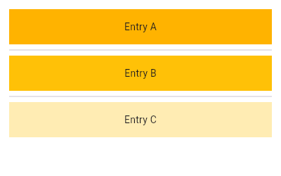 |
|---|
| 975 | /// |
|---|
| 976 | /// ```dart |
|---|
| 977 | /// final List<String> entries = <String>['A', 'B', 'C']; |
|---|
| 978 | /// final List<int> colorCodes = <int>[600, 500, 100]; |
|---|
| 979 | /// |
|---|
| 980 | /// Widget build(BuildContext context) { |
|---|
| 981 | /// return ListView.separated( |
|---|
| 982 | /// padding: const EdgeInsets.all(8), |
|---|
| 983 | /// itemCount: entries.length, |
|---|
| 984 | /// itemBuilder: (BuildContext context, int index) { |
|---|
| 985 | /// return Container( |
|---|
| 986 | /// height: 50, |
|---|
| 987 | /// color: Colors.amber[colorCodes[index]], |
|---|
| 988 | /// child: Center(child: Text('Entry ${entries[index]}')), |
|---|
| 989 | /// ); |
|---|
| 990 | /// }, |
|---|
| 991 | /// separatorBuilder: (BuildContext context, int index) => const Divider(), |
|---|
| 992 | /// ); |
|---|
| 993 | /// } |
|---|
| 994 | /// ``` |
|---|
| 995 | /// {@end-tool} |
|---|
| 996 | /// |
|---|
| 997 | /// ## Child elements' lifecycle |
|---|
| 998 | /// |
|---|
| 999 | /// ### Creation |
|---|
| 1000 | /// |
|---|
| 1001 | /// While laying out the list, visible children's elements, states and render |
|---|
| 1002 | /// objects will be created lazily based on existing widgets (such as when using |
|---|
| 1003 | /// the default constructor) or lazily provided ones (such as when using the |
|---|
| 1004 | /// [ListView.builder] constructor). |
|---|
| 1005 | /// |
|---|
| 1006 | /// ### Destruction |
|---|
| 1007 | /// |
|---|
| 1008 | /// When a child is scrolled out of view, the associated element subtree, |
|---|
| 1009 | /// states and render objects are destroyed. A new child at the same position |
|---|
| 1010 | /// in the list will be lazily recreated along with new elements, states and |
|---|
| 1011 | /// render objects when it is scrolled back. |
|---|
| 1012 | /// |
|---|
| 1013 | /// ### Destruction mitigation |
|---|
| 1014 | /// |
|---|
| 1015 | /// In order to preserve state as child elements are scrolled in and out of |
|---|
| 1016 | /// view, the following options are possible: |
|---|
| 1017 | /// |
|---|
| 1018 | /// * Moving the ownership of non-trivial UI-state-driving business logic |
|---|
| 1019 | /// out of the list child subtree. For instance, if a list contains posts |
|---|
| 1020 | /// with their number of upvotes coming from a cached network response, store |
|---|
| 1021 | /// the list of posts and upvote number in a data model outside the list. Let |
|---|
| 1022 | /// the list child UI subtree be easily recreate-able from the |
|---|
| 1023 | /// source-of-truth model object. Use [StatefulWidget]s in the child |
|---|
| 1024 | /// widget subtree to store instantaneous UI state only. |
|---|
| 1025 | /// |
|---|
| 1026 | /// * Letting [KeepAlive] be the root widget of the list child widget subtree |
|---|
| 1027 | /// that needs to be preserved. The [KeepAlive] widget marks the child |
|---|
| 1028 | /// subtree's top render object child for keepalive. When the associated top |
|---|
| 1029 | /// render object is scrolled out of view, the list keeps the child's render |
|---|
| 1030 | /// object (and by extension, its associated elements and states) in a cache |
|---|
| 1031 | /// list instead of destroying them. When scrolled back into view, the render |
|---|
| 1032 | /// object is repainted as-is (if it wasn't marked dirty in the interim). |
|---|
| 1033 | /// |
|---|
| 1034 | /// This only works if `addAutomaticKeepAlives` and `addRepaintBoundaries` |
|---|
| 1035 | /// are false since those parameters cause the [ListView] to wrap each child |
|---|
| 1036 | /// widget subtree with other widgets. |
|---|
| 1037 | /// |
|---|
| 1038 | /// * Using [AutomaticKeepAlive] widgets (inserted by default when |
|---|
| 1039 | /// `addAutomaticKeepAlives` is true). [AutomaticKeepAlive] allows descendant |
|---|
| 1040 | /// widgets to control whether the subtree is actually kept alive or not. |
|---|
| 1041 | /// This behavior is in contrast with [KeepAlive], which will unconditionally keep |
|---|
| 1042 | /// the subtree alive. |
|---|
| 1043 | /// |
|---|
| 1044 | /// As an example, the [EditableText] widget signals its list child element |
|---|
| 1045 | /// subtree to stay alive while its text field has input focus. If it doesn't |
|---|
| 1046 | /// have focus and no other descendants signaled for keepalive via a |
|---|
| 1047 | /// [KeepAliveNotification], the list child element subtree will be destroyed |
|---|
| 1048 | /// when scrolled away. |
|---|
| 1049 | /// |
|---|
| 1050 | /// [AutomaticKeepAlive] descendants typically signal it to be kept alive |
|---|
| 1051 | /// by using the [AutomaticKeepAliveClientMixin], then implementing the |
|---|
| 1052 | /// [AutomaticKeepAliveClientMixin.wantKeepAlive] getter and calling |
|---|
| 1053 | /// [AutomaticKeepAliveClientMixin.updateKeepAlive]. |
|---|
| 1054 | /// |
|---|
| 1055 | /// ## Transitioning to [CustomScrollView] |
|---|
| 1056 | /// |
|---|
| 1057 | /// A [ListView] is basically a [CustomScrollView] with a single [SliverList] in |
|---|
| 1058 | /// its [CustomScrollView.slivers] property. |
|---|
| 1059 | /// |
|---|
| 1060 | /// If [ListView] is no longer sufficient, for example because the scroll view |
|---|
| 1061 | /// is to have both a list and a grid, or because the list is to be combined |
|---|
| 1062 | /// with a [SliverAppBar], etc, it is straight-forward to port code from using |
|---|
| 1063 | /// [ListView] to using [CustomScrollView] directly. |
|---|
| 1064 | /// |
|---|
| 1065 | /// The [key], [scrollDirection], [reverse], [controller], [primary], [physics], |
|---|
| 1066 | /// and [shrinkWrap] properties on [ListView] map directly to the identically |
|---|
| 1067 | /// named properties on [CustomScrollView]. |
|---|
| 1068 | /// |
|---|
| 1069 | /// The [CustomScrollView.slivers] property should be a list containing either: |
|---|
| 1070 | /// * a [SliverList] if both [itemExtent] and [prototypeItem] were null; |
|---|
| 1071 | /// * a [SliverFixedExtentList] if [itemExtent] was not null; or |
|---|
| 1072 | /// * a [SliverPrototypeExtentList] if [prototypeItem] was not null. |
|---|
| 1073 | /// |
|---|
| 1074 | /// The [childrenDelegate] property on [ListView] corresponds to the |
|---|
| 1075 | /// [SliverList.delegate] (or [SliverFixedExtentList.delegate]) property. The |
|---|
| 1076 | /// [ListView] constructor's `children` argument corresponds to the |
|---|
| 1077 | /// [childrenDelegate] being a [SliverChildListDelegate] with that same |
|---|
| 1078 | /// argument. The [ListView.builder] constructor's `itemBuilder` and |
|---|
| 1079 | /// `itemCount` arguments correspond to the [childrenDelegate] being a |
|---|
| 1080 | /// [SliverChildBuilderDelegate] with the equivalent arguments. |
|---|
| 1081 | /// |
|---|
| 1082 | /// The [padding] property corresponds to having a [SliverPadding] in the |
|---|
| 1083 | /// [CustomScrollView.slivers] property instead of the list itself, and having |
|---|
| 1084 | /// the [SliverList] instead be a child of the [SliverPadding]. |
|---|
| 1085 | /// |
|---|
| 1086 | /// [CustomScrollView]s don't automatically avoid obstructions from [MediaQuery] |
|---|
| 1087 | /// like [ListView]s do. To reproduce the behavior, wrap the slivers in |
|---|
| 1088 | /// [SliverSafeArea]s. |
|---|
| 1089 | /// |
|---|
| 1090 | /// Once code has been ported to use [CustomScrollView], other slivers, such as |
|---|
| 1091 | /// [SliverGrid] or [SliverAppBar], can be put in the [CustomScrollView.slivers] |
|---|
| 1092 | /// list. |
|---|
| 1093 | /// |
|---|
| 1094 | /// {@tool snippet} |
|---|
| 1095 | /// |
|---|
| 1096 | /// Here are two brief snippets showing a [ListView] and its equivalent using |
|---|
| 1097 | /// [CustomScrollView]: |
|---|
| 1098 | /// |
|---|
| 1099 | /// ```dart |
|---|
| 1100 | /// ListView( |
|---|
| 1101 | /// padding: const EdgeInsets.all(20.0), |
|---|
| 1102 | /// children: const <Widget>[ |
|---|
| 1103 | /// Text("I'm dedicating every day to you"), |
|---|
| 1104 | /// Text('Domestic life was never quite my style'), |
|---|
| 1105 | /// Text('When you smile, you knock me out, I fall apart'), |
|---|
| 1106 | /// Text('And I thought I was so smart'), |
|---|
| 1107 | /// ], |
|---|
| 1108 | /// ) |
|---|
| 1109 | /// ``` |
|---|
| 1110 | /// {@end-tool} |
|---|
| 1111 | /// {@tool snippet} |
|---|
| 1112 | /// |
|---|
| 1113 | /// ```dart |
|---|
| 1114 | /// CustomScrollView( |
|---|
| 1115 | /// slivers: <Widget>[ |
|---|
| 1116 | /// SliverPadding( |
|---|
| 1117 | /// padding: const EdgeInsets.all(20.0), |
|---|
| 1118 | /// sliver: SliverList( |
|---|
| 1119 | /// delegate: SliverChildListDelegate( |
|---|
| 1120 | /// <Widget>[ |
|---|
| 1121 | /// const Text("I'm dedicating every day to you"), |
|---|
| 1122 | /// const Text('Domestic life was never quite my style'), |
|---|
| 1123 | /// const Text('When you smile, you knock me out, I fall apart'), |
|---|
| 1124 | /// const Text('And I thought I was so smart'), |
|---|
| 1125 | /// ], |
|---|
| 1126 | /// ), |
|---|
| 1127 | /// ), |
|---|
| 1128 | /// ), |
|---|
| 1129 | /// ], |
|---|
| 1130 | /// ) |
|---|
| 1131 | /// ``` |
|---|
| 1132 | /// {@end-tool} |
|---|
| 1133 | /// |
|---|
| 1134 | /// ## Special handling for an empty list |
|---|
| 1135 | /// |
|---|
| 1136 | /// A common design pattern is to have a custom UI for an empty list. The best |
|---|
| 1137 | /// way to achieve this in Flutter is just conditionally replacing the |
|---|
| 1138 | /// [ListView] at build time with whatever widgets you need to show for the |
|---|
| 1139 | /// empty list state: |
|---|
| 1140 | /// |
|---|
| 1141 | /// {@tool snippet} |
|---|
| 1142 | /// |
|---|
| 1143 | /// Example of simple empty list interface: |
|---|
| 1144 | /// |
|---|
| 1145 | /// ```dart |
|---|
| 1146 | /// Widget build(BuildContext context) { |
|---|
| 1147 | /// return Scaffold( |
|---|
| 1148 | /// appBar: AppBar(title: const Text('Empty List Test')), |
|---|
| 1149 | /// body: itemCount > 0 |
|---|
| 1150 | /// ? ListView.builder( |
|---|
| 1151 | /// itemCount: itemCount, |
|---|
| 1152 | /// itemBuilder: (BuildContext context, int index) { |
|---|
| 1153 | /// return ListTile( |
|---|
| 1154 | /// title: Text('Item ${index + 1}'), |
|---|
| 1155 | /// ); |
|---|
| 1156 | /// }, |
|---|
| 1157 | /// ) |
|---|
| 1158 | /// : const Center(child: Text('No items')), |
|---|
| 1159 | /// ); |
|---|
| 1160 | /// } |
|---|
| 1161 | /// ``` |
|---|
| 1162 | /// {@end-tool} |
|---|
| 1163 | /// |
|---|
| 1164 | /// ## Selection of list items |
|---|
| 1165 | /// |
|---|
| 1166 | /// [ListView] has no built-in notion of a selected item or items. For a small |
|---|
| 1167 | /// example of how a caller might wire up basic item selection, see |
|---|
| 1168 | /// [ListTile.selected]. |
|---|
| 1169 | /// |
|---|
| 1170 | /// {@tool dartpad} |
|---|
| 1171 | /// This example shows a custom implementation of [ListTile] selection in a [ListView] or [GridView]. |
|---|
| 1172 | /// Long press any [ListTile] to enable selection mode. |
|---|
| 1173 | /// |
|---|
| 1174 | /// ** See code in examples/api/lib/widgets/scroll_view/list_view.0.dart ** |
|---|
| 1175 | /// {@end-tool} |
|---|
| 1176 | /// |
|---|
| 1177 | /// {@macro flutter.widgets.BoxScroll.scrollBehaviour} |
|---|
| 1178 | /// |
|---|
| 1179 | /// {@macro flutter.widgets.ScrollView.PageStorage} |
|---|
| 1180 | /// |
|---|
| 1181 | /// See also: |
|---|
| 1182 | /// |
|---|
| 1183 | /// * [SingleChildScrollView], which is a scrollable widget that has a single |
|---|
| 1184 | /// child. |
|---|
| 1185 | /// * [PageView], which is a scrolling list of child widgets that are each the |
|---|
| 1186 | /// size of the viewport. |
|---|
| 1187 | /// * [GridView], which is a scrollable, 2D array of widgets. |
|---|
| 1188 | /// * [CustomScrollView], which is a scrollable widget that creates custom |
|---|
| 1189 | /// scroll effects using slivers. |
|---|
| 1190 | /// * [ListBody], which arranges its children in a similar manner, but without |
|---|
| 1191 | /// scrolling. |
|---|
| 1192 | /// * [ScrollNotification] and [NotificationListener], which can be used to watch |
|---|
| 1193 | /// the scroll position without using a [ScrollController]. |
|---|
| 1194 | /// * The [catalog of layout widgets](https://flutter.dev/widgets/layout/). |
|---|
| 1195 | /// * Cookbook: [Use lists](https://flutter.dev/docs/cookbook/lists/basic-list) |
|---|
| 1196 | /// * Cookbook: [Work with long lists](https://flutter.dev/docs/cookbook/lists/long-lists) |
|---|
| 1197 | /// * Cookbook: [Create a horizontal list](https://flutter.dev/docs/cookbook/lists/horizontal-list) |
|---|
| 1198 | /// * Cookbook: [Create lists with different types of items](https://flutter.dev/docs/cookbook/lists/mixed-list) |
|---|
| 1199 | /// * Cookbook: [Implement swipe to dismiss](https://flutter.dev/docs/cookbook/gestures/dismissible) |
|---|
| 1200 | class ListView extends BoxScrollView { |
|---|
| 1201 | /// Creates a scrollable, linear array of widgets from an explicit [List]. |
|---|
| 1202 | /// |
|---|
| 1203 | /// This constructor is appropriate for list views with a small number of |
|---|
| 1204 | /// children because constructing the [List] requires doing work for every |
|---|
| 1205 | /// child that could possibly be displayed in the list view instead of just |
|---|
| 1206 | /// those children that are actually visible. |
|---|
| 1207 | /// |
|---|
| 1208 | /// Like other widgets in the framework, this widget expects that |
|---|
| 1209 | /// the [children] list will not be mutated after it has been passed in here. |
|---|
| 1210 | /// See the documentation at [SliverChildListDelegate.children] for more details. |
|---|
| 1211 | /// |
|---|
| 1212 | /// It is usually more efficient to create children on demand using |
|---|
| 1213 | /// [ListView.builder] because it will create the widget children lazily as necessary. |
|---|
| 1214 | /// |
|---|
| 1215 | /// The `addAutomaticKeepAlives` argument corresponds to the |
|---|
| 1216 | /// [SliverChildListDelegate.addAutomaticKeepAlives] property. The |
|---|
| 1217 | /// `addRepaintBoundaries` argument corresponds to the |
|---|
| 1218 | /// [SliverChildListDelegate.addRepaintBoundaries] property. The |
|---|
| 1219 | /// `addSemanticIndexes` argument corresponds to the |
|---|
| 1220 | /// [SliverChildListDelegate.addSemanticIndexes] property. None |
|---|
| 1221 | /// may be null. |
|---|
| 1222 | ListView({ |
|---|
| 1223 | super.key, |
|---|
| 1224 | super.scrollDirection, |
|---|
| 1225 | super.reverse, |
|---|
| 1226 | super.controller, |
|---|
| 1227 | super.primary, |
|---|
| 1228 | super.physics, |
|---|
| 1229 | super.shrinkWrap, |
|---|
| 1230 | super.padding, |
|---|
| 1231 | this.itemExtent, |
|---|
| 1232 | this.itemExtentBuilder, |
|---|
| 1233 | this.prototypeItem, |
|---|
| 1234 | bool addAutomaticKeepAlives = true, |
|---|
| 1235 | bool addRepaintBoundaries = true, |
|---|
| 1236 | bool addSemanticIndexes = true, |
|---|
| 1237 | super.cacheExtent, |
|---|
| 1238 | List<Widget> children = const <Widget>[], |
|---|
| 1239 | int? semanticChildCount, |
|---|
| 1240 | super.dragStartBehavior, |
|---|
| 1241 | super.keyboardDismissBehavior, |
|---|
| 1242 | super.restorationId, |
|---|
| 1243 | super.clipBehavior, |
|---|
| 1244 | }) : assert( |
|---|
| 1245 | (itemExtent == null && prototypeItem == null) || |
|---|
| 1246 | (itemExtent == null && itemExtentBuilder == null) || |
|---|
| 1247 | (prototypeItem == null && itemExtentBuilder == null), |
|---|
| 1248 | 'You can only pass one of itemExtent, prototypeItem and itemExtentBuilder.' , |
|---|
| 1249 | ), |
|---|
| 1250 | childrenDelegate = SliverChildListDelegate( |
|---|
| 1251 | children, |
|---|
| 1252 | addAutomaticKeepAlives: addAutomaticKeepAlives, |
|---|
| 1253 | addRepaintBoundaries: addRepaintBoundaries, |
|---|
| 1254 | addSemanticIndexes: addSemanticIndexes, |
|---|
| 1255 | ), |
|---|
| 1256 | super( |
|---|
| 1257 | semanticChildCount: semanticChildCount ?? children.length, |
|---|
| 1258 | ); |
|---|
| 1259 | |
|---|
| 1260 | /// Creates a scrollable, linear array of widgets that are created on demand. |
|---|
| 1261 | /// |
|---|
| 1262 | /// This constructor is appropriate for list views with a large (or infinite) |
|---|
| 1263 | /// number of children because the builder is called only for those children |
|---|
| 1264 | /// that are actually visible. |
|---|
| 1265 | /// |
|---|
| 1266 | /// Providing a non-null `itemCount` improves the ability of the [ListView] to |
|---|
| 1267 | /// estimate the maximum scroll extent. |
|---|
| 1268 | /// |
|---|
| 1269 | /// The `itemBuilder` callback will be called only with indices greater than |
|---|
| 1270 | /// or equal to zero and less than `itemCount`. |
|---|
| 1271 | /// |
|---|
| 1272 | /// {@template flutter.widgets.ListView.builder.itemBuilder} |
|---|
| 1273 | /// It is legal for `itemBuilder` to return `null`. If it does, the scroll view |
|---|
| 1274 | /// will stop calling `itemBuilder`, even if it has yet to reach `itemCount`. |
|---|
| 1275 | /// By returning `null`, the [ScrollPosition.maxScrollExtent] will not be accurate |
|---|
| 1276 | /// unless the user has reached the end of the [ScrollView]. This can also cause the |
|---|
| 1277 | /// [Scrollbar] to grow as the user scrolls. |
|---|
| 1278 | /// |
|---|
| 1279 | /// For more accurate [ScrollMetrics], consider specifying `itemCount`. |
|---|
| 1280 | /// {@endtemplate} |
|---|
| 1281 | /// |
|---|
| 1282 | /// The `itemBuilder` should always create the widget instances when called. |
|---|
| 1283 | /// Avoid using a builder that returns a previously-constructed widget; if the |
|---|
| 1284 | /// list view's children are created in advance, or all at once when the |
|---|
| 1285 | /// [ListView] itself is created, it is more efficient to use the [ListView] |
|---|
| 1286 | /// constructor. Even more efficient, however, is to create the instances on |
|---|
| 1287 | /// demand using this constructor's `itemBuilder` callback. |
|---|
| 1288 | /// |
|---|
| 1289 | /// {@macro flutter.widgets.PageView.findChildIndexCallback} |
|---|
| 1290 | /// |
|---|
| 1291 | /// The `addAutomaticKeepAlives` argument corresponds to the |
|---|
| 1292 | /// [SliverChildBuilderDelegate.addAutomaticKeepAlives] property. The |
|---|
| 1293 | /// `addRepaintBoundaries` argument corresponds to the |
|---|
| 1294 | /// [SliverChildBuilderDelegate.addRepaintBoundaries] property. The |
|---|
| 1295 | /// `addSemanticIndexes` argument corresponds to the |
|---|
| 1296 | /// [SliverChildBuilderDelegate.addSemanticIndexes] property. None may be |
|---|
| 1297 | /// null. |
|---|
| 1298 | ListView.builder({ |
|---|
| 1299 | super.key, |
|---|
| 1300 | super.scrollDirection, |
|---|
| 1301 | super.reverse, |
|---|
| 1302 | super.controller, |
|---|
| 1303 | super.primary, |
|---|
| 1304 | super.physics, |
|---|
| 1305 | super.shrinkWrap, |
|---|
| 1306 | super.padding, |
|---|
| 1307 | this.itemExtent, |
|---|
| 1308 | this.itemExtentBuilder, |
|---|
| 1309 | this.prototypeItem, |
|---|
| 1310 | required NullableIndexedWidgetBuilder itemBuilder, |
|---|
| 1311 | ChildIndexGetter? findChildIndexCallback, |
|---|
| 1312 | int? itemCount, |
|---|
| 1313 | bool addAutomaticKeepAlives = true, |
|---|
| 1314 | bool addRepaintBoundaries = true, |
|---|
| 1315 | bool addSemanticIndexes = true, |
|---|
| 1316 | super.cacheExtent, |
|---|
| 1317 | int? semanticChildCount, |
|---|
| 1318 | super.dragStartBehavior, |
|---|
| 1319 | super.keyboardDismissBehavior, |
|---|
| 1320 | super.restorationId, |
|---|
| 1321 | super.clipBehavior, |
|---|
| 1322 | }) : assert(itemCount == null || itemCount >= 0), |
|---|
| 1323 | assert(semanticChildCount == null || semanticChildCount <= itemCount!), |
|---|
| 1324 | assert( |
|---|
| 1325 | (itemExtent == null && prototypeItem == null) || |
|---|
| 1326 | (itemExtent == null && itemExtentBuilder == null) || |
|---|
| 1327 | (prototypeItem == null && itemExtentBuilder == null), |
|---|
| 1328 | 'You can only pass one of itemExtent, prototypeItem and itemExtentBuilder.' , |
|---|
| 1329 | ), |
|---|
| 1330 | childrenDelegate = SliverChildBuilderDelegate( |
|---|
| 1331 | itemBuilder, |
|---|
| 1332 | findChildIndexCallback: findChildIndexCallback, |
|---|
| 1333 | childCount: itemCount, |
|---|
| 1334 | addAutomaticKeepAlives: addAutomaticKeepAlives, |
|---|
| 1335 | addRepaintBoundaries: addRepaintBoundaries, |
|---|
| 1336 | addSemanticIndexes: addSemanticIndexes, |
|---|
| 1337 | ), |
|---|
| 1338 | super( |
|---|
| 1339 | semanticChildCount: semanticChildCount ?? itemCount, |
|---|
| 1340 | ); |
|---|
| 1341 | |
|---|
| 1342 | /// Creates a fixed-length scrollable linear array of list "items" separated |
|---|
| 1343 | /// by list item "separators". |
|---|
| 1344 | /// |
|---|
| 1345 | /// This constructor is appropriate for list views with a large number of |
|---|
| 1346 | /// item and separator children because the builders are only called for |
|---|
| 1347 | /// the children that are actually visible. |
|---|
| 1348 | /// |
|---|
| 1349 | /// The `itemBuilder` callback will be called with indices greater than |
|---|
| 1350 | /// or equal to zero and less than `itemCount`. |
|---|
| 1351 | /// |
|---|
| 1352 | /// Separators only appear between list items: separator 0 appears after item |
|---|
| 1353 | /// 0 and the last separator appears before the last item. |
|---|
| 1354 | /// |
|---|
| 1355 | /// The `separatorBuilder` callback will be called with indices greater than |
|---|
| 1356 | /// or equal to zero and less than `itemCount - 1`. |
|---|
| 1357 | /// |
|---|
| 1358 | /// The `itemBuilder` and `separatorBuilder` callbacks should always |
|---|
| 1359 | /// actually create widget instances when called. Avoid using a builder that |
|---|
| 1360 | /// returns a previously-constructed widget; if the list view's children are |
|---|
| 1361 | /// created in advance, or all at once when the [ListView] itself is created, |
|---|
| 1362 | /// it is more efficient to use the [ListView] constructor. |
|---|
| 1363 | /// |
|---|
| 1364 | /// {@macro flutter.widgets.ListView.builder.itemBuilder} |
|---|
| 1365 | /// |
|---|
| 1366 | /// {@macro flutter.widgets.PageView.findChildIndexCallback} |
|---|
| 1367 | /// |
|---|
| 1368 | /// {@tool snippet} |
|---|
| 1369 | /// |
|---|
| 1370 | /// This example shows how to create [ListView] whose [ListTile] list items |
|---|
| 1371 | /// are separated by [Divider]s. |
|---|
| 1372 | /// |
|---|
| 1373 | /// ```dart |
|---|
| 1374 | /// ListView.separated( |
|---|
| 1375 | /// itemCount: 25, |
|---|
| 1376 | /// separatorBuilder: (BuildContext context, int index) => const Divider(), |
|---|
| 1377 | /// itemBuilder: (BuildContext context, int index) { |
|---|
| 1378 | /// return ListTile( |
|---|
| 1379 | /// title: Text('item $index'), |
|---|
| 1380 | /// ); |
|---|
| 1381 | /// }, |
|---|
| 1382 | /// ) |
|---|
| 1383 | /// ``` |
|---|
| 1384 | /// {@end-tool} |
|---|
| 1385 | /// |
|---|
| 1386 | /// The `addAutomaticKeepAlives` argument corresponds to the |
|---|
| 1387 | /// [SliverChildBuilderDelegate.addAutomaticKeepAlives] property. The |
|---|
| 1388 | /// `addRepaintBoundaries` argument corresponds to the |
|---|
| 1389 | /// [SliverChildBuilderDelegate.addRepaintBoundaries] property. The |
|---|
| 1390 | /// `addSemanticIndexes` argument corresponds to the |
|---|
| 1391 | /// [SliverChildBuilderDelegate.addSemanticIndexes] property. None may be |
|---|
| 1392 | /// null. |
|---|
| 1393 | ListView.separated({ |
|---|
| 1394 | super.key, |
|---|
| 1395 | super.scrollDirection, |
|---|
| 1396 | super.reverse, |
|---|
| 1397 | super.controller, |
|---|
| 1398 | super.primary, |
|---|
| 1399 | super.physics, |
|---|
| 1400 | super.shrinkWrap, |
|---|
| 1401 | super.padding, |
|---|
| 1402 | required NullableIndexedWidgetBuilder itemBuilder, |
|---|
| 1403 | ChildIndexGetter? findChildIndexCallback, |
|---|
| 1404 | required IndexedWidgetBuilder separatorBuilder, |
|---|
| 1405 | required int itemCount, |
|---|
| 1406 | bool addAutomaticKeepAlives = true, |
|---|
| 1407 | bool addRepaintBoundaries = true, |
|---|
| 1408 | bool addSemanticIndexes = true, |
|---|
| 1409 | super.cacheExtent, |
|---|
| 1410 | super.dragStartBehavior, |
|---|
| 1411 | super.keyboardDismissBehavior, |
|---|
| 1412 | super.restorationId, |
|---|
| 1413 | super.clipBehavior, |
|---|
| 1414 | }) : assert(itemCount >= 0), |
|---|
| 1415 | itemExtent = null, |
|---|
| 1416 | itemExtentBuilder = null, |
|---|
| 1417 | prototypeItem = null, |
|---|
| 1418 | childrenDelegate = SliverChildBuilderDelegate( |
|---|
| 1419 | (BuildContext context, int index) { |
|---|
| 1420 | final int itemIndex = index ~/ 2; |
|---|
| 1421 | if (index.isEven) { |
|---|
| 1422 | return itemBuilder(context, itemIndex); |
|---|
| 1423 | } |
|---|
| 1424 | return separatorBuilder(context, itemIndex); |
|---|
| 1425 | }, |
|---|
| 1426 | findChildIndexCallback: findChildIndexCallback, |
|---|
| 1427 | childCount: _computeActualChildCount(itemCount), |
|---|
| 1428 | addAutomaticKeepAlives: addAutomaticKeepAlives, |
|---|
| 1429 | addRepaintBoundaries: addRepaintBoundaries, |
|---|
| 1430 | addSemanticIndexes: addSemanticIndexes, |
|---|
| 1431 | semanticIndexCallback: (Widget widget, int index) { |
|---|
| 1432 | return index.isEven ? index ~/ 2 : null; |
|---|
| 1433 | }, |
|---|
| 1434 | ), |
|---|
| 1435 | super( |
|---|
| 1436 | semanticChildCount: itemCount, |
|---|
| 1437 | ); |
|---|
| 1438 | |
|---|
| 1439 | /// Creates a scrollable, linear array of widgets with a custom child model. |
|---|
| 1440 | /// |
|---|
| 1441 | /// For example, a custom child model can control the algorithm used to |
|---|
| 1442 | /// estimate the size of children that are not actually visible. |
|---|
| 1443 | /// |
|---|
| 1444 | /// {@tool dartpad} |
|---|
| 1445 | /// This example shows a [ListView] that uses a custom [SliverChildBuilderDelegate] to support child |
|---|
| 1446 | /// reordering. |
|---|
| 1447 | /// |
|---|
| 1448 | /// ** See code in examples/api/lib/widgets/scroll_view/list_view.1.dart ** |
|---|
| 1449 | /// {@end-tool} |
|---|
| 1450 | const ListView.custom({ |
|---|
| 1451 | super.key, |
|---|
| 1452 | super.scrollDirection, |
|---|
| 1453 | super.reverse, |
|---|
| 1454 | super.controller, |
|---|
| 1455 | super.primary, |
|---|
| 1456 | super.physics, |
|---|
| 1457 | super.shrinkWrap, |
|---|
| 1458 | super.padding, |
|---|
| 1459 | this.itemExtent, |
|---|
| 1460 | this.prototypeItem, |
|---|
| 1461 | this.itemExtentBuilder, |
|---|
| 1462 | required this.childrenDelegate, |
|---|
| 1463 | super.cacheExtent, |
|---|
| 1464 | super.semanticChildCount, |
|---|
| 1465 | super.dragStartBehavior, |
|---|
| 1466 | super.keyboardDismissBehavior, |
|---|
| 1467 | super.restorationId, |
|---|
| 1468 | super.clipBehavior, |
|---|
| 1469 | }) : assert( |
|---|
| 1470 | (itemExtent == null && prototypeItem == null) || |
|---|
| 1471 | (itemExtent == null && itemExtentBuilder == null) || |
|---|
| 1472 | (prototypeItem == null && itemExtentBuilder == null), |
|---|
| 1473 | 'You can only pass one of itemExtent, prototypeItem and itemExtentBuilder.' , |
|---|
| 1474 | ); |
|---|
| 1475 | |
|---|
| 1476 | /// {@template flutter.widgets.list_view.itemExtent} |
|---|
| 1477 | /// If non-null, forces the children to have the given extent in the scroll |
|---|
| 1478 | /// direction. |
|---|
| 1479 | /// |
|---|
| 1480 | /// Specifying an [itemExtent] is more efficient than letting the children |
|---|
| 1481 | /// determine their own extent because the scrolling machinery can make use of |
|---|
| 1482 | /// the foreknowledge of the children's extent to save work, for example when |
|---|
| 1483 | /// the scroll position changes drastically. |
|---|
| 1484 | /// |
|---|
| 1485 | /// See also: |
|---|
| 1486 | /// |
|---|
| 1487 | /// * [SliverFixedExtentList], the sliver used internally when this property |
|---|
| 1488 | /// is provided. It constrains its box children to have a specific given |
|---|
| 1489 | /// extent along the main axis. |
|---|
| 1490 | /// * The [prototypeItem] property, which allows forcing the children's |
|---|
| 1491 | /// extent to be the same as the given widget. |
|---|
| 1492 | /// * The [itemExtentBuilder] property, which allows forcing the children's |
|---|
| 1493 | /// extent to be the value returned by the callback. |
|---|
| 1494 | /// {@endtemplate} |
|---|
| 1495 | final double? itemExtent; |
|---|
| 1496 | |
|---|
| 1497 | /// {@template flutter.widgets.list_view.itemExtentBuilder} |
|---|
| 1498 | /// If non-null, forces the children to have the corresponding extent returned |
|---|
| 1499 | /// by the builder. |
|---|
| 1500 | /// |
|---|
| 1501 | /// Specifying an [itemExtentBuilder] is more efficient than letting the children |
|---|
| 1502 | /// determine their own extent because the scrolling machinery can make use of |
|---|
| 1503 | /// the foreknowledge of the children's extent to save work, for example when |
|---|
| 1504 | /// the scroll position changes drastically. |
|---|
| 1505 | /// |
|---|
| 1506 | /// This will be called multiple times during the layout phase of a frame to find |
|---|
| 1507 | /// the items that should be loaded by the lazy loading process. |
|---|
| 1508 | /// |
|---|
| 1509 | /// Unlike [itemExtent] or [prototypeItem], this allows children to have |
|---|
| 1510 | /// different extents. |
|---|
| 1511 | /// |
|---|
| 1512 | /// See also: |
|---|
| 1513 | /// |
|---|
| 1514 | /// * [SliverVariedExtentList], the sliver used internally when this property |
|---|
| 1515 | /// is provided. It constrains its box children to have a specific given |
|---|
| 1516 | /// extent along the main axis. |
|---|
| 1517 | /// * The [itemExtent] property, which allows forcing the children's extent |
|---|
| 1518 | /// to a given value. |
|---|
| 1519 | /// * The [prototypeItem] property, which allows forcing the children's |
|---|
| 1520 | /// extent to be the same as the given widget. |
|---|
| 1521 | /// {@endtemplate} |
|---|
| 1522 | final ItemExtentBuilder? itemExtentBuilder; |
|---|
| 1523 | |
|---|
| 1524 | /// {@template flutter.widgets.list_view.prototypeItem} |
|---|
| 1525 | /// If non-null, forces the children to have the same extent as the given |
|---|
| 1526 | /// widget in the scroll direction. |
|---|
| 1527 | /// |
|---|
| 1528 | /// Specifying an [prototypeItem] is more efficient than letting the children |
|---|
| 1529 | /// determine their own extent because the scrolling machinery can make use of |
|---|
| 1530 | /// the foreknowledge of the children's extent to save work, for example when |
|---|
| 1531 | /// the scroll position changes drastically. |
|---|
| 1532 | /// |
|---|
| 1533 | /// See also: |
|---|
| 1534 | /// |
|---|
| 1535 | /// * [SliverPrototypeExtentList], the sliver used internally when this |
|---|
| 1536 | /// property is provided. It constrains its box children to have the same |
|---|
| 1537 | /// extent as a prototype item along the main axis. |
|---|
| 1538 | /// * The [itemExtent] property, which allows forcing the children's extent |
|---|
| 1539 | /// to a given value. |
|---|
| 1540 | /// * The [itemExtentBuilder] property, which allows forcing the children's |
|---|
| 1541 | /// extent to be the value returned by the callback. |
|---|
| 1542 | /// {@endtemplate} |
|---|
| 1543 | final Widget? prototypeItem; |
|---|
| 1544 | |
|---|
| 1545 | /// A delegate that provides the children for the [ListView]. |
|---|
| 1546 | /// |
|---|
| 1547 | /// The [ListView.custom] constructor lets you specify this delegate |
|---|
| 1548 | /// explicitly. The [ListView] and [ListView.builder] constructors create a |
|---|
| 1549 | /// [childrenDelegate] that wraps the given [List] and [IndexedWidgetBuilder], |
|---|
| 1550 | /// respectively. |
|---|
| 1551 | final SliverChildDelegate childrenDelegate; |
|---|
| 1552 | |
|---|
| 1553 | @override |
|---|
| 1554 | Widget buildChildLayout(BuildContext context) { |
|---|
| 1555 | if (itemExtent != null) { |
|---|
| 1556 | return SliverFixedExtentList( |
|---|
| 1557 | delegate: childrenDelegate, |
|---|
| 1558 | itemExtent: itemExtent!, |
|---|
| 1559 | ); |
|---|
| 1560 | } else if (itemExtentBuilder != null) { |
|---|
| 1561 | return SliverVariedExtentList( |
|---|
| 1562 | delegate: childrenDelegate, |
|---|
| 1563 | itemExtentBuilder: itemExtentBuilder!, |
|---|
| 1564 | ); |
|---|
| 1565 | } else if (prototypeItem != null) { |
|---|
| 1566 | return SliverPrototypeExtentList( |
|---|
| 1567 | delegate: childrenDelegate, |
|---|
| 1568 | prototypeItem: prototypeItem!, |
|---|
| 1569 | ); |
|---|
| 1570 | } |
|---|
| 1571 | return SliverList(delegate: childrenDelegate); |
|---|
| 1572 | } |
|---|
| 1573 | |
|---|
| 1574 | @override |
|---|
| 1575 | void debugFillProperties(DiagnosticPropertiesBuilder properties) { |
|---|
| 1576 | super.debugFillProperties(properties); |
|---|
| 1577 | properties.add(DoubleProperty('itemExtent' , itemExtent, defaultValue: null)); |
|---|
| 1578 | } |
|---|
| 1579 | |
|---|
| 1580 | // Helper method to compute the actual child count for the separated constructor. |
|---|
| 1581 | static int _computeActualChildCount(int itemCount) { |
|---|
| 1582 | return math.max(0, itemCount * 2 - 1); |
|---|
| 1583 | } |
|---|
| 1584 | } |
|---|
| 1585 | |
|---|
| 1586 | /// A scrollable, 2D array of widgets. |
|---|
| 1587 | /// |
|---|
| 1588 | /// {@youtube 560 315 https://www.youtube.com/watch?v=bLOtZDTm4H8} |
|---|
| 1589 | /// |
|---|
| 1590 | /// The main axis direction of a grid is the direction in which it scrolls (the |
|---|
| 1591 | /// [scrollDirection]). |
|---|
| 1592 | /// |
|---|
| 1593 | /// The most commonly used grid layouts are [GridView.count], which creates a |
|---|
| 1594 | /// layout with a fixed number of tiles in the cross axis, and |
|---|
| 1595 | /// [GridView.extent], which creates a layout with tiles that have a maximum |
|---|
| 1596 | /// cross-axis extent. A custom [SliverGridDelegate] can produce an arbitrary 2D |
|---|
| 1597 | /// arrangement of children, including arrangements that are unaligned or |
|---|
| 1598 | /// overlapping. |
|---|
| 1599 | /// |
|---|
| 1600 | /// To create a grid with a large (or infinite) number of children, use the |
|---|
| 1601 | /// [GridView.builder] constructor with either a |
|---|
| 1602 | /// [SliverGridDelegateWithFixedCrossAxisCount] or a |
|---|
| 1603 | /// [SliverGridDelegateWithMaxCrossAxisExtent] for the [gridDelegate]. |
|---|
| 1604 | /// |
|---|
| 1605 | /// To use a custom [SliverChildDelegate], use [GridView.custom]. |
|---|
| 1606 | /// |
|---|
| 1607 | /// To create a linear array of children, use a [ListView]. |
|---|
| 1608 | /// |
|---|
| 1609 | /// To control the initial scroll offset of the scroll view, provide a |
|---|
| 1610 | /// [controller] with its [ScrollController.initialScrollOffset] property set. |
|---|
| 1611 | /// |
|---|
| 1612 | /// ## Transitioning to [CustomScrollView] |
|---|
| 1613 | /// |
|---|
| 1614 | /// A [GridView] is basically a [CustomScrollView] with a single [SliverGrid] in |
|---|
| 1615 | /// its [CustomScrollView.slivers] property. |
|---|
| 1616 | /// |
|---|
| 1617 | /// If [GridView] is no longer sufficient, for example because the scroll view |
|---|
| 1618 | /// is to have both a grid and a list, or because the grid is to be combined |
|---|
| 1619 | /// with a [SliverAppBar], etc, it is straight-forward to port code from using |
|---|
| 1620 | /// [GridView] to using [CustomScrollView] directly. |
|---|
| 1621 | /// |
|---|
| 1622 | /// The [key], [scrollDirection], [reverse], [controller], [primary], [physics], |
|---|
| 1623 | /// and [shrinkWrap] properties on [GridView] map directly to the identically |
|---|
| 1624 | /// named properties on [CustomScrollView]. |
|---|
| 1625 | /// |
|---|
| 1626 | /// The [CustomScrollView.slivers] property should be a list containing just a |
|---|
| 1627 | /// [SliverGrid]. |
|---|
| 1628 | /// |
|---|
| 1629 | /// The [childrenDelegate] property on [GridView] corresponds to the |
|---|
| 1630 | /// [SliverGrid.delegate] property, and the [gridDelegate] property on the |
|---|
| 1631 | /// [GridView] corresponds to the [SliverGrid.gridDelegate] property. |
|---|
| 1632 | /// |
|---|
| 1633 | /// The [GridView], [GridView.count], and [GridView.extent] |
|---|
| 1634 | /// constructors' `children` arguments correspond to the [childrenDelegate] |
|---|
| 1635 | /// being a [SliverChildListDelegate] with that same argument. The |
|---|
| 1636 | /// [GridView.builder] constructor's `itemBuilder` and `childCount` arguments |
|---|
| 1637 | /// correspond to the [childrenDelegate] being a [SliverChildBuilderDelegate] |
|---|
| 1638 | /// with the matching arguments. |
|---|
| 1639 | /// |
|---|
| 1640 | /// The [GridView.count] and [GridView.extent] constructors create |
|---|
| 1641 | /// custom grid delegates, and have equivalently named constructors on |
|---|
| 1642 | /// [SliverGrid] to ease the transition: [SliverGrid.count] and |
|---|
| 1643 | /// [SliverGrid.extent] respectively. |
|---|
| 1644 | /// |
|---|
| 1645 | /// The [padding] property corresponds to having a [SliverPadding] in the |
|---|
| 1646 | /// [CustomScrollView.slivers] property instead of the grid itself, and having |
|---|
| 1647 | /// the [SliverGrid] instead be a child of the [SliverPadding]. |
|---|
| 1648 | /// |
|---|
| 1649 | /// Once code has been ported to use [CustomScrollView], other slivers, such as |
|---|
| 1650 | /// [SliverList] or [SliverAppBar], can be put in the [CustomScrollView.slivers] |
|---|
| 1651 | /// list. |
|---|
| 1652 | /// |
|---|
| 1653 | /// {@macro flutter.widgets.ScrollView.PageStorage} |
|---|
| 1654 | /// |
|---|
| 1655 | /// ## Examples |
|---|
| 1656 | /// |
|---|
| 1657 | /// {@tool snippet} |
|---|
| 1658 | /// This example demonstrates how to create a [GridView] with two columns. The |
|---|
| 1659 | /// children are spaced apart using the `crossAxisSpacing` and `mainAxisSpacing` |
|---|
| 1660 | /// properties. |
|---|
| 1661 | /// |
|---|
| 1662 | /// 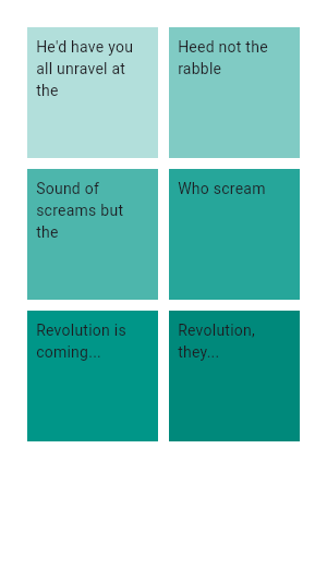 |
|---|
| 1663 | /// |
|---|
| 1664 | /// ```dart |
|---|
| 1665 | /// GridView.count( |
|---|
| 1666 | /// primary: false, |
|---|
| 1667 | /// padding: const EdgeInsets.all(20), |
|---|
| 1668 | /// crossAxisSpacing: 10, |
|---|
| 1669 | /// mainAxisSpacing: 10, |
|---|
| 1670 | /// crossAxisCount: 2, |
|---|
| 1671 | /// children: <Widget>[ |
|---|
| 1672 | /// Container( |
|---|
| 1673 | /// padding: const EdgeInsets.all(8), |
|---|
| 1674 | /// color: Colors.teal[100], |
|---|
| 1675 | /// child: const Text("He'd have you all unravel at the"), |
|---|
| 1676 | /// ), |
|---|
| 1677 | /// Container( |
|---|
| 1678 | /// padding: const EdgeInsets.all(8), |
|---|
| 1679 | /// color: Colors.teal[200], |
|---|
| 1680 | /// child: const Text('Heed not the rabble'), |
|---|
| 1681 | /// ), |
|---|
| 1682 | /// Container( |
|---|
| 1683 | /// padding: const EdgeInsets.all(8), |
|---|
| 1684 | /// color: Colors.teal[300], |
|---|
| 1685 | /// child: const Text('Sound of screams but the'), |
|---|
| 1686 | /// ), |
|---|
| 1687 | /// Container( |
|---|
| 1688 | /// padding: const EdgeInsets.all(8), |
|---|
| 1689 | /// color: Colors.teal[400], |
|---|
| 1690 | /// child: const Text('Who scream'), |
|---|
| 1691 | /// ), |
|---|
| 1692 | /// Container( |
|---|
| 1693 | /// padding: const EdgeInsets.all(8), |
|---|
| 1694 | /// color: Colors.teal[500], |
|---|
| 1695 | /// child: const Text('Revolution is coming...'), |
|---|
| 1696 | /// ), |
|---|
| 1697 | /// Container( |
|---|
| 1698 | /// padding: const EdgeInsets.all(8), |
|---|
| 1699 | /// color: Colors.teal[600], |
|---|
| 1700 | /// child: const Text('Revolution, they...'), |
|---|
| 1701 | /// ), |
|---|
| 1702 | /// ], |
|---|
| 1703 | /// ) |
|---|
| 1704 | /// ``` |
|---|
| 1705 | /// {@end-tool} |
|---|
| 1706 | /// |
|---|
| 1707 | /// {@tool snippet} |
|---|
| 1708 | /// This example shows how to create the same grid as the previous example |
|---|
| 1709 | /// using a [CustomScrollView] and a [SliverGrid]. |
|---|
| 1710 | /// |
|---|
| 1711 | ///  |
|---|
| 1712 | /// |
|---|
| 1713 | /// ```dart |
|---|
| 1714 | /// CustomScrollView( |
|---|
| 1715 | /// primary: false, |
|---|
| 1716 | /// slivers: <Widget>[ |
|---|
| 1717 | /// SliverPadding( |
|---|
| 1718 | /// padding: const EdgeInsets.all(20), |
|---|
| 1719 | /// sliver: SliverGrid.count( |
|---|
| 1720 | /// crossAxisSpacing: 10, |
|---|
| 1721 | /// mainAxisSpacing: 10, |
|---|
| 1722 | /// crossAxisCount: 2, |
|---|
| 1723 | /// children: <Widget>[ |
|---|
| 1724 | /// Container( |
|---|
| 1725 | /// padding: const EdgeInsets.all(8), |
|---|
| 1726 | /// color: Colors.green[100], |
|---|
| 1727 | /// child: const Text("He'd have you all unravel at the"), |
|---|
| 1728 | /// ), |
|---|
| 1729 | /// Container( |
|---|
| 1730 | /// padding: const EdgeInsets.all(8), |
|---|
| 1731 | /// color: Colors.green[200], |
|---|
| 1732 | /// child: const Text('Heed not the rabble'), |
|---|
| 1733 | /// ), |
|---|
| 1734 | /// Container( |
|---|
| 1735 | /// padding: const EdgeInsets.all(8), |
|---|
| 1736 | /// color: Colors.green[300], |
|---|
| 1737 | /// child: const Text('Sound of screams but the'), |
|---|
| 1738 | /// ), |
|---|
| 1739 | /// Container( |
|---|
| 1740 | /// padding: const EdgeInsets.all(8), |
|---|
| 1741 | /// color: Colors.green[400], |
|---|
| 1742 | /// child: const Text('Who scream'), |
|---|
| 1743 | /// ), |
|---|
| 1744 | /// Container( |
|---|
| 1745 | /// padding: const EdgeInsets.all(8), |
|---|
| 1746 | /// color: Colors.green[500], |
|---|
| 1747 | /// child: const Text('Revolution is coming...'), |
|---|
| 1748 | /// ), |
|---|
| 1749 | /// Container( |
|---|
| 1750 | /// padding: const EdgeInsets.all(8), |
|---|
| 1751 | /// color: Colors.green[600], |
|---|
| 1752 | /// child: const Text('Revolution, they...'), |
|---|
| 1753 | /// ), |
|---|
| 1754 | /// ], |
|---|
| 1755 | /// ), |
|---|
| 1756 | /// ), |
|---|
| 1757 | /// ], |
|---|
| 1758 | /// ) |
|---|
| 1759 | /// ``` |
|---|
| 1760 | /// {@end-tool} |
|---|
| 1761 | /// |
|---|
| 1762 | /// {@tool dartpad} |
|---|
| 1763 | /// This example shows a custom implementation of selection in list and grid views. |
|---|
| 1764 | /// Use the button in the top right (possibly hidden under the DEBUG banner) to toggle between |
|---|
| 1765 | /// [ListView] and [GridView]. |
|---|
| 1766 | /// Long press any [ListTile] or [GridTile] to enable selection mode. |
|---|
| 1767 | /// |
|---|
| 1768 | /// ** See code in examples/api/lib/widgets/scroll_view/list_view.0.dart ** |
|---|
| 1769 | /// {@end-tool} |
|---|
| 1770 | /// |
|---|
| 1771 | /// {@tool dartpad} |
|---|
| 1772 | /// This example shows a custom [SliverGridDelegate]. |
|---|
| 1773 | /// |
|---|
| 1774 | /// ** See code in examples/api/lib/widgets/scroll_view/grid_view.0.dart ** |
|---|
| 1775 | /// {@end-tool} |
|---|
| 1776 | /// |
|---|
| 1777 | /// ## Troubleshooting |
|---|
| 1778 | /// |
|---|
| 1779 | /// ### Padding |
|---|
| 1780 | /// |
|---|
| 1781 | /// By default, [GridView] will automatically pad the limits of the |
|---|
| 1782 | /// grid's scrollable to avoid partial obstructions indicated by |
|---|
| 1783 | /// [MediaQuery]'s padding. To avoid this behavior, override with a |
|---|
| 1784 | /// zero [padding] property. |
|---|
| 1785 | /// |
|---|
| 1786 | /// {@tool snippet} |
|---|
| 1787 | /// The following example demonstrates how to override the default top padding |
|---|
| 1788 | /// using [MediaQuery.removePadding]. |
|---|
| 1789 | /// |
|---|
| 1790 | /// ```dart |
|---|
| 1791 | /// Widget myWidget(BuildContext context) { |
|---|
| 1792 | /// return MediaQuery.removePadding( |
|---|
| 1793 | /// context: context, |
|---|
| 1794 | /// removeTop: true, |
|---|
| 1795 | /// child: GridView.builder( |
|---|
| 1796 | /// gridDelegate: const SliverGridDelegateWithFixedCrossAxisCount( |
|---|
| 1797 | /// crossAxisCount: 3, |
|---|
| 1798 | /// ), |
|---|
| 1799 | /// itemCount: 300, |
|---|
| 1800 | /// itemBuilder: (BuildContext context, int index) { |
|---|
| 1801 | /// return Card( |
|---|
| 1802 | /// color: Colors.amber, |
|---|
| 1803 | /// child: Center(child: Text('$index')), |
|---|
| 1804 | /// ); |
|---|
| 1805 | /// } |
|---|
| 1806 | /// ), |
|---|
| 1807 | /// ); |
|---|
| 1808 | /// } |
|---|
| 1809 | /// ``` |
|---|
| 1810 | /// {@end-tool} |
|---|
| 1811 | /// |
|---|
| 1812 | /// See also: |
|---|
| 1813 | /// |
|---|
| 1814 | /// * [SingleChildScrollView], which is a scrollable widget that has a single |
|---|
| 1815 | /// child. |
|---|
| 1816 | /// * [ListView], which is scrollable, linear list of widgets. |
|---|
| 1817 | /// * [PageView], which is a scrolling list of child widgets that are each the |
|---|
| 1818 | /// size of the viewport. |
|---|
| 1819 | /// * [CustomScrollView], which is a scrollable widget that creates custom |
|---|
| 1820 | /// scroll effects using slivers. |
|---|
| 1821 | /// * [SliverGridDelegateWithFixedCrossAxisCount], which creates a layout with |
|---|
| 1822 | /// a fixed number of tiles in the cross axis. |
|---|
| 1823 | /// * [SliverGridDelegateWithMaxCrossAxisExtent], which creates a layout with |
|---|
| 1824 | /// tiles that have a maximum cross-axis extent. |
|---|
| 1825 | /// * [ScrollNotification] and [NotificationListener], which can be used to watch |
|---|
| 1826 | /// the scroll position without using a [ScrollController]. |
|---|
| 1827 | /// * The [catalog of layout widgets](https://flutter.dev/widgets/layout/). |
|---|
| 1828 | class GridView extends BoxScrollView { |
|---|
| 1829 | /// Creates a scrollable, 2D array of widgets with a custom |
|---|
| 1830 | /// [SliverGridDelegate]. |
|---|
| 1831 | /// |
|---|
| 1832 | /// The `addAutomaticKeepAlives` argument corresponds to the |
|---|
| 1833 | /// [SliverChildListDelegate.addAutomaticKeepAlives] property. The |
|---|
| 1834 | /// `addRepaintBoundaries` argument corresponds to the |
|---|
| 1835 | /// [SliverChildListDelegate.addRepaintBoundaries] property. Both must not be |
|---|
| 1836 | /// null. |
|---|
| 1837 | GridView({ |
|---|
| 1838 | super.key, |
|---|
| 1839 | super.scrollDirection, |
|---|
| 1840 | super.reverse, |
|---|
| 1841 | super.controller, |
|---|
| 1842 | super.primary, |
|---|
| 1843 | super.physics, |
|---|
| 1844 | super.shrinkWrap, |
|---|
| 1845 | super.padding, |
|---|
| 1846 | required this.gridDelegate, |
|---|
| 1847 | bool addAutomaticKeepAlives = true, |
|---|
| 1848 | bool addRepaintBoundaries = true, |
|---|
| 1849 | bool addSemanticIndexes = true, |
|---|
| 1850 | super.cacheExtent, |
|---|
| 1851 | List<Widget> children = const <Widget>[], |
|---|
| 1852 | int? semanticChildCount, |
|---|
| 1853 | super.dragStartBehavior, |
|---|
| 1854 | super.clipBehavior, |
|---|
| 1855 | super.keyboardDismissBehavior, |
|---|
| 1856 | super.restorationId, |
|---|
| 1857 | }) : childrenDelegate = SliverChildListDelegate( |
|---|
| 1858 | children, |
|---|
| 1859 | addAutomaticKeepAlives: addAutomaticKeepAlives, |
|---|
| 1860 | addRepaintBoundaries: addRepaintBoundaries, |
|---|
| 1861 | addSemanticIndexes: addSemanticIndexes, |
|---|
| 1862 | ), |
|---|
| 1863 | super( |
|---|
| 1864 | semanticChildCount: semanticChildCount ?? children.length, |
|---|
| 1865 | ); |
|---|
| 1866 | |
|---|
| 1867 | /// Creates a scrollable, 2D array of widgets that are created on demand. |
|---|
| 1868 | /// |
|---|
| 1869 | /// This constructor is appropriate for grid views with a large (or infinite) |
|---|
| 1870 | /// number of children because the builder is called only for those children |
|---|
| 1871 | /// that are actually visible. |
|---|
| 1872 | /// |
|---|
| 1873 | /// Providing a non-null `itemCount` improves the ability of the [GridView] to |
|---|
| 1874 | /// estimate the maximum scroll extent. |
|---|
| 1875 | /// |
|---|
| 1876 | /// `itemBuilder` will be called only with indices greater than or equal to |
|---|
| 1877 | /// zero and less than `itemCount`. |
|---|
| 1878 | /// |
|---|
| 1879 | /// {@macro flutter.widgets.ListView.builder.itemBuilder} |
|---|
| 1880 | /// |
|---|
| 1881 | /// {@macro flutter.widgets.PageView.findChildIndexCallback} |
|---|
| 1882 | /// |
|---|
| 1883 | /// The [gridDelegate] argument is required. |
|---|
| 1884 | /// |
|---|
| 1885 | /// The `addAutomaticKeepAlives` argument corresponds to the |
|---|
| 1886 | /// [SliverChildBuilderDelegate.addAutomaticKeepAlives] property. The |
|---|
| 1887 | /// `addRepaintBoundaries` argument corresponds to the |
|---|
| 1888 | /// [SliverChildBuilderDelegate.addRepaintBoundaries] property. The |
|---|
| 1889 | /// `addSemanticIndexes` argument corresponds to the |
|---|
| 1890 | /// [SliverChildBuilderDelegate.addSemanticIndexes] property. |
|---|
| 1891 | GridView.builder({ |
|---|
| 1892 | super.key, |
|---|
| 1893 | super.scrollDirection, |
|---|
| 1894 | super.reverse, |
|---|
| 1895 | super.controller, |
|---|
| 1896 | super.primary, |
|---|
| 1897 | super.physics, |
|---|
| 1898 | super.shrinkWrap, |
|---|
| 1899 | super.padding, |
|---|
| 1900 | required this.gridDelegate, |
|---|
| 1901 | required NullableIndexedWidgetBuilder itemBuilder, |
|---|
| 1902 | ChildIndexGetter? findChildIndexCallback, |
|---|
| 1903 | int? itemCount, |
|---|
| 1904 | bool addAutomaticKeepAlives = true, |
|---|
| 1905 | bool addRepaintBoundaries = true, |
|---|
| 1906 | bool addSemanticIndexes = true, |
|---|
| 1907 | super.cacheExtent, |
|---|
| 1908 | int? semanticChildCount, |
|---|
| 1909 | super.dragStartBehavior, |
|---|
| 1910 | super.keyboardDismissBehavior, |
|---|
| 1911 | super.restorationId, |
|---|
| 1912 | super.clipBehavior, |
|---|
| 1913 | }) : childrenDelegate = SliverChildBuilderDelegate( |
|---|
| 1914 | itemBuilder, |
|---|
| 1915 | findChildIndexCallback: findChildIndexCallback, |
|---|
| 1916 | childCount: itemCount, |
|---|
| 1917 | addAutomaticKeepAlives: addAutomaticKeepAlives, |
|---|
| 1918 | addRepaintBoundaries: addRepaintBoundaries, |
|---|
| 1919 | addSemanticIndexes: addSemanticIndexes, |
|---|
| 1920 | ), |
|---|
| 1921 | super( |
|---|
| 1922 | semanticChildCount: semanticChildCount ?? itemCount, |
|---|
| 1923 | ); |
|---|
| 1924 | |
|---|
| 1925 | /// Creates a scrollable, 2D array of widgets with both a custom |
|---|
| 1926 | /// [SliverGridDelegate] and a custom [SliverChildDelegate]. |
|---|
| 1927 | /// |
|---|
| 1928 | /// To use an [IndexedWidgetBuilder] callback to build children, either use |
|---|
| 1929 | /// a [SliverChildBuilderDelegate] or use the [GridView.builder] constructor. |
|---|
| 1930 | const GridView.custom({ |
|---|
| 1931 | super.key, |
|---|
| 1932 | super.scrollDirection, |
|---|
| 1933 | super.reverse, |
|---|
| 1934 | super.controller, |
|---|
| 1935 | super.primary, |
|---|
| 1936 | super.physics, |
|---|
| 1937 | super.shrinkWrap, |
|---|
| 1938 | super.padding, |
|---|
| 1939 | required this.gridDelegate, |
|---|
| 1940 | required this.childrenDelegate, |
|---|
| 1941 | super.cacheExtent, |
|---|
| 1942 | super.semanticChildCount, |
|---|
| 1943 | super.dragStartBehavior, |
|---|
| 1944 | super.keyboardDismissBehavior, |
|---|
| 1945 | super.restorationId, |
|---|
| 1946 | super.clipBehavior, |
|---|
| 1947 | }); |
|---|
| 1948 | |
|---|
| 1949 | /// Creates a scrollable, 2D array of widgets with a fixed number of tiles in |
|---|
| 1950 | /// the cross axis. |
|---|
| 1951 | /// |
|---|
| 1952 | /// Uses a [SliverGridDelegateWithFixedCrossAxisCount] as the [gridDelegate]. |
|---|
| 1953 | /// |
|---|
| 1954 | /// The `addAutomaticKeepAlives` argument corresponds to the |
|---|
| 1955 | /// [SliverChildListDelegate.addAutomaticKeepAlives] property. The |
|---|
| 1956 | /// `addRepaintBoundaries` argument corresponds to the |
|---|
| 1957 | /// [SliverChildListDelegate.addRepaintBoundaries] property. Both must not be |
|---|
| 1958 | /// null. |
|---|
| 1959 | /// |
|---|
| 1960 | /// See also: |
|---|
| 1961 | /// |
|---|
| 1962 | /// * [SliverGrid.count], the equivalent constructor for [SliverGrid]. |
|---|
| 1963 | GridView.count({ |
|---|
| 1964 | super.key, |
|---|
| 1965 | super.scrollDirection, |
|---|
| 1966 | super.reverse, |
|---|
| 1967 | super.controller, |
|---|
| 1968 | super.primary, |
|---|
| 1969 | super.physics, |
|---|
| 1970 | super.shrinkWrap, |
|---|
| 1971 | super.padding, |
|---|
| 1972 | required int crossAxisCount, |
|---|
| 1973 | double mainAxisSpacing = 0.0, |
|---|
| 1974 | double crossAxisSpacing = 0.0, |
|---|
| 1975 | double childAspectRatio = 1.0, |
|---|
| 1976 | bool addAutomaticKeepAlives = true, |
|---|
| 1977 | bool addRepaintBoundaries = true, |
|---|
| 1978 | bool addSemanticIndexes = true, |
|---|
| 1979 | super.cacheExtent, |
|---|
| 1980 | List<Widget> children = const <Widget>[], |
|---|
| 1981 | int? semanticChildCount, |
|---|
| 1982 | super.dragStartBehavior, |
|---|
| 1983 | super.keyboardDismissBehavior, |
|---|
| 1984 | super.restorationId, |
|---|
| 1985 | super.clipBehavior, |
|---|
| 1986 | }) : gridDelegate = SliverGridDelegateWithFixedCrossAxisCount( |
|---|
| 1987 | crossAxisCount: crossAxisCount, |
|---|
| 1988 | mainAxisSpacing: mainAxisSpacing, |
|---|
| 1989 | crossAxisSpacing: crossAxisSpacing, |
|---|
| 1990 | childAspectRatio: childAspectRatio, |
|---|
| 1991 | ), |
|---|
| 1992 | childrenDelegate = SliverChildListDelegate( |
|---|
| 1993 | children, |
|---|
| 1994 | addAutomaticKeepAlives: addAutomaticKeepAlives, |
|---|
| 1995 | addRepaintBoundaries: addRepaintBoundaries, |
|---|
| 1996 | addSemanticIndexes: addSemanticIndexes, |
|---|
| 1997 | ), |
|---|
| 1998 | super( |
|---|
| 1999 | semanticChildCount: semanticChildCount ?? children.length, |
|---|
| 2000 | ); |
|---|
| 2001 | |
|---|
| 2002 | /// Creates a scrollable, 2D array of widgets with tiles that each have a |
|---|
| 2003 | /// maximum cross-axis extent. |
|---|
| 2004 | /// |
|---|
| 2005 | /// Uses a [SliverGridDelegateWithMaxCrossAxisExtent] as the [gridDelegate]. |
|---|
| 2006 | /// |
|---|
| 2007 | /// The `addAutomaticKeepAlives` argument corresponds to the |
|---|
| 2008 | /// [SliverChildListDelegate.addAutomaticKeepAlives] property. The |
|---|
| 2009 | /// `addRepaintBoundaries` argument corresponds to the |
|---|
| 2010 | /// [SliverChildListDelegate.addRepaintBoundaries] property. Both must not be |
|---|
| 2011 | /// null. |
|---|
| 2012 | /// |
|---|
| 2013 | /// See also: |
|---|
| 2014 | /// |
|---|
| 2015 | /// * [SliverGrid.extent], the equivalent constructor for [SliverGrid]. |
|---|
| 2016 | GridView.extent({ |
|---|
| 2017 | super.key, |
|---|
| 2018 | super.scrollDirection, |
|---|
| 2019 | super.reverse, |
|---|
| 2020 | super.controller, |
|---|
| 2021 | super.primary, |
|---|
| 2022 | super.physics, |
|---|
| 2023 | super.shrinkWrap, |
|---|
| 2024 | super.padding, |
|---|
| 2025 | required double maxCrossAxisExtent, |
|---|
| 2026 | double mainAxisSpacing = 0.0, |
|---|
| 2027 | double crossAxisSpacing = 0.0, |
|---|
| 2028 | double childAspectRatio = 1.0, |
|---|
| 2029 | bool addAutomaticKeepAlives = true, |
|---|
| 2030 | bool addRepaintBoundaries = true, |
|---|
| 2031 | bool addSemanticIndexes = true, |
|---|
| 2032 | super.cacheExtent, |
|---|
| 2033 | List<Widget> children = const <Widget>[], |
|---|
| 2034 | int? semanticChildCount, |
|---|
| 2035 | super.dragStartBehavior, |
|---|
| 2036 | super.keyboardDismissBehavior, |
|---|
| 2037 | super.restorationId, |
|---|
| 2038 | super.clipBehavior, |
|---|
| 2039 | }) : gridDelegate = SliverGridDelegateWithMaxCrossAxisExtent( |
|---|
| 2040 | maxCrossAxisExtent: maxCrossAxisExtent, |
|---|
| 2041 | mainAxisSpacing: mainAxisSpacing, |
|---|
| 2042 | crossAxisSpacing: crossAxisSpacing, |
|---|
| 2043 | childAspectRatio: childAspectRatio, |
|---|
| 2044 | ), |
|---|
| 2045 | childrenDelegate = SliverChildListDelegate( |
|---|
| 2046 | children, |
|---|
| 2047 | addAutomaticKeepAlives: addAutomaticKeepAlives, |
|---|
| 2048 | addRepaintBoundaries: addRepaintBoundaries, |
|---|
| 2049 | addSemanticIndexes: addSemanticIndexes, |
|---|
| 2050 | ), |
|---|
| 2051 | super( |
|---|
| 2052 | semanticChildCount: semanticChildCount ?? children.length, |
|---|
| 2053 | ); |
|---|
| 2054 | |
|---|
| 2055 | /// A delegate that controls the layout of the children within the [GridView]. |
|---|
| 2056 | /// |
|---|
| 2057 | /// The [GridView], [GridView.builder], and [GridView.custom] constructors let you specify this |
|---|
| 2058 | /// delegate explicitly. The other constructors create a [gridDelegate] |
|---|
| 2059 | /// implicitly. |
|---|
| 2060 | final SliverGridDelegate gridDelegate; |
|---|
| 2061 | |
|---|
| 2062 | /// A delegate that provides the children for the [GridView]. |
|---|
| 2063 | /// |
|---|
| 2064 | /// The [GridView.custom] constructor lets you specify this delegate |
|---|
| 2065 | /// explicitly. The other constructors create a [childrenDelegate] that wraps |
|---|
| 2066 | /// the given child list. |
|---|
| 2067 | final SliverChildDelegate childrenDelegate; |
|---|
| 2068 | |
|---|
| 2069 | @override |
|---|
| 2070 | Widget buildChildLayout(BuildContext context) { |
|---|
| 2071 | return SliverGrid( |
|---|
| 2072 | delegate: childrenDelegate, |
|---|
| 2073 | gridDelegate: gridDelegate, |
|---|
| 2074 | ); |
|---|
| 2075 | } |
|---|
| 2076 | } |
|---|
| 2077 | |
|---|
