| 1 | // Copyright 2014 The Flutter Authors. All rights reserved. |
| 2 | // Use of this source code is governed by a BSD-style license that can be |
|---|
| 3 | // found in the LICENSE file. |
|---|
| 4 | |
|---|
| 5 | /// @docImport 'elevated_button.dart'; |
|---|
| 6 | /// @docImport 'material.dart'; |
|---|
| 7 | /// @docImport 'outlined_button.dart'; |
|---|
| 8 | /// @docImport 'text_button.dart'; |
|---|
| 9 | /// @docImport 'theme.dart'; |
|---|
| 10 | /// @docImport 'theme_data.dart'; |
|---|
| 11 | library; |
|---|
| 12 | |
|---|
| 13 | import 'package:flutter/foundation.dart'; |
|---|
| 14 | import 'package:flutter/widgets.dart'; |
|---|
| 15 | |
|---|
| 16 | import 'theme.dart'; |
|---|
| 17 | import 'typography.dart'; |
|---|
| 18 | |
|---|
| 19 | /// Material design text theme. |
|---|
| 20 | /// |
|---|
| 21 | /// Definitions for the various typographical styles found in Material Design |
|---|
| 22 | /// (e.g., labelLarge, bodySmall). Rather than creating a [TextTheme] directly, |
|---|
| 23 | /// you can obtain an instance as [Typography.black] or [Typography.white]. |
|---|
| 24 | /// |
|---|
| 25 | /// To obtain the current text theme, call [TextTheme.of] with the current |
|---|
| 26 | /// [BuildContext]. This is equivalent to calling [Theme.of] and reading |
|---|
| 27 | /// the [ThemeData.textTheme] property. |
|---|
| 28 | /// |
|---|
| 29 | /// The names of the TextTheme properties match this table from the |
|---|
| 30 | /// [Material Design spec](https://m3.material.io/styles/typography/tokens). |
|---|
| 31 | /// |
|---|
| 32 | /// 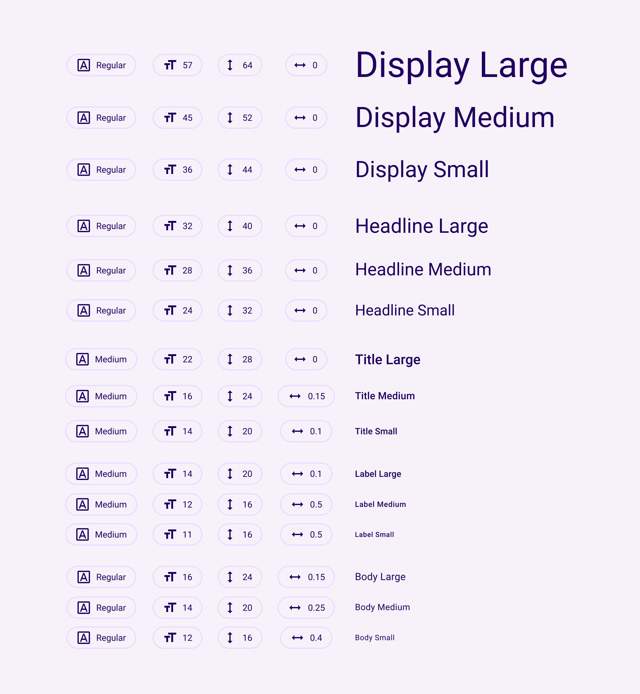 |
|---|
| 33 | /// |
|---|
| 34 | /// The Material Design typography scheme was significantly changed in the |
|---|
| 35 | /// current (2021) version of the specification |
|---|
| 36 | /// ([https://m3.material.io/styles/typography/tokens](https://m3.material.io/styles/typography/tokens)). |
|---|
| 37 | /// |
|---|
| 38 | /// The **2021** spec has fifteen text styles: |
|---|
| 39 | /// |
|---|
| 40 | /// | NAME | SIZE | HEIGHT | WEIGHT | SPACING | | |
|---|
| 41 | /// |----------------|------|---------|---------|----------|-------------| |
|---|
| 42 | /// | displayLarge | 57.0 | 64.0 | regular | -0.25 | | |
|---|
| 43 | /// | displayMedium | 45.0 | 52.0 | regular | 0.0 | | |
|---|
| 44 | /// | displaySmall | 36.0 | 44.0 | regular | 0.0 | | |
|---|
| 45 | /// | headlineLarge | 32.0 | 40.0 | regular | 0.0 | | |
|---|
| 46 | /// | headlineMedium | 28.0 | 36.0 | regular | 0.0 | | |
|---|
| 47 | /// | headlineSmall | 24.0 | 32.0 | regular | 0.0 | | |
|---|
| 48 | /// | titleLarge | 22.0 | 28.0 | regular | 0.0 | | |
|---|
| 49 | /// | titleMedium | 16.0 | 24.0 | medium | 0.15 | | |
|---|
| 50 | /// | titleSmall | 14.0 | 20.0 | medium | 0.1 | | |
|---|
| 51 | /// | bodyLarge | 16.0 | 24.0 | regular | 0.5 | | |
|---|
| 52 | /// | bodyMedium | 14.0 | 20.0 | regular | 0.25 | | |
|---|
| 53 | /// | bodySmall | 12.0 | 16.0 | regular | 0.4 | | |
|---|
| 54 | /// | labelLarge | 14.0 | 20.0 | medium | 0.1 | | |
|---|
| 55 | /// | labelMedium | 12.0 | 16.0 | medium | 0.5 | | |
|---|
| 56 | /// | labelSmall | 11.0 | 16.0 | medium | 0.5 | | |
|---|
| 57 | /// |
|---|
| 58 | /// ...where "regular" is `FontWeight.w400` and "medium" is `FontWeight.w500`. |
|---|
| 59 | /// |
|---|
| 60 | /// The names of the 2018 TextTheme properties match this table from the |
|---|
| 61 | /// [Material Design spec](https://material.io/design/typography/the-type-system.html#type-scale) |
|---|
| 62 | /// with a few exceptions: the styles called H1-H6 in the spec are |
|---|
| 63 | /// displayLarge-titleLarge in the API chart, body1,body2 are called |
|---|
| 64 | /// bodyLarge and bodyMedium, caption is now bodySmall, button is labelLarge, |
|---|
| 65 | /// and overline is now labelSmall. |
|---|
| 66 | /// |
|---|
| 67 | /// The **2018** spec has thirteen text styles: |
|---|
| 68 | /// |
|---|
| 69 | /// | NAME | SIZE | WEIGHT | SPACING | | |
|---|
| 70 | /// |----------------|------|---------|----------|-------------| |
|---|
| 71 | /// | displayLarge | 96.0 | light | -1.5 | | |
|---|
| 72 | /// | displayMedium | 60.0 | light | -0.5 | | |
|---|
| 73 | /// | displaySmall | 48.0 | regular | 0.0 | | |
|---|
| 74 | /// | headlineMedium | 34.0 | regular | 0.25 | | |
|---|
| 75 | /// | headlineSmall | 24.0 | regular | 0.0 | | |
|---|
| 76 | /// | titleLarge | 20.0 | medium | 0.15 | | |
|---|
| 77 | /// | titleMedium | 16.0 | regular | 0.15 | | |
|---|
| 78 | /// | titleSmall | 14.0 | medium | 0.1 | | |
|---|
| 79 | /// | bodyLarge | 16.0 | regular | 0.5 | | |
|---|
| 80 | /// | bodyMedium | 14.0 | regular | 0.25 | | |
|---|
| 81 | /// | bodySmall | 12.0 | regular | 0.4 | | |
|---|
| 82 | /// | labelLarge | 14.0 | medium | 1.25 | | |
|---|
| 83 | /// | labelSmall | 10.0 | regular | 1.5 | | |
|---|
| 84 | /// |
|---|
| 85 | /// ...where "light" is `FontWeight.w300`, "regular" is `FontWeight.w400` and |
|---|
| 86 | /// "medium" is `FontWeight.w500`. |
|---|
| 87 | /// |
|---|
| 88 | /// By default, text styles are initialized to match the 2018 Material Design |
|---|
| 89 | /// specification as listed above. To provide backwards compatibility, the 2014 |
|---|
| 90 | /// specification is also available. |
|---|
| 91 | /// |
|---|
| 92 | /// To explicitly configure a [Theme] for the 2018 sizes, weights, and letter |
|---|
| 93 | /// spacings, you can initialize its [ThemeData.typography] value using |
|---|
| 94 | /// [Typography.material2018]. The [Typography] constructor defaults to this |
|---|
| 95 | /// configuration. To configure a [Theme] for the 2014 sizes, weights, and letter |
|---|
| 96 | /// spacings, initialize its [ThemeData.typography] value using |
|---|
| 97 | /// [Typography.material2014]. |
|---|
| 98 | /// |
|---|
| 99 | /// See also: |
|---|
| 100 | /// |
|---|
| 101 | /// * [Typography], the class that generates [TextTheme]s appropriate for a platform. |
|---|
| 102 | /// * [Theme], for other aspects of a Material Design application that can be |
|---|
| 103 | /// globally adjusted, such as the color scheme. |
|---|
| 104 | /// * <https://material.io/design/typography/> |
|---|
| 105 | @immutable |
|---|
| 106 | class TextTheme with Diagnosticable { |
|---|
| 107 | /// Creates a text theme that uses the given values. |
|---|
| 108 | /// |
|---|
| 109 | /// Rather than creating a new text theme, consider using [Typography.black] |
|---|
| 110 | /// or [Typography.white], which implement the typography styles in the |
|---|
| 111 | /// Material Design specification: |
|---|
| 112 | /// |
|---|
| 113 | /// <https://material.io/design/typography/#type-scale> |
|---|
| 114 | /// |
|---|
| 115 | /// If you do decide to create your own text theme, consider using one of |
|---|
| 116 | /// those predefined themes as a starting point for [copyWith] or [apply]. |
|---|
| 117 | /// |
|---|
| 118 | /// The 2018 styles cannot be mixed with the 2021 styles. Only one or the |
|---|
| 119 | /// other is allowed in this constructor. The 2018 styles are deprecated and |
|---|
| 120 | /// will eventually be removed. |
|---|
| 121 | const TextTheme({ |
|---|
| 122 | this.displayLarge, |
|---|
| 123 | this.displayMedium, |
|---|
| 124 | this.displaySmall, |
|---|
| 125 | this.headlineLarge, |
|---|
| 126 | this.headlineMedium, |
|---|
| 127 | this.headlineSmall, |
|---|
| 128 | this.titleLarge, |
|---|
| 129 | this.titleMedium, |
|---|
| 130 | this.titleSmall, |
|---|
| 131 | this.bodyLarge, |
|---|
| 132 | this.bodyMedium, |
|---|
| 133 | this.bodySmall, |
|---|
| 134 | this.labelLarge, |
|---|
| 135 | this.labelMedium, |
|---|
| 136 | this.labelSmall, |
|---|
| 137 | }); |
|---|
| 138 | |
|---|
| 139 | /// Largest of the display styles. |
|---|
| 140 | /// |
|---|
| 141 | /// As the largest text on the screen, display styles are reserved for short, |
|---|
| 142 | /// important text or numerals. They work best on large screens. |
|---|
| 143 | final TextStyle? displayLarge; |
|---|
| 144 | |
|---|
| 145 | /// Middle size of the display styles. |
|---|
| 146 | /// |
|---|
| 147 | /// As the largest text on the screen, display styles are reserved for short, |
|---|
| 148 | /// important text or numerals. They work best on large screens. |
|---|
| 149 | final TextStyle? displayMedium; |
|---|
| 150 | |
|---|
| 151 | /// Smallest of the display styles. |
|---|
| 152 | /// |
|---|
| 153 | /// As the largest text on the screen, display styles are reserved for short, |
|---|
| 154 | /// important text or numerals. They work best on large screens. |
|---|
| 155 | final TextStyle? displaySmall; |
|---|
| 156 | |
|---|
| 157 | /// Largest of the headline styles. |
|---|
| 158 | /// |
|---|
| 159 | /// Headline styles are smaller than display styles. They're best-suited for |
|---|
| 160 | /// short, high-emphasis text on smaller screens. |
|---|
| 161 | final TextStyle? headlineLarge; |
|---|
| 162 | |
|---|
| 163 | /// Middle size of the headline styles. |
|---|
| 164 | /// |
|---|
| 165 | /// Headline styles are smaller than display styles. They're best-suited for |
|---|
| 166 | /// short, high-emphasis text on smaller screens. |
|---|
| 167 | final TextStyle? headlineMedium; |
|---|
| 168 | |
|---|
| 169 | /// Smallest of the headline styles. |
|---|
| 170 | /// |
|---|
| 171 | /// Headline styles are smaller than display styles. They're best-suited for |
|---|
| 172 | /// short, high-emphasis text on smaller screens. |
|---|
| 173 | final TextStyle? headlineSmall; |
|---|
| 174 | |
|---|
| 175 | /// Largest of the title styles. |
|---|
| 176 | /// |
|---|
| 177 | /// Titles are smaller than headline styles and should be used for shorter, |
|---|
| 178 | /// medium-emphasis text. |
|---|
| 179 | final TextStyle? titleLarge; |
|---|
| 180 | |
|---|
| 181 | /// Middle size of the title styles. |
|---|
| 182 | /// |
|---|
| 183 | /// Titles are smaller than headline styles and should be used for shorter, |
|---|
| 184 | /// medium-emphasis text. |
|---|
| 185 | final TextStyle? titleMedium; |
|---|
| 186 | |
|---|
| 187 | /// Smallest of the title styles. |
|---|
| 188 | /// |
|---|
| 189 | /// Titles are smaller than headline styles and should be used for shorter, |
|---|
| 190 | /// medium-emphasis text. |
|---|
| 191 | final TextStyle? titleSmall; |
|---|
| 192 | |
|---|
| 193 | /// Largest of the body styles. |
|---|
| 194 | /// |
|---|
| 195 | /// Body styles are used for longer passages of text. |
|---|
| 196 | final TextStyle? bodyLarge; |
|---|
| 197 | |
|---|
| 198 | /// Middle size of the body styles. |
|---|
| 199 | /// |
|---|
| 200 | /// Body styles are used for longer passages of text. |
|---|
| 201 | /// |
|---|
| 202 | /// The default text style for [Material]. |
|---|
| 203 | final TextStyle? bodyMedium; |
|---|
| 204 | |
|---|
| 205 | /// Smallest of the body styles. |
|---|
| 206 | /// |
|---|
| 207 | /// Body styles are used for longer passages of text. |
|---|
| 208 | final TextStyle? bodySmall; |
|---|
| 209 | |
|---|
| 210 | /// Largest of the label styles. |
|---|
| 211 | /// |
|---|
| 212 | /// Label styles are smaller, utilitarian styles, used for areas of the UI |
|---|
| 213 | /// such as text inside of components or very small supporting text in the |
|---|
| 214 | /// content body, like captions. |
|---|
| 215 | /// |
|---|
| 216 | /// Used for text on [ElevatedButton], [TextButton] and [OutlinedButton]. |
|---|
| 217 | final TextStyle? labelLarge; |
|---|
| 218 | |
|---|
| 219 | /// Middle size of the label styles. |
|---|
| 220 | /// |
|---|
| 221 | /// Label styles are smaller, utilitarian styles, used for areas of the UI |
|---|
| 222 | /// such as text inside of components or very small supporting text in the |
|---|
| 223 | /// content body, like captions. |
|---|
| 224 | final TextStyle? labelMedium; |
|---|
| 225 | |
|---|
| 226 | /// Smallest of the label styles. |
|---|
| 227 | /// |
|---|
| 228 | /// Label styles are smaller, utilitarian styles, used for areas of the UI |
|---|
| 229 | /// such as text inside of components or very small supporting text in the |
|---|
| 230 | /// content body, like captions. |
|---|
| 231 | final TextStyle? labelSmall; |
|---|
| 232 | |
|---|
| 233 | /// Creates a copy of this text theme but with the given fields replaced with |
|---|
| 234 | /// the new values. |
|---|
| 235 | /// |
|---|
| 236 | /// Consider using [Typography.black] or [Typography.white], which implement |
|---|
| 237 | /// the typography styles in the Material Design specification, as a starting |
|---|
| 238 | /// point. |
|---|
| 239 | /// |
|---|
| 240 | /// {@tool snippet} |
|---|
| 241 | /// |
|---|
| 242 | /// ```dart |
|---|
| 243 | /// /// A Widget that sets the ambient theme's title text color for its |
|---|
| 244 | /// /// descendants, while leaving other ambient theme attributes alone. |
|---|
| 245 | /// class TitleColorThemeCopy extends StatelessWidget { |
|---|
| 246 | /// const TitleColorThemeCopy({super.key, required this.titleColor, required this.child}); |
|---|
| 247 | /// |
|---|
| 248 | /// final Color titleColor; |
|---|
| 249 | /// final Widget child; |
|---|
| 250 | /// |
|---|
| 251 | /// @override |
|---|
| 252 | /// Widget build(BuildContext context) { |
|---|
| 253 | /// final ThemeData theme = Theme.of(context); |
|---|
| 254 | /// return Theme( |
|---|
| 255 | /// data: theme.copyWith( |
|---|
| 256 | /// textTheme: theme.textTheme.copyWith( |
|---|
| 257 | /// titleLarge: theme.textTheme.titleLarge!.copyWith( |
|---|
| 258 | /// color: titleColor, |
|---|
| 259 | /// ), |
|---|
| 260 | /// ), |
|---|
| 261 | /// ), |
|---|
| 262 | /// child: child, |
|---|
| 263 | /// ); |
|---|
| 264 | /// } |
|---|
| 265 | /// } |
|---|
| 266 | /// ``` |
|---|
| 267 | /// {@end-tool} |
|---|
| 268 | /// |
|---|
| 269 | /// See also: |
|---|
| 270 | /// |
|---|
| 271 | /// * [merge] is used instead of [copyWith] when you want to merge all |
|---|
| 272 | /// of the fields of a TextTheme instead of individual fields. |
|---|
| 273 | TextTheme copyWith({ |
|---|
| 274 | TextStyle? displayLarge, |
|---|
| 275 | TextStyle? displayMedium, |
|---|
| 276 | TextStyle? displaySmall, |
|---|
| 277 | TextStyle? headlineLarge, |
|---|
| 278 | TextStyle? headlineMedium, |
|---|
| 279 | TextStyle? headlineSmall, |
|---|
| 280 | TextStyle? titleLarge, |
|---|
| 281 | TextStyle? titleMedium, |
|---|
| 282 | TextStyle? titleSmall, |
|---|
| 283 | TextStyle? bodyLarge, |
|---|
| 284 | TextStyle? bodyMedium, |
|---|
| 285 | TextStyle? bodySmall, |
|---|
| 286 | TextStyle? labelLarge, |
|---|
| 287 | TextStyle? labelMedium, |
|---|
| 288 | TextStyle? labelSmall, |
|---|
| 289 | }) { |
|---|
| 290 | return TextTheme( |
|---|
| 291 | displayLarge: displayLarge ?? this.displayLarge, |
|---|
| 292 | displayMedium: displayMedium ?? this.displayMedium, |
|---|
| 293 | displaySmall: displaySmall ?? this.displaySmall, |
|---|
| 294 | headlineLarge: headlineLarge ?? this.headlineLarge, |
|---|
| 295 | headlineMedium: headlineMedium ?? this.headlineMedium, |
|---|
| 296 | headlineSmall: headlineSmall ?? this.headlineSmall, |
|---|
| 297 | titleLarge: titleLarge ?? this.titleLarge, |
|---|
| 298 | titleMedium: titleMedium ?? this.titleMedium, |
|---|
| 299 | titleSmall: titleSmall ?? this.titleSmall, |
|---|
| 300 | bodyLarge: bodyLarge ?? this.bodyLarge, |
|---|
| 301 | bodyMedium: bodyMedium ?? this.bodyMedium, |
|---|
| 302 | bodySmall: bodySmall ?? this.bodySmall, |
|---|
| 303 | labelLarge: labelLarge ?? this.labelLarge, |
|---|
| 304 | labelMedium: labelMedium ?? this.labelMedium, |
|---|
| 305 | labelSmall: labelSmall ?? this.labelSmall, |
|---|
| 306 | ); |
|---|
| 307 | } |
|---|
| 308 | |
|---|
| 309 | /// Creates a new [TextTheme] where each text style from this object has been |
|---|
| 310 | /// merged with the matching text style from the `other` object. |
|---|
| 311 | /// |
|---|
| 312 | /// The merging is done by calling [TextStyle.merge] on each respective pair |
|---|
| 313 | /// of text styles from this and the [other] text themes and is subject to |
|---|
| 314 | /// the value of [TextStyle.inherit] flag. For more details, see the |
|---|
| 315 | /// documentation on [TextStyle.merge] and [TextStyle.inherit]. |
|---|
| 316 | /// |
|---|
| 317 | /// If this theme, or the `other` theme has members that are null, then the |
|---|
| 318 | /// non-null one (if any) is used. If the `other` theme is itself null, then |
|---|
| 319 | /// this [TextTheme] is returned unchanged. If values in both are set, then |
|---|
| 320 | /// the values are merged using [TextStyle.merge]. |
|---|
| 321 | /// |
|---|
| 322 | /// This is particularly useful if one [TextTheme] defines one set of |
|---|
| 323 | /// properties and another defines a different set, e.g. having colors |
|---|
| 324 | /// defined in one text theme and font sizes in another, or when one |
|---|
| 325 | /// [TextTheme] has only some fields defined, and you want to define the rest |
|---|
| 326 | /// by merging it with a default theme. |
|---|
| 327 | /// |
|---|
| 328 | /// {@tool snippet} |
|---|
| 329 | /// |
|---|
| 330 | /// ```dart |
|---|
| 331 | /// /// A Widget that sets the ambient theme's title text color for its |
|---|
| 332 | /// /// descendants, while leaving other ambient theme attributes alone. |
|---|
| 333 | /// class TitleColorTheme extends StatelessWidget { |
|---|
| 334 | /// const TitleColorTheme({super.key, required this.child, required this.titleColor}); |
|---|
| 335 | /// |
|---|
| 336 | /// final Color titleColor; |
|---|
| 337 | /// final Widget child; |
|---|
| 338 | /// |
|---|
| 339 | /// @override |
|---|
| 340 | /// Widget build(BuildContext context) { |
|---|
| 341 | /// ThemeData theme = Theme.of(context); |
|---|
| 342 | /// // This partialTheme is incomplete: it only has the title style |
|---|
| 343 | /// // defined. Just replacing theme.textTheme with partialTheme would |
|---|
| 344 | /// // set the title, but everything else would be null. This isn't very |
|---|
| 345 | /// // useful, so merge it with the existing theme to keep all of the |
|---|
| 346 | /// // preexisting definitions for the other styles. |
|---|
| 347 | /// final TextTheme partialTheme = TextTheme(titleLarge: TextStyle(color: titleColor)); |
|---|
| 348 | /// theme = theme.copyWith(textTheme: theme.textTheme.merge(partialTheme)); |
|---|
| 349 | /// return Theme(data: theme, child: child); |
|---|
| 350 | /// } |
|---|
| 351 | /// } |
|---|
| 352 | /// ``` |
|---|
| 353 | /// {@end-tool} |
|---|
| 354 | /// |
|---|
| 355 | /// See also: |
|---|
| 356 | /// |
|---|
| 357 | /// * [copyWith] is used instead of [merge] when you wish to override |
|---|
| 358 | /// individual fields in the [TextTheme] instead of merging all of the |
|---|
| 359 | /// fields of two [TextTheme]s. |
|---|
| 360 | TextTheme merge(TextTheme? other) { |
|---|
| 361 | if (other == null) { |
|---|
| 362 | return this; |
|---|
| 363 | } |
|---|
| 364 | return copyWith( |
|---|
| 365 | displayLarge: displayLarge?.merge(other.displayLarge) ?? other.displayLarge, |
|---|
| 366 | displayMedium: displayMedium?.merge(other.displayMedium) ?? other.displayMedium, |
|---|
| 367 | displaySmall: displaySmall?.merge(other.displaySmall) ?? other.displaySmall, |
|---|
| 368 | headlineLarge: headlineLarge?.merge(other.headlineLarge) ?? other.headlineLarge, |
|---|
| 369 | headlineMedium: headlineMedium?.merge(other.headlineMedium) ?? other.headlineMedium, |
|---|
| 370 | headlineSmall: headlineSmall?.merge(other.headlineSmall) ?? other.headlineSmall, |
|---|
| 371 | titleLarge: titleLarge?.merge(other.titleLarge) ?? other.titleLarge, |
|---|
| 372 | titleMedium: titleMedium?.merge(other.titleMedium) ?? other.titleMedium, |
|---|
| 373 | titleSmall: titleSmall?.merge(other.titleSmall) ?? other.titleSmall, |
|---|
| 374 | bodyLarge: bodyLarge?.merge(other.bodyLarge) ?? other.bodyLarge, |
|---|
| 375 | bodyMedium: bodyMedium?.merge(other.bodyMedium) ?? other.bodyMedium, |
|---|
| 376 | bodySmall: bodySmall?.merge(other.bodySmall) ?? other.bodySmall, |
|---|
| 377 | labelLarge: labelLarge?.merge(other.labelLarge) ?? other.labelLarge, |
|---|
| 378 | labelMedium: labelMedium?.merge(other.labelMedium) ?? other.labelMedium, |
|---|
| 379 | labelSmall: labelSmall?.merge(other.labelSmall) ?? other.labelSmall, |
|---|
| 380 | ); |
|---|
| 381 | } |
|---|
| 382 | |
|---|
| 383 | /// Creates a copy of this text theme but with the given field replaced in |
|---|
| 384 | /// each of the individual text styles. |
|---|
| 385 | /// |
|---|
| 386 | /// The `displayColor` is applied to [displayLarge], [displayMedium], |
|---|
| 387 | /// [displaySmall], [headlineLarge], [headlineMedium], and [bodySmall]. The |
|---|
| 388 | /// `bodyColor` is applied to the remaining text styles. |
|---|
| 389 | /// |
|---|
| 390 | /// Consider using [Typography.black] or [Typography.white], which implement |
|---|
| 391 | /// the typography styles in the Material Design specification, as a starting |
|---|
| 392 | /// point. |
|---|
| 393 | TextTheme apply({ |
|---|
| 394 | String? fontFamily, |
|---|
| 395 | List<String>? fontFamilyFallback, |
|---|
| 396 | String? package, |
|---|
| 397 | double fontSizeFactor = 1.0, |
|---|
| 398 | double fontSizeDelta = 0.0, |
|---|
| 399 | double letterSpacingFactor = 1.0, |
|---|
| 400 | double letterSpacingDelta = 0.0, |
|---|
| 401 | double wordSpacingFactor = 1.0, |
|---|
| 402 | double wordSpacingDelta = 0.0, |
|---|
| 403 | double heightFactor = 1.0, |
|---|
| 404 | double heightDelta = 0.0, |
|---|
| 405 | Color? displayColor, |
|---|
| 406 | Color? bodyColor, |
|---|
| 407 | TextDecoration? decoration, |
|---|
| 408 | Color? decorationColor, |
|---|
| 409 | TextDecorationStyle? decorationStyle, |
|---|
| 410 | }) { |
|---|
| 411 | return TextTheme( |
|---|
| 412 | displayLarge: displayLarge?.apply( |
|---|
| 413 | color: displayColor, |
|---|
| 414 | decoration: decoration, |
|---|
| 415 | decorationColor: decorationColor, |
|---|
| 416 | decorationStyle: decorationStyle, |
|---|
| 417 | fontFamily: fontFamily, |
|---|
| 418 | fontFamilyFallback: fontFamilyFallback, |
|---|
| 419 | fontSizeFactor: fontSizeFactor, |
|---|
| 420 | fontSizeDelta: fontSizeDelta, |
|---|
| 421 | letterSpacingDelta: letterSpacingDelta, |
|---|
| 422 | letterSpacingFactor: letterSpacingFactor, |
|---|
| 423 | wordSpacingDelta: wordSpacingDelta, |
|---|
| 424 | wordSpacingFactor: wordSpacingFactor, |
|---|
| 425 | heightFactor: heightFactor, |
|---|
| 426 | heightDelta: heightDelta, |
|---|
| 427 | package: package, |
|---|
| 428 | ), |
|---|
| 429 | displayMedium: displayMedium?.apply( |
|---|
| 430 | color: displayColor, |
|---|
| 431 | decoration: decoration, |
|---|
| 432 | decorationColor: decorationColor, |
|---|
| 433 | decorationStyle: decorationStyle, |
|---|
| 434 | fontFamily: fontFamily, |
|---|
| 435 | fontFamilyFallback: fontFamilyFallback, |
|---|
| 436 | fontSizeFactor: fontSizeFactor, |
|---|
| 437 | fontSizeDelta: fontSizeDelta, |
|---|
| 438 | letterSpacingDelta: letterSpacingDelta, |
|---|
| 439 | letterSpacingFactor: letterSpacingFactor, |
|---|
| 440 | wordSpacingDelta: wordSpacingDelta, |
|---|
| 441 | wordSpacingFactor: wordSpacingFactor, |
|---|
| 442 | heightFactor: heightFactor, |
|---|
| 443 | heightDelta: heightDelta, |
|---|
| 444 | package: package, |
|---|
| 445 | ), |
|---|
| 446 | displaySmall: displaySmall?.apply( |
|---|
| 447 | color: displayColor, |
|---|
| 448 | decoration: decoration, |
|---|
| 449 | decorationColor: decorationColor, |
|---|
| 450 | decorationStyle: decorationStyle, |
|---|
| 451 | fontFamily: fontFamily, |
|---|
| 452 | fontFamilyFallback: fontFamilyFallback, |
|---|
| 453 | fontSizeFactor: fontSizeFactor, |
|---|
| 454 | fontSizeDelta: fontSizeDelta, |
|---|
| 455 | letterSpacingDelta: letterSpacingDelta, |
|---|
| 456 | letterSpacingFactor: letterSpacingFactor, |
|---|
| 457 | wordSpacingDelta: wordSpacingDelta, |
|---|
| 458 | wordSpacingFactor: wordSpacingFactor, |
|---|
| 459 | heightFactor: heightFactor, |
|---|
| 460 | heightDelta: heightDelta, |
|---|
| 461 | package: package, |
|---|
| 462 | ), |
|---|
| 463 | headlineLarge: headlineLarge?.apply( |
|---|
| 464 | color: displayColor, |
|---|
| 465 | decoration: decoration, |
|---|
| 466 | decorationColor: decorationColor, |
|---|
| 467 | decorationStyle: decorationStyle, |
|---|
| 468 | fontFamily: fontFamily, |
|---|
| 469 | fontFamilyFallback: fontFamilyFallback, |
|---|
| 470 | fontSizeFactor: fontSizeFactor, |
|---|
| 471 | fontSizeDelta: fontSizeDelta, |
|---|
| 472 | letterSpacingDelta: letterSpacingDelta, |
|---|
| 473 | letterSpacingFactor: letterSpacingFactor, |
|---|
| 474 | wordSpacingDelta: wordSpacingDelta, |
|---|
| 475 | wordSpacingFactor: wordSpacingFactor, |
|---|
| 476 | heightFactor: heightFactor, |
|---|
| 477 | heightDelta: heightDelta, |
|---|
| 478 | package: package, |
|---|
| 479 | ), |
|---|
| 480 | headlineMedium: headlineMedium?.apply( |
|---|
| 481 | color: displayColor, |
|---|
| 482 | decoration: decoration, |
|---|
| 483 | decorationColor: decorationColor, |
|---|
| 484 | decorationStyle: decorationStyle, |
|---|
| 485 | fontFamily: fontFamily, |
|---|
| 486 | fontFamilyFallback: fontFamilyFallback, |
|---|
| 487 | fontSizeFactor: fontSizeFactor, |
|---|
| 488 | fontSizeDelta: fontSizeDelta, |
|---|
| 489 | letterSpacingDelta: letterSpacingDelta, |
|---|
| 490 | letterSpacingFactor: letterSpacingFactor, |
|---|
| 491 | wordSpacingDelta: wordSpacingDelta, |
|---|
| 492 | wordSpacingFactor: wordSpacingFactor, |
|---|
| 493 | heightFactor: heightFactor, |
|---|
| 494 | heightDelta: heightDelta, |
|---|
| 495 | package: package, |
|---|
| 496 | ), |
|---|
| 497 | headlineSmall: headlineSmall?.apply( |
|---|
| 498 | color: bodyColor, |
|---|
| 499 | decoration: decoration, |
|---|
| 500 | decorationColor: decorationColor, |
|---|
| 501 | decorationStyle: decorationStyle, |
|---|
| 502 | fontFamily: fontFamily, |
|---|
| 503 | fontFamilyFallback: fontFamilyFallback, |
|---|
| 504 | fontSizeFactor: fontSizeFactor, |
|---|
| 505 | fontSizeDelta: fontSizeDelta, |
|---|
| 506 | letterSpacingDelta: letterSpacingDelta, |
|---|
| 507 | letterSpacingFactor: letterSpacingFactor, |
|---|
| 508 | wordSpacingDelta: wordSpacingDelta, |
|---|
| 509 | wordSpacingFactor: wordSpacingFactor, |
|---|
| 510 | heightFactor: heightFactor, |
|---|
| 511 | heightDelta: heightDelta, |
|---|
| 512 | package: package, |
|---|
| 513 | ), |
|---|
| 514 | titleLarge: titleLarge?.apply( |
|---|
| 515 | color: bodyColor, |
|---|
| 516 | decoration: decoration, |
|---|
| 517 | decorationColor: decorationColor, |
|---|
| 518 | decorationStyle: decorationStyle, |
|---|
| 519 | fontFamily: fontFamily, |
|---|
| 520 | fontFamilyFallback: fontFamilyFallback, |
|---|
| 521 | fontSizeFactor: fontSizeFactor, |
|---|
| 522 | fontSizeDelta: fontSizeDelta, |
|---|
| 523 | letterSpacingDelta: letterSpacingDelta, |
|---|
| 524 | letterSpacingFactor: letterSpacingFactor, |
|---|
| 525 | wordSpacingDelta: wordSpacingDelta, |
|---|
| 526 | wordSpacingFactor: wordSpacingFactor, |
|---|
| 527 | heightFactor: heightFactor, |
|---|
| 528 | heightDelta: heightDelta, |
|---|
| 529 | package: package, |
|---|
| 530 | ), |
|---|
| 531 | titleMedium: titleMedium?.apply( |
|---|
| 532 | color: bodyColor, |
|---|
| 533 | decoration: decoration, |
|---|
| 534 | decorationColor: decorationColor, |
|---|
| 535 | decorationStyle: decorationStyle, |
|---|
| 536 | fontFamily: fontFamily, |
|---|
| 537 | fontFamilyFallback: fontFamilyFallback, |
|---|
| 538 | fontSizeFactor: fontSizeFactor, |
|---|
| 539 | fontSizeDelta: fontSizeDelta, |
|---|
| 540 | letterSpacingDelta: letterSpacingDelta, |
|---|
| 541 | letterSpacingFactor: letterSpacingFactor, |
|---|
| 542 | wordSpacingDelta: wordSpacingDelta, |
|---|
| 543 | wordSpacingFactor: wordSpacingFactor, |
|---|
| 544 | heightFactor: heightFactor, |
|---|
| 545 | heightDelta: heightDelta, |
|---|
| 546 | package: package, |
|---|
| 547 | ), |
|---|
| 548 | titleSmall: titleSmall?.apply( |
|---|
| 549 | color: bodyColor, |
|---|
| 550 | decoration: decoration, |
|---|
| 551 | decorationColor: decorationColor, |
|---|
| 552 | decorationStyle: decorationStyle, |
|---|
| 553 | fontFamily: fontFamily, |
|---|
| 554 | fontFamilyFallback: fontFamilyFallback, |
|---|
| 555 | fontSizeFactor: fontSizeFactor, |
|---|
| 556 | fontSizeDelta: fontSizeDelta, |
|---|
| 557 | letterSpacingDelta: letterSpacingDelta, |
|---|
| 558 | letterSpacingFactor: letterSpacingFactor, |
|---|
| 559 | wordSpacingDelta: wordSpacingDelta, |
|---|
| 560 | wordSpacingFactor: wordSpacingFactor, |
|---|
| 561 | heightFactor: heightFactor, |
|---|
| 562 | heightDelta: heightDelta, |
|---|
| 563 | package: package, |
|---|
| 564 | ), |
|---|
| 565 | bodyLarge: bodyLarge?.apply( |
|---|
| 566 | color: bodyColor, |
|---|
| 567 | decoration: decoration, |
|---|
| 568 | decorationColor: decorationColor, |
|---|
| 569 | decorationStyle: decorationStyle, |
|---|
| 570 | fontFamily: fontFamily, |
|---|
| 571 | fontFamilyFallback: fontFamilyFallback, |
|---|
| 572 | fontSizeFactor: fontSizeFactor, |
|---|
| 573 | fontSizeDelta: fontSizeDelta, |
|---|
| 574 | letterSpacingDelta: letterSpacingDelta, |
|---|
| 575 | letterSpacingFactor: letterSpacingFactor, |
|---|
| 576 | wordSpacingDelta: wordSpacingDelta, |
|---|
| 577 | wordSpacingFactor: wordSpacingFactor, |
|---|
| 578 | heightFactor: heightFactor, |
|---|
| 579 | heightDelta: heightDelta, |
|---|
| 580 | package: package, |
|---|
| 581 | ), |
|---|
| 582 | bodyMedium: bodyMedium?.apply( |
|---|
| 583 | color: bodyColor, |
|---|
| 584 | decoration: decoration, |
|---|
| 585 | decorationColor: decorationColor, |
|---|
| 586 | decorationStyle: decorationStyle, |
|---|
| 587 | fontFamily: fontFamily, |
|---|
| 588 | fontFamilyFallback: fontFamilyFallback, |
|---|
| 589 | fontSizeFactor: fontSizeFactor, |
|---|
| 590 | fontSizeDelta: fontSizeDelta, |
|---|
| 591 | letterSpacingDelta: letterSpacingDelta, |
|---|
| 592 | letterSpacingFactor: letterSpacingFactor, |
|---|
| 593 | wordSpacingDelta: wordSpacingDelta, |
|---|
| 594 | wordSpacingFactor: wordSpacingFactor, |
|---|
| 595 | heightFactor: heightFactor, |
|---|
| 596 | heightDelta: heightDelta, |
|---|
| 597 | package: package, |
|---|
| 598 | ), |
|---|
| 599 | bodySmall: bodySmall?.apply( |
|---|
| 600 | color: displayColor, |
|---|
| 601 | decoration: decoration, |
|---|
| 602 | decorationColor: decorationColor, |
|---|
| 603 | decorationStyle: decorationStyle, |
|---|
| 604 | fontFamily: fontFamily, |
|---|
| 605 | fontFamilyFallback: fontFamilyFallback, |
|---|
| 606 | fontSizeFactor: fontSizeFactor, |
|---|
| 607 | fontSizeDelta: fontSizeDelta, |
|---|
| 608 | letterSpacingDelta: letterSpacingDelta, |
|---|
| 609 | letterSpacingFactor: letterSpacingFactor, |
|---|
| 610 | wordSpacingDelta: wordSpacingDelta, |
|---|
| 611 | wordSpacingFactor: wordSpacingFactor, |
|---|
| 612 | heightFactor: heightFactor, |
|---|
| 613 | heightDelta: heightDelta, |
|---|
| 614 | package: package, |
|---|
| 615 | ), |
|---|
| 616 | labelLarge: labelLarge?.apply( |
|---|
| 617 | color: bodyColor, |
|---|
| 618 | decoration: decoration, |
|---|
| 619 | decorationColor: decorationColor, |
|---|
| 620 | decorationStyle: decorationStyle, |
|---|
| 621 | fontFamily: fontFamily, |
|---|
| 622 | fontFamilyFallback: fontFamilyFallback, |
|---|
| 623 | fontSizeFactor: fontSizeFactor, |
|---|
| 624 | fontSizeDelta: fontSizeDelta, |
|---|
| 625 | letterSpacingDelta: letterSpacingDelta, |
|---|
| 626 | letterSpacingFactor: letterSpacingFactor, |
|---|
| 627 | wordSpacingDelta: wordSpacingDelta, |
|---|
| 628 | wordSpacingFactor: wordSpacingFactor, |
|---|
| 629 | heightFactor: heightFactor, |
|---|
| 630 | heightDelta: heightDelta, |
|---|
| 631 | package: package, |
|---|
| 632 | ), |
|---|
| 633 | labelMedium: labelMedium?.apply( |
|---|
| 634 | color: bodyColor, |
|---|
| 635 | decoration: decoration, |
|---|
| 636 | decorationColor: decorationColor, |
|---|
| 637 | decorationStyle: decorationStyle, |
|---|
| 638 | fontFamily: fontFamily, |
|---|
| 639 | fontFamilyFallback: fontFamilyFallback, |
|---|
| 640 | fontSizeFactor: fontSizeFactor, |
|---|
| 641 | fontSizeDelta: fontSizeDelta, |
|---|
| 642 | letterSpacingDelta: letterSpacingDelta, |
|---|
| 643 | letterSpacingFactor: letterSpacingFactor, |
|---|
| 644 | wordSpacingDelta: wordSpacingDelta, |
|---|
| 645 | wordSpacingFactor: wordSpacingFactor, |
|---|
| 646 | heightFactor: heightFactor, |
|---|
| 647 | heightDelta: heightDelta, |
|---|
| 648 | package: package, |
|---|
| 649 | ), |
|---|
| 650 | labelSmall: labelSmall?.apply( |
|---|
| 651 | color: bodyColor, |
|---|
| 652 | decoration: decoration, |
|---|
| 653 | decorationColor: decorationColor, |
|---|
| 654 | decorationStyle: decorationStyle, |
|---|
| 655 | fontFamily: fontFamily, |
|---|
| 656 | fontFamilyFallback: fontFamilyFallback, |
|---|
| 657 | fontSizeFactor: fontSizeFactor, |
|---|
| 658 | fontSizeDelta: fontSizeDelta, |
|---|
| 659 | letterSpacingDelta: letterSpacingDelta, |
|---|
| 660 | letterSpacingFactor: letterSpacingFactor, |
|---|
| 661 | wordSpacingDelta: wordSpacingDelta, |
|---|
| 662 | wordSpacingFactor: wordSpacingFactor, |
|---|
| 663 | heightFactor: heightFactor, |
|---|
| 664 | heightDelta: heightDelta, |
|---|
| 665 | package: package, |
|---|
| 666 | ), |
|---|
| 667 | ); |
|---|
| 668 | } |
|---|
| 669 | |
|---|
| 670 | /// Linearly interpolate between two text themes. |
|---|
| 671 | /// |
|---|
| 672 | /// {@macro dart.ui.shadow.lerp} |
|---|
| 673 | static TextTheme lerp(TextTheme? a, TextTheme? b, double t) { |
|---|
| 674 | if (identical(a, b) && a != null) { |
|---|
| 675 | return a; |
|---|
| 676 | } |
|---|
| 677 | return TextTheme( |
|---|
| 678 | displayLarge: TextStyle.lerp(a?.displayLarge, b?.displayLarge, t), |
|---|
| 679 | displayMedium: TextStyle.lerp(a?.displayMedium, b?.displayMedium, t), |
|---|
| 680 | displaySmall: TextStyle.lerp(a?.displaySmall, b?.displaySmall, t), |
|---|
| 681 | headlineLarge: TextStyle.lerp(a?.headlineLarge, b?.headlineLarge, t), |
|---|
| 682 | headlineMedium: TextStyle.lerp(a?.headlineMedium, b?.headlineMedium, t), |
|---|
| 683 | headlineSmall: TextStyle.lerp(a?.headlineSmall, b?.headlineSmall, t), |
|---|
| 684 | titleLarge: TextStyle.lerp(a?.titleLarge, b?.titleLarge, t), |
|---|
| 685 | titleMedium: TextStyle.lerp(a?.titleMedium, b?.titleMedium, t), |
|---|
| 686 | titleSmall: TextStyle.lerp(a?.titleSmall, b?.titleSmall, t), |
|---|
| 687 | bodyLarge: TextStyle.lerp(a?.bodyLarge, b?.bodyLarge, t), |
|---|
| 688 | bodyMedium: TextStyle.lerp(a?.bodyMedium, b?.bodyMedium, t), |
|---|
| 689 | bodySmall: TextStyle.lerp(a?.bodySmall, b?.bodySmall, t), |
|---|
| 690 | labelLarge: TextStyle.lerp(a?.labelLarge, b?.labelLarge, t), |
|---|
| 691 | labelMedium: TextStyle.lerp(a?.labelMedium, b?.labelMedium, t), |
|---|
| 692 | labelSmall: TextStyle.lerp(a?.labelSmall, b?.labelSmall, t), |
|---|
| 693 | ); |
|---|
| 694 | } |
|---|
| 695 | |
|---|
| 696 | /// The [ThemeData.textTheme] property of the ambient [Theme]. |
|---|
| 697 | /// |
|---|
| 698 | /// Equivalent to `Theme.of(context).textTheme`. |
|---|
| 699 | /// |
|---|
| 700 | /// See also: |
|---|
| 701 | /// * [TextTheme.primaryOf], which returns the [ThemeData.primaryTextTheme] property of |
|---|
| 702 | /// the ambient [Theme] instead. |
|---|
| 703 | static TextTheme of(BuildContext context) => Theme.of(context).textTheme; |
|---|
| 704 | |
|---|
| 705 | /// The [ThemeData.primaryTextTheme] property of the ambient [Theme]. |
|---|
| 706 | /// |
|---|
| 707 | /// |
|---|
| 708 | /// Equivalent to `Theme.of(context).primaryTextTheme`. |
|---|
| 709 | /// |
|---|
| 710 | /// See also: |
|---|
| 711 | /// * [TextTheme.of], which returns the [ThemeData.textTheme] property of the ambient |
|---|
| 712 | /// [Theme] instead. |
|---|
| 713 | static TextTheme primaryOf(BuildContext context) => Theme.of(context).primaryTextTheme; |
|---|
| 714 | |
|---|
| 715 | @override |
|---|
| 716 | bool operator ==(Object other) { |
|---|
| 717 | if (identical(this, other)) { |
|---|
| 718 | return true; |
|---|
| 719 | } |
|---|
| 720 | if (other.runtimeType != runtimeType) { |
|---|
| 721 | return false; |
|---|
| 722 | } |
|---|
| 723 | return other is TextTheme && |
|---|
| 724 | displayLarge == other.displayLarge && |
|---|
| 725 | displayMedium == other.displayMedium && |
|---|
| 726 | displaySmall == other.displaySmall && |
|---|
| 727 | headlineLarge == other.headlineLarge && |
|---|
| 728 | headlineMedium == other.headlineMedium && |
|---|
| 729 | headlineSmall == other.headlineSmall && |
|---|
| 730 | titleLarge == other.titleLarge && |
|---|
| 731 | titleMedium == other.titleMedium && |
|---|
| 732 | titleSmall == other.titleSmall && |
|---|
| 733 | bodyLarge == other.bodyLarge && |
|---|
| 734 | bodyMedium == other.bodyMedium && |
|---|
| 735 | bodySmall == other.bodySmall && |
|---|
| 736 | labelLarge == other.labelLarge && |
|---|
| 737 | labelMedium == other.labelMedium && |
|---|
| 738 | labelSmall == other.labelSmall; |
|---|
| 739 | } |
|---|
| 740 | |
|---|
| 741 | @override |
|---|
| 742 | int get hashCode => Object.hash( |
|---|
| 743 | displayLarge, |
|---|
| 744 | displayMedium, |
|---|
| 745 | displaySmall, |
|---|
| 746 | headlineLarge, |
|---|
| 747 | headlineMedium, |
|---|
| 748 | headlineSmall, |
|---|
| 749 | titleLarge, |
|---|
| 750 | titleMedium, |
|---|
| 751 | titleSmall, |
|---|
| 752 | bodyLarge, |
|---|
| 753 | bodyMedium, |
|---|
| 754 | bodySmall, |
|---|
| 755 | labelLarge, |
|---|
| 756 | labelMedium, |
|---|
| 757 | labelSmall, |
|---|
| 758 | ); |
|---|
| 759 | |
|---|
| 760 | @override |
|---|
| 761 | void debugFillProperties(DiagnosticPropertiesBuilder properties) { |
|---|
| 762 | super.debugFillProperties(properties); |
|---|
| 763 | final TextTheme defaultTheme = Typography.material2018(platform: defaultTargetPlatform).black; |
|---|
| 764 | properties.add( |
|---|
| 765 | DiagnosticsProperty<TextStyle>( |
|---|
| 766 | 'displayLarge' , |
|---|
| 767 | displayLarge, |
|---|
| 768 | defaultValue: defaultTheme.displayLarge, |
|---|
| 769 | ), |
|---|
| 770 | ); |
|---|
| 771 | properties.add( |
|---|
| 772 | DiagnosticsProperty<TextStyle>( |
|---|
| 773 | 'displayMedium' , |
|---|
| 774 | displayMedium, |
|---|
| 775 | defaultValue: defaultTheme.displayMedium, |
|---|
| 776 | ), |
|---|
| 777 | ); |
|---|
| 778 | properties.add( |
|---|
| 779 | DiagnosticsProperty<TextStyle>( |
|---|
| 780 | 'displaySmall' , |
|---|
| 781 | displaySmall, |
|---|
| 782 | defaultValue: defaultTheme.displaySmall, |
|---|
| 783 | ), |
|---|
| 784 | ); |
|---|
| 785 | properties.add( |
|---|
| 786 | DiagnosticsProperty<TextStyle>( |
|---|
| 787 | 'headlineLarge' , |
|---|
| 788 | headlineLarge, |
|---|
| 789 | defaultValue: defaultTheme.headlineLarge, |
|---|
| 790 | ), |
|---|
| 791 | ); |
|---|
| 792 | properties.add( |
|---|
| 793 | DiagnosticsProperty<TextStyle>( |
|---|
| 794 | 'headlineMedium' , |
|---|
| 795 | headlineMedium, |
|---|
| 796 | defaultValue: defaultTheme.headlineMedium, |
|---|
| 797 | ), |
|---|
| 798 | ); |
|---|
| 799 | properties.add( |
|---|
| 800 | DiagnosticsProperty<TextStyle>( |
|---|
| 801 | 'headlineSmall' , |
|---|
| 802 | headlineSmall, |
|---|
| 803 | defaultValue: defaultTheme.headlineSmall, |
|---|
| 804 | ), |
|---|
| 805 | ); |
|---|
| 806 | properties.add( |
|---|
| 807 | DiagnosticsProperty<TextStyle>( |
|---|
| 808 | 'titleLarge' , |
|---|
| 809 | titleLarge, |
|---|
| 810 | defaultValue: defaultTheme.titleLarge, |
|---|
| 811 | ), |
|---|
| 812 | ); |
|---|
| 813 | properties.add( |
|---|
| 814 | DiagnosticsProperty<TextStyle>( |
|---|
| 815 | 'titleMedium' , |
|---|
| 816 | titleMedium, |
|---|
| 817 | defaultValue: defaultTheme.titleMedium, |
|---|
| 818 | ), |
|---|
| 819 | ); |
|---|
| 820 | properties.add( |
|---|
| 821 | DiagnosticsProperty<TextStyle>( |
|---|
| 822 | 'titleSmall' , |
|---|
| 823 | titleSmall, |
|---|
| 824 | defaultValue: defaultTheme.titleSmall, |
|---|
| 825 | ), |
|---|
| 826 | ); |
|---|
| 827 | properties.add( |
|---|
| 828 | DiagnosticsProperty<TextStyle>('bodyLarge' , bodyLarge, defaultValue: defaultTheme.bodyLarge), |
|---|
| 829 | ); |
|---|
| 830 | properties.add( |
|---|
| 831 | DiagnosticsProperty<TextStyle>( |
|---|
| 832 | 'bodyMedium' , |
|---|
| 833 | bodyMedium, |
|---|
| 834 | defaultValue: defaultTheme.bodyMedium, |
|---|
| 835 | ), |
|---|
| 836 | ); |
|---|
| 837 | properties.add( |
|---|
| 838 | DiagnosticsProperty<TextStyle>('bodySmall' , bodySmall, defaultValue: defaultTheme.bodySmall), |
|---|
| 839 | ); |
|---|
| 840 | properties.add( |
|---|
| 841 | DiagnosticsProperty<TextStyle>( |
|---|
| 842 | 'labelLarge' , |
|---|
| 843 | labelLarge, |
|---|
| 844 | defaultValue: defaultTheme.labelLarge, |
|---|
| 845 | ), |
|---|
| 846 | ); |
|---|
| 847 | properties.add( |
|---|
| 848 | DiagnosticsProperty<TextStyle>( |
|---|
| 849 | 'labelMedium' , |
|---|
| 850 | labelMedium, |
|---|
| 851 | defaultValue: defaultTheme.labelMedium, |
|---|
| 852 | ), |
|---|
| 853 | ); |
|---|
| 854 | properties.add( |
|---|
| 855 | DiagnosticsProperty<TextStyle>( |
|---|
| 856 | 'labelSmall' , |
|---|
| 857 | labelSmall, |
|---|
| 858 | defaultValue: defaultTheme.labelSmall, |
|---|
| 859 | ), |
|---|
| 860 | ); |
|---|
| 861 | } |
|---|
| 862 | } |
|---|
| 863 | |
|---|
