| 1 | // Copyright 2014 The Flutter Authors. All rights reserved. |
| 2 | // Use of this source code is governed by a BSD-style license that can be |
|---|
| 3 | // found in the LICENSE file. |
|---|
| 4 | |
|---|
| 5 | /// @docImport 'package:flutter/material.dart'; |
|---|
| 6 | /// |
|---|
| 7 | /// @docImport 'app.dart'; |
|---|
| 8 | /// @docImport 'image_icon.dart'; |
|---|
| 9 | library; |
|---|
| 10 | |
|---|
| 11 | import 'package:flutter/foundation.dart'; |
|---|
| 12 | import 'package:flutter/rendering.dart'; |
|---|
| 13 | |
|---|
| 14 | import 'basic.dart'; |
|---|
| 15 | import 'debug.dart'; |
|---|
| 16 | import 'framework.dart'; |
|---|
| 17 | import 'icon_data.dart'; |
|---|
| 18 | import 'icon_theme.dart'; |
|---|
| 19 | import 'icon_theme_data.dart'; |
|---|
| 20 | import 'media_query.dart'; |
|---|
| 21 | |
|---|
| 22 | /// A graphical icon widget drawn with a glyph from a font described in |
|---|
| 23 | /// an [IconData] such as material's predefined [IconData]s in [Icons]. |
|---|
| 24 | /// |
|---|
| 25 | /// Icons are not interactive. For an interactive icon, consider material's |
|---|
| 26 | /// [IconButton]. |
|---|
| 27 | /// |
|---|
| 28 | /// There must be an ambient [Directionality] widget when using [Icon]. |
|---|
| 29 | /// Typically this is introduced automatically by the [WidgetsApp] or |
|---|
| 30 | /// [MaterialApp]. |
|---|
| 31 | /// |
|---|
| 32 | /// This widget assumes that the rendered icon is squared. Non-squared icons may |
|---|
| 33 | /// render incorrectly. |
|---|
| 34 | /// |
|---|
| 35 | /// {@tool snippet} |
|---|
| 36 | /// |
|---|
| 37 | /// This example shows how to create a [Row] of [Icon]s in different colors and |
|---|
| 38 | /// sizes. The first [Icon] uses a [semanticLabel] to announce in accessibility |
|---|
| 39 | /// modes like TalkBack and VoiceOver. |
|---|
| 40 | /// |
|---|
| 41 | /// 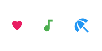 |
|---|
| 42 | /// |
|---|
| 43 | /// ```dart |
|---|
| 44 | /// const Row( |
|---|
| 45 | /// mainAxisAlignment: MainAxisAlignment.spaceAround, |
|---|
| 46 | /// children: <Widget>[ |
|---|
| 47 | /// Icon( |
|---|
| 48 | /// Icons.favorite, |
|---|
| 49 | /// color: Colors.pink, |
|---|
| 50 | /// size: 24.0, |
|---|
| 51 | /// semanticLabel: 'Text to announce in accessibility modes', |
|---|
| 52 | /// ), |
|---|
| 53 | /// Icon( |
|---|
| 54 | /// Icons.audiotrack, |
|---|
| 55 | /// color: Colors.green, |
|---|
| 56 | /// size: 30.0, |
|---|
| 57 | /// ), |
|---|
| 58 | /// Icon( |
|---|
| 59 | /// Icons.beach_access, |
|---|
| 60 | /// color: Colors.blue, |
|---|
| 61 | /// size: 36.0, |
|---|
| 62 | /// ), |
|---|
| 63 | /// ], |
|---|
| 64 | /// ) |
|---|
| 65 | /// ``` |
|---|
| 66 | /// {@end-tool} |
|---|
| 67 | /// |
|---|
| 68 | /// See also: |
|---|
| 69 | /// |
|---|
| 70 | /// * [IconButton], for interactive icons. |
|---|
| 71 | /// * [Icons], for the list of available Material Icons for use with this class. |
|---|
| 72 | /// * [IconTheme], which provides ambient configuration for icons. |
|---|
| 73 | /// * [ImageIcon], for showing icons from [AssetImage]s or other [ImageProvider]s. |
|---|
| 74 | class Icon extends StatelessWidget { |
|---|
| 75 | /// Creates an icon. |
|---|
| 76 | const Icon( |
|---|
| 77 | this.icon, { |
|---|
| 78 | super.key, |
|---|
| 79 | this.size, |
|---|
| 80 | this.fill, |
|---|
| 81 | this.weight, |
|---|
| 82 | this.grade, |
|---|
| 83 | this.opticalSize, |
|---|
| 84 | this.color, |
|---|
| 85 | this.shadows, |
|---|
| 86 | this.semanticLabel, |
|---|
| 87 | this.textDirection, |
|---|
| 88 | this.applyTextScaling, |
|---|
| 89 | this.blendMode, |
|---|
| 90 | }) : assert(fill == null || (0.0 <= fill && fill <= 1.0)), |
|---|
| 91 | assert(weight == null || (0.0 < weight)), |
|---|
| 92 | assert(opticalSize == null || (0.0 < opticalSize)); |
|---|
| 93 | |
|---|
| 94 | /// The icon to display. The available icons are described in [Icons]. |
|---|
| 95 | /// |
|---|
| 96 | /// The icon can be null, in which case the widget will render as an empty |
|---|
| 97 | /// space of the specified [size]. |
|---|
| 98 | final IconData? icon; |
|---|
| 99 | |
|---|
| 100 | /// The size of the icon in logical pixels. |
|---|
| 101 | /// |
|---|
| 102 | /// Icons occupy a square with width and height equal to size. |
|---|
| 103 | /// |
|---|
| 104 | /// Defaults to the nearest [IconTheme]'s [IconThemeData.size]. |
|---|
| 105 | /// |
|---|
| 106 | /// If this [Icon] is being placed inside an [IconButton], then use |
|---|
| 107 | /// [IconButton.iconSize] instead, so that the [IconButton] can make the splash |
|---|
| 108 | /// area the appropriate size as well. The [IconButton] uses an [IconTheme] to |
|---|
| 109 | /// pass down the size to the [Icon]. |
|---|
| 110 | final double? size; |
|---|
| 111 | |
|---|
| 112 | /// The fill for drawing the icon. |
|---|
| 113 | /// |
|---|
| 114 | /// Requires the underlying icon font to support the `FILL` [FontVariation] |
|---|
| 115 | /// axis, otherwise has no effect. Variable font filenames often indicate |
|---|
| 116 | /// the supported axes. Must be between 0.0 (unfilled) and 1.0 (filled), |
|---|
| 117 | /// inclusive. |
|---|
| 118 | /// |
|---|
| 119 | /// Can be used to convey a state transition for animation or interaction. |
|---|
| 120 | /// |
|---|
| 121 | /// Defaults to nearest [IconTheme]'s [IconThemeData.fill]. |
|---|
| 122 | /// |
|---|
| 123 | /// See also: |
|---|
| 124 | /// * [weight], for controlling stroke weight. |
|---|
| 125 | /// * [grade], for controlling stroke weight in a more granular way. |
|---|
| 126 | /// * [opticalSize], for controlling optical size. |
|---|
| 127 | final double? fill; |
|---|
| 128 | |
|---|
| 129 | /// The stroke weight for drawing the icon. |
|---|
| 130 | /// |
|---|
| 131 | /// Requires the underlying icon font to support the `wght` [FontVariation] |
|---|
| 132 | /// axis, otherwise has no effect. Variable font filenames often indicate |
|---|
| 133 | /// the supported axes. Must be greater than 0. |
|---|
| 134 | /// |
|---|
| 135 | /// Defaults to nearest [IconTheme]'s [IconThemeData.weight]. |
|---|
| 136 | /// |
|---|
| 137 | /// See also: |
|---|
| 138 | /// * [fill], for controlling fill. |
|---|
| 139 | /// * [grade], for controlling stroke weight in a more granular way. |
|---|
| 140 | /// * [opticalSize], for controlling optical size. |
|---|
| 141 | /// * https://fonts.google.com/knowledge/glossary/weight_axis |
|---|
| 142 | final double? weight; |
|---|
| 143 | |
|---|
| 144 | /// The grade (granular stroke weight) for drawing the icon. |
|---|
| 145 | /// |
|---|
| 146 | /// Requires the underlying icon font to support the `GRAD` [FontVariation] |
|---|
| 147 | /// axis, otherwise has no effect. Variable font filenames often indicate |
|---|
| 148 | /// the supported axes. Can be negative. |
|---|
| 149 | /// |
|---|
| 150 | /// Grade and [weight] both affect a symbol's stroke weight (thickness), but |
|---|
| 151 | /// grade has a smaller impact on the size of the symbol. |
|---|
| 152 | /// |
|---|
| 153 | /// Grade is also available in some text fonts. One can match grade levels |
|---|
| 154 | /// between text and symbols for a harmonious visual effect. For example, if |
|---|
| 155 | /// the text font has a -25 grade value, the symbols can match it with a |
|---|
| 156 | /// suitable value, say -25. |
|---|
| 157 | /// |
|---|
| 158 | /// Defaults to nearest [IconTheme]'s [IconThemeData.grade]. |
|---|
| 159 | /// |
|---|
| 160 | /// See also: |
|---|
| 161 | /// * [fill], for controlling fill. |
|---|
| 162 | /// * [weight], for controlling stroke weight in a less granular way. |
|---|
| 163 | /// * [opticalSize], for controlling optical size. |
|---|
| 164 | /// * https://fonts.google.com/knowledge/glossary/grade_axis |
|---|
| 165 | final double? grade; |
|---|
| 166 | |
|---|
| 167 | /// The optical size for drawing the icon. |
|---|
| 168 | /// |
|---|
| 169 | /// Requires the underlying icon font to support the `opsz` [FontVariation] |
|---|
| 170 | /// axis, otherwise has no effect. Variable font filenames often indicate |
|---|
| 171 | /// the supported axes. Must be greater than 0. |
|---|
| 172 | /// |
|---|
| 173 | /// For an icon to look the same at different sizes, the stroke weight |
|---|
| 174 | /// (thickness) must change as the icon size scales. Optical size offers a way |
|---|
| 175 | /// to automatically adjust the stroke weight as icon size changes. |
|---|
| 176 | /// |
|---|
| 177 | /// Defaults to nearest [IconTheme]'s [IconThemeData.opticalSize]. |
|---|
| 178 | /// |
|---|
| 179 | /// See also: |
|---|
| 180 | /// * [fill], for controlling fill. |
|---|
| 181 | /// * [weight], for controlling stroke weight. |
|---|
| 182 | /// * [grade], for controlling stroke weight in a more granular way. |
|---|
| 183 | /// * https://fonts.google.com/knowledge/glossary/optical_size_axis |
|---|
| 184 | final double? opticalSize; |
|---|
| 185 | |
|---|
| 186 | /// The color to use when drawing the icon. |
|---|
| 187 | /// |
|---|
| 188 | /// Defaults to the nearest [IconTheme]'s [IconThemeData.color]. |
|---|
| 189 | /// |
|---|
| 190 | /// The color (whether specified explicitly here or obtained from the |
|---|
| 191 | /// [IconTheme]) will be further adjusted by the nearest [IconTheme]'s |
|---|
| 192 | /// [IconThemeData.opacity]. |
|---|
| 193 | /// |
|---|
| 194 | /// {@tool snippet} |
|---|
| 195 | /// Typically, a Material Design color will be used, as follows: |
|---|
| 196 | /// |
|---|
| 197 | /// ```dart |
|---|
| 198 | /// Icon( |
|---|
| 199 | /// Icons.widgets, |
|---|
| 200 | /// color: Colors.blue.shade400, |
|---|
| 201 | /// ) |
|---|
| 202 | /// ``` |
|---|
| 203 | /// {@end-tool} |
|---|
| 204 | final Color? color; |
|---|
| 205 | |
|---|
| 206 | /// A list of [Shadow]s that will be painted underneath the icon. |
|---|
| 207 | /// |
|---|
| 208 | /// Multiple shadows are supported to replicate lighting from multiple light |
|---|
| 209 | /// sources. |
|---|
| 210 | /// |
|---|
| 211 | /// Shadows must be in the same order for [Icon] to be considered as |
|---|
| 212 | /// equivalent as order produces differing transparency. |
|---|
| 213 | /// |
|---|
| 214 | /// Defaults to the nearest [IconTheme]'s [IconThemeData.shadows]. |
|---|
| 215 | final List<Shadow>? shadows; |
|---|
| 216 | |
|---|
| 217 | /// Semantic label for the icon. |
|---|
| 218 | /// |
|---|
| 219 | /// Announced by assistive technologies (e.g TalkBack/VoiceOver). |
|---|
| 220 | /// This label does not show in the UI. |
|---|
| 221 | /// |
|---|
| 222 | /// * [SemanticsProperties.label], which is set to [semanticLabel] in the |
|---|
| 223 | /// underlying [Semantics] widget. |
|---|
| 224 | final String? semanticLabel; |
|---|
| 225 | |
|---|
| 226 | /// The text direction to use for rendering the icon. |
|---|
| 227 | /// |
|---|
| 228 | /// If this is null, the ambient [Directionality] is used instead. |
|---|
| 229 | /// |
|---|
| 230 | /// Some icons follow the reading direction. For example, "back" buttons point |
|---|
| 231 | /// left in left-to-right environments and right in right-to-left |
|---|
| 232 | /// environments. Such icons have their [IconData.matchTextDirection] field |
|---|
| 233 | /// set to true, and the [Icon] widget uses the [textDirection] to determine |
|---|
| 234 | /// the orientation in which to draw the icon. |
|---|
| 235 | /// |
|---|
| 236 | /// This property has no effect if the [icon]'s [IconData.matchTextDirection] |
|---|
| 237 | /// field is false, but for consistency a text direction value must always be |
|---|
| 238 | /// specified, either directly using this property or using [Directionality]. |
|---|
| 239 | final TextDirection? textDirection; |
|---|
| 240 | |
|---|
| 241 | /// Whether to scale the size of this widget using the ambient [MediaQuery]'s [TextScaler]. |
|---|
| 242 | /// |
|---|
| 243 | /// This is specially useful when you have an icon associated with a text, as |
|---|
| 244 | /// scaling the text without scaling the icon would result in a confusing |
|---|
| 245 | /// interface. |
|---|
| 246 | /// |
|---|
| 247 | /// Defaults to the nearest [IconTheme]'s |
|---|
| 248 | /// [IconThemeData.applyTextScaling]. |
|---|
| 249 | final bool? applyTextScaling; |
|---|
| 250 | |
|---|
| 251 | /// The [BlendMode] to apply to the foreground of the icon. |
|---|
| 252 | /// |
|---|
| 253 | /// Defaults to [BlendMode.srcOver] |
|---|
| 254 | final BlendMode? blendMode; |
|---|
| 255 | |
|---|
| 256 | @override |
|---|
| 257 | Widget build(BuildContext context) { |
|---|
| 258 | assert(this.textDirection != null || debugCheckHasDirectionality(context)); |
|---|
| 259 | final TextDirection textDirection = this.textDirection ?? Directionality.of(context); |
|---|
| 260 | |
|---|
| 261 | final IconThemeData iconTheme = IconTheme.of(context); |
|---|
| 262 | |
|---|
| 263 | final bool applyTextScaling = this.applyTextScaling ?? iconTheme.applyTextScaling ?? false; |
|---|
| 264 | |
|---|
| 265 | final double tentativeIconSize = size ?? iconTheme.size ?? kDefaultFontSize; |
|---|
| 266 | |
|---|
| 267 | final double iconSize = |
|---|
| 268 | applyTextScaling |
|---|
| 269 | ? MediaQuery.textScalerOf(context).scale(tentativeIconSize) |
|---|
| 270 | : tentativeIconSize; |
|---|
| 271 | |
|---|
| 272 | final double? iconFill = fill ?? iconTheme.fill; |
|---|
| 273 | |
|---|
| 274 | final double? iconWeight = weight ?? iconTheme.weight; |
|---|
| 275 | |
|---|
| 276 | final double? iconGrade = grade ?? iconTheme.grade; |
|---|
| 277 | |
|---|
| 278 | final double? iconOpticalSize = opticalSize ?? iconTheme.opticalSize; |
|---|
| 279 | |
|---|
| 280 | final List<Shadow>? iconShadows = shadows ?? iconTheme.shadows; |
|---|
| 281 | |
|---|
| 282 | final IconData? icon = this.icon; |
|---|
| 283 | if (icon == null) { |
|---|
| 284 | return Semantics(label: semanticLabel, child: SizedBox(width: iconSize, height: iconSize)); |
|---|
| 285 | } |
|---|
| 286 | |
|---|
| 287 | final double iconOpacity = iconTheme.opacity ?? 1.0; |
|---|
| 288 | Color? iconColor = color ?? iconTheme.color!; |
|---|
| 289 | Paint? foreground; |
|---|
| 290 | if (iconOpacity != 1.0) { |
|---|
| 291 | iconColor = iconColor.withOpacity(iconColor.opacity * iconOpacity); |
|---|
| 292 | } |
|---|
| 293 | if (blendMode != null) { |
|---|
| 294 | foreground = |
|---|
| 295 | Paint() |
|---|
| 296 | ..blendMode = blendMode! |
|---|
| 297 | ..color = iconColor; |
|---|
| 298 | // Cannot provide both a color and a foreground. |
|---|
| 299 | iconColor = null; |
|---|
| 300 | } |
|---|
| 301 | |
|---|
| 302 | final TextStyle fontStyle = TextStyle( |
|---|
| 303 | fontVariations: <FontVariation>[ |
|---|
| 304 | if (iconFill != null) FontVariation('FILL' , iconFill), |
|---|
| 305 | if (iconWeight != null) FontVariation('wght' , iconWeight), |
|---|
| 306 | if (iconGrade != null) FontVariation('GRAD' , iconGrade), |
|---|
| 307 | if (iconOpticalSize != null) FontVariation('opsz' , iconOpticalSize), |
|---|
| 308 | ], |
|---|
| 309 | inherit: false, |
|---|
| 310 | color: iconColor, |
|---|
| 311 | fontSize: iconSize, |
|---|
| 312 | fontFamily: icon.fontFamily, |
|---|
| 313 | package: icon.fontPackage, |
|---|
| 314 | fontFamilyFallback: icon.fontFamilyFallback, |
|---|
| 315 | shadows: iconShadows, |
|---|
| 316 | height: |
|---|
| 317 | 1.0, // Makes sure the font's body is vertically centered within the iconSize x iconSize square. |
|---|
| 318 | leadingDistribution: TextLeadingDistribution.even, |
|---|
| 319 | foreground: foreground, |
|---|
| 320 | ); |
|---|
| 321 | |
|---|
| 322 | Widget iconWidget = RichText( |
|---|
| 323 | overflow: TextOverflow.visible, // Never clip. |
|---|
| 324 | textDirection: textDirection, // Since we already fetched it for the assert... |
|---|
| 325 | text: TextSpan(text: String.fromCharCode(icon.codePoint), style: fontStyle), |
|---|
| 326 | ); |
|---|
| 327 | |
|---|
| 328 | if (icon.matchTextDirection) { |
|---|
| 329 | switch (textDirection) { |
|---|
| 330 | case TextDirection.rtl: |
|---|
| 331 | iconWidget = Transform( |
|---|
| 332 | transform: Matrix4.identity()..scale(-1.0, 1.0, 1.0), |
|---|
| 333 | alignment: Alignment.center, |
|---|
| 334 | transformHitTests: false, |
|---|
| 335 | child: iconWidget, |
|---|
| 336 | ); |
|---|
| 337 | case TextDirection.ltr: |
|---|
| 338 | break; |
|---|
| 339 | } |
|---|
| 340 | } |
|---|
| 341 | |
|---|
| 342 | return Semantics( |
|---|
| 343 | label: semanticLabel, |
|---|
| 344 | child: ExcludeSemantics( |
|---|
| 345 | child: SizedBox(width: iconSize, height: iconSize, child: Center(child: iconWidget)), |
|---|
| 346 | ), |
|---|
| 347 | ); |
|---|
| 348 | } |
|---|
| 349 | |
|---|
| 350 | @override |
|---|
| 351 | void debugFillProperties(DiagnosticPropertiesBuilder properties) { |
|---|
| 352 | super.debugFillProperties(properties); |
|---|
| 353 | properties.add(IconDataProperty('icon' , icon, ifNull: '<empty>' , showName: false)); |
|---|
| 354 | properties.add(DoubleProperty('size' , size, defaultValue: null)); |
|---|
| 355 | properties.add(DoubleProperty('fill' , fill, defaultValue: null)); |
|---|
| 356 | properties.add(DoubleProperty('weight' , weight, defaultValue: null)); |
|---|
| 357 | properties.add(DoubleProperty('grade' , grade, defaultValue: null)); |
|---|
| 358 | properties.add(DoubleProperty('opticalSize' , opticalSize, defaultValue: null)); |
|---|
| 359 | properties.add(ColorProperty('color' , color, defaultValue: null)); |
|---|
| 360 | properties.add(IterableProperty<Shadow>('shadows' , shadows, defaultValue: null)); |
|---|
| 361 | properties.add(StringProperty('semanticLabel' , semanticLabel, defaultValue: null)); |
|---|
| 362 | properties.add(EnumProperty<TextDirection>('textDirection' , textDirection, defaultValue: null)); |
|---|
| 363 | properties.add( |
|---|
| 364 | DiagnosticsProperty<bool>('applyTextScaling' , applyTextScaling, defaultValue: null), |
|---|
| 365 | ); |
|---|
| 366 | } |
|---|
| 367 | } |
|---|
| 368 | |
|---|
