
| 1 | // Copyright 2014 The Flutter Authors. All rights reserved. |
|---|---|
| 2 | // Use of this source code is governed by a BSD-style license that can be |
| 3 | // found in the LICENSE file. |
| 4 | |
| 5 | /// @docImport 'package:flutter_localizations/flutter_localizations.dart'; |
| 6 | /// |
| 7 | /// @docImport 'app_bar.dart'; |
| 8 | /// @docImport 'color_scheme.dart'; |
| 9 | /// @docImport 'dialog.dart'; |
| 10 | /// @docImport 'drawer.dart'; |
| 11 | /// @docImport 'material.dart'; |
| 12 | /// @docImport 'popup_menu.dart'; |
| 13 | /// @docImport 'scaffold.dart'; |
| 14 | library; |
| 15 | |
| 16 | import 'dart:ui' as ui; |
| 17 | |
| 18 | import 'package:flutter/cupertino.dart'; |
| 19 | import 'package:flutter/foundation.dart'; |
| 20 | import 'package:flutter/services.dart'; |
| 21 | |
| 22 | import 'arc.dart'; |
| 23 | import 'button_style.dart'; |
| 24 | import 'colors.dart'; |
| 25 | import 'icon_button.dart'; |
| 26 | import 'icons.dart'; |
| 27 | import 'material_localizations.dart'; |
| 28 | import 'page.dart'; |
| 29 | import 'scaffold.dart' show ScaffoldMessenger, ScaffoldMessengerState; |
| 30 | import 'scrollbar.dart'; |
| 31 | import 'theme.dart'; |
| 32 | import 'theme_data.dart'; |
| 33 | import 'tooltip.dart'; |
| 34 | |
| 35 | // Examples can assume: |
| 36 | // typedef GlobalWidgetsLocalizations = DefaultWidgetsLocalizations; |
| 37 | // typedef GlobalMaterialLocalizations = DefaultMaterialLocalizations; |
| 38 | |
| 39 | /// [MaterialApp] uses this [TextStyle] as its [DefaultTextStyle] to encourage |
| 40 | /// developers to be intentional about their [DefaultTextStyle]. |
| 41 | /// |
| 42 | /// In Material Design, most [Text] widgets are contained in [Material] widgets, |
| 43 | /// which sets a specific [DefaultTextStyle]. If you're seeing text that uses |
| 44 | /// this text style, consider putting your text in a [Material] widget (or |
| 45 | /// another widget that sets a [DefaultTextStyle]). |
| 46 | const TextStyle _errorTextStyle = TextStyle( |
| 47 | color: Color(0xD0FF0000), |
| 48 | fontFamily: 'monospace', |
| 49 | fontSize: 48.0, |
| 50 | fontWeight: FontWeight.w900, |
| 51 | decoration: TextDecoration.underline, |
| 52 | decorationColor: Color(0xFFFFFF00), |
| 53 | decorationStyle: TextDecorationStyle.double, |
| 54 | debugLabel: 'fallback style; consider putting your text in a Material', |
| 55 | ); |
| 56 | |
| 57 | /// Describes which theme will be used by [MaterialApp]. |
| 58 | enum ThemeMode { |
| 59 | /// Use either the light or dark theme based on what the user has selected in |
| 60 | /// the system settings. |
| 61 | system, |
| 62 | |
| 63 | /// Always use the light mode regardless of system preference. |
| 64 | light, |
| 65 | |
| 66 | /// Always use the dark mode (if available) regardless of system preference. |
| 67 | dark, |
| 68 | } |
| 69 | |
| 70 | /// An application that uses Material Design. |
| 71 | /// |
| 72 | /// A convenience widget that wraps a number of widgets that are commonly |
| 73 | /// required for Material Design applications. It builds upon a [WidgetsApp] by |
| 74 | /// adding material-design specific functionality, such as [AnimatedTheme] and |
| 75 | /// [GridPaper]. |
| 76 | /// |
| 77 | /// [MaterialApp] configures its [WidgetsApp.textStyle] with an ugly red/yellow |
| 78 | /// text style that's intended to warn the developer that their app hasn't defined |
| 79 | /// a default text style. Typically the app's [Scaffold] builds a [Material] widget |
| 80 | /// whose default [Material.textStyle] defines the text style for the entire scaffold. |
| 81 | /// |
| 82 | /// The [MaterialApp] configures the top-level [Navigator] to search for routes |
| 83 | /// in the following order: |
| 84 | /// |
| 85 | /// 1. For the `/` route, the [home] property, if non-null, is used. |
| 86 | /// |
| 87 | /// 2. Otherwise, the [routes] table is used, if it has an entry for the route. |
| 88 | /// |
| 89 | /// 3. Otherwise, [onGenerateRoute] is called, if provided. It should return a |
| 90 | /// non-null value for any _valid_ route not handled by [home] and [routes]. |
| 91 | /// |
| 92 | /// 4. Finally if all else fails [onUnknownRoute] is called. |
| 93 | /// |
| 94 | /// If a [Navigator] is created, at least one of these options must handle the |
| 95 | /// `/` route, since it is used when an invalid [initialRoute] is specified on |
| 96 | /// startup (e.g. by another application launching this one with an intent on |
| 97 | /// Android; see [dart:ui.PlatformDispatcher.defaultRouteName]). |
| 98 | /// |
| 99 | /// This widget also configures the observer of the top-level [Navigator] (if |
| 100 | /// any) to perform [Hero] animations. |
| 101 | /// |
| 102 | /// {@template flutter.material.MaterialApp.defaultSelectionStyle} |
| 103 | /// The [MaterialApp] automatically creates a [DefaultSelectionStyle]. It uses |
| 104 | /// the colors in the [ThemeData.textSelectionTheme] if they are not null; |
| 105 | /// otherwise, the [MaterialApp] sets [DefaultSelectionStyle.selectionColor] to |
| 106 | /// [ColorScheme.primary] with 0.4 opacity and |
| 107 | /// [DefaultSelectionStyle.cursorColor] to [ColorScheme.primary]. |
| 108 | /// {@endtemplate} |
| 109 | /// |
| 110 | /// If [home], [routes], [onGenerateRoute], and [onUnknownRoute] are all null, |
| 111 | /// and [builder] is not null, then no [Navigator] is created. |
| 112 | /// |
| 113 | /// {@tool snippet} |
| 114 | /// This example shows how to create a [MaterialApp] that disables the "debug" |
| 115 | /// banner with a [home] route that will be displayed when the app is launched. |
| 116 | /// |
| 117 | /// 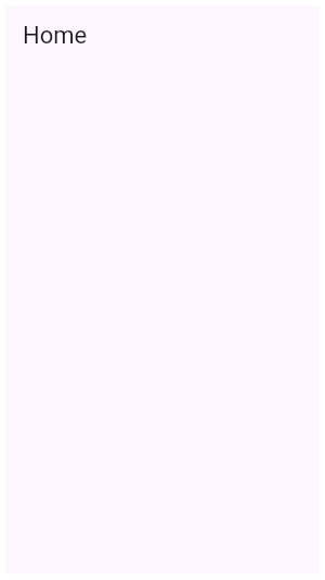 |
| 118 | /// |
| 119 | /// ```dart |
| 120 | /// MaterialApp( |
| 121 | /// home: Scaffold( |
| 122 | /// appBar: AppBar( |
| 123 | /// title: const Text('Home'), |
| 124 | /// ), |
| 125 | /// ), |
| 126 | /// debugShowCheckedModeBanner: false, |
| 127 | /// ) |
| 128 | /// ``` |
| 129 | /// {@end-tool} |
| 130 | /// |
| 131 | /// {@tool snippet} |
| 132 | /// This example shows how to create a [MaterialApp] that uses the [routes] |
| 133 | /// `Map` to define the "home" route and an "about" route. |
| 134 | /// |
| 135 | /// ```dart |
| 136 | /// MaterialApp( |
| 137 | /// routes: <String, WidgetBuilder>{ |
| 138 | /// '/': (BuildContext context) { |
| 139 | /// return Scaffold( |
| 140 | /// appBar: AppBar( |
| 141 | /// title: const Text('Home Route'), |
| 142 | /// ), |
| 143 | /// ); |
| 144 | /// }, |
| 145 | /// '/about': (BuildContext context) { |
| 146 | /// return Scaffold( |
| 147 | /// appBar: AppBar( |
| 148 | /// title: const Text('About Route'), |
| 149 | /// ), |
| 150 | /// ); |
| 151 | /// } |
| 152 | /// }, |
| 153 | /// ) |
| 154 | /// ``` |
| 155 | /// {@end-tool} |
| 156 | /// |
| 157 | /// {@tool snippet} |
| 158 | /// This example shows how to create a [MaterialApp] that defines a [theme] that |
| 159 | /// will be used for material widgets in the app. |
| 160 | /// |
| 161 | /// 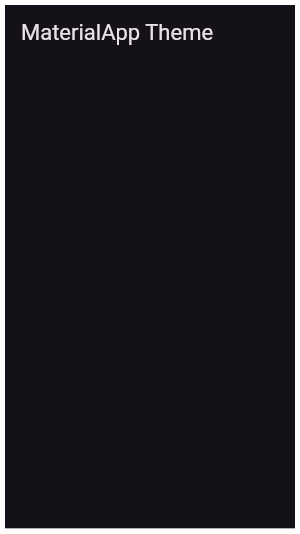 |
| 162 | /// |
| 163 | /// ```dart |
| 164 | /// MaterialApp( |
| 165 | /// theme: ThemeData( |
| 166 | /// brightness: Brightness.dark, |
| 167 | /// primaryColor: Colors.blueGrey |
| 168 | /// ), |
| 169 | /// home: Scaffold( |
| 170 | /// appBar: AppBar( |
| 171 | /// title: const Text('MaterialApp Theme'), |
| 172 | /// ), |
| 173 | /// ), |
| 174 | /// ) |
| 175 | /// ``` |
| 176 | /// {@end-tool} |
| 177 | /// |
| 178 | /// ## Troubleshooting |
| 179 | /// |
| 180 | /// ### Why is my app's text red with yellow underlines? |
| 181 | /// |
| 182 | /// [Text] widgets that lack a [Material] ancestor will be rendered with an ugly |
| 183 | /// red/yellow text style. |
| 184 | /// |
| 185 | /// 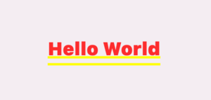 |
| 186 | /// |
| 187 | /// The typical fix is to give the widget a [Scaffold] ancestor. The [Scaffold] creates |
| 188 | /// a [Material] widget that defines its default text style. |
| 189 | /// |
| 190 | /// ```dart |
| 191 | /// const MaterialApp( |
| 192 | /// title: 'Material App', |
| 193 | /// home: Scaffold( |
| 194 | /// body: Center( |
| 195 | /// child: Text('Hello World'), |
| 196 | /// ), |
| 197 | /// ), |
| 198 | /// ) |
| 199 | /// ``` |
| 200 | /// |
| 201 | /// See also: |
| 202 | /// |
| 203 | /// * [Scaffold], which provides standard app elements like an [AppBar] and a [Drawer]. |
| 204 | /// * [Navigator], which is used to manage the app's stack of pages. |
| 205 | /// * [MaterialPageRoute], which defines an app page that transitions in a material-specific way. |
| 206 | /// * [WidgetsApp], which defines the basic app elements but does not depend on the material library. |
| 207 | /// * The Flutter Internationalization Tutorial, |
| 208 | /// <https://flutter.dev/to/internationalization/>. |
| 209 | class MaterialApp extends StatefulWidget { |
| 210 | /// Creates a MaterialApp. |
| 211 | /// |
| 212 | /// At least one of [home], [routes], [onGenerateRoute], or [builder] must be |
| 213 | /// non-null. If only [routes] is given, it must include an entry for the |
| 214 | /// [Navigator.defaultRouteName] (`/`), since that is the route used when the |
| 215 | /// application is launched with an intent that specifies an otherwise |
| 216 | /// unsupported route. |
| 217 | /// |
| 218 | /// This class creates an instance of [WidgetsApp]. |
| 219 | const MaterialApp({ |
| 220 | super.key, |
| 221 | this.navigatorKey, |
| 222 | this.scaffoldMessengerKey, |
| 223 | this.home, |
| 224 | Map<String, WidgetBuilder> this.routes = const <String, WidgetBuilder>{}, |
| 225 | this.initialRoute, |
| 226 | this.onGenerateRoute, |
| 227 | this.onGenerateInitialRoutes, |
| 228 | this.onUnknownRoute, |
| 229 | this.onNavigationNotification, |
| 230 | List<NavigatorObserver> this.navigatorObservers = const <NavigatorObserver>[], |
| 231 | this.builder, |
| 232 | this.title = '', |
| 233 | this.onGenerateTitle, |
| 234 | this.color, |
| 235 | this.theme, |
| 236 | this.darkTheme, |
| 237 | this.highContrastTheme, |
| 238 | this.highContrastDarkTheme, |
| 239 | this.themeMode = ThemeMode.system, |
| 240 | this.themeAnimationDuration = kThemeAnimationDuration, |
| 241 | this.themeAnimationCurve = Curves.linear, |
| 242 | this.locale, |
| 243 | this.localizationsDelegates, |
| 244 | this.localeListResolutionCallback, |
| 245 | this.localeResolutionCallback, |
| 246 | this.supportedLocales = const <Locale>[Locale('en', 'US')], |
| 247 | this.debugShowMaterialGrid = false, |
| 248 | this.showPerformanceOverlay = false, |
| 249 | this.checkerboardRasterCacheImages = false, |
| 250 | this.checkerboardOffscreenLayers = false, |
| 251 | this.showSemanticsDebugger = false, |
| 252 | this.debugShowCheckedModeBanner = true, |
| 253 | this.shortcuts, |
| 254 | this.actions, |
| 255 | this.restorationScopeId, |
| 256 | this.scrollBehavior, |
| 257 | @Deprecated( |
| 258 | 'Remove this parameter as it is now ignored. ' |
| 259 | 'MaterialApp never introduces its own MediaQuery; the View widget takes care of that. ' |
| 260 | 'This feature was deprecated after v3.7.0-29.0.pre.', |
| 261 | ) |
| 262 | this.useInheritedMediaQuery = false, |
| 263 | this.themeAnimationStyle, |
| 264 | }) : routeInformationProvider = null, |
| 265 | routeInformationParser = null, |
| 266 | routerDelegate = null, |
| 267 | backButtonDispatcher = null, |
| 268 | routerConfig = null; |
| 269 | |
| 270 | /// Creates a [MaterialApp] that uses the [Router] instead of a [Navigator]. |
| 271 | /// |
| 272 | /// {@macro flutter.widgets.WidgetsApp.router} |
| 273 | const MaterialApp.router({ |
| 274 | super.key, |
| 275 | this.scaffoldMessengerKey, |
| 276 | this.routeInformationProvider, |
| 277 | this.routeInformationParser, |
| 278 | this.routerDelegate, |
| 279 | this.routerConfig, |
| 280 | this.backButtonDispatcher, |
| 281 | this.builder, |
| 282 | this.title, |
| 283 | this.onGenerateTitle, |
| 284 | this.onNavigationNotification, |
| 285 | this.color, |
| 286 | this.theme, |
| 287 | this.darkTheme, |
| 288 | this.highContrastTheme, |
| 289 | this.highContrastDarkTheme, |
| 290 | this.themeMode = ThemeMode.system, |
| 291 | this.themeAnimationDuration = kThemeAnimationDuration, |
| 292 | this.themeAnimationCurve = Curves.linear, |
| 293 | this.locale, |
| 294 | this.localizationsDelegates, |
| 295 | this.localeListResolutionCallback, |
| 296 | this.localeResolutionCallback, |
| 297 | this.supportedLocales = const <Locale>[Locale('en', 'US')], |
| 298 | this.debugShowMaterialGrid = false, |
| 299 | this.showPerformanceOverlay = false, |
| 300 | this.checkerboardRasterCacheImages = false, |
| 301 | this.checkerboardOffscreenLayers = false, |
| 302 | this.showSemanticsDebugger = false, |
| 303 | this.debugShowCheckedModeBanner = true, |
| 304 | this.shortcuts, |
| 305 | this.actions, |
| 306 | this.restorationScopeId, |
| 307 | this.scrollBehavior, |
| 308 | @Deprecated( |
| 309 | 'Remove this parameter as it is now ignored. ' |
| 310 | 'MaterialApp never introduces its own MediaQuery; the View widget takes care of that. ' |
| 311 | 'This feature was deprecated after v3.7.0-29.0.pre.', |
| 312 | ) |
| 313 | this.useInheritedMediaQuery = false, |
| 314 | this.themeAnimationStyle, |
| 315 | }) : assert(routerDelegate != null || routerConfig != null), |
| 316 | navigatorObservers = null, |
| 317 | navigatorKey = null, |
| 318 | onGenerateRoute = null, |
| 319 | home = null, |
| 320 | onGenerateInitialRoutes = null, |
| 321 | onUnknownRoute = null, |
| 322 | routes = null, |
| 323 | initialRoute = null; |
| 324 | |
| 325 | /// {@macro flutter.widgets.widgetsApp.navigatorKey} |
| 326 | final GlobalKey<NavigatorState>? navigatorKey; |
| 327 | |
| 328 | /// A key to use when building the [ScaffoldMessenger]. |
| 329 | /// |
| 330 | /// If a [scaffoldMessengerKey] is specified, the [ScaffoldMessenger] can be |
| 331 | /// directly manipulated without first obtaining it from a [BuildContext] via |
| 332 | /// [ScaffoldMessenger.of]: from the [scaffoldMessengerKey], use the |
| 333 | /// [GlobalKey.currentState] getter. |
| 334 | final GlobalKey<ScaffoldMessengerState>? scaffoldMessengerKey; |
| 335 | |
| 336 | /// {@macro flutter.widgets.widgetsApp.home} |
| 337 | final Widget? home; |
| 338 | |
| 339 | /// The application's top-level routing table. |
| 340 | /// |
| 341 | /// When a named route is pushed with [Navigator.pushNamed], the route name is |
| 342 | /// looked up in this map. If the name is present, the associated |
| 343 | /// [WidgetBuilder] is used to construct a [MaterialPageRoute] that |
| 344 | /// performs an appropriate transition, including [Hero] animations, to the |
| 345 | /// new route. |
| 346 | /// |
| 347 | /// {@macro flutter.widgets.widgetsApp.routes} |
| 348 | final Map<String, WidgetBuilder>? routes; |
| 349 | |
| 350 | /// {@macro flutter.widgets.widgetsApp.initialRoute} |
| 351 | final String? initialRoute; |
| 352 | |
| 353 | /// {@macro flutter.widgets.widgetsApp.onGenerateRoute} |
| 354 | final RouteFactory? onGenerateRoute; |
| 355 | |
| 356 | /// {@macro flutter.widgets.widgetsApp.onGenerateInitialRoutes} |
| 357 | final InitialRouteListFactory? onGenerateInitialRoutes; |
| 358 | |
| 359 | /// {@macro flutter.widgets.widgetsApp.onUnknownRoute} |
| 360 | final RouteFactory? onUnknownRoute; |
| 361 | |
| 362 | /// {@macro flutter.widgets.widgetsApp.onNavigationNotification} |
| 363 | final NotificationListenerCallback<NavigationNotification>? onNavigationNotification; |
| 364 | |
| 365 | /// {@macro flutter.widgets.widgetsApp.navigatorObservers} |
| 366 | final List<NavigatorObserver>? navigatorObservers; |
| 367 | |
| 368 | /// {@macro flutter.widgets.widgetsApp.routeInformationProvider} |
| 369 | final RouteInformationProvider? routeInformationProvider; |
| 370 | |
| 371 | /// {@macro flutter.widgets.widgetsApp.routeInformationParser} |
| 372 | final RouteInformationParser<Object>? routeInformationParser; |
| 373 | |
| 374 | /// {@macro flutter.widgets.widgetsApp.routerDelegate} |
| 375 | final RouterDelegate<Object>? routerDelegate; |
| 376 | |
| 377 | /// {@macro flutter.widgets.widgetsApp.backButtonDispatcher} |
| 378 | final BackButtonDispatcher? backButtonDispatcher; |
| 379 | |
| 380 | /// {@macro flutter.widgets.widgetsApp.routerConfig} |
| 381 | final RouterConfig<Object>? routerConfig; |
| 382 | |
| 383 | /// {@macro flutter.widgets.widgetsApp.builder} |
| 384 | /// |
| 385 | /// Material specific features such as [showDialog] and [showMenu], and widgets |
| 386 | /// such as [Tooltip], [PopupMenuButton], also require a [Navigator] to properly |
| 387 | /// function. |
| 388 | final TransitionBuilder? builder; |
| 389 | |
| 390 | /// {@macro flutter.widgets.widgetsApp.title} |
| 391 | /// |
| 392 | /// This value is passed unmodified to [WidgetsApp.title]. |
| 393 | final String? title; |
| 394 | |
| 395 | /// {@macro flutter.widgets.widgetsApp.onGenerateTitle} |
| 396 | /// |
| 397 | /// This value is passed unmodified to [WidgetsApp.onGenerateTitle]. |
| 398 | final GenerateAppTitle? onGenerateTitle; |
| 399 | |
| 400 | /// Default visual properties, like colors fonts and shapes, for this app's |
| 401 | /// material widgets. |
| 402 | /// |
| 403 | /// A second [darkTheme] [ThemeData] value, which is used to provide a dark |
| 404 | /// version of the user interface can also be specified. [themeMode] will |
| 405 | /// control which theme will be used if a [darkTheme] is provided. |
| 406 | /// |
| 407 | /// The default value of this property is the value of [ThemeData.light()]. |
| 408 | /// |
| 409 | /// See also: |
| 410 | /// |
| 411 | /// * [themeMode], which controls which theme to use. |
| 412 | /// * [MediaQueryData.platformBrightness], which indicates the platform's |
| 413 | /// desired brightness and is used to automatically toggle between [theme] |
| 414 | /// and [darkTheme] in [MaterialApp]. |
| 415 | /// * [ThemeData.brightness], which indicates the [Brightness] of a theme's |
| 416 | /// colors. |
| 417 | final ThemeData? theme; |
| 418 | |
| 419 | /// The [ThemeData] to use when a 'dark mode' is requested by the system. |
| 420 | /// |
| 421 | /// Some host platforms allow the users to select a system-wide 'dark mode', |
| 422 | /// or the application may want to offer the user the ability to choose a |
| 423 | /// dark theme just for this application. This is theme that will be used for |
| 424 | /// such cases. [themeMode] will control which theme will be used. |
| 425 | /// |
| 426 | /// This theme should have a [ThemeData.brightness] set to [Brightness.dark]. |
| 427 | /// |
| 428 | /// Uses [theme] instead when null. Defaults to the value of |
| 429 | /// [ThemeData.light()] when both [darkTheme] and [theme] are null. |
| 430 | /// |
| 431 | /// See also: |
| 432 | /// |
| 433 | /// * [themeMode], which controls which theme to use. |
| 434 | /// * [MediaQueryData.platformBrightness], which indicates the platform's |
| 435 | /// desired brightness and is used to automatically toggle between [theme] |
| 436 | /// and [darkTheme] in [MaterialApp]. |
| 437 | /// * [ThemeData.brightness], which is typically set to the value of |
| 438 | /// [MediaQueryData.platformBrightness]. |
| 439 | final ThemeData? darkTheme; |
| 440 | |
| 441 | /// The [ThemeData] to use when 'high contrast' is requested by the system. |
| 442 | /// |
| 443 | /// Some host platforms (for example, iOS) allow the users to increase |
| 444 | /// contrast through an accessibility setting. |
| 445 | /// |
| 446 | /// Uses [theme] instead when null. |
| 447 | /// |
| 448 | /// See also: |
| 449 | /// |
| 450 | /// * [MediaQueryData.highContrast], which indicates the platform's |
| 451 | /// desire to increase contrast. |
| 452 | final ThemeData? highContrastTheme; |
| 453 | |
| 454 | /// The [ThemeData] to use when a 'dark mode' and 'high contrast' is requested |
| 455 | /// by the system. |
| 456 | /// |
| 457 | /// Some host platforms (for example, iOS) allow the users to increase |
| 458 | /// contrast through an accessibility setting. |
| 459 | /// |
| 460 | /// This theme should have a [ThemeData.brightness] set to [Brightness.dark]. |
| 461 | /// |
| 462 | /// Uses [darkTheme] instead when null. |
| 463 | /// |
| 464 | /// See also: |
| 465 | /// |
| 466 | /// * [MediaQueryData.highContrast], which indicates the platform's |
| 467 | /// desire to increase contrast. |
| 468 | final ThemeData? highContrastDarkTheme; |
| 469 | |
| 470 | /// Determines which theme will be used by the application if both [theme] |
| 471 | /// and [darkTheme] are provided. |
| 472 | /// |
| 473 | /// If set to [ThemeMode.system], the choice of which theme to use will |
| 474 | /// be based on the user's system preferences. If the [MediaQuery.platformBrightnessOf] |
| 475 | /// is [Brightness.light], [theme] will be used. If it is [Brightness.dark], |
| 476 | /// [darkTheme] will be used (unless it is null, in which case [theme] |
| 477 | /// will be used. |
| 478 | /// |
| 479 | /// If set to [ThemeMode.light] the [theme] will always be used, |
| 480 | /// regardless of the user's system preference. |
| 481 | /// |
| 482 | /// If set to [ThemeMode.dark] the [darkTheme] will be used |
| 483 | /// regardless of the user's system preference. If [darkTheme] is null |
| 484 | /// then it will fallback to using [theme]. |
| 485 | /// |
| 486 | /// The default value is [ThemeMode.system]. |
| 487 | /// |
| 488 | /// See also: |
| 489 | /// |
| 490 | /// * [theme], which is used when a light mode is selected. |
| 491 | /// * [darkTheme], which is used when a dark mode is selected. |
| 492 | /// * [ThemeData.brightness], which indicates to various parts of the |
| 493 | /// system what kind of theme is being used. |
| 494 | final ThemeMode? themeMode; |
| 495 | |
| 496 | /// The duration of animated theme changes. |
| 497 | /// |
| 498 | /// When the theme changes (either by the [theme], [darkTheme] or [themeMode] |
| 499 | /// parameters changing) it is animated to the new theme over time. |
| 500 | /// The [themeAnimationDuration] determines how long this animation takes. |
| 501 | /// |
| 502 | /// To have the theme change immediately, you can set this to [Duration.zero]. |
| 503 | /// |
| 504 | /// The default is [kThemeAnimationDuration]. |
| 505 | /// |
| 506 | /// See also: |
| 507 | /// [themeAnimationCurve], which defines the curve used for the animation. |
| 508 | final Duration themeAnimationDuration; |
| 509 | |
| 510 | /// The curve to apply when animating theme changes. |
| 511 | /// |
| 512 | /// The default is [Curves.linear]. |
| 513 | /// |
| 514 | /// This is ignored if [themeAnimationDuration] is [Duration.zero]. |
| 515 | /// |
| 516 | /// See also: |
| 517 | /// [themeAnimationDuration], which defines how long the animation is. |
| 518 | final Curve themeAnimationCurve; |
| 519 | |
| 520 | /// {@macro flutter.widgets.widgetsApp.color} |
| 521 | final Color? color; |
| 522 | |
| 523 | /// {@macro flutter.widgets.widgetsApp.locale} |
| 524 | final Locale? locale; |
| 525 | |
| 526 | /// {@macro flutter.widgets.widgetsApp.localizationsDelegates} |
| 527 | /// |
| 528 | /// Internationalized apps that require translations for one of the locales |
| 529 | /// listed in [GlobalMaterialLocalizations] should specify this parameter |
| 530 | /// and list the [supportedLocales] that the application can handle. |
| 531 | /// |
| 532 | /// ```dart |
| 533 | /// // The GlobalMaterialLocalizations and GlobalWidgetsLocalizations |
| 534 | /// // classes require the following import: |
| 535 | /// // import 'package:flutter_localizations/flutter_localizations.dart'; |
| 536 | /// |
| 537 | /// const MaterialApp( |
| 538 | /// localizationsDelegates: <LocalizationsDelegate<Object>>[ |
| 539 | /// // ... app-specific localization delegate(s) here |
| 540 | /// GlobalMaterialLocalizations.delegate, |
| 541 | /// GlobalWidgetsLocalizations.delegate, |
| 542 | /// ], |
| 543 | /// supportedLocales: <Locale>[ |
| 544 | /// Locale('en', 'US'), // English |
| 545 | /// Locale('he', 'IL'), // Hebrew |
| 546 | /// // ... other locales the app supports |
| 547 | /// ], |
| 548 | /// // ... |
| 549 | /// ) |
| 550 | /// ``` |
| 551 | /// |
| 552 | /// ## Adding localizations for a new locale |
| 553 | /// |
| 554 | /// The information that follows applies to the unusual case of an app |
| 555 | /// adding translations for a language not already supported by |
| 556 | /// [GlobalMaterialLocalizations]. |
| 557 | /// |
| 558 | /// Delegates that produce [WidgetsLocalizations] and [MaterialLocalizations] |
| 559 | /// are included automatically. Apps can provide their own versions of these |
| 560 | /// localizations by creating implementations of |
| 561 | /// [LocalizationsDelegate<WidgetsLocalizations>] or |
| 562 | /// [LocalizationsDelegate<MaterialLocalizations>] whose load methods return |
| 563 | /// custom versions of [WidgetsLocalizations] or [MaterialLocalizations]. |
| 564 | /// |
| 565 | /// For example: to add support to [MaterialLocalizations] for a locale it |
| 566 | /// doesn't already support, say `const Locale('foo', 'BR')`, one first |
| 567 | /// creates a subclass of [MaterialLocalizations] that provides the |
| 568 | /// translations: |
| 569 | /// |
| 570 | /// ```dart |
| 571 | /// class FooLocalizations extends MaterialLocalizations { |
| 572 | /// FooLocalizations(); |
| 573 | /// @override |
| 574 | /// String get okButtonLabel => 'foo'; |
| 575 | /// // ... |
| 576 | /// // lots of other getters and methods to override! |
| 577 | /// } |
| 578 | /// ``` |
| 579 | /// |
| 580 | /// One must then create a [LocalizationsDelegate] subclass that can provide |
| 581 | /// an instance of the [MaterialLocalizations] subclass. In this case, this is |
| 582 | /// essentially just a method that constructs a `FooLocalizations` object. A |
| 583 | /// [SynchronousFuture] is used here because no asynchronous work takes place |
| 584 | /// upon "loading" the localizations object. |
| 585 | /// |
| 586 | /// ```dart |
| 587 | /// // continuing from previous example... |
| 588 | /// class FooLocalizationsDelegate extends LocalizationsDelegate<MaterialLocalizations> { |
| 589 | /// const FooLocalizationsDelegate(); |
| 590 | /// @override |
| 591 | /// bool isSupported(Locale locale) { |
| 592 | /// return locale == const Locale('foo', 'BR'); |
| 593 | /// } |
| 594 | /// @override |
| 595 | /// Future<FooLocalizations> load(Locale locale) { |
| 596 | /// assert(locale == const Locale('foo', 'BR')); |
| 597 | /// return SynchronousFuture<FooLocalizations>(FooLocalizations()); |
| 598 | /// } |
| 599 | /// @override |
| 600 | /// bool shouldReload(FooLocalizationsDelegate old) => false; |
| 601 | /// } |
| 602 | /// ``` |
| 603 | /// |
| 604 | /// Constructing a [MaterialApp] with a `FooLocalizationsDelegate` overrides |
| 605 | /// the automatically included delegate for [MaterialLocalizations] because |
| 606 | /// only the first delegate of each [LocalizationsDelegate.type] is used and |
| 607 | /// the automatically included delegates are added to the end of the app's |
| 608 | /// [localizationsDelegates] list. |
| 609 | /// |
| 610 | /// ```dart |
| 611 | /// // continuing from previous example... |
| 612 | /// const MaterialApp( |
| 613 | /// localizationsDelegates: <LocalizationsDelegate<Object>>[ |
| 614 | /// FooLocalizationsDelegate(), |
| 615 | /// ], |
| 616 | /// // ... |
| 617 | /// ) |
| 618 | /// ``` |
| 619 | /// See also: |
| 620 | /// |
| 621 | /// * [supportedLocales], which must be specified along with |
| 622 | /// [localizationsDelegates]. |
| 623 | /// * [GlobalMaterialLocalizations], a [localizationsDelegates] value |
| 624 | /// which provides material localizations for many languages. |
| 625 | /// * The Flutter Internationalization Tutorial, |
| 626 | /// <https://flutter.dev/to/internationalization/>. |
| 627 | final Iterable<LocalizationsDelegate<dynamic>>? localizationsDelegates; |
| 628 | |
| 629 | /// {@macro flutter.widgets.widgetsApp.localeListResolutionCallback} |
| 630 | /// |
| 631 | /// This callback is passed along to the [WidgetsApp] built by this widget. |
| 632 | final LocaleListResolutionCallback? localeListResolutionCallback; |
| 633 | |
| 634 | /// {@macro flutter.widgets.LocaleResolutionCallback} |
| 635 | /// |
| 636 | /// This callback is passed along to the [WidgetsApp] built by this widget. |
| 637 | final LocaleResolutionCallback? localeResolutionCallback; |
| 638 | |
| 639 | /// {@macro flutter.widgets.widgetsApp.supportedLocales} |
| 640 | /// |
| 641 | /// It is passed along unmodified to the [WidgetsApp] built by this widget. |
| 642 | /// |
| 643 | /// See also: |
| 644 | /// |
| 645 | /// * [localizationsDelegates], which must be specified for localized |
| 646 | /// applications. |
| 647 | /// * [GlobalMaterialLocalizations], a [localizationsDelegates] value |
| 648 | /// which provides material localizations for many languages. |
| 649 | /// * The Flutter Internationalization Tutorial, |
| 650 | /// <https://flutter.dev/to/internationalization/>. |
| 651 | final Iterable<Locale> supportedLocales; |
| 652 | |
| 653 | /// Turns on a performance overlay. |
| 654 | /// |
| 655 | /// See also: |
| 656 | /// |
| 657 | /// * <https://flutter.dev/to/performance-overlay> |
| 658 | final bool showPerformanceOverlay; |
| 659 | |
| 660 | /// Turns on checkerboarding of raster cache images. |
| 661 | final bool checkerboardRasterCacheImages; |
| 662 | |
| 663 | /// Turns on checkerboarding of layers rendered to offscreen bitmaps. |
| 664 | final bool checkerboardOffscreenLayers; |
| 665 | |
| 666 | /// Turns on an overlay that shows the accessibility information |
| 667 | /// reported by the framework. |
| 668 | final bool showSemanticsDebugger; |
| 669 | |
| 670 | /// {@macro flutter.widgets.widgetsApp.debugShowCheckedModeBanner} |
| 671 | final bool debugShowCheckedModeBanner; |
| 672 | |
| 673 | /// {@macro flutter.widgets.widgetsApp.shortcuts} |
| 674 | /// {@tool snippet} |
| 675 | /// This example shows how to add a single shortcut for |
| 676 | /// [LogicalKeyboardKey.select] to the default shortcuts without needing to |
| 677 | /// add your own [Shortcuts] widget. |
| 678 | /// |
| 679 | /// Alternatively, you could insert a [Shortcuts] widget with just the mapping |
| 680 | /// you want to add between the [WidgetsApp] and its child and get the same |
| 681 | /// effect. |
| 682 | /// |
| 683 | /// ```dart |
| 684 | /// Widget build(BuildContext context) { |
| 685 | /// return WidgetsApp( |
| 686 | /// shortcuts: <ShortcutActivator, Intent>{ |
| 687 | /// ... WidgetsApp.defaultShortcuts, |
| 688 | /// const SingleActivator(LogicalKeyboardKey.select): const ActivateIntent(), |
| 689 | /// }, |
| 690 | /// color: const Color(0xFFFF0000), |
| 691 | /// builder: (BuildContext context, Widget? child) { |
| 692 | /// return const Placeholder(); |
| 693 | /// }, |
| 694 | /// ); |
| 695 | /// } |
| 696 | /// ``` |
| 697 | /// {@end-tool} |
| 698 | /// {@macro flutter.widgets.widgetsApp.shortcuts.seeAlso} |
| 699 | final Map<ShortcutActivator, Intent>? shortcuts; |
| 700 | |
| 701 | /// {@macro flutter.widgets.widgetsApp.actions} |
| 702 | /// {@tool snippet} |
| 703 | /// This example shows how to add a single action handling an |
| 704 | /// [ActivateAction] to the default actions without needing to |
| 705 | /// add your own [Actions] widget. |
| 706 | /// |
| 707 | /// Alternatively, you could insert a [Actions] widget with just the mapping |
| 708 | /// you want to add between the [WidgetsApp] and its child and get the same |
| 709 | /// effect. |
| 710 | /// |
| 711 | /// ```dart |
| 712 | /// Widget build(BuildContext context) { |
| 713 | /// return WidgetsApp( |
| 714 | /// actions: <Type, Action<Intent>>{ |
| 715 | /// ... WidgetsApp.defaultActions, |
| 716 | /// ActivateAction: CallbackAction<Intent>( |
| 717 | /// onInvoke: (Intent intent) { |
| 718 | /// // Do something here... |
| 719 | /// return null; |
| 720 | /// }, |
| 721 | /// ), |
| 722 | /// }, |
| 723 | /// color: const Color(0xFFFF0000), |
| 724 | /// builder: (BuildContext context, Widget? child) { |
| 725 | /// return const Placeholder(); |
| 726 | /// }, |
| 727 | /// ); |
| 728 | /// } |
| 729 | /// ``` |
| 730 | /// {@end-tool} |
| 731 | /// {@macro flutter.widgets.widgetsApp.actions.seeAlso} |
| 732 | final Map<Type, Action<Intent>>? actions; |
| 733 | |
| 734 | /// {@macro flutter.widgets.widgetsApp.restorationScopeId} |
| 735 | final String? restorationScopeId; |
| 736 | |
| 737 | /// {@template flutter.material.materialApp.scrollBehavior} |
| 738 | /// The default [ScrollBehavior] for the application. |
| 739 | /// |
| 740 | /// [ScrollBehavior]s describe how [Scrollable] widgets behave. Providing |
| 741 | /// a [ScrollBehavior] can set the default [ScrollPhysics] across |
| 742 | /// an application, and manage [Scrollable] decorations like [Scrollbar]s and |
| 743 | /// [GlowingOverscrollIndicator]s. |
| 744 | /// {@endtemplate} |
| 745 | /// |
| 746 | /// When null, defaults to [MaterialScrollBehavior]. |
| 747 | /// |
| 748 | /// See also: |
| 749 | /// |
| 750 | /// * [ScrollConfiguration], which controls how [Scrollable] widgets behave |
| 751 | /// in a subtree. |
| 752 | final ScrollBehavior? scrollBehavior; |
| 753 | |
| 754 | /// Turns on a [GridPaper] overlay that paints a baseline grid |
| 755 | /// Material apps. |
| 756 | /// |
| 757 | /// Only available in debug mode. |
| 758 | /// |
| 759 | /// See also: |
| 760 | /// |
| 761 | /// * <https://material.io/design/layout/spacing-methods.html> |
| 762 | final bool debugShowMaterialGrid; |
| 763 | |
| 764 | /// {@macro flutter.widgets.widgetsApp.useInheritedMediaQuery} |
| 765 | @Deprecated( |
| 766 | 'This setting is now ignored. ' |
| 767 | 'MaterialApp never introduces its own MediaQuery; the View widget takes care of that. ' |
| 768 | 'This feature was deprecated after v3.7.0-29.0.pre.', |
| 769 | ) |
| 770 | final bool useInheritedMediaQuery; |
| 771 | |
| 772 | /// Used to override the theme animation curve and duration. |
| 773 | /// |
| 774 | /// If [AnimationStyle.duration] is provided, it will be used to override |
| 775 | /// the theme animation duration in the underlying [AnimatedTheme] widget. |
| 776 | /// If it is null, then [themeAnimationDuration] will be used. Otherwise, |
| 777 | /// defaults to 200ms. |
| 778 | /// |
| 779 | /// If [AnimationStyle.curve] is provided, it will be used to override |
| 780 | /// the theme animation curve in the underlying [AnimatedTheme] widget. |
| 781 | /// If it is null, then [themeAnimationCurve] will be used. Otherwise, |
| 782 | /// defaults to [Curves.linear]. |
| 783 | /// |
| 784 | /// To disable the theme animation, use [AnimationStyle.noAnimation]. |
| 785 | /// |
| 786 | /// {@tool dartpad} |
| 787 | /// This sample showcases how to override the theme animation curve and |
| 788 | /// duration in the [MaterialApp] widget using [AnimationStyle]. |
| 789 | /// |
| 790 | /// ** See code in examples/api/lib/material/app/app.0.dart ** |
| 791 | /// {@end-tool} |
| 792 | final AnimationStyle? themeAnimationStyle; |
| 793 | |
| 794 | @override |
| 795 | State<MaterialApp> createState() => _MaterialAppState(); |
| 796 | |
| 797 | /// The [HeroController] used for Material page transitions. |
| 798 | /// |
| 799 | /// Used by the [MaterialApp]. |
| 800 | static HeroController createMaterialHeroController() { |
| 801 | return HeroController( |
| 802 | createRectTween: (Rect? begin, Rect? end) { |
| 803 | return MaterialRectArcTween(begin: begin, end: end); |
| 804 | }, |
| 805 | ); |
| 806 | } |
| 807 | } |
| 808 | |
| 809 | /// Describes how [Scrollable] widgets behave for [MaterialApp]s. |
| 810 | /// |
| 811 | /// {@macro flutter.widgets.scrollBehavior} |
| 812 | /// |
| 813 | /// Setting a [MaterialScrollBehavior] will apply a |
| 814 | /// [GlowingOverscrollIndicator] to [Scrollable] descendants when executing on |
| 815 | /// [TargetPlatform.android] and [TargetPlatform.fuchsia]. |
| 816 | /// |
| 817 | /// When using the desktop platform, if the [Scrollable] widget scrolls in the |
| 818 | /// [Axis.vertical], a [Scrollbar] is applied. |
| 819 | /// |
| 820 | /// If the scroll direction is [Axis.horizontal] scroll views are less |
| 821 | /// discoverable, so consider adding a Scrollbar in these cases, either directly |
| 822 | /// or through the [buildScrollbar] method. |
| 823 | /// |
| 824 | /// [ThemeData.useMaterial3] specifies the |
| 825 | /// overscroll indicator that is used on [TargetPlatform.android], which |
| 826 | /// defaults to true, resulting in a [StretchingOverscrollIndicator]. Setting |
| 827 | /// [ThemeData.useMaterial3] to false will instead use a |
| 828 | /// [GlowingOverscrollIndicator]. |
| 829 | /// |
| 830 | /// See also: |
| 831 | /// |
| 832 | /// * [ScrollBehavior], the default scrolling behavior extended by this class. |
| 833 | class MaterialScrollBehavior extends ScrollBehavior { |
| 834 | /// Creates a MaterialScrollBehavior that decorates [Scrollable]s with |
| 835 | /// [StretchingOverscrollIndicator]s and [Scrollbar]s based on the current |
| 836 | /// platform and provided [ScrollableDetails]. |
| 837 | /// |
| 838 | /// [ThemeData.useMaterial3] specifies the |
| 839 | /// overscroll indicator that is used on [TargetPlatform.android], which |
| 840 | /// defaults to true, resulting in a [StretchingOverscrollIndicator]. Setting |
| 841 | /// [ThemeData.useMaterial3] to false will instead use a |
| 842 | /// [GlowingOverscrollIndicator]. |
| 843 | const MaterialScrollBehavior(); |
| 844 | |
| 845 | @override |
| 846 | TargetPlatform getPlatform(BuildContext context) => Theme.of(context).platform; |
| 847 | |
| 848 | @override |
| 849 | Widget buildScrollbar(BuildContext context, Widget child, ScrollableDetails details) { |
| 850 | // When modifying this function, consider modifying the implementation in |
| 851 | // the base class ScrollBehavior as well. |
| 852 | switch (axisDirectionToAxis(details.direction)) { |
| 853 | case Axis.horizontal: |
| 854 | return child; |
| 855 | case Axis.vertical: |
| 856 | switch (getPlatform(context)) { |
| 857 | case TargetPlatform.linux: |
| 858 | case TargetPlatform.macOS: |
| 859 | case TargetPlatform.windows: |
| 860 | assert(details.controller != null); |
| 861 | return Scrollbar(controller: details.controller, child: child); |
| 862 | case TargetPlatform.android: |
| 863 | case TargetPlatform.fuchsia: |
| 864 | case TargetPlatform.iOS: |
| 865 | return child; |
| 866 | } |
| 867 | } |
| 868 | } |
| 869 | |
| 870 | @override |
| 871 | Widget buildOverscrollIndicator(BuildContext context, Widget child, ScrollableDetails details) { |
| 872 | // When modifying this function, consider modifying the implementation in |
| 873 | // the base class ScrollBehavior as well. |
| 874 | final AndroidOverscrollIndicator indicator = |
| 875 | Theme.of(context).useMaterial3 |
| 876 | ? AndroidOverscrollIndicator.stretch |
| 877 | : AndroidOverscrollIndicator.glow; |
| 878 | switch (getPlatform(context)) { |
| 879 | case TargetPlatform.iOS: |
| 880 | case TargetPlatform.linux: |
| 881 | case TargetPlatform.macOS: |
| 882 | case TargetPlatform.windows: |
| 883 | return child; |
| 884 | case TargetPlatform.android: |
| 885 | switch (indicator) { |
| 886 | case AndroidOverscrollIndicator.stretch: |
| 887 | return StretchingOverscrollIndicator( |
| 888 | axisDirection: details.direction, |
| 889 | clipBehavior: details.clipBehavior ?? Clip.hardEdge, |
| 890 | child: child, |
| 891 | ); |
| 892 | case AndroidOverscrollIndicator.glow: |
| 893 | break; |
| 894 | } |
| 895 | case TargetPlatform.fuchsia: |
| 896 | break; |
| 897 | } |
| 898 | return GlowingOverscrollIndicator( |
| 899 | axisDirection: details.direction, |
| 900 | color: Theme.of(context).colorScheme.secondary, |
| 901 | child: child, |
| 902 | ); |
| 903 | } |
| 904 | } |
| 905 | |
| 906 | class _MaterialAppState extends State<MaterialApp> { |
| 907 | late HeroController _heroController; |
| 908 | |
| 909 | bool get _usesRouter => widget.routerDelegate != null || widget.routerConfig != null; |
| 910 | |
| 911 | @override |
| 912 | void initState() { |
| 913 | super.initState(); |
| 914 | _heroController = MaterialApp.createMaterialHeroController(); |
| 915 | } |
| 916 | |
| 917 | @override |
| 918 | void dispose() { |
| 919 | _heroController.dispose(); |
| 920 | super.dispose(); |
| 921 | } |
| 922 | |
| 923 | // Combine the Localizations for Material with the ones contributed |
| 924 | // by the localizationsDelegates parameter, if any. Only the first delegate |
| 925 | // of a particular LocalizationsDelegate.type is loaded so the |
| 926 | // localizationsDelegate parameter can be used to override |
| 927 | // _MaterialLocalizationsDelegate. |
| 928 | Iterable<LocalizationsDelegate<dynamic>> get _localizationsDelegates { |
| 929 | return <LocalizationsDelegate<dynamic>>[ |
| 930 | if (widget.localizationsDelegates != null) ...widget.localizationsDelegates!, |
| 931 | DefaultMaterialLocalizations.delegate, |
| 932 | DefaultCupertinoLocalizations.delegate, |
| 933 | ]; |
| 934 | } |
| 935 | |
| 936 | Widget _exitWidgetSelectionButtonBuilder( |
| 937 | BuildContext context, { |
| 938 | required VoidCallback onPressed, |
| 939 | required String semanticLabel, |
| 940 | required GlobalKey key, |
| 941 | }) { |
| 942 | return _MaterialInspectorButton.filled( |
| 943 | onPressed: onPressed, |
| 944 | semanticLabel: semanticLabel, |
| 945 | icon: Icons.close, |
| 946 | isDarkTheme: _isDarkTheme(context), |
| 947 | buttonKey: key, |
| 948 | ); |
| 949 | } |
| 950 | |
| 951 | Widget _moveExitWidgetSelectionButtonBuilder( |
| 952 | BuildContext context, { |
| 953 | required VoidCallback onPressed, |
| 954 | required String semanticLabel, |
| 955 | bool isLeftAligned = true, |
| 956 | }) { |
| 957 | return _MaterialInspectorButton.iconOnly( |
| 958 | onPressed: onPressed, |
| 959 | semanticLabel: semanticLabel, |
| 960 | icon: isLeftAligned ? Icons.arrow_right : Icons.arrow_left, |
| 961 | isDarkTheme: _isDarkTheme(context), |
| 962 | ); |
| 963 | } |
| 964 | |
| 965 | Widget _tapBehaviorButtonBuilder( |
| 966 | BuildContext context, { |
| 967 | required VoidCallback onPressed, |
| 968 | required String semanticLabel, |
| 969 | required bool selectionOnTapEnabled, |
| 970 | }) { |
| 971 | return _MaterialInspectorButton.toggle( |
| 972 | onPressed: onPressed, |
| 973 | semanticLabel: semanticLabel, |
| 974 | // This unicode icon is also used for the Cupertino-styled button and for |
| 975 | // DevTools. It should be updated in all 3 places if changed. |
| 976 | icon: const IconData(0x1F74A), |
| 977 | isDarkTheme: _isDarkTheme(context), |
| 978 | toggledOn: selectionOnTapEnabled, |
| 979 | ); |
| 980 | } |
| 981 | |
| 982 | bool _isDarkTheme(BuildContext context) { |
| 983 | return widget.themeMode == ThemeMode.dark || |
| 984 | widget.themeMode == ThemeMode.system && |
| 985 | MediaQuery.platformBrightnessOf(context) == Brightness.dark; |
| 986 | } |
| 987 | |
| 988 | ThemeData _themeBuilder(BuildContext context) { |
| 989 | ThemeData? theme; |
| 990 | // Resolve which theme to use based on brightness and high contrast. |
| 991 | final ThemeMode mode = widget.themeMode ?? ThemeMode.system; |
| 992 | final Brightness platformBrightness = MediaQuery.platformBrightnessOf(context); |
| 993 | final bool useDarkTheme = |
| 994 | mode == ThemeMode.dark || |
| 995 | (mode == ThemeMode.system && platformBrightness == ui.Brightness.dark); |
| 996 | final bool highContrast = MediaQuery.highContrastOf(context); |
| 997 | if (useDarkTheme && highContrast && widget.highContrastDarkTheme != null) { |
| 998 | theme = widget.highContrastDarkTheme; |
| 999 | } else if (useDarkTheme && widget.darkTheme != null) { |
| 1000 | theme = widget.darkTheme; |
| 1001 | } else if (highContrast && widget.highContrastTheme != null) { |
| 1002 | theme = widget.highContrastTheme; |
| 1003 | } |
| 1004 | theme ??= widget.theme ?? ThemeData(); |
| 1005 | SystemChrome.setSystemUIOverlayStyle( |
| 1006 | theme.brightness == Brightness.dark ? SystemUiOverlayStyle.light : SystemUiOverlayStyle.dark, |
| 1007 | ); |
| 1008 | |
| 1009 | return theme; |
| 1010 | } |
| 1011 | |
| 1012 | Widget _materialBuilder(BuildContext context, Widget? child) { |
| 1013 | final ThemeData theme = _themeBuilder(context); |
| 1014 | final Color effectiveSelectionColor = |
| 1015 | theme.textSelectionTheme.selectionColor ?? theme.colorScheme.primary.withOpacity(0.40); |
| 1016 | final Color effectiveCursorColor = |
| 1017 | theme.textSelectionTheme.cursorColor ?? theme.colorScheme.primary; |
| 1018 | |
| 1019 | Widget childWidget = child ?? const SizedBox.shrink(); |
| 1020 | |
| 1021 | if (widget.builder != null) { |
| 1022 | childWidget = Builder( |
| 1023 | builder: (BuildContext context) { |
| 1024 | // Why are we surrounding a builder with a builder? |
| 1025 | // |
| 1026 | // The widget.builder may contain code that invokes |
| 1027 | // Theme.of(), which should return the theme we selected |
| 1028 | // above in AnimatedTheme. However, if we invoke |
| 1029 | // widget.builder() directly as the child of AnimatedTheme |
| 1030 | // then there is no BuildContext separating them, the |
| 1031 | // widget.builder() will not find the theme. Therefore, we |
| 1032 | // surround widget.builder with yet another builder so that |
| 1033 | // a context separates them and Theme.of() correctly |
| 1034 | // resolves to the theme we passed to AnimatedTheme. |
| 1035 | return widget.builder!(context, child); |
| 1036 | }, |
| 1037 | ); |
| 1038 | } |
| 1039 | |
| 1040 | childWidget = ScaffoldMessenger( |
| 1041 | key: widget.scaffoldMessengerKey, |
| 1042 | child: DefaultSelectionStyle( |
| 1043 | selectionColor: effectiveSelectionColor, |
| 1044 | cursorColor: effectiveCursorColor, |
| 1045 | child: childWidget, |
| 1046 | ), |
| 1047 | ); |
| 1048 | |
| 1049 | if (widget.themeAnimationStyle != AnimationStyle.noAnimation) { |
| 1050 | childWidget = AnimatedTheme( |
| 1051 | data: theme, |
| 1052 | duration: widget.themeAnimationStyle?.duration ?? widget.themeAnimationDuration, |
| 1053 | curve: widget.themeAnimationStyle?.curve ?? widget.themeAnimationCurve, |
| 1054 | child: childWidget, |
| 1055 | ); |
| 1056 | } else { |
| 1057 | childWidget = Theme(data: theme, child: childWidget); |
| 1058 | } |
| 1059 | |
| 1060 | return childWidget; |
| 1061 | } |
| 1062 | |
| 1063 | Widget _buildWidgetApp(BuildContext context) { |
| 1064 | // The color property is always pulled from the light theme, even if dark |
| 1065 | // mode is activated. This was done to simplify the technical details |
| 1066 | // of switching themes and it was deemed acceptable because this color |
| 1067 | // property is only used on old Android OSes to color the app bar in |
| 1068 | // Android's switcher UI. |
| 1069 | // |
| 1070 | // blue is the primary color of the default theme. |
| 1071 | final Color materialColor = widget.color ?? widget.theme?.primaryColor ?? Colors.blue; |
| 1072 | if (_usesRouter) { |
| 1073 | return WidgetsApp.router( |
| 1074 | key: GlobalObjectKey(this), |
| 1075 | routeInformationProvider: widget.routeInformationProvider, |
| 1076 | routeInformationParser: widget.routeInformationParser, |
| 1077 | routerDelegate: widget.routerDelegate, |
| 1078 | routerConfig: widget.routerConfig, |
| 1079 | backButtonDispatcher: widget.backButtonDispatcher, |
| 1080 | onNavigationNotification: widget.onNavigationNotification, |
| 1081 | builder: _materialBuilder, |
| 1082 | title: widget.title, |
| 1083 | onGenerateTitle: widget.onGenerateTitle, |
| 1084 | textStyle: _errorTextStyle, |
| 1085 | color: materialColor, |
| 1086 | locale: widget.locale, |
| 1087 | localizationsDelegates: _localizationsDelegates, |
| 1088 | localeResolutionCallback: widget.localeResolutionCallback, |
| 1089 | localeListResolutionCallback: widget.localeListResolutionCallback, |
| 1090 | supportedLocales: widget.supportedLocales, |
| 1091 | showPerformanceOverlay: widget.showPerformanceOverlay, |
| 1092 | showSemanticsDebugger: widget.showSemanticsDebugger, |
| 1093 | debugShowCheckedModeBanner: widget.debugShowCheckedModeBanner, |
| 1094 | exitWidgetSelectionButtonBuilder: _exitWidgetSelectionButtonBuilder, |
| 1095 | moveExitWidgetSelectionButtonBuilder: _moveExitWidgetSelectionButtonBuilder, |
| 1096 | tapBehaviorButtonBuilder: _tapBehaviorButtonBuilder, |
| 1097 | shortcuts: widget.shortcuts, |
| 1098 | actions: widget.actions, |
| 1099 | restorationScopeId: widget.restorationScopeId, |
| 1100 | ); |
| 1101 | } |
| 1102 | |
| 1103 | return WidgetsApp( |
| 1104 | key: GlobalObjectKey(this), |
| 1105 | navigatorKey: widget.navigatorKey, |
| 1106 | navigatorObservers: widget.navigatorObservers!, |
| 1107 | pageRouteBuilder: <T>(RouteSettings settings, WidgetBuilder builder) { |
| 1108 | return MaterialPageRoute<T>(settings: settings, builder: builder); |
| 1109 | }, |
| 1110 | home: widget.home, |
| 1111 | routes: widget.routes!, |
| 1112 | initialRoute: widget.initialRoute, |
| 1113 | onGenerateRoute: widget.onGenerateRoute, |
| 1114 | onGenerateInitialRoutes: widget.onGenerateInitialRoutes, |
| 1115 | onUnknownRoute: widget.onUnknownRoute, |
| 1116 | onNavigationNotification: widget.onNavigationNotification, |
| 1117 | builder: _materialBuilder, |
| 1118 | title: widget.title, |
| 1119 | onGenerateTitle: widget.onGenerateTitle, |
| 1120 | textStyle: _errorTextStyle, |
| 1121 | color: materialColor, |
| 1122 | locale: widget.locale, |
| 1123 | localizationsDelegates: _localizationsDelegates, |
| 1124 | localeResolutionCallback: widget.localeResolutionCallback, |
| 1125 | localeListResolutionCallback: widget.localeListResolutionCallback, |
| 1126 | supportedLocales: widget.supportedLocales, |
| 1127 | showPerformanceOverlay: widget.showPerformanceOverlay, |
| 1128 | showSemanticsDebugger: widget.showSemanticsDebugger, |
| 1129 | debugShowCheckedModeBanner: widget.debugShowCheckedModeBanner, |
| 1130 | exitWidgetSelectionButtonBuilder: _exitWidgetSelectionButtonBuilder, |
| 1131 | moveExitWidgetSelectionButtonBuilder: _moveExitWidgetSelectionButtonBuilder, |
| 1132 | tapBehaviorButtonBuilder: _tapBehaviorButtonBuilder, |
| 1133 | shortcuts: widget.shortcuts, |
| 1134 | actions: widget.actions, |
| 1135 | restorationScopeId: widget.restorationScopeId, |
| 1136 | ); |
| 1137 | } |
| 1138 | |
| 1139 | @override |
| 1140 | Widget build(BuildContext context) { |
| 1141 | Widget result = _buildWidgetApp(context); |
| 1142 | result = Focus( |
| 1143 | canRequestFocus: false, |
| 1144 | onKeyEvent: (FocusNode node, KeyEvent event) { |
| 1145 | if ((event is! KeyDownEvent && event is! KeyRepeatEvent) || |
| 1146 | event.logicalKey != LogicalKeyboardKey.escape) { |
| 1147 | return KeyEventResult.ignored; |
| 1148 | } |
| 1149 | return Tooltip.dismissAllToolTips() ? KeyEventResult.handled : KeyEventResult.ignored; |
| 1150 | }, |
| 1151 | child: result, |
| 1152 | ); |
| 1153 | assert(() { |
| 1154 | if (widget.debugShowMaterialGrid) { |
| 1155 | result = GridPaper( |
| 1156 | color: const Color(0xE0F9BBE0), |
| 1157 | interval: 8.0, |
| 1158 | subdivisions: 1, |
| 1159 | child: result, |
| 1160 | ); |
| 1161 | } |
| 1162 | return true; |
| 1163 | }()); |
| 1164 | |
| 1165 | return ScrollConfiguration( |
| 1166 | behavior: widget.scrollBehavior ?? const MaterialScrollBehavior(), |
| 1167 | child: HeroControllerScope(controller: _heroController, child: result), |
| 1168 | ); |
| 1169 | } |
| 1170 | } |
| 1171 | |
| 1172 | class _MaterialInspectorButton extends InspectorButton { |
| 1173 | const _MaterialInspectorButton.filled({ |
| 1174 | required super.onPressed, |
| 1175 | required super.semanticLabel, |
| 1176 | required super.icon, |
| 1177 | required this.isDarkTheme, |
| 1178 | super.buttonKey, |
| 1179 | }) : super.filled(); |
| 1180 | |
| 1181 | const _MaterialInspectorButton.toggle({ |
| 1182 | required super.onPressed, |
| 1183 | required super.semanticLabel, |
| 1184 | required super.icon, |
| 1185 | required this.isDarkTheme, |
| 1186 | super.toggledOn, |
| 1187 | }) : super.toggle(); |
| 1188 | |
| 1189 | const _MaterialInspectorButton.iconOnly({ |
| 1190 | required super.onPressed, |
| 1191 | required super.semanticLabel, |
| 1192 | required super.icon, |
| 1193 | required this.isDarkTheme, |
| 1194 | }) : super.iconOnly(); |
| 1195 | |
| 1196 | final bool isDarkTheme; |
| 1197 | |
| 1198 | static const EdgeInsets _buttonPadding = EdgeInsets.zero; |
| 1199 | static const BoxConstraints _buttonConstraints = BoxConstraints.tightFor( |
| 1200 | width: InspectorButton.buttonSize, |
| 1201 | height: InspectorButton.buttonSize, |
| 1202 | ); |
| 1203 | |
| 1204 | @override |
| 1205 | Widget build(BuildContext context) { |
| 1206 | return IconButton( |
| 1207 | key: buttonKey, |
| 1208 | onPressed: onPressed, |
| 1209 | iconSize: iconSizeForVariant, |
| 1210 | padding: _buttonPadding, |
| 1211 | constraints: _buttonConstraints, |
| 1212 | style: _selectionButtonsIconStyle(context), |
| 1213 | icon: Icon(icon, semanticLabel: semanticLabel), |
| 1214 | ); |
| 1215 | } |
| 1216 | |
| 1217 | ButtonStyle _selectionButtonsIconStyle(BuildContext context) { |
| 1218 | final Color foreground = foregroundColor(context); |
| 1219 | final Color background = backgroundColor(context); |
| 1220 | |
| 1221 | return IconButton.styleFrom( |
| 1222 | foregroundColor: foreground, |
| 1223 | backgroundColor: background, |
| 1224 | side: |
| 1225 | variant == InspectorButtonVariant.toggle && !toggledOn! |
| 1226 | ? BorderSide(color: foreground) |
| 1227 | : null, |
| 1228 | tapTargetSize: MaterialTapTargetSize.padded, |
| 1229 | ); |
| 1230 | } |
| 1231 | |
| 1232 | @override |
| 1233 | Color foregroundColor(BuildContext context) { |
| 1234 | final Color primaryColor = _primaryColor(context); |
| 1235 | final Color secondaryColor = _secondaryColor(context); |
| 1236 | switch (variant) { |
| 1237 | case InspectorButtonVariant.filled: |
| 1238 | return primaryColor; |
| 1239 | case InspectorButtonVariant.iconOnly: |
| 1240 | return secondaryColor; |
| 1241 | case InspectorButtonVariant.toggle: |
| 1242 | return !toggledOn! ? secondaryColor : primaryColor; |
| 1243 | } |
| 1244 | } |
| 1245 | |
| 1246 | @override |
| 1247 | Color backgroundColor(BuildContext context) { |
| 1248 | final Color secondaryColor = _secondaryColor(context); |
| 1249 | switch (variant) { |
| 1250 | case InspectorButtonVariant.filled: |
| 1251 | return secondaryColor; |
| 1252 | case InspectorButtonVariant.iconOnly: |
| 1253 | return Colors.transparent; |
| 1254 | case InspectorButtonVariant.toggle: |
| 1255 | return !toggledOn! ? Colors.transparent : secondaryColor; |
| 1256 | } |
| 1257 | } |
| 1258 | |
| 1259 | Color _primaryColor(BuildContext context) { |
| 1260 | final ThemeData theme = Theme.of(context); |
| 1261 | return isDarkTheme ? theme.colorScheme.onPrimaryContainer : theme.colorScheme.primaryContainer; |
| 1262 | } |
| 1263 | |
| 1264 | Color _secondaryColor(BuildContext context) { |
| 1265 | final ThemeData theme = Theme.of(context); |
| 1266 | return isDarkTheme ? theme.colorScheme.primaryContainer : theme.colorScheme.onPrimaryContainer; |
| 1267 | } |
| 1268 | } |
| 1269 |
Definitions
- _errorTextStyle
- ThemeMode
- MaterialApp
- MaterialApp
- router
- createState
- createMaterialHeroController
- MaterialScrollBehavior
- MaterialScrollBehavior
- getPlatform
- buildScrollbar
- buildOverscrollIndicator
- _MaterialAppState
- _usesRouter
- initState
- dispose
- _localizationsDelegates
- _exitWidgetSelectionButtonBuilder
- _moveExitWidgetSelectionButtonBuilder
- _tapBehaviorButtonBuilder
- _isDarkTheme
- _themeBuilder
- _materialBuilder
- _buildWidgetApp
- build
- _MaterialInspectorButton
- filled
- toggle
- iconOnly
- build
- _selectionButtonsIconStyle
- foregroundColor
- backgroundColor
- _primaryColor
Learn more about Flutter for embedded and desktop on industrialflutter.com