
| 1 | // Copyright 2014 The Flutter Authors. All rights reserved. |
|---|---|
| 2 | // Use of this source code is governed by a BSD-style license that can be |
| 3 | // found in the LICENSE file. |
| 4 | |
| 5 | /// @docImport 'app.dart'; |
| 6 | /// @docImport 'checkbox.dart'; |
| 7 | /// @docImport 'color_scheme.dart'; |
| 8 | /// @docImport 'material.dart'; |
| 9 | /// @docImport 'radio.dart'; |
| 10 | /// @docImport 'scaffold.dart'; |
| 11 | /// @docImport 'slider.dart'; |
| 12 | /// @docImport 'switch.dart'; |
| 13 | /// @docImport 'text_theme.dart'; |
| 14 | library; |
| 15 | |
| 16 | import 'dart:async'; |
| 17 | import 'dart:math' as math; |
| 18 | import 'dart:ui' as ui; |
| 19 | |
| 20 | import 'package:flutter/foundation.dart'; |
| 21 | import 'package:flutter/gestures.dart'; |
| 22 | import 'package:flutter/rendering.dart'; |
| 23 | import 'package:flutter/scheduler.dart' show timeDilation; |
| 24 | import 'package:flutter/widgets.dart'; |
| 25 | |
| 26 | import 'constants.dart'; |
| 27 | import 'debug.dart'; |
| 28 | import 'material_state.dart'; |
| 29 | import 'slider_theme.dart'; |
| 30 | import 'slider_value_indicator_shape.dart'; |
| 31 | import 'theme.dart'; |
| 32 | |
| 33 | // Examples can assume: |
| 34 | // RangeValues _rangeValues = const RangeValues(0.3, 0.7); |
| 35 | // RangeValues _dollarsRange = const RangeValues(50, 100); |
| 36 | // void setState(VoidCallback fn) { } |
| 37 | |
| 38 | /// [RangeSlider] uses this callback to paint the value indicator on the overlay. |
| 39 | /// Since the value indicator is painted on the Overlay; this method paints the |
| 40 | /// value indicator in a [RenderBox] that appears in the [Overlay]. |
| 41 | typedef PaintRangeValueIndicator = void Function(PaintingContext context, Offset offset); |
| 42 | |
| 43 | /// A Material Design range slider. |
| 44 | /// |
| 45 | /// Used to select a range from a range of values. |
| 46 | /// |
| 47 | /// {@youtube 560 315 https://www.youtube.com/watch?v=ufb4gIPDmEs} |
| 48 | /// |
| 49 | /// {@tool dartpad} |
| 50 | /// 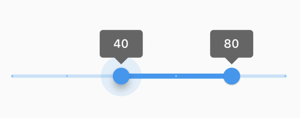 |
| 52 | /// |
| 53 | /// This range values are in intervals of 20 because the Range Slider has 5 |
| 54 | /// divisions, from 0 to 100. This means are values are split between 0, 20, 40, |
| 55 | /// 60, 80, and 100. The range values are initialized with 40 and 80 in this demo. |
| 56 | /// |
| 57 | /// ** See code in examples/api/lib/material/range_slider/range_slider.0.dart ** |
| 58 | /// {@end-tool} |
| 59 | /// |
| 60 | /// A range slider can be used to select from either a continuous or a discrete |
| 61 | /// set of values. The default is to use a continuous range of values from [min] |
| 62 | /// to [max]. To use discrete values, use a non-null value for [divisions], which |
| 63 | /// indicates the number of discrete intervals. For example, if [min] is 0.0 and |
| 64 | /// [max] is 50.0 and [divisions] is 5, then the slider can take on the |
| 65 | /// discrete values 0.0, 10.0, 20.0, 30.0, 40.0, and 50.0. |
| 66 | /// |
| 67 | /// The terms for the parts of a slider are: |
| 68 | /// |
| 69 | /// * The "thumbs", which are the shapes that slide horizontally when the user |
| 70 | /// drags them to change the selected range. |
| 71 | /// * The "track", which is the horizontal line that the thumbs can be dragged |
| 72 | /// along. |
| 73 | /// * The "tick marks", which mark the discrete values of a discrete slider. |
| 74 | /// * The "overlay", which is a highlight that's drawn over a thumb in response |
| 75 | /// to a user tap-down gesture. |
| 76 | /// * The "value indicators", which are the shapes that pop up when the user |
| 77 | /// is dragging a thumb to show the value being selected. |
| 78 | /// * The "active" segment of the slider is the segment between the two thumbs. |
| 79 | /// * The "inactive" slider segments are the two track intervals outside of the |
| 80 | /// slider's thumbs. |
| 81 | /// |
| 82 | /// The range slider will be disabled if [onChanged] is null or if the range |
| 83 | /// given by [min]..[max] is empty (i.e. if [min] is equal to [max]). |
| 84 | /// |
| 85 | /// The range slider widget itself does not maintain any state. Instead, when |
| 86 | /// the state of the slider changes, the widget calls the [onChanged] callback. |
| 87 | /// Most widgets that use a range slider will listen for the [onChanged] callback |
| 88 | /// and rebuild the slider with new [values] to update the visual appearance of |
| 89 | /// the slider. To know when the value starts to change, or when it is done |
| 90 | /// changing, set the optional callbacks [onChangeStart] and/or [onChangeEnd]. |
| 91 | /// |
| 92 | /// By default, a slider will be as wide as possible, centered vertically. When |
| 93 | /// given unbounded constraints, it will attempt to make the track 144 pixels |
| 94 | /// wide (including margins on each side) and will shrink-wrap vertically. |
| 95 | /// |
| 96 | /// Requires one of its ancestors to be a [Material] widget. This is typically |
| 97 | /// provided by a [Scaffold] widget. |
| 98 | /// |
| 99 | /// Requires one of its ancestors to be a [MediaQuery] widget. Typically, a |
| 100 | /// [MediaQuery] widget is introduced by the [MaterialApp] or [WidgetsApp] |
| 101 | /// widget at the top of your application widget tree. |
| 102 | /// |
| 103 | /// To determine how it should be displayed (e.g. colors, thumb shape, etc.), |
| 104 | /// a slider uses the [SliderThemeData] available from either a [SliderTheme] |
| 105 | /// widget, or the [ThemeData.sliderTheme] inside a [Theme] widget above it in |
| 106 | /// the widget tree. You can also override some of the colors with the |
| 107 | /// [activeColor] and [inactiveColor] properties, although more fine-grained |
| 108 | /// control of the colors, and other visual properties is achieved using a |
| 109 | /// [SliderThemeData]. |
| 110 | /// |
| 111 | /// See also: |
| 112 | /// |
| 113 | /// * [SliderTheme] and [SliderThemeData] for information about controlling |
| 114 | /// the visual appearance of the slider. |
| 115 | /// * [Slider], for a single-valued slider. |
| 116 | /// * [Radio], for selecting among a set of explicit values. |
| 117 | /// * [Checkbox] and [Switch], for toggling a particular value on or off. |
| 118 | /// * <https://material.io/design/components/sliders.html> |
| 119 | /// * [MediaQuery], from which the text scale factor is obtained. |
| 120 | class RangeSlider extends StatefulWidget { |
| 121 | /// Creates a Material Design range slider. |
| 122 | /// |
| 123 | /// The range slider widget itself does not maintain any state. Instead, when |
| 124 | /// the state of the slider changes, the widget calls the [onChanged] |
| 125 | /// callback. Most widgets that use a range slider will listen for the |
| 126 | /// [onChanged] callback and rebuild the slider with new [values] to update |
| 127 | /// the visual appearance of the slider. To know when the value starts to |
| 128 | /// change, or when it is done changing, set the optional callbacks |
| 129 | /// [onChangeStart] and/or [onChangeEnd]. |
| 130 | /// |
| 131 | /// * [values], which determines currently selected values for this range |
| 132 | /// slider. |
| 133 | /// * [onChanged], which is called while the user is selecting a new value for |
| 134 | /// the range slider. |
| 135 | /// * [onChangeStart], which is called when the user starts to select a new |
| 136 | /// value for the range slider. |
| 137 | /// * [onChangeEnd], which is called when the user is done selecting a new |
| 138 | /// value for the range slider. |
| 139 | /// |
| 140 | /// You can override some of the colors with the [activeColor] and |
| 141 | /// [inactiveColor] properties, although more fine-grained control of the |
| 142 | /// appearance is achieved using a [SliderThemeData]. |
| 143 | /// |
| 144 | /// The [min] must be less than or equal to the [max]. |
| 145 | /// |
| 146 | /// The [RangeValues.start] attribute of the [values] parameter must be less |
| 147 | /// than or equal to its [RangeValues.end] attribute. The [RangeValues.start] |
| 148 | /// and [RangeValues.end] attributes of the [values] parameter must be greater |
| 149 | /// than or equal to the [min] parameter and less than or equal to the [max] |
| 150 | /// parameter. |
| 151 | /// |
| 152 | /// The [divisions] parameter must be null or greater than zero. |
| 153 | RangeSlider({ |
| 154 | super.key, |
| 155 | required this.values, |
| 156 | required this.onChanged, |
| 157 | this.onChangeStart, |
| 158 | this.onChangeEnd, |
| 159 | this.min = 0.0, |
| 160 | this.max = 1.0, |
| 161 | this.divisions, |
| 162 | this.labels, |
| 163 | this.activeColor, |
| 164 | this.inactiveColor, |
| 165 | this.overlayColor, |
| 166 | this.mouseCursor, |
| 167 | this.semanticFormatterCallback, |
| 168 | }) : assert(min <= max), |
| 169 | assert(values.start <= values.end), |
| 170 | assert(values.start >= min && values.start <= max), |
| 171 | assert(values.end >= min && values.end <= max), |
| 172 | assert(divisions == null || divisions > 0); |
| 173 | |
| 174 | /// The currently selected values for this range slider. |
| 175 | /// |
| 176 | /// The slider's thumbs are drawn at horizontal positions that corresponds to |
| 177 | /// these values. |
| 178 | final RangeValues values; |
| 179 | |
| 180 | /// Called when the user is selecting a new value for the slider by dragging. |
| 181 | /// |
| 182 | /// The slider passes the new values to the callback but does not actually |
| 183 | /// change state until the parent widget rebuilds the slider with the new |
| 184 | /// values. |
| 185 | /// |
| 186 | /// If null, the slider will be displayed as disabled. |
| 187 | /// |
| 188 | /// The callback provided to [onChanged] should update the state of the parent |
| 189 | /// [StatefulWidget] using the [State.setState] method, so that the parent |
| 190 | /// gets rebuilt; for example: |
| 191 | /// |
| 192 | /// {@tool snippet} |
| 193 | /// |
| 194 | /// ```dart |
| 195 | /// RangeSlider( |
| 196 | /// values: _rangeValues, |
| 197 | /// min: 1.0, |
| 198 | /// max: 10.0, |
| 199 | /// onChanged: (RangeValues newValues) { |
| 200 | /// setState(() { |
| 201 | /// _rangeValues = newValues; |
| 202 | /// }); |
| 203 | /// }, |
| 204 | /// ) |
| 205 | /// ``` |
| 206 | /// {@end-tool} |
| 207 | /// |
| 208 | /// See also: |
| 209 | /// |
| 210 | /// * [onChangeStart], which is called when the user starts changing the |
| 211 | /// values. |
| 212 | /// * [onChangeEnd], which is called when the user stops changing the values. |
| 213 | final ValueChanged<RangeValues>? onChanged; |
| 214 | |
| 215 | /// Called when the user starts selecting new values for the slider. |
| 216 | /// |
| 217 | /// This callback shouldn't be used to update the slider [values] (use |
| 218 | /// [onChanged] for that). Rather, it should be used to be notified when the |
| 219 | /// user has started selecting a new value by starting a drag or with a tap. |
| 220 | /// |
| 221 | /// The values passed will be the last [values] that the slider had before the |
| 222 | /// change began. |
| 223 | /// |
| 224 | /// {@tool snippet} |
| 225 | /// |
| 226 | /// ```dart |
| 227 | /// RangeSlider( |
| 228 | /// values: _rangeValues, |
| 229 | /// min: 1.0, |
| 230 | /// max: 10.0, |
| 231 | /// onChanged: (RangeValues newValues) { |
| 232 | /// setState(() { |
| 233 | /// _rangeValues = newValues; |
| 234 | /// }); |
| 235 | /// }, |
| 236 | /// onChangeStart: (RangeValues startValues) { |
| 237 | /// print('Started change at $startValues'); |
| 238 | /// }, |
| 239 | /// ) |
| 240 | /// ``` |
| 241 | /// {@end-tool} |
| 242 | /// |
| 243 | /// See also: |
| 244 | /// |
| 245 | /// * [onChangeEnd] for a callback that is called when the value change is |
| 246 | /// complete. |
| 247 | final ValueChanged<RangeValues>? onChangeStart; |
| 248 | |
| 249 | /// Called when the user is done selecting new values for the slider. |
| 250 | /// |
| 251 | /// This differs from [onChanged] because it is only called once at the end |
| 252 | /// of the interaction, while [onChanged] is called as the value is getting |
| 253 | /// updated within the interaction. |
| 254 | /// |
| 255 | /// This callback shouldn't be used to update the slider [values] (use |
| 256 | /// [onChanged] for that). Rather, it should be used to know when the user has |
| 257 | /// completed selecting a new [values] by ending a drag or a click. |
| 258 | /// |
| 259 | /// {@tool snippet} |
| 260 | /// |
| 261 | /// ```dart |
| 262 | /// RangeSlider( |
| 263 | /// values: _rangeValues, |
| 264 | /// min: 1.0, |
| 265 | /// max: 10.0, |
| 266 | /// onChanged: (RangeValues newValues) { |
| 267 | /// setState(() { |
| 268 | /// _rangeValues = newValues; |
| 269 | /// }); |
| 270 | /// }, |
| 271 | /// onChangeEnd: (RangeValues endValues) { |
| 272 | /// print('Ended change at $endValues'); |
| 273 | /// }, |
| 274 | /// ) |
| 275 | /// ``` |
| 276 | /// {@end-tool} |
| 277 | /// |
| 278 | /// See also: |
| 279 | /// |
| 280 | /// * [onChangeStart] for a callback that is called when a value change |
| 281 | /// begins. |
| 282 | final ValueChanged<RangeValues>? onChangeEnd; |
| 283 | |
| 284 | /// The minimum value the user can select. |
| 285 | /// |
| 286 | /// Defaults to 0.0. Must be less than or equal to [max]. |
| 287 | /// |
| 288 | /// If the [max] is equal to the [min], then the slider is disabled. |
| 289 | final double min; |
| 290 | |
| 291 | /// The maximum value the user can select. |
| 292 | /// |
| 293 | /// Defaults to 1.0. Must be greater than or equal to [min]. |
| 294 | /// |
| 295 | /// If the [max] is equal to the [min], then the slider is disabled. |
| 296 | final double max; |
| 297 | |
| 298 | /// The number of discrete divisions. |
| 299 | /// |
| 300 | /// Typically used with [labels] to show the current discrete values. |
| 301 | /// |
| 302 | /// If null, the slider is continuous. |
| 303 | final int? divisions; |
| 304 | |
| 305 | /// Labels to show as text in the [SliderThemeData.rangeValueIndicatorShape] |
| 306 | /// when the slider is active and [SliderThemeData.showValueIndicator] |
| 307 | /// is satisfied. |
| 308 | /// |
| 309 | /// There are two labels: one for the start thumb and one for the end thumb. |
| 310 | /// |
| 311 | /// Each label is rendered using the active [ThemeData]'s |
| 312 | /// [TextTheme.bodyLarge] text style, with the theme data's |
| 313 | /// [ColorScheme.onPrimary] color. The label's text style can be overridden |
| 314 | /// with [SliderThemeData.valueIndicatorTextStyle]. |
| 315 | /// |
| 316 | /// If null, then the value indicator will not be displayed. |
| 317 | /// |
| 318 | /// See also: |
| 319 | /// |
| 320 | /// * [RangeSliderValueIndicatorShape] for how to create a custom value |
| 321 | /// indicator shape. |
| 322 | final RangeLabels? labels; |
| 323 | |
| 324 | /// The color of the track's active segment, i.e. the span of track between |
| 325 | /// the thumbs. |
| 326 | /// |
| 327 | /// Defaults to [ColorScheme.primary]. |
| 328 | /// |
| 329 | /// Using a [SliderTheme] gives more fine-grained control over the |
| 330 | /// appearance of various components of the slider. |
| 331 | final Color? activeColor; |
| 332 | |
| 333 | /// The color of the track's inactive segments, i.e. the span of tracks |
| 334 | /// between the min and the start thumb, and the end thumb and the max. |
| 335 | /// |
| 336 | /// Defaults to [ColorScheme.primary] with 24% opacity. |
| 337 | /// |
| 338 | /// Using a [SliderTheme] gives more fine-grained control over the |
| 339 | /// appearance of various components of the slider. |
| 340 | final Color? inactiveColor; |
| 341 | |
| 342 | /// The highlight color that's typically used to indicate that |
| 343 | /// the range slider thumb is hovered or dragged. |
| 344 | /// |
| 345 | /// If this property is null, [RangeSlider] will use [activeColor] with |
| 346 | /// an opacity of 0.12. If null, [SliderThemeData.overlayColor] |
| 347 | /// will be used, otherwise defaults to [ColorScheme.primary] with |
| 348 | /// an opacity of 0.12. |
| 349 | final MaterialStateProperty<Color?>? overlayColor; |
| 350 | |
| 351 | /// The cursor for a mouse pointer when it enters or is hovering over the |
| 352 | /// widget. |
| 353 | /// |
| 354 | /// If null, then the value of [SliderThemeData.mouseCursor] is used. If that |
| 355 | /// is also null, then [WidgetStateMouseCursor.clickable] is used. |
| 356 | /// |
| 357 | /// See also: |
| 358 | /// |
| 359 | /// * [WidgetStateMouseCursor], which can be used to create a [MouseCursor]. |
| 360 | final MaterialStateProperty<MouseCursor?>? mouseCursor; |
| 361 | |
| 362 | /// The callback used to create a semantic value from the slider's values. |
| 363 | /// |
| 364 | /// Defaults to formatting values as a percentage. |
| 365 | /// |
| 366 | /// This is used by accessibility frameworks like TalkBack on Android to |
| 367 | /// inform users what the currently selected value is with more context. |
| 368 | /// |
| 369 | /// {@tool snippet} |
| 370 | /// |
| 371 | /// In the example below, a slider for currency values is configured to |
| 372 | /// announce a value with a currency label. |
| 373 | /// |
| 374 | /// ```dart |
| 375 | /// RangeSlider( |
| 376 | /// values: _dollarsRange, |
| 377 | /// min: 20.0, |
| 378 | /// max: 330.0, |
| 379 | /// onChanged: (RangeValues newValues) { |
| 380 | /// setState(() { |
| 381 | /// _dollarsRange = newValues; |
| 382 | /// }); |
| 383 | /// }, |
| 384 | /// semanticFormatterCallback: (double newValue) { |
| 385 | /// return '${newValue.round()} dollars'; |
| 386 | /// } |
| 387 | /// ) |
| 388 | /// ``` |
| 389 | /// {@end-tool} |
| 390 | final SemanticFormatterCallback? semanticFormatterCallback; |
| 391 | |
| 392 | // Touch width for the tap boundary of the slider thumbs. |
| 393 | static const double _minTouchTargetWidth = kMinInteractiveDimension; |
| 394 | |
| 395 | @override |
| 396 | State<RangeSlider> createState() => _RangeSliderState(); |
| 397 | |
| 398 | @override |
| 399 | void debugFillProperties(DiagnosticPropertiesBuilder properties) { |
| 400 | super.debugFillProperties(properties); |
| 401 | properties.add(DoubleProperty('valueStart', values.start)); |
| 402 | properties.add(DoubleProperty('valueEnd', values.end)); |
| 403 | properties.add( |
| 404 | ObjectFlagProperty<ValueChanged<RangeValues>>('onChanged', onChanged, ifNull: 'disabled'), |
| 405 | ); |
| 406 | properties.add( |
| 407 | ObjectFlagProperty<ValueChanged<RangeValues>>.has('onChangeStart', onChangeStart), |
| 408 | ); |
| 409 | properties.add(ObjectFlagProperty<ValueChanged<RangeValues>>.has('onChangeEnd', onChangeEnd)); |
| 410 | properties.add(DoubleProperty('min', min)); |
| 411 | properties.add(DoubleProperty('max', max)); |
| 412 | properties.add(IntProperty('divisions', divisions)); |
| 413 | properties.add(StringProperty('labelStart', labels?.start)); |
| 414 | properties.add(StringProperty('labelEnd', labels?.end)); |
| 415 | properties.add(ColorProperty('activeColor', activeColor)); |
| 416 | properties.add(ColorProperty('inactiveColor', inactiveColor)); |
| 417 | properties.add( |
| 418 | ObjectFlagProperty<ValueChanged<double>>.has( |
| 419 | 'semanticFormatterCallback', |
| 420 | semanticFormatterCallback, |
| 421 | ), |
| 422 | ); |
| 423 | } |
| 424 | } |
| 425 | |
| 426 | class _RangeSliderState extends State<RangeSlider> with TickerProviderStateMixin { |
| 427 | static const Duration enableAnimationDuration = Duration(milliseconds: 75); |
| 428 | static const Duration valueIndicatorAnimationDuration = Duration(milliseconds: 100); |
| 429 | |
| 430 | // Animation controller that is run when the overlay (a.k.a radial reaction) |
| 431 | // changes visibility in response to user interaction. |
| 432 | late AnimationController overlayController; |
| 433 | |
| 434 | // Animation controller that is run when the value indicators change visibility. |
| 435 | late AnimationController valueIndicatorController; |
| 436 | |
| 437 | // Animation controller that is run when enabling/disabling the slider. |
| 438 | late AnimationController enableController; |
| 439 | |
| 440 | // Animation controllers that are run when transitioning between one value |
| 441 | // and the next on a discrete slider. |
| 442 | late AnimationController startPositionController; |
| 443 | late AnimationController endPositionController; |
| 444 | Timer? interactionTimer; |
| 445 | // Value Indicator paint Animation that appears on the Overlay. |
| 446 | PaintRangeValueIndicator? paintTopValueIndicator; |
| 447 | PaintRangeValueIndicator? paintBottomValueIndicator; |
| 448 | |
| 449 | bool get _enabled => widget.onChanged != null; |
| 450 | |
| 451 | bool _dragging = false; |
| 452 | |
| 453 | bool _hovering = false; |
| 454 | void _handleHoverChanged(bool hovering) { |
| 455 | if (hovering != _hovering) { |
| 456 | setState(() { |
| 457 | _hovering = hovering; |
| 458 | }); |
| 459 | } |
| 460 | } |
| 461 | |
| 462 | @override |
| 463 | void initState() { |
| 464 | super.initState(); |
| 465 | overlayController = AnimationController(duration: kRadialReactionDuration, vsync: this); |
| 466 | valueIndicatorController = AnimationController( |
| 467 | duration: valueIndicatorAnimationDuration, |
| 468 | vsync: this, |
| 469 | ); |
| 470 | enableController = AnimationController( |
| 471 | duration: enableAnimationDuration, |
| 472 | vsync: this, |
| 473 | value: _enabled ? 1.0 : 0.0, |
| 474 | ); |
| 475 | startPositionController = AnimationController( |
| 476 | duration: Duration.zero, |
| 477 | vsync: this, |
| 478 | value: _unlerp(widget.values.start), |
| 479 | ); |
| 480 | endPositionController = AnimationController( |
| 481 | duration: Duration.zero, |
| 482 | vsync: this, |
| 483 | value: _unlerp(widget.values.end), |
| 484 | ); |
| 485 | } |
| 486 | |
| 487 | @override |
| 488 | void didUpdateWidget(RangeSlider oldWidget) { |
| 489 | super.didUpdateWidget(oldWidget); |
| 490 | if (oldWidget.onChanged == widget.onChanged) { |
| 491 | return; |
| 492 | } |
| 493 | final bool wasEnabled = oldWidget.onChanged != null; |
| 494 | final bool isEnabled = _enabled; |
| 495 | if (wasEnabled != isEnabled) { |
| 496 | if (isEnabled) { |
| 497 | enableController.forward(); |
| 498 | } else { |
| 499 | enableController.reverse(); |
| 500 | } |
| 501 | } |
| 502 | } |
| 503 | |
| 504 | @override |
| 505 | void dispose() { |
| 506 | interactionTimer?.cancel(); |
| 507 | overlayController.dispose(); |
| 508 | valueIndicatorController.dispose(); |
| 509 | enableController.dispose(); |
| 510 | startPositionController.dispose(); |
| 511 | endPositionController.dispose(); |
| 512 | overlayEntry?.remove(); |
| 513 | overlayEntry?.dispose(); |
| 514 | overlayEntry = null; |
| 515 | super.dispose(); |
| 516 | } |
| 517 | |
| 518 | void _handleChanged(RangeValues values) { |
| 519 | assert(_enabled); |
| 520 | final RangeValues lerpValues = _lerpRangeValues(values); |
| 521 | if (lerpValues != widget.values) { |
| 522 | widget.onChanged!(lerpValues); |
| 523 | } |
| 524 | } |
| 525 | |
| 526 | void _handleDragStart(RangeValues values) { |
| 527 | assert(widget.onChangeStart != null); |
| 528 | _dragging = true; |
| 529 | widget.onChangeStart!(_lerpRangeValues(values)); |
| 530 | } |
| 531 | |
| 532 | void _handleDragEnd(RangeValues values) { |
| 533 | assert(widget.onChangeEnd != null); |
| 534 | _dragging = false; |
| 535 | widget.onChangeEnd!(_lerpRangeValues(values)); |
| 536 | } |
| 537 | |
| 538 | // Returns a number between min and max, proportional to value, which must |
| 539 | // be between 0.0 and 1.0. |
| 540 | double _lerp(double value) => ui.lerpDouble(widget.min, widget.max, value)!; |
| 541 | |
| 542 | // Returns a new range value with the start and end lerped. |
| 543 | RangeValues _lerpRangeValues(RangeValues values) { |
| 544 | return RangeValues(_lerp(values.start), _lerp(values.end)); |
| 545 | } |
| 546 | |
| 547 | // Returns a number between 0.0 and 1.0, given a value between min and max. |
| 548 | double _unlerp(double value) { |
| 549 | assert(value <= widget.max); |
| 550 | assert(value >= widget.min); |
| 551 | return widget.max > widget.min ? (value - widget.min) / (widget.max - widget.min) : 0.0; |
| 552 | } |
| 553 | |
| 554 | // Returns a new range value with the start and end unlerped. |
| 555 | RangeValues _unlerpRangeValues(RangeValues values) { |
| 556 | return RangeValues(_unlerp(values.start), _unlerp(values.end)); |
| 557 | } |
| 558 | |
| 559 | // Finds closest thumb. If the thumbs are close to each other, no thumb is |
| 560 | // immediately selected while the drag displacement is zero. If the first |
| 561 | // non-zero displacement is negative, then the left thumb is selected, and if its |
| 562 | // positive, then the right thumb is selected. |
| 563 | Thumb? _defaultRangeThumbSelector( |
| 564 | TextDirection textDirection, |
| 565 | RangeValues values, |
| 566 | double tapValue, |
| 567 | Size thumbSize, |
| 568 | Size trackSize, |
| 569 | double dx, // The horizontal delta or displacement of the drag update. |
| 570 | ) { |
| 571 | final double touchRadius = math.max(thumbSize.width, RangeSlider._minTouchTargetWidth) / 2; |
| 572 | final bool inStartTouchTarget = (tapValue - values.start).abs() * trackSize.width < touchRadius; |
| 573 | final bool inEndTouchTarget = (tapValue - values.end).abs() * trackSize.width < touchRadius; |
| 574 | |
| 575 | // Use dx if the thumb touch targets overlap. If dx is 0 and the drag |
| 576 | // position is in both touch targets, no thumb is selected because it is |
| 577 | // ambiguous to which thumb should be selected. If the dx is non-zero, the |
| 578 | // thumb selection is determined by the direction of the dx. The left thumb |
| 579 | // is chosen for negative dx, and the right thumb is chosen for positive dx. |
| 580 | if (inStartTouchTarget && inEndTouchTarget) { |
| 581 | final (bool towardsStart, bool towardsEnd) = switch (textDirection) { |
| 582 | TextDirection.ltr => (dx < 0, dx > 0), |
| 583 | TextDirection.rtl => (dx > 0, dx < 0), |
| 584 | }; |
| 585 | if (towardsStart) { |
| 586 | return Thumb.start; |
| 587 | } |
| 588 | if (towardsEnd) { |
| 589 | return Thumb.end; |
| 590 | } |
| 591 | } else { |
| 592 | // Snap position on the track if its in the inactive range. |
| 593 | if (tapValue < values.start || inStartTouchTarget) { |
| 594 | return Thumb.start; |
| 595 | } |
| 596 | if (tapValue > values.end || inEndTouchTarget) { |
| 597 | return Thumb.end; |
| 598 | } |
| 599 | } |
| 600 | return null; |
| 601 | } |
| 602 | |
| 603 | @override |
| 604 | Widget build(BuildContext context) { |
| 605 | assert(debugCheckHasMaterial(context)); |
| 606 | assert(debugCheckHasMediaQuery(context)); |
| 607 | |
| 608 | final ThemeData theme = Theme.of(context); |
| 609 | SliderThemeData sliderTheme = SliderTheme.of(context); |
| 610 | |
| 611 | // If the widget has active or inactive colors specified, then we plug them |
| 612 | // in to the slider theme as best we can. If the developer wants more |
| 613 | // control than that, then they need to use a SliderTheme. The default |
| 614 | // colors come from the ThemeData.colorScheme. These colors, along with |
| 615 | // the default shapes and text styles are aligned to the Material |
| 616 | // Guidelines. |
| 617 | |
| 618 | const double defaultTrackHeight = 4; |
| 619 | const RangeSliderTrackShape defaultTrackShape = RoundedRectRangeSliderTrackShape(); |
| 620 | const RangeSliderTickMarkShape defaultTickMarkShape = RoundRangeSliderTickMarkShape(); |
| 621 | const SliderComponentShape defaultOverlayShape = RoundSliderOverlayShape(); |
| 622 | const RangeSliderThumbShape defaultThumbShape = RoundRangeSliderThumbShape(); |
| 623 | const RangeSliderValueIndicatorShape defaultValueIndicatorShape = |
| 624 | RectangularRangeSliderValueIndicatorShape(); |
| 625 | const ShowValueIndicator defaultShowValueIndicator = ShowValueIndicator.onlyForDiscrete; |
| 626 | const double defaultMinThumbSeparation = 8; |
| 627 | |
| 628 | final Set<MaterialState> states = <MaterialState>{ |
| 629 | if (!_enabled) MaterialState.disabled, |
| 630 | if (_hovering) MaterialState.hovered, |
| 631 | if (_dragging) MaterialState.dragged, |
| 632 | }; |
| 633 | |
| 634 | // The value indicator's color is not the same as the thumb and active track |
| 635 | // (which can be defined by activeColor) if the |
| 636 | // RectangularSliderValueIndicatorShape is used. In all other cases, the |
| 637 | // value indicator is assumed to be the same as the active color. |
| 638 | final RangeSliderValueIndicatorShape valueIndicatorShape = |
| 639 | sliderTheme.rangeValueIndicatorShape ?? defaultValueIndicatorShape; |
| 640 | final Color valueIndicatorColor; |
| 641 | if (valueIndicatorShape is RectangularRangeSliderValueIndicatorShape) { |
| 642 | valueIndicatorColor = |
| 643 | sliderTheme.valueIndicatorColor ?? |
| 644 | Color.alphaBlend( |
| 645 | theme.colorScheme.onSurface.withOpacity(0.60), |
| 646 | theme.colorScheme.surface.withOpacity(0.90), |
| 647 | ); |
| 648 | } else { |
| 649 | valueIndicatorColor = |
| 650 | widget.activeColor ?? sliderTheme.valueIndicatorColor ?? theme.colorScheme.primary; |
| 651 | } |
| 652 | |
| 653 | Color? effectiveOverlayColor() { |
| 654 | return widget.overlayColor?.resolve(states) ?? |
| 655 | widget.activeColor?.withOpacity(0.12) ?? |
| 656 | MaterialStateProperty.resolveAs<Color?>(sliderTheme.overlayColor, states) ?? |
| 657 | theme.colorScheme.primary.withOpacity(0.12); |
| 658 | } |
| 659 | |
| 660 | sliderTheme = sliderTheme.copyWith( |
| 661 | trackHeight: sliderTheme.trackHeight ?? defaultTrackHeight, |
| 662 | activeTrackColor: |
| 663 | widget.activeColor ?? sliderTheme.activeTrackColor ?? theme.colorScheme.primary, |
| 664 | inactiveTrackColor: |
| 665 | widget.inactiveColor ?? |
| 666 | sliderTheme.inactiveTrackColor ?? |
| 667 | theme.colorScheme.primary.withOpacity(0.24), |
| 668 | disabledActiveTrackColor: |
| 669 | sliderTheme.disabledActiveTrackColor ?? theme.colorScheme.onSurface.withOpacity(0.32), |
| 670 | disabledInactiveTrackColor: |
| 671 | sliderTheme.disabledInactiveTrackColor ?? theme.colorScheme.onSurface.withOpacity(0.12), |
| 672 | activeTickMarkColor: |
| 673 | widget.inactiveColor ?? |
| 674 | sliderTheme.activeTickMarkColor ?? |
| 675 | theme.colorScheme.onPrimary.withOpacity(0.54), |
| 676 | inactiveTickMarkColor: |
| 677 | widget.activeColor ?? |
| 678 | sliderTheme.inactiveTickMarkColor ?? |
| 679 | theme.colorScheme.primary.withOpacity(0.54), |
| 680 | disabledActiveTickMarkColor: |
| 681 | sliderTheme.disabledActiveTickMarkColor ?? theme.colorScheme.onPrimary.withOpacity(0.12), |
| 682 | disabledInactiveTickMarkColor: |
| 683 | sliderTheme.disabledInactiveTickMarkColor ?? |
| 684 | theme.colorScheme.onSurface.withOpacity(0.12), |
| 685 | thumbColor: widget.activeColor ?? sliderTheme.thumbColor ?? theme.colorScheme.primary, |
| 686 | overlappingShapeStrokeColor: |
| 687 | sliderTheme.overlappingShapeStrokeColor ?? theme.colorScheme.surface, |
| 688 | disabledThumbColor: |
| 689 | sliderTheme.disabledThumbColor ?? |
| 690 | Color.alphaBlend(theme.colorScheme.onSurface.withOpacity(.38), theme.colorScheme.surface), |
| 691 | overlayColor: effectiveOverlayColor(), |
| 692 | valueIndicatorColor: valueIndicatorColor, |
| 693 | rangeTrackShape: sliderTheme.rangeTrackShape ?? defaultTrackShape, |
| 694 | rangeTickMarkShape: sliderTheme.rangeTickMarkShape ?? defaultTickMarkShape, |
| 695 | rangeThumbShape: sliderTheme.rangeThumbShape ?? defaultThumbShape, |
| 696 | overlayShape: sliderTheme.overlayShape ?? defaultOverlayShape, |
| 697 | rangeValueIndicatorShape: valueIndicatorShape, |
| 698 | showValueIndicator: sliderTheme.showValueIndicator ?? defaultShowValueIndicator, |
| 699 | valueIndicatorTextStyle: |
| 700 | sliderTheme.valueIndicatorTextStyle ?? |
| 701 | theme.textTheme.bodyLarge!.copyWith(color: theme.colorScheme.onPrimary), |
| 702 | minThumbSeparation: sliderTheme.minThumbSeparation ?? defaultMinThumbSeparation, |
| 703 | thumbSelector: sliderTheme.thumbSelector ?? _defaultRangeThumbSelector, |
| 704 | ); |
| 705 | final MouseCursor effectiveMouseCursor = |
| 706 | widget.mouseCursor?.resolve(states) ?? |
| 707 | sliderTheme.mouseCursor?.resolve(states) ?? |
| 708 | MaterialStateMouseCursor.clickable.resolve(states); |
| 709 | |
| 710 | // This size is used as the max bounds for the painting of the value |
| 711 | // indicators. It must be kept in sync with the function with the same name |
| 712 | // in slider.dart. |
| 713 | Size screenSize() => MediaQuery.sizeOf(context); |
| 714 | |
| 715 | final double fontSize = sliderTheme.valueIndicatorTextStyle?.fontSize ?? kDefaultFontSize; |
| 716 | final double fontSizeToScale = fontSize == 0.0 ? kDefaultFontSize : fontSize; |
| 717 | final double effectiveTextScale = |
| 718 | MediaQuery.textScalerOf(context).scale(fontSizeToScale) / fontSizeToScale; |
| 719 | |
| 720 | return FocusableActionDetector( |
| 721 | enabled: _enabled, |
| 722 | onShowHoverHighlight: _handleHoverChanged, |
| 723 | includeFocusSemantics: false, |
| 724 | mouseCursor: effectiveMouseCursor, |
| 725 | child: CompositedTransformTarget( |
| 726 | link: _layerLink, |
| 727 | child: _RangeSliderRenderObjectWidget( |
| 728 | values: _unlerpRangeValues(widget.values), |
| 729 | divisions: widget.divisions, |
| 730 | labels: widget.labels, |
| 731 | sliderTheme: sliderTheme, |
| 732 | textScaleFactor: effectiveTextScale, |
| 733 | screenSize: screenSize(), |
| 734 | onChanged: _enabled && (widget.max > widget.min) ? _handleChanged : null, |
| 735 | onChangeStart: widget.onChangeStart != null ? _handleDragStart : null, |
| 736 | onChangeEnd: widget.onChangeEnd != null ? _handleDragEnd : null, |
| 737 | state: this, |
| 738 | semanticFormatterCallback: widget.semanticFormatterCallback, |
| 739 | hovering: _hovering, |
| 740 | ), |
| 741 | ), |
| 742 | ); |
| 743 | } |
| 744 | |
| 745 | final LayerLink _layerLink = LayerLink(); |
| 746 | |
| 747 | OverlayEntry? overlayEntry; |
| 748 | |
| 749 | void showValueIndicator() { |
| 750 | if (overlayEntry == null) { |
| 751 | overlayEntry = OverlayEntry( |
| 752 | builder: (BuildContext context) { |
| 753 | return CompositedTransformFollower( |
| 754 | link: _layerLink, |
| 755 | child: _ValueIndicatorRenderObjectWidget(state: this), |
| 756 | ); |
| 757 | }, |
| 758 | ); |
| 759 | Overlay.of(context, debugRequiredFor: widget).insert(overlayEntry!); |
| 760 | } |
| 761 | } |
| 762 | } |
| 763 | |
| 764 | class _RangeSliderRenderObjectWidget extends LeafRenderObjectWidget { |
| 765 | const _RangeSliderRenderObjectWidget({ |
| 766 | required this.values, |
| 767 | required this.divisions, |
| 768 | required this.labels, |
| 769 | required this.sliderTheme, |
| 770 | required this.textScaleFactor, |
| 771 | required this.screenSize, |
| 772 | required this.onChanged, |
| 773 | required this.onChangeStart, |
| 774 | required this.onChangeEnd, |
| 775 | required this.state, |
| 776 | required this.semanticFormatterCallback, |
| 777 | required this.hovering, |
| 778 | }); |
| 779 | |
| 780 | final RangeValues values; |
| 781 | final int? divisions; |
| 782 | final RangeLabels? labels; |
| 783 | final SliderThemeData sliderTheme; |
| 784 | final double textScaleFactor; |
| 785 | final Size screenSize; |
| 786 | final ValueChanged<RangeValues>? onChanged; |
| 787 | final ValueChanged<RangeValues>? onChangeStart; |
| 788 | final ValueChanged<RangeValues>? onChangeEnd; |
| 789 | final SemanticFormatterCallback? semanticFormatterCallback; |
| 790 | final _RangeSliderState state; |
| 791 | final bool hovering; |
| 792 | |
| 793 | @override |
| 794 | _RenderRangeSlider createRenderObject(BuildContext context) { |
| 795 | return _RenderRangeSlider( |
| 796 | values: values, |
| 797 | divisions: divisions, |
| 798 | labels: labels, |
| 799 | sliderTheme: sliderTheme, |
| 800 | theme: Theme.of(context), |
| 801 | textScaleFactor: textScaleFactor, |
| 802 | screenSize: screenSize, |
| 803 | onChanged: onChanged, |
| 804 | onChangeStart: onChangeStart, |
| 805 | onChangeEnd: onChangeEnd, |
| 806 | state: state, |
| 807 | textDirection: Directionality.of(context), |
| 808 | semanticFormatterCallback: semanticFormatterCallback, |
| 809 | platform: Theme.of(context).platform, |
| 810 | hovering: hovering, |
| 811 | gestureSettings: MediaQuery.gestureSettingsOf(context), |
| 812 | ); |
| 813 | } |
| 814 | |
| 815 | @override |
| 816 | void updateRenderObject(BuildContext context, _RenderRangeSlider renderObject) { |
| 817 | renderObject |
| 818 | // We should update the `divisions` ahead of `values`, because the `values` |
| 819 | // setter dependent on the `divisions`. |
| 820 | ..divisions = divisions |
| 821 | ..values = values |
| 822 | ..labels = labels |
| 823 | ..sliderTheme = sliderTheme |
| 824 | ..theme = Theme.of(context) |
| 825 | ..textScaleFactor = textScaleFactor |
| 826 | ..screenSize = screenSize |
| 827 | ..onChanged = onChanged |
| 828 | ..onChangeStart = onChangeStart |
| 829 | ..onChangeEnd = onChangeEnd |
| 830 | ..textDirection = Directionality.of(context) |
| 831 | ..semanticFormatterCallback = semanticFormatterCallback |
| 832 | ..platform = Theme.of(context).platform |
| 833 | ..hovering = hovering |
| 834 | ..gestureSettings = MediaQuery.gestureSettingsOf(context); |
| 835 | } |
| 836 | } |
| 837 | |
| 838 | class _RenderRangeSlider extends RenderBox with RelayoutWhenSystemFontsChangeMixin { |
| 839 | _RenderRangeSlider({ |
| 840 | required RangeValues values, |
| 841 | required int? divisions, |
| 842 | required RangeLabels? labels, |
| 843 | required SliderThemeData sliderTheme, |
| 844 | required ThemeData? theme, |
| 845 | required double textScaleFactor, |
| 846 | required Size screenSize, |
| 847 | required TargetPlatform platform, |
| 848 | required ValueChanged<RangeValues>? onChanged, |
| 849 | required SemanticFormatterCallback? semanticFormatterCallback, |
| 850 | required this.onChangeStart, |
| 851 | required this.onChangeEnd, |
| 852 | required _RangeSliderState state, |
| 853 | required TextDirection textDirection, |
| 854 | required bool hovering, |
| 855 | required DeviceGestureSettings gestureSettings, |
| 856 | }) : assert(values.start >= 0.0 && values.start <= 1.0), |
| 857 | assert(values.end >= 0.0 && values.end <= 1.0), |
| 858 | _platform = platform, |
| 859 | _semanticFormatterCallback = semanticFormatterCallback, |
| 860 | _labels = labels, |
| 861 | _values = values, |
| 862 | _divisions = divisions, |
| 863 | _sliderTheme = sliderTheme, |
| 864 | _theme = theme, |
| 865 | _textScaleFactor = textScaleFactor, |
| 866 | _screenSize = screenSize, |
| 867 | _onChanged = onChanged, |
| 868 | _state = state, |
| 869 | _textDirection = textDirection, |
| 870 | _hovering = hovering { |
| 871 | _updateLabelPainters(); |
| 872 | final GestureArenaTeam team = GestureArenaTeam(); |
| 873 | _drag = |
| 874 | HorizontalDragGestureRecognizer() |
| 875 | ..team = team |
| 876 | ..onStart = _handleDragStart |
| 877 | ..onUpdate = _handleDragUpdate |
| 878 | ..onEnd = _handleDragEnd |
| 879 | ..onCancel = _handleDragCancel |
| 880 | ..gestureSettings = gestureSettings; |
| 881 | _tap = |
| 882 | TapGestureRecognizer() |
| 883 | ..team = team |
| 884 | ..onTapDown = _handleTapDown |
| 885 | ..onTapUp = _handleTapUp |
| 886 | ..gestureSettings = gestureSettings; |
| 887 | _overlayAnimation = CurvedAnimation( |
| 888 | parent: _state.overlayController, |
| 889 | curve: Curves.fastOutSlowIn, |
| 890 | ); |
| 891 | _valueIndicatorAnimation = CurvedAnimation( |
| 892 | parent: _state.valueIndicatorController, |
| 893 | curve: Curves.fastOutSlowIn, |
| 894 | )..addStatusListener((AnimationStatus status) { |
| 895 | if (status.isDismissed) { |
| 896 | _state.overlayEntry?.remove(); |
| 897 | _state.overlayEntry?.dispose(); |
| 898 | _state.overlayEntry = null; |
| 899 | } |
| 900 | }); |
| 901 | _enableAnimation = CurvedAnimation(parent: _state.enableController, curve: Curves.easeInOut); |
| 902 | } |
| 903 | |
| 904 | // Keep track of the last selected thumb so they can be drawn in the |
| 905 | // right order. |
| 906 | Thumb? _lastThumbSelection; |
| 907 | |
| 908 | static const Duration _positionAnimationDuration = Duration(milliseconds: 75); |
| 909 | |
| 910 | // This value is the touch target, 48, multiplied by 3. |
| 911 | static const double _minPreferredTrackWidth = 144.0; |
| 912 | |
| 913 | // Compute the largest width and height needed to paint the slider shapes, |
| 914 | // other than the track shape. It is assumed that these shapes are vertically |
| 915 | // centered on the track. |
| 916 | double get _maxSliderPartWidth => |
| 917 | _sliderPartSizes.map((Size size) => size.width).reduce(math.max); |
| 918 | double get _maxSliderPartHeight => |
| 919 | _sliderPartSizes.map((Size size) => size.height).reduce(math.max); |
| 920 | List<Size> get _sliderPartSizes => <Size>[ |
| 921 | _sliderTheme.overlayShape!.getPreferredSize(isEnabled, isDiscrete), |
| 922 | _sliderTheme.rangeThumbShape!.getPreferredSize(isEnabled, isDiscrete), |
| 923 | _sliderTheme.rangeTickMarkShape!.getPreferredSize( |
| 924 | isEnabled: isEnabled, |
| 925 | sliderTheme: sliderTheme, |
| 926 | ), |
| 927 | ]; |
| 928 | double? get _minPreferredTrackHeight => _sliderTheme.trackHeight; |
| 929 | |
| 930 | // This rect is used in gesture calculations, where the gesture coordinates |
| 931 | // are relative to the sliders origin. Therefore, the offset is passed as |
| 932 | // (0,0). |
| 933 | Rect get _trackRect => _sliderTheme.rangeTrackShape!.getPreferredRect( |
| 934 | parentBox: this, |
| 935 | sliderTheme: _sliderTheme, |
| 936 | isDiscrete: false, |
| 937 | ); |
| 938 | |
| 939 | static const Duration _minimumInteractionTime = Duration(milliseconds: 500); |
| 940 | |
| 941 | final _RangeSliderState _state; |
| 942 | late CurvedAnimation _overlayAnimation; |
| 943 | late CurvedAnimation _valueIndicatorAnimation; |
| 944 | late CurvedAnimation _enableAnimation; |
| 945 | final TextPainter _startLabelPainter = TextPainter(); |
| 946 | final TextPainter _endLabelPainter = TextPainter(); |
| 947 | late HorizontalDragGestureRecognizer _drag; |
| 948 | late TapGestureRecognizer _tap; |
| 949 | bool _active = false; |
| 950 | late RangeValues _newValues; |
| 951 | Offset _startThumbCenter = Offset.zero; |
| 952 | Offset _endThumbCenter = Offset.zero; |
| 953 | Rect? overlayStartRect; |
| 954 | Rect? overlayEndRect; |
| 955 | |
| 956 | bool get isEnabled => onChanged != null; |
| 957 | |
| 958 | bool get isDiscrete => divisions != null && divisions! > 0; |
| 959 | |
| 960 | double get _minThumbSeparationValue => |
| 961 | isDiscrete ? 0 : sliderTheme.minThumbSeparation! / _trackRect.width; |
| 962 | |
| 963 | RangeValues get values => _values; |
| 964 | RangeValues _values; |
| 965 | set values(RangeValues newValues) { |
| 966 | assert(newValues.start >= 0.0 && newValues.start <= 1.0); |
| 967 | assert(newValues.end >= 0.0 && newValues.end <= 1.0); |
| 968 | assert(newValues.start <= newValues.end); |
| 969 | final RangeValues convertedValues = isDiscrete ? _discretizeRangeValues(newValues) : newValues; |
| 970 | if (convertedValues == _values) { |
| 971 | return; |
| 972 | } |
| 973 | _values = convertedValues; |
| 974 | if (isDiscrete) { |
| 975 | // Reset the duration to match the distance that we're traveling, so that |
| 976 | // whatever the distance, we still do it in _positionAnimationDuration, |
| 977 | // and if we get re-targeted in the middle, it still takes that long to |
| 978 | // get to the new location. |
| 979 | final double startDistance = (_values.start - _state.startPositionController.value).abs(); |
| 980 | _state.startPositionController.duration = |
| 981 | startDistance != 0.0 ? _positionAnimationDuration * (1.0 / startDistance) : Duration.zero; |
| 982 | _state.startPositionController.animateTo(_values.start, curve: Curves.easeInOut); |
| 983 | final double endDistance = (_values.end - _state.endPositionController.value).abs(); |
| 984 | _state.endPositionController.duration = |
| 985 | endDistance != 0.0 ? _positionAnimationDuration * (1.0 / endDistance) : Duration.zero; |
| 986 | _state.endPositionController.animateTo(_values.end, curve: Curves.easeInOut); |
| 987 | } else { |
| 988 | _state.startPositionController.value = convertedValues.start; |
| 989 | _state.endPositionController.value = convertedValues.end; |
| 990 | } |
| 991 | markNeedsSemanticsUpdate(); |
| 992 | } |
| 993 | |
| 994 | TargetPlatform _platform; |
| 995 | TargetPlatform get platform => _platform; |
| 996 | set platform(TargetPlatform value) { |
| 997 | if (_platform == value) { |
| 998 | return; |
| 999 | } |
| 1000 | _platform = value; |
| 1001 | markNeedsSemanticsUpdate(); |
| 1002 | } |
| 1003 | |
| 1004 | DeviceGestureSettings? get gestureSettings => _drag.gestureSettings; |
| 1005 | set gestureSettings(DeviceGestureSettings? gestureSettings) { |
| 1006 | _drag.gestureSettings = gestureSettings; |
| 1007 | _tap.gestureSettings = gestureSettings; |
| 1008 | } |
| 1009 | |
| 1010 | SemanticFormatterCallback? _semanticFormatterCallback; |
| 1011 | SemanticFormatterCallback? get semanticFormatterCallback => _semanticFormatterCallback; |
| 1012 | set semanticFormatterCallback(SemanticFormatterCallback? value) { |
| 1013 | if (_semanticFormatterCallback == value) { |
| 1014 | return; |
| 1015 | } |
| 1016 | _semanticFormatterCallback = value; |
| 1017 | markNeedsSemanticsUpdate(); |
| 1018 | } |
| 1019 | |
| 1020 | int? get divisions => _divisions; |
| 1021 | int? _divisions; |
| 1022 | set divisions(int? value) { |
| 1023 | if (value == _divisions) { |
| 1024 | return; |
| 1025 | } |
| 1026 | _divisions = value; |
| 1027 | markNeedsPaint(); |
| 1028 | } |
| 1029 | |
| 1030 | RangeLabels? get labels => _labels; |
| 1031 | RangeLabels? _labels; |
| 1032 | set labels(RangeLabels? labels) { |
| 1033 | if (labels == _labels) { |
| 1034 | return; |
| 1035 | } |
| 1036 | _labels = labels; |
| 1037 | _updateLabelPainters(); |
| 1038 | } |
| 1039 | |
| 1040 | SliderThemeData get sliderTheme => _sliderTheme; |
| 1041 | SliderThemeData _sliderTheme; |
| 1042 | set sliderTheme(SliderThemeData value) { |
| 1043 | if (value == _sliderTheme) { |
| 1044 | return; |
| 1045 | } |
| 1046 | _sliderTheme = value; |
| 1047 | markNeedsPaint(); |
| 1048 | } |
| 1049 | |
| 1050 | ThemeData? get theme => _theme; |
| 1051 | ThemeData? _theme; |
| 1052 | set theme(ThemeData? value) { |
| 1053 | if (value == _theme) { |
| 1054 | return; |
| 1055 | } |
| 1056 | _theme = value; |
| 1057 | markNeedsPaint(); |
| 1058 | } |
| 1059 | |
| 1060 | double get textScaleFactor => _textScaleFactor; |
| 1061 | double _textScaleFactor; |
| 1062 | set textScaleFactor(double value) { |
| 1063 | if (value == _textScaleFactor) { |
| 1064 | return; |
| 1065 | } |
| 1066 | _textScaleFactor = value; |
| 1067 | _updateLabelPainters(); |
| 1068 | } |
| 1069 | |
| 1070 | Size get screenSize => _screenSize; |
| 1071 | Size _screenSize; |
| 1072 | set screenSize(Size value) { |
| 1073 | if (value == screenSize) { |
| 1074 | return; |
| 1075 | } |
| 1076 | _screenSize = value; |
| 1077 | markNeedsPaint(); |
| 1078 | } |
| 1079 | |
| 1080 | ValueChanged<RangeValues>? get onChanged => _onChanged; |
| 1081 | ValueChanged<RangeValues>? _onChanged; |
| 1082 | set onChanged(ValueChanged<RangeValues>? value) { |
| 1083 | if (value == _onChanged) { |
| 1084 | return; |
| 1085 | } |
| 1086 | final bool wasEnabled = isEnabled; |
| 1087 | _onChanged = value; |
| 1088 | if (wasEnabled != isEnabled) { |
| 1089 | markNeedsPaint(); |
| 1090 | markNeedsSemanticsUpdate(); |
| 1091 | } |
| 1092 | } |
| 1093 | |
| 1094 | ValueChanged<RangeValues>? onChangeStart; |
| 1095 | ValueChanged<RangeValues>? onChangeEnd; |
| 1096 | |
| 1097 | TextDirection get textDirection => _textDirection; |
| 1098 | TextDirection _textDirection; |
| 1099 | set textDirection(TextDirection value) { |
| 1100 | if (value == _textDirection) { |
| 1101 | return; |
| 1102 | } |
| 1103 | _textDirection = value; |
| 1104 | _updateLabelPainters(); |
| 1105 | } |
| 1106 | |
| 1107 | /// True if this slider is being hovered over by a pointer. |
| 1108 | bool get hovering => _hovering; |
| 1109 | bool _hovering; |
| 1110 | set hovering(bool value) { |
| 1111 | if (value == _hovering) { |
| 1112 | return; |
| 1113 | } |
| 1114 | _hovering = value; |
| 1115 | _updateForHover(_hovering); |
| 1116 | } |
| 1117 | |
| 1118 | /// True if the slider is interactive and the start thumb is being |
| 1119 | /// hovered over by a pointer. |
| 1120 | bool _hoveringStartThumb = false; |
| 1121 | bool get hoveringStartThumb => _hoveringStartThumb; |
| 1122 | set hoveringStartThumb(bool value) { |
| 1123 | if (value == _hoveringStartThumb) { |
| 1124 | return; |
| 1125 | } |
| 1126 | _hoveringStartThumb = value; |
| 1127 | _updateForHover(_hovering); |
| 1128 | } |
| 1129 | |
| 1130 | /// True if the slider is interactive and the end thumb is being |
| 1131 | /// hovered over by a pointer. |
| 1132 | bool _hoveringEndThumb = false; |
| 1133 | bool get hoveringEndThumb => _hoveringEndThumb; |
| 1134 | set hoveringEndThumb(bool value) { |
| 1135 | if (value == _hoveringEndThumb) { |
| 1136 | return; |
| 1137 | } |
| 1138 | _hoveringEndThumb = value; |
| 1139 | _updateForHover(_hovering); |
| 1140 | } |
| 1141 | |
| 1142 | void _updateForHover(bool hovered) { |
| 1143 | // Only show overlay when pointer is hovering the thumb. |
| 1144 | if (hovered && (hoveringStartThumb || hoveringEndThumb)) { |
| 1145 | _state.overlayController.forward(); |
| 1146 | } else { |
| 1147 | _state.overlayController.reverse(); |
| 1148 | } |
| 1149 | } |
| 1150 | |
| 1151 | bool get showValueIndicator => switch (_sliderTheme.showValueIndicator!) { |
| 1152 | ShowValueIndicator.onlyForDiscrete => isDiscrete, |
| 1153 | ShowValueIndicator.onlyForContinuous => !isDiscrete, |
| 1154 | ShowValueIndicator.always => true, |
| 1155 | ShowValueIndicator.never => false, |
| 1156 | }; |
| 1157 | |
| 1158 | Size get _thumbSize => _sliderTheme.rangeThumbShape!.getPreferredSize(isEnabled, isDiscrete); |
| 1159 | |
| 1160 | double get _adjustmentUnit { |
| 1161 | switch (_platform) { |
| 1162 | case TargetPlatform.iOS: |
| 1163 | // Matches iOS implementation of material slider. |
| 1164 | return 0.1; |
| 1165 | case TargetPlatform.android: |
| 1166 | case TargetPlatform.fuchsia: |
| 1167 | case TargetPlatform.linux: |
| 1168 | case TargetPlatform.macOS: |
| 1169 | case TargetPlatform.windows: |
| 1170 | // Matches Android implementation of material slider. |
| 1171 | return 0.05; |
| 1172 | } |
| 1173 | } |
| 1174 | |
| 1175 | void _updateLabelPainters() { |
| 1176 | _updateLabelPainter(Thumb.start); |
| 1177 | _updateLabelPainter(Thumb.end); |
| 1178 | } |
| 1179 | |
| 1180 | void _updateLabelPainter(Thumb thumb) { |
| 1181 | final RangeLabels? labels = this.labels; |
| 1182 | if (labels == null) { |
| 1183 | return; |
| 1184 | } |
| 1185 | |
| 1186 | final (String text, TextPainter labelPainter) = switch (thumb) { |
| 1187 | Thumb.start => (labels.start, _startLabelPainter), |
| 1188 | Thumb.end => (labels.end, _endLabelPainter), |
| 1189 | }; |
| 1190 | |
| 1191 | labelPainter |
| 1192 | ..text = TextSpan(style: _sliderTheme.valueIndicatorTextStyle, text: text) |
| 1193 | ..textDirection = textDirection |
| 1194 | ..textScaleFactor = textScaleFactor |
| 1195 | ..layout(); |
| 1196 | // Changing the textDirection can result in the layout changing, because the |
| 1197 | // bidi algorithm might line up the glyphs differently which can result in |
| 1198 | // different ligatures, different shapes, etc. So we always markNeedsLayout. |
| 1199 | markNeedsLayout(); |
| 1200 | } |
| 1201 | |
| 1202 | @override |
| 1203 | void systemFontsDidChange() { |
| 1204 | super.systemFontsDidChange(); |
| 1205 | _startLabelPainter.markNeedsLayout(); |
| 1206 | _endLabelPainter.markNeedsLayout(); |
| 1207 | _updateLabelPainters(); |
| 1208 | } |
| 1209 | |
| 1210 | @override |
| 1211 | void attach(PipelineOwner owner) { |
| 1212 | super.attach(owner); |
| 1213 | _overlayAnimation.addListener(markNeedsPaint); |
| 1214 | _valueIndicatorAnimation.addListener(markNeedsPaint); |
| 1215 | _enableAnimation.addListener(markNeedsPaint); |
| 1216 | _state.startPositionController.addListener(markNeedsPaint); |
| 1217 | _state.endPositionController.addListener(markNeedsPaint); |
| 1218 | } |
| 1219 | |
| 1220 | @override |
| 1221 | void detach() { |
| 1222 | _overlayAnimation.removeListener(markNeedsPaint); |
| 1223 | _valueIndicatorAnimation.removeListener(markNeedsPaint); |
| 1224 | _enableAnimation.removeListener(markNeedsPaint); |
| 1225 | _state.startPositionController.removeListener(markNeedsPaint); |
| 1226 | _state.endPositionController.removeListener(markNeedsPaint); |
| 1227 | super.detach(); |
| 1228 | } |
| 1229 | |
| 1230 | @override |
| 1231 | void dispose() { |
| 1232 | _drag.dispose(); |
| 1233 | _tap.dispose(); |
| 1234 | _startLabelPainter.dispose(); |
| 1235 | _endLabelPainter.dispose(); |
| 1236 | _enableAnimation.dispose(); |
| 1237 | _valueIndicatorAnimation.dispose(); |
| 1238 | _overlayAnimation.dispose(); |
| 1239 | super.dispose(); |
| 1240 | } |
| 1241 | |
| 1242 | double _getValueFromVisualPosition(double visualPosition) { |
| 1243 | return switch (textDirection) { |
| 1244 | TextDirection.rtl => 1.0 - visualPosition, |
| 1245 | TextDirection.ltr => visualPosition, |
| 1246 | }; |
| 1247 | } |
| 1248 | |
| 1249 | double _getValueFromGlobalPosition(Offset globalPosition) { |
| 1250 | final double visualPosition = |
| 1251 | (globalToLocal(globalPosition).dx - _trackRect.left) / _trackRect.width; |
| 1252 | return _getValueFromVisualPosition(visualPosition); |
| 1253 | } |
| 1254 | |
| 1255 | double _discretize(double value) { |
| 1256 | double result = clampDouble(value, 0.0, 1.0); |
| 1257 | if (isDiscrete) { |
| 1258 | result = (result * divisions!).round() / divisions!; |
| 1259 | } |
| 1260 | return result; |
| 1261 | } |
| 1262 | |
| 1263 | RangeValues _discretizeRangeValues(RangeValues values) { |
| 1264 | return RangeValues(_discretize(values.start), _discretize(values.end)); |
| 1265 | } |
| 1266 | |
| 1267 | void _startInteraction(Offset globalPosition) { |
| 1268 | if (_active) { |
| 1269 | return; |
| 1270 | } |
| 1271 | |
| 1272 | _state.showValueIndicator(); |
| 1273 | final double tapValue = clampDouble(_getValueFromGlobalPosition(globalPosition), 0.0, 1.0); |
| 1274 | _lastThumbSelection = sliderTheme.thumbSelector!( |
| 1275 | textDirection, |
| 1276 | values, |
| 1277 | tapValue, |
| 1278 | _thumbSize, |
| 1279 | size, |
| 1280 | 0, |
| 1281 | ); |
| 1282 | |
| 1283 | if (_lastThumbSelection != null) { |
| 1284 | _active = true; |
| 1285 | // We supply the *current* values as the start locations, so that if we have |
| 1286 | // a tap, it consists of a call to onChangeStart with the previous value and |
| 1287 | // a call to onChangeEnd with the new value. |
| 1288 | final RangeValues currentValues = _discretizeRangeValues(values); |
| 1289 | _newValues = switch (_lastThumbSelection!) { |
| 1290 | Thumb.start => RangeValues(tapValue, currentValues.end), |
| 1291 | Thumb.end => RangeValues(currentValues.start, tapValue), |
| 1292 | }; |
| 1293 | _updateLabelPainter(_lastThumbSelection!); |
| 1294 | |
| 1295 | onChangeStart?.call(currentValues); |
| 1296 | |
| 1297 | onChanged!(_discretizeRangeValues(_newValues)); |
| 1298 | |
| 1299 | _state.overlayController.forward(); |
| 1300 | if (showValueIndicator) { |
| 1301 | _state.valueIndicatorController.forward(); |
| 1302 | _state.interactionTimer?.cancel(); |
| 1303 | _state.interactionTimer = Timer(_minimumInteractionTime * timeDilation, () { |
| 1304 | _state.interactionTimer = null; |
| 1305 | if (!_active && _state.valueIndicatorController.isCompleted) { |
| 1306 | _state.valueIndicatorController.reverse(); |
| 1307 | } |
| 1308 | }); |
| 1309 | } |
| 1310 | } |
| 1311 | } |
| 1312 | |
| 1313 | void _handleDragUpdate(DragUpdateDetails details) { |
| 1314 | if (!_state.mounted) { |
| 1315 | return; |
| 1316 | } |
| 1317 | |
| 1318 | final double dragValue = _getValueFromGlobalPosition(details.globalPosition); |
| 1319 | |
| 1320 | // If no selection has been made yet, test for thumb selection again now |
| 1321 | // that the value of dx can be non-zero. If this is the first selection of |
| 1322 | // the interaction, then onChangeStart must be called. |
| 1323 | bool shouldCallOnChangeStart = false; |
| 1324 | if (_lastThumbSelection == null) { |
| 1325 | _lastThumbSelection = sliderTheme.thumbSelector!( |
| 1326 | textDirection, |
| 1327 | values, |
| 1328 | dragValue, |
| 1329 | _thumbSize, |
| 1330 | size, |
| 1331 | details.delta.dx, |
| 1332 | ); |
| 1333 | if (_lastThumbSelection != null) { |
| 1334 | shouldCallOnChangeStart = true; |
| 1335 | _active = true; |
| 1336 | _state.overlayController.forward(); |
| 1337 | if (showValueIndicator) { |
| 1338 | _state.valueIndicatorController.forward(); |
| 1339 | } |
| 1340 | } |
| 1341 | } |
| 1342 | |
| 1343 | if (isEnabled && _lastThumbSelection != null) { |
| 1344 | final RangeValues currentValues = _discretizeRangeValues(values); |
| 1345 | if (onChangeStart != null && shouldCallOnChangeStart) { |
| 1346 | onChangeStart!(currentValues); |
| 1347 | } |
| 1348 | final double currentDragValue = _discretize(dragValue); |
| 1349 | |
| 1350 | _newValues = switch (_lastThumbSelection!) { |
| 1351 | Thumb.start => RangeValues( |
| 1352 | math.min(currentDragValue, currentValues.end - _minThumbSeparationValue), |
| 1353 | currentValues.end, |
| 1354 | ), |
| 1355 | Thumb.end => RangeValues( |
| 1356 | currentValues.start, |
| 1357 | math.max(currentDragValue, currentValues.start + _minThumbSeparationValue), |
| 1358 | ), |
| 1359 | }; |
| 1360 | onChanged!(_newValues); |
| 1361 | } |
| 1362 | } |
| 1363 | |
| 1364 | void _endInteraction() { |
| 1365 | if (!_state.mounted) { |
| 1366 | return; |
| 1367 | } |
| 1368 | |
| 1369 | if (showValueIndicator && _state.interactionTimer == null) { |
| 1370 | _state.valueIndicatorController.reverse(); |
| 1371 | } |
| 1372 | |
| 1373 | if (_active && _state.mounted && _lastThumbSelection != null) { |
| 1374 | final RangeValues discreteValues = _discretizeRangeValues(_newValues); |
| 1375 | onChangeEnd?.call(discreteValues); |
| 1376 | _active = false; |
| 1377 | } |
| 1378 | _state.overlayController.reverse(); |
| 1379 | } |
| 1380 | |
| 1381 | void _handleDragStart(DragStartDetails details) { |
| 1382 | _startInteraction(details.globalPosition); |
| 1383 | } |
| 1384 | |
| 1385 | void _handleDragEnd(DragEndDetails details) { |
| 1386 | _endInteraction(); |
| 1387 | } |
| 1388 | |
| 1389 | void _handleDragCancel() { |
| 1390 | _endInteraction(); |
| 1391 | } |
| 1392 | |
| 1393 | void _handleTapDown(TapDownDetails details) { |
| 1394 | _startInteraction(details.globalPosition); |
| 1395 | } |
| 1396 | |
| 1397 | void _handleTapUp(TapUpDetails details) { |
| 1398 | _endInteraction(); |
| 1399 | } |
| 1400 | |
| 1401 | @override |
| 1402 | bool hitTestSelf(Offset position) => true; |
| 1403 | |
| 1404 | @override |
| 1405 | void handleEvent(PointerEvent event, HitTestEntry entry) { |
| 1406 | assert(debugHandleEvent(event, entry)); |
| 1407 | if (event is PointerDownEvent && isEnabled) { |
| 1408 | // We need to add the drag first so that it has priority. |
| 1409 | _drag.addPointer(event); |
| 1410 | _tap.addPointer(event); |
| 1411 | } |
| 1412 | if (isEnabled) { |
| 1413 | if (overlayStartRect != null) { |
| 1414 | hoveringStartThumb = overlayStartRect!.contains(event.localPosition); |
| 1415 | } |
| 1416 | if (overlayEndRect != null) { |
| 1417 | hoveringEndThumb = overlayEndRect!.contains(event.localPosition); |
| 1418 | } |
| 1419 | } |
| 1420 | } |
| 1421 | |
| 1422 | @override |
| 1423 | double computeMinIntrinsicWidth(double height) => _minPreferredTrackWidth + _maxSliderPartWidth; |
| 1424 | |
| 1425 | @override |
| 1426 | double computeMaxIntrinsicWidth(double height) => _minPreferredTrackWidth + _maxSliderPartWidth; |
| 1427 | |
| 1428 | @override |
| 1429 | double computeMinIntrinsicHeight(double width) => |
| 1430 | math.max(_minPreferredTrackHeight!, _maxSliderPartHeight); |
| 1431 | |
| 1432 | @override |
| 1433 | double computeMaxIntrinsicHeight(double width) => |
| 1434 | math.max(_minPreferredTrackHeight!, _maxSliderPartHeight); |
| 1435 | |
| 1436 | @override |
| 1437 | bool get sizedByParent => true; |
| 1438 | |
| 1439 | @override |
| 1440 | Size computeDryLayout(BoxConstraints constraints) { |
| 1441 | return Size( |
| 1442 | constraints.hasBoundedWidth |
| 1443 | ? constraints.maxWidth |
| 1444 | : _minPreferredTrackWidth + _maxSliderPartWidth, |
| 1445 | constraints.hasBoundedHeight |
| 1446 | ? constraints.maxHeight |
| 1447 | : math.max(_minPreferredTrackHeight!, _maxSliderPartHeight), |
| 1448 | ); |
| 1449 | } |
| 1450 | |
| 1451 | @override |
| 1452 | void paint(PaintingContext context, Offset offset) { |
| 1453 | final double startValue = _state.startPositionController.value; |
| 1454 | final double endValue = _state.endPositionController.value; |
| 1455 | |
| 1456 | // The visual position is the position of the thumb from 0 to 1 from left |
| 1457 | // to right. In left to right, this is the same as the value, but it is |
| 1458 | // reversed for right to left text. |
| 1459 | final (double startVisualPosition, double endVisualPosition) = switch (textDirection) { |
| 1460 | TextDirection.rtl => (1.0 - startValue, 1.0 - endValue), |
| 1461 | TextDirection.ltr => (startValue, endValue), |
| 1462 | }; |
| 1463 | |
| 1464 | final Rect trackRect = _sliderTheme.rangeTrackShape!.getPreferredRect( |
| 1465 | parentBox: this, |
| 1466 | offset: offset, |
| 1467 | sliderTheme: _sliderTheme, |
| 1468 | isDiscrete: isDiscrete, |
| 1469 | ); |
| 1470 | final double padding = |
| 1471 | isDiscrete || _sliderTheme.rangeTrackShape!.isRounded ? trackRect.height : 0.0; |
| 1472 | final double thumbYOffset = trackRect.center.dy; |
| 1473 | final double startThumbPosition = |
| 1474 | isDiscrete |
| 1475 | ? trackRect.left + startVisualPosition * (trackRect.width - padding) + padding / 2 |
| 1476 | : trackRect.left + startVisualPosition * trackRect.width; |
| 1477 | final double endThumbPosition = |
| 1478 | isDiscrete |
| 1479 | ? trackRect.left + endVisualPosition * (trackRect.width - padding) + padding / 2 |
| 1480 | : trackRect.left + endVisualPosition * trackRect.width; |
| 1481 | final Size thumbPreferredSize = _sliderTheme.rangeThumbShape!.getPreferredSize( |
| 1482 | isEnabled, |
| 1483 | isDiscrete, |
| 1484 | ); |
| 1485 | final double thumbPadding = (padding > thumbPreferredSize.width / 2 ? padding / 2 : 0); |
| 1486 | _startThumbCenter = Offset( |
| 1487 | clampDouble( |
| 1488 | startThumbPosition, |
| 1489 | trackRect.left + thumbPadding, |
| 1490 | trackRect.right - thumbPadding, |
| 1491 | ), |
| 1492 | thumbYOffset, |
| 1493 | ); |
| 1494 | _endThumbCenter = Offset( |
| 1495 | clampDouble(endThumbPosition, trackRect.left + thumbPadding, trackRect.right - thumbPadding), |
| 1496 | thumbYOffset, |
| 1497 | ); |
| 1498 | if (isEnabled) { |
| 1499 | final Size overlaySize = sliderTheme.overlayShape!.getPreferredSize(isEnabled, false); |
| 1500 | overlayStartRect = Rect.fromCircle( |
| 1501 | center: _startThumbCenter, |
| 1502 | radius: overlaySize.width / 2.0, |
| 1503 | ); |
| 1504 | overlayEndRect = Rect.fromCircle(center: _endThumbCenter, radius: overlaySize.width / 2.0); |
| 1505 | } |
| 1506 | |
| 1507 | _sliderTheme.rangeTrackShape!.paint( |
| 1508 | context, |
| 1509 | offset, |
| 1510 | parentBox: this, |
| 1511 | sliderTheme: _sliderTheme, |
| 1512 | enableAnimation: _enableAnimation, |
| 1513 | textDirection: _textDirection, |
| 1514 | startThumbCenter: _startThumbCenter, |
| 1515 | endThumbCenter: _endThumbCenter, |
| 1516 | isDiscrete: isDiscrete, |
| 1517 | isEnabled: isEnabled, |
| 1518 | ); |
| 1519 | |
| 1520 | final bool startThumbSelected = _lastThumbSelection == Thumb.start && !hoveringEndThumb; |
| 1521 | final bool endThumbSelected = _lastThumbSelection == Thumb.end && !hoveringStartThumb; |
| 1522 | final Size resolvedscreenSize = screenSize.isEmpty ? size : screenSize; |
| 1523 | |
| 1524 | if (!_overlayAnimation.isDismissed) { |
| 1525 | if (startThumbSelected || hoveringStartThumb) { |
| 1526 | _sliderTheme.overlayShape!.paint( |
| 1527 | context, |
| 1528 | _startThumbCenter, |
| 1529 | activationAnimation: _overlayAnimation, |
| 1530 | enableAnimation: _enableAnimation, |
| 1531 | isDiscrete: isDiscrete, |
| 1532 | labelPainter: _startLabelPainter, |
| 1533 | parentBox: this, |
| 1534 | sliderTheme: _sliderTheme, |
| 1535 | textDirection: _textDirection, |
| 1536 | value: startValue, |
| 1537 | textScaleFactor: _textScaleFactor, |
| 1538 | sizeWithOverflow: resolvedscreenSize, |
| 1539 | ); |
| 1540 | } |
| 1541 | if (endThumbSelected || hoveringEndThumb) { |
| 1542 | _sliderTheme.overlayShape!.paint( |
| 1543 | context, |
| 1544 | _endThumbCenter, |
| 1545 | activationAnimation: _overlayAnimation, |
| 1546 | enableAnimation: _enableAnimation, |
| 1547 | isDiscrete: isDiscrete, |
| 1548 | labelPainter: _endLabelPainter, |
| 1549 | parentBox: this, |
| 1550 | sliderTheme: _sliderTheme, |
| 1551 | textDirection: _textDirection, |
| 1552 | value: endValue, |
| 1553 | textScaleFactor: _textScaleFactor, |
| 1554 | sizeWithOverflow: resolvedscreenSize, |
| 1555 | ); |
| 1556 | } |
| 1557 | } |
| 1558 | |
| 1559 | if (isDiscrete) { |
| 1560 | final double tickMarkWidth = |
| 1561 | _sliderTheme.rangeTickMarkShape! |
| 1562 | .getPreferredSize(isEnabled: isEnabled, sliderTheme: _sliderTheme) |
| 1563 | .width; |
| 1564 | final double padding = trackRect.height; |
| 1565 | final double adjustedTrackWidth = trackRect.width - padding; |
| 1566 | // If the tick marks would be too dense, don't bother painting them. |
| 1567 | if (adjustedTrackWidth / divisions! >= 3.0 * tickMarkWidth) { |
| 1568 | final double dy = trackRect.center.dy; |
| 1569 | for (int i = 0; i <= divisions!; i++) { |
| 1570 | final double value = i / divisions!; |
| 1571 | // The ticks are mapped to be within the track, so the tick mark width |
| 1572 | // must be subtracted from the track width. |
| 1573 | final double dx = trackRect.left + value * adjustedTrackWidth + padding / 2; |
| 1574 | final Offset tickMarkOffset = Offset(dx, dy); |
| 1575 | _sliderTheme.rangeTickMarkShape!.paint( |
| 1576 | context, |
| 1577 | tickMarkOffset, |
| 1578 | parentBox: this, |
| 1579 | sliderTheme: _sliderTheme, |
| 1580 | enableAnimation: _enableAnimation, |
| 1581 | textDirection: _textDirection, |
| 1582 | startThumbCenter: _startThumbCenter, |
| 1583 | endThumbCenter: _endThumbCenter, |
| 1584 | isEnabled: isEnabled, |
| 1585 | ); |
| 1586 | } |
| 1587 | } |
| 1588 | } |
| 1589 | |
| 1590 | final double thumbDelta = (_endThumbCenter.dx - _startThumbCenter.dx).abs(); |
| 1591 | |
| 1592 | final bool isLastThumbStart = _lastThumbSelection == Thumb.start; |
| 1593 | final Thumb bottomThumb = isLastThumbStart ? Thumb.end : Thumb.start; |
| 1594 | final Thumb topThumb = isLastThumbStart ? Thumb.start : Thumb.end; |
| 1595 | final Offset bottomThumbCenter = isLastThumbStart ? _endThumbCenter : _startThumbCenter; |
| 1596 | final Offset topThumbCenter = isLastThumbStart ? _startThumbCenter : _endThumbCenter; |
| 1597 | final TextPainter bottomLabelPainter = isLastThumbStart ? _endLabelPainter : _startLabelPainter; |
| 1598 | final TextPainter topLabelPainter = isLastThumbStart ? _startLabelPainter : _endLabelPainter; |
| 1599 | final double bottomValue = isLastThumbStart ? endValue : startValue; |
| 1600 | final double topValue = isLastThumbStart ? startValue : endValue; |
| 1601 | final bool shouldPaintValueIndicators = |
| 1602 | isEnabled && labels != null && !_valueIndicatorAnimation.isDismissed && showValueIndicator; |
| 1603 | |
| 1604 | if (shouldPaintValueIndicators) { |
| 1605 | _state.paintBottomValueIndicator = (PaintingContext context, Offset offset) { |
| 1606 | if (attached) { |
| 1607 | _sliderTheme.rangeValueIndicatorShape!.paint( |
| 1608 | context, |
| 1609 | bottomThumbCenter, |
| 1610 | activationAnimation: _valueIndicatorAnimation, |
| 1611 | enableAnimation: _enableAnimation, |
| 1612 | isDiscrete: isDiscrete, |
| 1613 | isOnTop: false, |
| 1614 | labelPainter: bottomLabelPainter, |
| 1615 | parentBox: this, |
| 1616 | sliderTheme: _sliderTheme, |
| 1617 | textDirection: _textDirection, |
| 1618 | thumb: bottomThumb, |
| 1619 | value: bottomValue, |
| 1620 | textScaleFactor: textScaleFactor, |
| 1621 | sizeWithOverflow: resolvedscreenSize, |
| 1622 | ); |
| 1623 | } |
| 1624 | }; |
| 1625 | } |
| 1626 | |
| 1627 | _sliderTheme.rangeThumbShape!.paint( |
| 1628 | context, |
| 1629 | bottomThumbCenter, |
| 1630 | activationAnimation: _valueIndicatorAnimation, |
| 1631 | enableAnimation: _enableAnimation, |
| 1632 | isDiscrete: isDiscrete, |
| 1633 | isOnTop: false, |
| 1634 | textDirection: textDirection, |
| 1635 | sliderTheme: _sliderTheme, |
| 1636 | thumb: bottomThumb, |
| 1637 | isPressed: bottomThumb == Thumb.start ? startThumbSelected : endThumbSelected, |
| 1638 | ); |
| 1639 | |
| 1640 | if (shouldPaintValueIndicators) { |
| 1641 | final double startOffset = sliderTheme.rangeValueIndicatorShape!.getHorizontalShift( |
| 1642 | parentBox: this, |
| 1643 | center: _startThumbCenter, |
| 1644 | labelPainter: _startLabelPainter, |
| 1645 | activationAnimation: _valueIndicatorAnimation, |
| 1646 | textScaleFactor: textScaleFactor, |
| 1647 | sizeWithOverflow: resolvedscreenSize, |
| 1648 | ); |
| 1649 | final double endOffset = sliderTheme.rangeValueIndicatorShape!.getHorizontalShift( |
| 1650 | parentBox: this, |
| 1651 | center: _endThumbCenter, |
| 1652 | labelPainter: _endLabelPainter, |
| 1653 | activationAnimation: _valueIndicatorAnimation, |
| 1654 | textScaleFactor: textScaleFactor, |
| 1655 | sizeWithOverflow: resolvedscreenSize, |
| 1656 | ); |
| 1657 | final double startHalfWidth = |
| 1658 | sliderTheme.rangeValueIndicatorShape! |
| 1659 | .getPreferredSize( |
| 1660 | isEnabled, |
| 1661 | isDiscrete, |
| 1662 | labelPainter: _startLabelPainter, |
| 1663 | textScaleFactor: textScaleFactor, |
| 1664 | ) |
| 1665 | .width / |
| 1666 | 2; |
| 1667 | final double endHalfWidth = |
| 1668 | sliderTheme.rangeValueIndicatorShape! |
| 1669 | .getPreferredSize( |
| 1670 | isEnabled, |
| 1671 | isDiscrete, |
| 1672 | labelPainter: _endLabelPainter, |
| 1673 | textScaleFactor: textScaleFactor, |
| 1674 | ) |
| 1675 | .width / |
| 1676 | 2; |
| 1677 | final double innerOverflow = |
| 1678 | startHalfWidth + |
| 1679 | endHalfWidth + |
| 1680 | switch (textDirection) { |
| 1681 | TextDirection.ltr => startOffset - endOffset, |
| 1682 | TextDirection.rtl => endOffset - startOffset, |
| 1683 | }; |
| 1684 | |
| 1685 | _state.paintTopValueIndicator = (PaintingContext context, Offset offset) { |
| 1686 | if (attached) { |
| 1687 | _sliderTheme.rangeValueIndicatorShape!.paint( |
| 1688 | context, |
| 1689 | topThumbCenter, |
| 1690 | activationAnimation: _valueIndicatorAnimation, |
| 1691 | enableAnimation: _enableAnimation, |
| 1692 | isDiscrete: isDiscrete, |
| 1693 | isOnTop: thumbDelta < innerOverflow, |
| 1694 | labelPainter: topLabelPainter, |
| 1695 | parentBox: this, |
| 1696 | sliderTheme: _sliderTheme, |
| 1697 | textDirection: _textDirection, |
| 1698 | thumb: topThumb, |
| 1699 | value: topValue, |
| 1700 | textScaleFactor: textScaleFactor, |
| 1701 | sizeWithOverflow: resolvedscreenSize, |
| 1702 | ); |
| 1703 | } |
| 1704 | }; |
| 1705 | } |
| 1706 | |
| 1707 | _sliderTheme.rangeThumbShape!.paint( |
| 1708 | context, |
| 1709 | topThumbCenter, |
| 1710 | activationAnimation: _overlayAnimation, |
| 1711 | enableAnimation: _enableAnimation, |
| 1712 | isDiscrete: isDiscrete, |
| 1713 | isOnTop: |
| 1714 | thumbDelta < sliderTheme.rangeThumbShape!.getPreferredSize(isEnabled, isDiscrete).width, |
| 1715 | textDirection: textDirection, |
| 1716 | sliderTheme: _sliderTheme, |
| 1717 | thumb: topThumb, |
| 1718 | isPressed: topThumb == Thumb.start ? startThumbSelected : endThumbSelected, |
| 1719 | ); |
| 1720 | } |
| 1721 | |
| 1722 | /// Describe the semantics of the start thumb. |
| 1723 | SemanticsNode? _startSemanticsNode; |
| 1724 | |
| 1725 | /// Describe the semantics of the end thumb. |
| 1726 | SemanticsNode? _endSemanticsNode; |
| 1727 | |
| 1728 | // Create the semantics configuration for a single value. |
| 1729 | SemanticsConfiguration _createSemanticsConfiguration( |
| 1730 | double value, |
| 1731 | double increasedValue, |
| 1732 | double decreasedValue, |
| 1733 | VoidCallback increaseAction, |
| 1734 | VoidCallback decreaseAction, |
| 1735 | ) { |
| 1736 | final SemanticsConfiguration config = SemanticsConfiguration(); |
| 1737 | config.isEnabled = isEnabled; |
| 1738 | config.textDirection = textDirection; |
| 1739 | config.isSlider = true; |
| 1740 | if (isEnabled) { |
| 1741 | config.onIncrease = increaseAction; |
| 1742 | config.onDecrease = decreaseAction; |
| 1743 | } |
| 1744 | |
| 1745 | if (semanticFormatterCallback != null) { |
| 1746 | config.value = semanticFormatterCallback!(_state._lerp(value)); |
| 1747 | config.increasedValue = semanticFormatterCallback!(_state._lerp(increasedValue)); |
| 1748 | config.decreasedValue = semanticFormatterCallback!(_state._lerp(decreasedValue)); |
| 1749 | } else { |
| 1750 | config.value = '${(value * 100).round()} %'; |
| 1751 | config.increasedValue = '${(increasedValue * 100).round()} %'; |
| 1752 | config.decreasedValue = '${(decreasedValue * 100).round()} %'; |
| 1753 | } |
| 1754 | |
| 1755 | return config; |
| 1756 | } |
| 1757 | |
| 1758 | @override |
| 1759 | void assembleSemanticsNode( |
| 1760 | SemanticsNode node, |
| 1761 | SemanticsConfiguration config, |
| 1762 | Iterable<SemanticsNode> children, |
| 1763 | ) { |
| 1764 | assert(children.isEmpty); |
| 1765 | |
| 1766 | final SemanticsConfiguration startSemanticsConfiguration = _createSemanticsConfiguration( |
| 1767 | values.start, |
| 1768 | _increasedStartValue, |
| 1769 | _decreasedStartValue, |
| 1770 | _increaseStartAction, |
| 1771 | _decreaseStartAction, |
| 1772 | ); |
| 1773 | final SemanticsConfiguration endSemanticsConfiguration = _createSemanticsConfiguration( |
| 1774 | values.end, |
| 1775 | _increasedEndValue, |
| 1776 | _decreasedEndValue, |
| 1777 | _increaseEndAction, |
| 1778 | _decreaseEndAction, |
| 1779 | ); |
| 1780 | |
| 1781 | // Split the semantics node area between the start and end nodes. |
| 1782 | final Rect leftRect = Rect.fromCenter( |
| 1783 | center: _startThumbCenter, |
| 1784 | width: kMinInteractiveDimension, |
| 1785 | height: kMinInteractiveDimension, |
| 1786 | ); |
| 1787 | final Rect rightRect = Rect.fromCenter( |
| 1788 | center: _endThumbCenter, |
| 1789 | width: kMinInteractiveDimension, |
| 1790 | height: kMinInteractiveDimension, |
| 1791 | ); |
| 1792 | |
| 1793 | _startSemanticsNode ??= SemanticsNode(); |
| 1794 | _endSemanticsNode ??= SemanticsNode(); |
| 1795 | |
| 1796 | switch (textDirection) { |
| 1797 | case TextDirection.ltr: |
| 1798 | _startSemanticsNode!.rect = leftRect; |
| 1799 | _endSemanticsNode!.rect = rightRect; |
| 1800 | case TextDirection.rtl: |
| 1801 | _startSemanticsNode!.rect = rightRect; |
| 1802 | _endSemanticsNode!.rect = leftRect; |
| 1803 | } |
| 1804 | |
| 1805 | _startSemanticsNode!.updateWith(config: startSemanticsConfiguration); |
| 1806 | _endSemanticsNode!.updateWith(config: endSemanticsConfiguration); |
| 1807 | |
| 1808 | final List<SemanticsNode> finalChildren = <SemanticsNode>[ |
| 1809 | _startSemanticsNode!, |
| 1810 | _endSemanticsNode!, |
| 1811 | ]; |
| 1812 | |
| 1813 | node.updateWith(config: config, childrenInInversePaintOrder: finalChildren); |
| 1814 | } |
| 1815 | |
| 1816 | @override |
| 1817 | void clearSemantics() { |
| 1818 | super.clearSemantics(); |
| 1819 | _startSemanticsNode = null; |
| 1820 | _endSemanticsNode = null; |
| 1821 | } |
| 1822 | |
| 1823 | @override |
| 1824 | void describeSemanticsConfiguration(SemanticsConfiguration config) { |
| 1825 | super.describeSemanticsConfiguration(config); |
| 1826 | config.isSemanticBoundary = true; |
| 1827 | } |
| 1828 | |
| 1829 | double get _semanticActionUnit => divisions != null ? 1.0 / divisions! : _adjustmentUnit; |
| 1830 | |
| 1831 | void _increaseStartAction() { |
| 1832 | if (isEnabled) { |
| 1833 | onChanged!(RangeValues(_increasedStartValue, values.end)); |
| 1834 | } |
| 1835 | } |
| 1836 | |
| 1837 | void _decreaseStartAction() { |
| 1838 | if (isEnabled) { |
| 1839 | onChanged!(RangeValues(_decreasedStartValue, values.end)); |
| 1840 | } |
| 1841 | } |
| 1842 | |
| 1843 | void _increaseEndAction() { |
| 1844 | if (isEnabled) { |
| 1845 | onChanged!(RangeValues(values.start, _increasedEndValue)); |
| 1846 | } |
| 1847 | } |
| 1848 | |
| 1849 | void _decreaseEndAction() { |
| 1850 | if (isEnabled) { |
| 1851 | onChanged!(RangeValues(values.start, _decreasedEndValue)); |
| 1852 | } |
| 1853 | } |
| 1854 | |
| 1855 | double get _increasedStartValue { |
| 1856 | // Due to floating-point operations, this value can actually be greater than |
| 1857 | // expected (e.g. 0.4 + 0.2 = 0.600000000001), so we limit to 2 decimal points. |
| 1858 | final double increasedStartValue = double.parse( |
| 1859 | (values.start + _semanticActionUnit).toStringAsFixed(2), |
| 1860 | ); |
| 1861 | return increasedStartValue <= values.end - _minThumbSeparationValue |
| 1862 | ? increasedStartValue |
| 1863 | : values.start; |
| 1864 | } |
| 1865 | |
| 1866 | double get _decreasedStartValue { |
| 1867 | return clampDouble(values.start - _semanticActionUnit, 0.0, 1.0); |
| 1868 | } |
| 1869 | |
| 1870 | double get _increasedEndValue { |
| 1871 | return clampDouble(values.end + _semanticActionUnit, 0.0, 1.0); |
| 1872 | } |
| 1873 | |
| 1874 | double get _decreasedEndValue { |
| 1875 | final double decreasedEndValue = values.end - _semanticActionUnit; |
| 1876 | return decreasedEndValue >= values.start + _minThumbSeparationValue |
| 1877 | ? decreasedEndValue |
| 1878 | : values.end; |
| 1879 | } |
| 1880 | } |
| 1881 | |
| 1882 | class _ValueIndicatorRenderObjectWidget extends LeafRenderObjectWidget { |
| 1883 | const _ValueIndicatorRenderObjectWidget({required this.state}); |
| 1884 | |
| 1885 | final _RangeSliderState state; |
| 1886 | |
| 1887 | @override |
| 1888 | _RenderValueIndicator createRenderObject(BuildContext context) { |
| 1889 | return _RenderValueIndicator(state: state); |
| 1890 | } |
| 1891 | |
| 1892 | @override |
| 1893 | void updateRenderObject(BuildContext context, _RenderValueIndicator renderObject) { |
| 1894 | renderObject._state = state; |
| 1895 | } |
| 1896 | } |
| 1897 | |
| 1898 | class _RenderValueIndicator extends RenderBox with RelayoutWhenSystemFontsChangeMixin { |
| 1899 | _RenderValueIndicator({required _RangeSliderState state}) : _state = state { |
| 1900 | _valueIndicatorAnimation = CurvedAnimation( |
| 1901 | parent: _state.valueIndicatorController, |
| 1902 | curve: Curves.fastOutSlowIn, |
| 1903 | ); |
| 1904 | } |
| 1905 | |
| 1906 | late CurvedAnimation _valueIndicatorAnimation; |
| 1907 | late _RangeSliderState _state; |
| 1908 | |
| 1909 | @override |
| 1910 | bool get sizedByParent => true; |
| 1911 | |
| 1912 | @override |
| 1913 | void attach(PipelineOwner owner) { |
| 1914 | super.attach(owner); |
| 1915 | _valueIndicatorAnimation.addListener(markNeedsPaint); |
| 1916 | _state.startPositionController.addListener(markNeedsPaint); |
| 1917 | _state.endPositionController.addListener(markNeedsPaint); |
| 1918 | } |
| 1919 | |
| 1920 | @override |
| 1921 | void detach() { |
| 1922 | _valueIndicatorAnimation.removeListener(markNeedsPaint); |
| 1923 | _state.startPositionController.removeListener(markNeedsPaint); |
| 1924 | _state.endPositionController.removeListener(markNeedsPaint); |
| 1925 | super.detach(); |
| 1926 | } |
| 1927 | |
| 1928 | @override |
| 1929 | void paint(PaintingContext context, Offset offset) { |
| 1930 | _state.paintBottomValueIndicator?.call(context, offset); |
| 1931 | _state.paintTopValueIndicator?.call(context, offset); |
| 1932 | } |
| 1933 | |
| 1934 | @override |
| 1935 | Size computeDryLayout(BoxConstraints constraints) { |
| 1936 | return constraints.smallest; |
| 1937 | } |
| 1938 | |
| 1939 | @override |
| 1940 | void dispose() { |
| 1941 | _valueIndicatorAnimation.dispose(); |
| 1942 | super.dispose(); |
| 1943 | } |
| 1944 | } |
| 1945 |
Definitions
- RangeSlider
- RangeSlider
- createState
- debugFillProperties
- _RangeSliderState
- _enabled
- _handleHoverChanged
- initState
- didUpdateWidget
- dispose
- _handleChanged
- _handleDragStart
- _handleDragEnd
- _lerp
- _lerpRangeValues
- _unlerp
- _unlerpRangeValues
- _defaultRangeThumbSelector
- build
- effectiveOverlayColor
- screenSize
- showValueIndicator
- _RangeSliderRenderObjectWidget
- _RangeSliderRenderObjectWidget
- createRenderObject
- updateRenderObject
- _RenderRangeSlider
- _RenderRangeSlider
- _maxSliderPartWidth
- _maxSliderPartHeight
- _sliderPartSizes
- _minPreferredTrackHeight
- _trackRect
- isEnabled
- isDiscrete
- _minThumbSeparationValue
- values
- values
- platform
- platform
- gestureSettings
- gestureSettings
- semanticFormatterCallback
- semanticFormatterCallback
- divisions
- divisions
- labels
- labels
- sliderTheme
- sliderTheme
- theme
- theme
- textScaleFactor
- textScaleFactor
- screenSize
- screenSize
- onChanged
- onChanged
- textDirection
- textDirection
- hovering
- hovering
- hoveringStartThumb
- hoveringStartThumb
- hoveringEndThumb
- hoveringEndThumb
- _updateForHover
- showValueIndicator
- _thumbSize
- _adjustmentUnit
- _updateLabelPainters
- _updateLabelPainter
- systemFontsDidChange
- attach
- detach
- dispose
- _getValueFromVisualPosition
- _getValueFromGlobalPosition
- _discretize
- _discretizeRangeValues
- _startInteraction
- _handleDragUpdate
- _endInteraction
- _handleDragStart
- _handleDragEnd
- _handleDragCancel
- _handleTapDown
- _handleTapUp
- hitTestSelf
- handleEvent
- computeMinIntrinsicWidth
- computeMaxIntrinsicWidth
- computeMinIntrinsicHeight
- computeMaxIntrinsicHeight
- sizedByParent
- computeDryLayout
- paint
- _createSemanticsConfiguration
- assembleSemanticsNode
- clearSemantics
- describeSemanticsConfiguration
- _semanticActionUnit
- _increaseStartAction
- _decreaseStartAction
- _increaseEndAction
- _decreaseEndAction
- _increasedStartValue
- _decreasedStartValue
- _increasedEndValue
- _decreasedEndValue
- _ValueIndicatorRenderObjectWidget
- _ValueIndicatorRenderObjectWidget
- createRenderObject
- updateRenderObject
- _RenderValueIndicator
- _RenderValueIndicator
- sizedByParent
- attach
- detach
- paint
- computeDryLayout
Learn more about Flutter for embedded and desktop on industrialflutter.com