
| 1 | // Copyright 2014 The Flutter Authors. All rights reserved. |
|---|---|
| 2 | // Use of this source code is governed by a BSD-style license that can be |
| 3 | // found in the LICENSE file. |
| 4 | |
| 5 | /// @docImport 'package:flutter/material.dart'; |
| 6 | library; |
| 7 | |
| 8 | import 'dart:math' as math; |
| 9 | |
| 10 | import 'package:flutter/foundation.dart'; |
| 11 | |
| 12 | import 'basic_types.dart'; |
| 13 | import 'border_radius.dart'; |
| 14 | import 'borders.dart'; |
| 15 | import 'box_border.dart'; |
| 16 | import 'box_shadow.dart'; |
| 17 | import 'colors.dart'; |
| 18 | import 'debug.dart'; |
| 19 | import 'decoration.dart'; |
| 20 | import 'decoration_image.dart'; |
| 21 | import 'edge_insets.dart'; |
| 22 | import 'gradient.dart'; |
| 23 | import 'image_provider.dart'; |
| 24 | |
| 25 | /// An immutable description of how to paint a box. |
| 26 | /// |
| 27 | /// The [BoxDecoration] class provides a variety of ways to draw a box. |
| 28 | /// |
| 29 | /// The box has a [border], a body, and may cast a [boxShadow]. |
| 30 | /// |
| 31 | /// The [shape] of the box can be [BoxShape.circle] or [BoxShape.rectangle]. If |
| 32 | /// it is [BoxShape.rectangle], then the [borderRadius] property can be used to |
| 33 | /// make it a rounded rectangle ([RRect]). |
| 34 | /// |
| 35 | /// The body of the box is painted in layers. The bottom-most layer is the |
| 36 | /// [color], which fills the box. Above that is the [gradient], which also fills |
| 37 | /// the box. Finally there is the [image], the precise alignment of which is |
| 38 | /// controlled by the [DecorationImage] class. |
| 39 | /// |
| 40 | /// The [border] paints over the body; the [boxShadow], naturally, paints below it. |
| 41 | /// |
| 42 | /// {@tool snippet} |
| 43 | /// |
| 44 | /// The following applies a [BoxDecoration] to a [Container] widget to draw an |
| 45 | /// [image] of an owl with a thick black [border] and rounded corners. |
| 46 | /// |
| 47 | /// 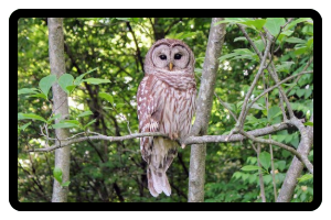 |
| 48 | /// |
| 49 | /// ```dart |
| 50 | /// Container( |
| 51 | /// decoration: BoxDecoration( |
| 52 | /// color: const Color(0xff7c94b6), |
| 53 | /// image: const DecorationImage( |
| 54 | /// image: NetworkImage('https://flutter.github.io/assets-for-api-docs/assets/widgets/owl-2.jpg'), |
| 55 | /// fit: BoxFit.cover, |
| 56 | /// ), |
| 57 | /// border: Border.all( |
| 58 | /// width: 8, |
| 59 | /// ), |
| 60 | /// borderRadius: BorderRadius.circular(12), |
| 61 | /// ), |
| 62 | /// ) |
| 63 | /// ``` |
| 64 | /// {@end-tool} |
| 65 | /// |
| 66 | /// {@template flutter.painting.BoxDecoration.clip} |
| 67 | /// The [shape] or the [borderRadius] won't clip the children of the |
| 68 | /// decorated [Container]. If the clip is required, insert a clip widget |
| 69 | /// (e.g., [ClipRect], [ClipRRect], [ClipPath]) as the child of the [Container]. |
| 70 | /// Be aware that clipping may be costly in terms of performance. |
| 71 | /// {@endtemplate} |
| 72 | /// |
| 73 | /// See also: |
| 74 | /// |
| 75 | /// * [DecoratedBox] and [Container], widgets that can be configured with |
| 76 | /// [BoxDecoration] objects. |
| 77 | /// * [DecoratedSliver], a widget that can be configured with a [BoxDecoration] |
| 78 | /// that is converted to render with slivers. |
| 79 | /// * [CustomPaint], a widget that lets you draw arbitrary graphics. |
| 80 | /// * [Decoration], the base class which lets you define other decorations. |
| 81 | class BoxDecoration extends Decoration { |
| 82 | /// Creates a box decoration. |
| 83 | /// |
| 84 | /// * If [color] is null, this decoration does not paint a background color. |
| 85 | /// * If [image] is null, this decoration does not paint a background image. |
| 86 | /// * If [border] is null, this decoration does not paint a border. |
| 87 | /// * If [borderRadius] is null, this decoration uses more efficient background |
| 88 | /// painting commands. The [borderRadius] argument must be null if [shape] is |
| 89 | /// [BoxShape.circle]. |
| 90 | /// * If [boxShadow] is null, this decoration does not paint a shadow. |
| 91 | /// * If [gradient] is null, this decoration does not paint gradients. |
| 92 | /// * If [backgroundBlendMode] is null, this decoration paints with [BlendMode.srcOver] |
| 93 | const BoxDecoration({ |
| 94 | this.color, |
| 95 | this.image, |
| 96 | this.border, |
| 97 | this.borderRadius, |
| 98 | this.boxShadow, |
| 99 | this.gradient, |
| 100 | this.backgroundBlendMode, |
| 101 | this.shape = BoxShape.rectangle, |
| 102 | }) : assert( |
| 103 | backgroundBlendMode == null || color != null || gradient != null, |
| 104 | "backgroundBlendMode applies to BoxDecoration's background color or " |
| 105 | 'gradient, but no color or gradient was provided.', |
| 106 | ); |
| 107 | |
| 108 | /// Creates a copy of this object but with the given fields replaced with the |
| 109 | /// new values. |
| 110 | BoxDecoration copyWith({ |
| 111 | Color? color, |
| 112 | DecorationImage? image, |
| 113 | BoxBorder? border, |
| 114 | BorderRadiusGeometry? borderRadius, |
| 115 | List<BoxShadow>? boxShadow, |
| 116 | Gradient? gradient, |
| 117 | BlendMode? backgroundBlendMode, |
| 118 | BoxShape? shape, |
| 119 | }) { |
| 120 | return BoxDecoration( |
| 121 | color: color ?? this.color, |
| 122 | image: image ?? this.image, |
| 123 | border: border ?? this.border, |
| 124 | borderRadius: borderRadius ?? this.borderRadius, |
| 125 | boxShadow: boxShadow ?? this.boxShadow, |
| 126 | gradient: gradient ?? this.gradient, |
| 127 | backgroundBlendMode: backgroundBlendMode ?? this.backgroundBlendMode, |
| 128 | shape: shape ?? this.shape, |
| 129 | ); |
| 130 | } |
| 131 | |
| 132 | @override |
| 133 | bool debugAssertIsValid() { |
| 134 | assert( |
| 135 | shape != BoxShape.circle || borderRadius == null, |
| 136 | 'A circle cannot have a border radius. Remove either the shape or the borderRadius argument.', |
| 137 | ); // Can't have a border radius if you're a circle. |
| 138 | return super.debugAssertIsValid(); |
| 139 | } |
| 140 | |
| 141 | /// The color to fill in the background of the box. |
| 142 | /// |
| 143 | /// The color is filled into the [shape] of the box (e.g., either a rectangle, |
| 144 | /// potentially with a [borderRadius], or a circle). |
| 145 | /// |
| 146 | /// This is ignored if [gradient] is non-null. |
| 147 | /// |
| 148 | /// The [color] is drawn under the [image]. |
| 149 | final Color? color; |
| 150 | |
| 151 | /// An image to paint above the background [color] or [gradient]. |
| 152 | /// |
| 153 | /// If [shape] is [BoxShape.circle] then the image is clipped to the circle's |
| 154 | /// boundary; if [borderRadius] is non-null then the image is clipped to the |
| 155 | /// given radii. |
| 156 | final DecorationImage? image; |
| 157 | |
| 158 | /// A border to draw above the background [color], [gradient], or [image]. |
| 159 | /// |
| 160 | /// Follows the [shape] and [borderRadius]. |
| 161 | /// |
| 162 | /// Use [Border] objects to describe borders that do not depend on the reading |
| 163 | /// direction. |
| 164 | /// |
| 165 | /// Use [BoxBorder] objects to describe borders that should flip their left |
| 166 | /// and right edges based on whether the text is being read left-to-right or |
| 167 | /// right-to-left. |
| 168 | final BoxBorder? border; |
| 169 | |
| 170 | /// If non-null, the corners of this box are rounded by this [BorderRadius]. |
| 171 | /// |
| 172 | /// Applies only to boxes with rectangular shapes; ignored if [shape] is not |
| 173 | /// [BoxShape.rectangle]. |
| 174 | /// |
| 175 | /// {@macro flutter.painting.BoxDecoration.clip} |
| 176 | final BorderRadiusGeometry? borderRadius; |
| 177 | |
| 178 | /// A list of shadows cast by this box behind the box. |
| 179 | /// |
| 180 | /// The shadow follows the [shape] of the box. |
| 181 | /// |
| 182 | /// See also: |
| 183 | /// |
| 184 | /// * [kElevationToShadow], for some predefined shadows used in Material |
| 185 | /// Design. |
| 186 | /// * [PhysicalModel], a widget for showing shadows. |
| 187 | final List<BoxShadow>? boxShadow; |
| 188 | |
| 189 | /// A gradient to use when filling the box. |
| 190 | /// |
| 191 | /// If this is specified, [color] has no effect. |
| 192 | /// |
| 193 | /// The [gradient] is drawn under the [image]. |
| 194 | final Gradient? gradient; |
| 195 | |
| 196 | /// The blend mode applied to the [color] or [gradient] background of the box. |
| 197 | /// |
| 198 | /// If no [backgroundBlendMode] is provided then the default painting blend |
| 199 | /// mode is used. |
| 200 | /// |
| 201 | /// If no [color] or [gradient] is provided then the blend mode has no impact. |
| 202 | final BlendMode? backgroundBlendMode; |
| 203 | |
| 204 | /// The shape to fill the background [color], [gradient], and [image] into and |
| 205 | /// to cast as the [boxShadow]. |
| 206 | /// |
| 207 | /// If this is [BoxShape.circle] then [borderRadius] is ignored. |
| 208 | /// |
| 209 | /// The [shape] cannot be interpolated; animating between two [BoxDecoration]s |
| 210 | /// with different [shape]s will result in a discontinuity in the rendering. |
| 211 | /// To interpolate between two shapes, consider using [ShapeDecoration] and |
| 212 | /// different [ShapeBorder]s; in particular, [CircleBorder] instead of |
| 213 | /// [BoxShape.circle] and [RoundedRectangleBorder] instead of |
| 214 | /// [BoxShape.rectangle]. |
| 215 | /// |
| 216 | /// {@macro flutter.painting.BoxDecoration.clip} |
| 217 | final BoxShape shape; |
| 218 | |
| 219 | @override |
| 220 | EdgeInsetsGeometry get padding => border?.dimensions ?? EdgeInsets.zero; |
| 221 | |
| 222 | @override |
| 223 | Path getClipPath(Rect rect, TextDirection textDirection) { |
| 224 | switch (shape) { |
| 225 | case BoxShape.circle: |
| 226 | final Offset center = rect.center; |
| 227 | final double radius = rect.shortestSide / 2.0; |
| 228 | final Rect square = Rect.fromCircle(center: center, radius: radius); |
| 229 | return Path()..addOval(square); |
| 230 | case BoxShape.rectangle: |
| 231 | if (borderRadius != null) { |
| 232 | return Path()..addRRect(borderRadius!.resolve(textDirection).toRRect(rect)); |
| 233 | } |
| 234 | return Path()..addRect(rect); |
| 235 | } |
| 236 | } |
| 237 | |
| 238 | /// Returns a new box decoration that is scaled by the given factor. |
| 239 | BoxDecoration scale(double factor) { |
| 240 | return BoxDecoration( |
| 241 | color: Color.lerp(null, color, factor), |
| 242 | image: DecorationImage.lerp(null, image, factor), |
| 243 | border: BoxBorder.lerp(null, border, factor), |
| 244 | borderRadius: BorderRadiusGeometry.lerp(null, borderRadius, factor), |
| 245 | boxShadow: BoxShadow.lerpList(null, boxShadow, factor), |
| 246 | gradient: gradient?.scale(factor), |
| 247 | shape: shape, |
| 248 | ); |
| 249 | } |
| 250 | |
| 251 | @override |
| 252 | bool get isComplex => boxShadow != null; |
| 253 | |
| 254 | @override |
| 255 | BoxDecoration? lerpFrom(Decoration? a, double t) => switch (a) { |
| 256 | null => scale(t), |
| 257 | BoxDecoration() => BoxDecoration.lerp(a, this, t), |
| 258 | _ => super.lerpFrom(a, t) as BoxDecoration?, |
| 259 | }; |
| 260 | |
| 261 | @override |
| 262 | BoxDecoration? lerpTo(Decoration? b, double t) => switch (b) { |
| 263 | null => scale(1.0 - t), |
| 264 | BoxDecoration() => BoxDecoration.lerp(this, b, t), |
| 265 | _ => super.lerpTo(b, t) as BoxDecoration?, |
| 266 | }; |
| 267 | |
| 268 | /// Linearly interpolate between two box decorations. |
| 269 | /// |
| 270 | /// Interpolates each parameter of the box decoration separately. |
| 271 | /// |
| 272 | /// The [shape] is not interpolated. To interpolate the shape, consider using |
| 273 | /// a [ShapeDecoration] with different border shapes. |
| 274 | /// |
| 275 | /// If both values are null, this returns null. Otherwise, it returns a |
| 276 | /// non-null value. If one of the values is null, then the result is obtained |
| 277 | /// by applying [scale] to the other value. If neither value is null and `t == |
| 278 | /// 0.0`, then `a` is returned unmodified; if `t == 1.0` then `b` is returned |
| 279 | /// unmodified. Otherwise, the values are computed by interpolating the |
| 280 | /// properties appropriately. |
| 281 | /// |
| 282 | /// {@macro dart.ui.shadow.lerp} |
| 283 | /// |
| 284 | /// See also: |
| 285 | /// |
| 286 | /// * [Decoration.lerp], which can interpolate between any two types of |
| 287 | /// [Decoration]s, not just [BoxDecoration]s. |
| 288 | /// * [lerpFrom] and [lerpTo], which are used to implement [Decoration.lerp] |
| 289 | /// and which use [BoxDecoration.lerp] when interpolating two |
| 290 | /// [BoxDecoration]s or a [BoxDecoration] to or from null. |
| 291 | static BoxDecoration? lerp(BoxDecoration? a, BoxDecoration? b, double t) { |
| 292 | if (identical(a, b)) { |
| 293 | return a; |
| 294 | } |
| 295 | if (a == null) { |
| 296 | return b!.scale(t); |
| 297 | } |
| 298 | if (b == null) { |
| 299 | return a.scale(1.0 - t); |
| 300 | } |
| 301 | if (t == 0.0) { |
| 302 | return a; |
| 303 | } |
| 304 | if (t == 1.0) { |
| 305 | return b; |
| 306 | } |
| 307 | return BoxDecoration( |
| 308 | color: Color.lerp(a.color, b.color, t), |
| 309 | image: DecorationImage.lerp(a.image, b.image, t), |
| 310 | border: BoxBorder.lerp(a.border, b.border, t), |
| 311 | borderRadius: BorderRadiusGeometry.lerp(a.borderRadius, b.borderRadius, t), |
| 312 | boxShadow: BoxShadow.lerpList(a.boxShadow, b.boxShadow, t), |
| 313 | gradient: Gradient.lerp(a.gradient, b.gradient, t), |
| 314 | shape: t < 0.5 ? a.shape : b.shape, |
| 315 | ); |
| 316 | } |
| 317 | |
| 318 | @override |
| 319 | bool operator ==(Object other) { |
| 320 | if (identical(this, other)) { |
| 321 | return true; |
| 322 | } |
| 323 | if (other.runtimeType != runtimeType) { |
| 324 | return false; |
| 325 | } |
| 326 | return other is BoxDecoration && |
| 327 | other.color == color && |
| 328 | other.image == image && |
| 329 | other.border == border && |
| 330 | other.borderRadius == borderRadius && |
| 331 | listEquals<BoxShadow>(other.boxShadow, boxShadow) && |
| 332 | other.gradient == gradient && |
| 333 | other.backgroundBlendMode == backgroundBlendMode && |
| 334 | other.shape == shape; |
| 335 | } |
| 336 | |
| 337 | @override |
| 338 | int get hashCode => Object.hash( |
| 339 | color, |
| 340 | image, |
| 341 | border, |
| 342 | borderRadius, |
| 343 | boxShadow == null ? null : Object.hashAll(boxShadow!), |
| 344 | gradient, |
| 345 | backgroundBlendMode, |
| 346 | shape, |
| 347 | ); |
| 348 | |
| 349 | @override |
| 350 | void debugFillProperties(DiagnosticPropertiesBuilder properties) { |
| 351 | super.debugFillProperties(properties); |
| 352 | properties |
| 353 | ..defaultDiagnosticsTreeStyle = DiagnosticsTreeStyle.whitespace |
| 354 | ..emptyBodyDescription = '<no decorations specified>'; |
| 355 | |
| 356 | properties.add(ColorProperty('color', color, defaultValue: null)); |
| 357 | properties.add(DiagnosticsProperty<DecorationImage>('image', image, defaultValue: null)); |
| 358 | properties.add(DiagnosticsProperty<BoxBorder>('border', border, defaultValue: null)); |
| 359 | properties.add( |
| 360 | DiagnosticsProperty<BorderRadiusGeometry>('borderRadius', borderRadius, defaultValue: null), |
| 361 | ); |
| 362 | properties.add( |
| 363 | IterableProperty<BoxShadow>( |
| 364 | 'boxShadow', |
| 365 | boxShadow, |
| 366 | defaultValue: null, |
| 367 | style: DiagnosticsTreeStyle.whitespace, |
| 368 | ), |
| 369 | ); |
| 370 | properties.add(DiagnosticsProperty<Gradient>('gradient', gradient, defaultValue: null)); |
| 371 | properties.add(EnumProperty<BoxShape>('shape', shape, defaultValue: BoxShape.rectangle)); |
| 372 | } |
| 373 | |
| 374 | @override |
| 375 | bool hitTest(Size size, Offset position, {TextDirection? textDirection}) { |
| 376 | assert((Offset.zero & size).contains(position)); |
| 377 | switch (shape) { |
| 378 | case BoxShape.rectangle: |
| 379 | if (borderRadius != null) { |
| 380 | final RRect bounds = borderRadius!.resolve(textDirection).toRRect(Offset.zero & size); |
| 381 | return bounds.contains(position); |
| 382 | } |
| 383 | return true; |
| 384 | case BoxShape.circle: |
| 385 | // Circles are inscribed into our smallest dimension. |
| 386 | final Offset center = size.center(Offset.zero); |
| 387 | final double distance = (position - center).distance; |
| 388 | return distance <= math.min(size.width, size.height) / 2.0; |
| 389 | } |
| 390 | } |
| 391 | |
| 392 | @override |
| 393 | BoxPainter createBoxPainter([VoidCallback? onChanged]) { |
| 394 | assert(onChanged != null || image == null); |
| 395 | return _BoxDecorationPainter(this, onChanged); |
| 396 | } |
| 397 | } |
| 398 | |
| 399 | /// An object that paints a [BoxDecoration] into a canvas. |
| 400 | class _BoxDecorationPainter extends BoxPainter { |
| 401 | _BoxDecorationPainter(this._decoration, super.onChanged); |
| 402 | |
| 403 | final BoxDecoration _decoration; |
| 404 | |
| 405 | Paint? _cachedBackgroundPaint; |
| 406 | Rect? _rectForCachedBackgroundPaint; |
| 407 | Paint _getBackgroundPaint(Rect rect, TextDirection? textDirection) { |
| 408 | assert(_decoration.gradient != null || _rectForCachedBackgroundPaint == null); |
| 409 | |
| 410 | if (_cachedBackgroundPaint == null || |
| 411 | (_decoration.gradient != null && _rectForCachedBackgroundPaint != rect)) { |
| 412 | final Paint paint = Paint(); |
| 413 | if (_decoration.backgroundBlendMode != null) { |
| 414 | paint.blendMode = _decoration.backgroundBlendMode!; |
| 415 | } |
| 416 | if (_decoration.color != null) { |
| 417 | paint.color = _decoration.color!; |
| 418 | } |
| 419 | if (_decoration.gradient != null) { |
| 420 | paint.shader = _decoration.gradient!.createShader(rect, textDirection: textDirection); |
| 421 | _rectForCachedBackgroundPaint = rect; |
| 422 | } |
| 423 | _cachedBackgroundPaint = paint; |
| 424 | } |
| 425 | |
| 426 | return _cachedBackgroundPaint!; |
| 427 | } |
| 428 | |
| 429 | void _paintBox(Canvas canvas, Rect rect, Paint paint, TextDirection? textDirection) { |
| 430 | switch (_decoration.shape) { |
| 431 | case BoxShape.circle: |
| 432 | assert( |
| 433 | _decoration.borderRadius == null, |
| 434 | 'A circle cannot have a border radius. Remove either the shape or the borderRadius argument.', |
| 435 | ); |
| 436 | final Offset center = rect.center; |
| 437 | final double radius = rect.shortestSide / 2.0; |
| 438 | canvas.drawCircle(center, radius, paint); |
| 439 | case BoxShape.rectangle: |
| 440 | if (_decoration.borderRadius == null || _decoration.borderRadius == BorderRadius.zero) { |
| 441 | canvas.drawRect(rect, paint); |
| 442 | } else { |
| 443 | canvas.drawRRect(_decoration.borderRadius!.resolve(textDirection).toRRect(rect), paint); |
| 444 | } |
| 445 | } |
| 446 | } |
| 447 | |
| 448 | void _paintShadows(Canvas canvas, Rect rect, TextDirection? textDirection) { |
| 449 | if (_decoration.boxShadow == null) { |
| 450 | return; |
| 451 | } |
| 452 | for (final BoxShadow boxShadow in _decoration.boxShadow!) { |
| 453 | final Paint paint = boxShadow.toPaint(); |
| 454 | final Rect bounds = rect.shift(boxShadow.offset).inflate(boxShadow.spreadRadius); |
| 455 | assert(() { |
| 456 | if (debugDisableShadows && boxShadow.blurStyle == BlurStyle.outer) { |
| 457 | canvas.save(); |
| 458 | canvas.clipRect(bounds); |
| 459 | } |
| 460 | return true; |
| 461 | }()); |
| 462 | _paintBox(canvas, bounds, paint, textDirection); |
| 463 | assert(() { |
| 464 | if (debugDisableShadows && boxShadow.blurStyle == BlurStyle.outer) { |
| 465 | canvas.restore(); |
| 466 | } |
| 467 | return true; |
| 468 | }()); |
| 469 | } |
| 470 | } |
| 471 | |
| 472 | void _paintBackgroundColor(Canvas canvas, Rect rect, TextDirection? textDirection) { |
| 473 | if (_decoration.color != null || _decoration.gradient != null) { |
| 474 | // When border is filled, the rect is reduced to avoid anti-aliasing |
| 475 | // rounding error leaking the background color around the clipped shape. |
| 476 | final Rect adjustedRect = _adjustedRectOnOutlinedBorder(rect, textDirection); |
| 477 | _paintBox(canvas, adjustedRect, _getBackgroundPaint(rect, textDirection), textDirection); |
| 478 | } |
| 479 | } |
| 480 | |
| 481 | double _calculateAdjustedSide(BorderSide side) { |
| 482 | if (side.color.alpha == 255 && side.style == BorderStyle.solid) { |
| 483 | return side.strokeInset; |
| 484 | } |
| 485 | return 0; |
| 486 | } |
| 487 | |
| 488 | Rect _adjustedRectOnOutlinedBorder(Rect rect, TextDirection? textDirection) { |
| 489 | if (_decoration.border == null) { |
| 490 | return rect; |
| 491 | } |
| 492 | |
| 493 | if (_decoration.border is Border) { |
| 494 | final Border border = _decoration.border! as Border; |
| 495 | |
| 496 | final EdgeInsets insets = |
| 497 | EdgeInsets.fromLTRB( |
| 498 | _calculateAdjustedSide(border.left), |
| 499 | _calculateAdjustedSide(border.top), |
| 500 | _calculateAdjustedSide(border.right), |
| 501 | _calculateAdjustedSide(border.bottom), |
| 502 | ) / |
| 503 | 2; |
| 504 | |
| 505 | return Rect.fromLTRB( |
| 506 | rect.left + insets.left, |
| 507 | rect.top + insets.top, |
| 508 | rect.right - insets.right, |
| 509 | rect.bottom - insets.bottom, |
| 510 | ); |
| 511 | } else if (_decoration.border is BorderDirectional && textDirection != null) { |
| 512 | final BorderDirectional border = _decoration.border! as BorderDirectional; |
| 513 | final BorderSide leftSide = textDirection == TextDirection.rtl ? border.end : border.start; |
| 514 | final BorderSide rightSide = textDirection == TextDirection.rtl ? border.start : border.end; |
| 515 | |
| 516 | final EdgeInsets insets = |
| 517 | EdgeInsets.fromLTRB( |
| 518 | _calculateAdjustedSide(leftSide), |
| 519 | _calculateAdjustedSide(border.top), |
| 520 | _calculateAdjustedSide(rightSide), |
| 521 | _calculateAdjustedSide(border.bottom), |
| 522 | ) / |
| 523 | 2; |
| 524 | |
| 525 | return Rect.fromLTRB( |
| 526 | rect.left + insets.left, |
| 527 | rect.top + insets.top, |
| 528 | rect.right - insets.right, |
| 529 | rect.bottom - insets.bottom, |
| 530 | ); |
| 531 | } |
| 532 | return rect; |
| 533 | } |
| 534 | |
| 535 | DecorationImagePainter? _imagePainter; |
| 536 | void _paintBackgroundImage(Canvas canvas, Rect rect, ImageConfiguration configuration) { |
| 537 | if (_decoration.image == null) { |
| 538 | return; |
| 539 | } |
| 540 | _imagePainter ??= _decoration.image!.createPainter(onChanged!); |
| 541 | Path? clipPath; |
| 542 | switch (_decoration.shape) { |
| 543 | case BoxShape.circle: |
| 544 | assert( |
| 545 | _decoration.borderRadius == null, |
| 546 | 'A circle cannot have a border radius. Remove either the shape or the borderRadius argument.', |
| 547 | ); |
| 548 | final Offset center = rect.center; |
| 549 | final double radius = rect.shortestSide / 2.0; |
| 550 | final Rect square = Rect.fromCircle(center: center, radius: radius); |
| 551 | clipPath = Path()..addOval(square); |
| 552 | case BoxShape.rectangle: |
| 553 | if (_decoration.borderRadius != null) { |
| 554 | clipPath = Path() |
| 555 | ..addRRect( |
| 556 | _decoration.borderRadius!.resolve(configuration.textDirection).toRRect(rect), |
| 557 | ); |
| 558 | } |
| 559 | } |
| 560 | _imagePainter!.paint(canvas, rect, clipPath, configuration); |
| 561 | } |
| 562 | |
| 563 | @override |
| 564 | void dispose() { |
| 565 | _imagePainter?.dispose(); |
| 566 | super.dispose(); |
| 567 | } |
| 568 | |
| 569 | /// Paint the box decoration into the given location on the given canvas. |
| 570 | @override |
| 571 | void paint(Canvas canvas, Offset offset, ImageConfiguration configuration) { |
| 572 | assert(configuration.size != null); |
| 573 | final Rect rect = offset & configuration.size!; |
| 574 | final TextDirection? textDirection = configuration.textDirection; |
| 575 | _paintShadows(canvas, rect, textDirection); |
| 576 | _paintBackgroundColor(canvas, rect, textDirection); |
| 577 | _paintBackgroundImage(canvas, rect, configuration); |
| 578 | _decoration.border?.paint( |
| 579 | canvas, |
| 580 | rect, |
| 581 | shape: _decoration.shape, |
| 582 | borderRadius: _decoration.borderRadius?.resolve(textDirection), |
| 583 | textDirection: configuration.textDirection, |
| 584 | ); |
| 585 | } |
| 586 | |
| 587 | @override |
| 588 | String toString() { |
| 589 | return 'BoxPainter for$_decoration '; |
| 590 | } |
| 591 | } |
| 592 |
Definitions
- BoxDecoration
- BoxDecoration
- copyWith
- debugAssertIsValid
- padding
- getClipPath
- scale
- isComplex
- lerpFrom
- lerpTo
- lerp
- ==
- hashCode
- debugFillProperties
- hitTest
- createBoxPainter
- _BoxDecorationPainter
- _BoxDecorationPainter
- _getBackgroundPaint
- _paintBox
- _paintShadows
- _paintBackgroundColor
- _calculateAdjustedSide
- _adjustedRectOnOutlinedBorder
- _paintBackgroundImage
- dispose
- paint
Learn more about Flutter for embedded and desktop on industrialflutter.com