| 1 | // Copyright 2014 The Flutter Authors. All rights reserved. |
| 2 | // Use of this source code is governed by a BSD-style license that can be |
|---|
| 3 | // found in the LICENSE file. |
|---|
| 4 | |
|---|
| 5 | /// @docImport 'data_table.dart'; |
|---|
| 6 | /// @docImport 'elevated_button.dart'; |
|---|
| 7 | /// @docImport 'icon_button.dart'; |
|---|
| 8 | /// @docImport 'ink_decoration.dart'; |
|---|
| 9 | /// @docImport 'ink_ripple.dart'; |
|---|
| 10 | /// @docImport 'ink_splash.dart'; |
|---|
| 11 | /// @docImport 'text_button.dart'; |
|---|
| 12 | library; |
|---|
| 13 | |
|---|
| 14 | import 'dart:async'; |
|---|
| 15 | import 'dart:collection'; |
|---|
| 16 | |
|---|
| 17 | import 'package:flutter/foundation.dart'; |
|---|
| 18 | import 'package:flutter/gestures.dart'; |
|---|
| 19 | import 'package:flutter/rendering.dart'; |
|---|
| 20 | import 'package:flutter/widgets.dart'; |
|---|
| 21 | |
|---|
| 22 | import 'debug.dart'; |
|---|
| 23 | import 'ink_highlight.dart'; |
|---|
| 24 | import 'material.dart'; |
|---|
| 25 | import 'material_state.dart'; |
|---|
| 26 | import 'theme.dart'; |
|---|
| 27 | |
|---|
| 28 | // Examples can assume: |
|---|
| 29 | // late BuildContext context; |
|---|
| 30 | |
|---|
| 31 | /// An ink feature that displays a [color] "splash" in response to a user |
|---|
| 32 | /// gesture that can be confirmed or canceled. |
|---|
| 33 | /// |
|---|
| 34 | /// Subclasses call [confirm] when an input gesture is recognized. For |
|---|
| 35 | /// example a press event might trigger an ink feature that's confirmed |
|---|
| 36 | /// when the corresponding up event is seen. |
|---|
| 37 | /// |
|---|
| 38 | /// Subclasses call [cancel] when an input gesture is aborted before it |
|---|
| 39 | /// is recognized. For example a press event might trigger an ink feature |
|---|
| 40 | /// that's canceled when the pointer is dragged out of the reference |
|---|
| 41 | /// box. |
|---|
| 42 | /// |
|---|
| 43 | /// The [InkWell] and [InkResponse] widgets generate instances of this |
|---|
| 44 | /// class. |
|---|
| 45 | abstract class InteractiveInkFeature extends InkFeature { |
|---|
| 46 | /// Creates an InteractiveInkFeature. |
|---|
| 47 | InteractiveInkFeature({ |
|---|
| 48 | required super.controller, |
|---|
| 49 | required super.referenceBox, |
|---|
| 50 | required Color color, |
|---|
| 51 | ShapeBorder? customBorder, |
|---|
| 52 | super.onRemoved, |
|---|
| 53 | }) : _color = color, |
|---|
| 54 | _customBorder = customBorder; |
|---|
| 55 | |
|---|
| 56 | /// Called when the user input that triggered this feature's appearance was confirmed. |
|---|
| 57 | /// |
|---|
| 58 | /// Typically causes the ink to propagate faster across the material. By default this |
|---|
| 59 | /// method does nothing. |
|---|
| 60 | void confirm() {} |
|---|
| 61 | |
|---|
| 62 | /// Called when the user input that triggered this feature's appearance was canceled. |
|---|
| 63 | /// |
|---|
| 64 | /// Typically causes the ink to gradually disappear. By default this method does |
|---|
| 65 | /// nothing. |
|---|
| 66 | void cancel() {} |
|---|
| 67 | |
|---|
| 68 | /// The ink's color. |
|---|
| 69 | Color get color => _color; |
|---|
| 70 | Color _color; |
|---|
| 71 | set color(Color value) { |
|---|
| 72 | if (value == _color) { |
|---|
| 73 | return; |
|---|
| 74 | } |
|---|
| 75 | _color = value; |
|---|
| 76 | controller.markNeedsPaint(); |
|---|
| 77 | } |
|---|
| 78 | |
|---|
| 79 | /// The ink's optional custom border. |
|---|
| 80 | ShapeBorder? get customBorder => _customBorder; |
|---|
| 81 | ShapeBorder? _customBorder; |
|---|
| 82 | set customBorder(ShapeBorder? value) { |
|---|
| 83 | if (value == _customBorder) { |
|---|
| 84 | return; |
|---|
| 85 | } |
|---|
| 86 | _customBorder = value; |
|---|
| 87 | controller.markNeedsPaint(); |
|---|
| 88 | } |
|---|
| 89 | |
|---|
| 90 | /// Draws an ink splash or ink ripple on the passed in [Canvas]. |
|---|
| 91 | /// |
|---|
| 92 | /// The [transform] argument is the [Matrix4] transform that typically |
|---|
| 93 | /// shifts the coordinate space of the canvas to the space in which |
|---|
| 94 | /// the ink circle is to be painted. |
|---|
| 95 | /// |
|---|
| 96 | /// [center] is the [Offset] from origin of the canvas where the center |
|---|
| 97 | /// of the circle is drawn. |
|---|
| 98 | /// |
|---|
| 99 | /// [paint] takes a [Paint] object that describes the styles used to draw the ink circle. |
|---|
| 100 | /// For example, [paint] can specify properties like color, strokewidth, colorFilter. |
|---|
| 101 | /// |
|---|
| 102 | /// [radius] is the radius of ink circle to be drawn on canvas. |
|---|
| 103 | /// |
|---|
| 104 | /// [clipCallback] is the callback used to obtain the [Rect] used for clipping the ink effect. |
|---|
| 105 | /// If [clipCallback] is null, no clipping is performed on the ink circle. |
|---|
| 106 | /// |
|---|
| 107 | /// Clipping can happen in 3 different ways: |
|---|
| 108 | /// 1. If [customBorder] is provided, it is used to determine the path |
|---|
| 109 | /// for clipping. |
|---|
| 110 | /// 2. If [customBorder] is null, and [borderRadius] is provided, the canvas |
|---|
| 111 | /// is clipped by an [RRect] created from [clipCallback] and [borderRadius]. |
|---|
| 112 | /// 3. If [borderRadius] is the default [BorderRadius.zero], then the [Rect] provided |
|---|
| 113 | /// by [clipCallback] is used for clipping. |
|---|
| 114 | /// |
|---|
| 115 | /// [textDirection] is used by [customBorder] if it is non-null. This allows the [customBorder]'s path |
|---|
| 116 | /// to be properly defined if it was the path was expressed in terms of "start" and "end" instead of |
|---|
| 117 | /// "left" and "right". |
|---|
| 118 | /// |
|---|
| 119 | /// For examples on how the function is used, see [InkSplash] and [InkRipple]. |
|---|
| 120 | @protected |
|---|
| 121 | void paintInkCircle({ |
|---|
| 122 | required Canvas canvas, |
|---|
| 123 | required Matrix4 transform, |
|---|
| 124 | required Paint paint, |
|---|
| 125 | required Offset center, |
|---|
| 126 | required double radius, |
|---|
| 127 | TextDirection? textDirection, |
|---|
| 128 | ShapeBorder? customBorder, |
|---|
| 129 | BorderRadius borderRadius = BorderRadius.zero, |
|---|
| 130 | RectCallback? clipCallback, |
|---|
| 131 | }) { |
|---|
| 132 | final Offset? originOffset = MatrixUtils.getAsTranslation(transform); |
|---|
| 133 | canvas.save(); |
|---|
| 134 | if (originOffset == null) { |
|---|
| 135 | canvas.transform(transform.storage); |
|---|
| 136 | } else { |
|---|
| 137 | canvas.translate(originOffset.dx, originOffset.dy); |
|---|
| 138 | } |
|---|
| 139 | if (clipCallback != null) { |
|---|
| 140 | final Rect rect = clipCallback(); |
|---|
| 141 | if (customBorder != null) { |
|---|
| 142 | canvas.clipPath(customBorder.getOuterPath(rect, textDirection: textDirection)); |
|---|
| 143 | } else if (borderRadius != BorderRadius.zero) { |
|---|
| 144 | canvas.clipRRect( |
|---|
| 145 | RRect.fromRectAndCorners( |
|---|
| 146 | rect, |
|---|
| 147 | topLeft: borderRadius.topLeft, |
|---|
| 148 | topRight: borderRadius.topRight, |
|---|
| 149 | bottomLeft: borderRadius.bottomLeft, |
|---|
| 150 | bottomRight: borderRadius.bottomRight, |
|---|
| 151 | ), |
|---|
| 152 | ); |
|---|
| 153 | } else { |
|---|
| 154 | canvas.clipRect(rect); |
|---|
| 155 | } |
|---|
| 156 | } |
|---|
| 157 | canvas.drawCircle(center, radius, paint); |
|---|
| 158 | canvas.restore(); |
|---|
| 159 | } |
|---|
| 160 | } |
|---|
| 161 | |
|---|
| 162 | /// An encapsulation of an [InteractiveInkFeature] constructor used by |
|---|
| 163 | /// [InkWell], [InkResponse], and [ThemeData]. |
|---|
| 164 | /// |
|---|
| 165 | /// Interactive ink feature implementations should provide a static const |
|---|
| 166 | /// `splashFactory` value that's an instance of this class. The `splashFactory` |
|---|
| 167 | /// can be used to configure an [InkWell], [InkResponse] or [ThemeData]. |
|---|
| 168 | /// |
|---|
| 169 | /// See also: |
|---|
| 170 | /// |
|---|
| 171 | /// * [InkSplash.splashFactory] |
|---|
| 172 | /// * [InkRipple.splashFactory] |
|---|
| 173 | abstract class InteractiveInkFeatureFactory { |
|---|
| 174 | /// Abstract const constructor. This constructor enables subclasses to provide |
|---|
| 175 | /// const constructors so that they can be used in const expressions. |
|---|
| 176 | /// |
|---|
| 177 | /// Subclasses should provide a const constructor. |
|---|
| 178 | const InteractiveInkFeatureFactory(); |
|---|
| 179 | |
|---|
| 180 | /// The factory method. |
|---|
| 181 | /// |
|---|
| 182 | /// Subclasses should override this method to return a new instance of an |
|---|
| 183 | /// [InteractiveInkFeature]. |
|---|
| 184 | @factory |
|---|
| 185 | InteractiveInkFeature create({ |
|---|
| 186 | required MaterialInkController controller, |
|---|
| 187 | required RenderBox referenceBox, |
|---|
| 188 | required Offset position, |
|---|
| 189 | required Color color, |
|---|
| 190 | required TextDirection textDirection, |
|---|
| 191 | bool containedInkWell = false, |
|---|
| 192 | RectCallback? rectCallback, |
|---|
| 193 | BorderRadius? borderRadius, |
|---|
| 194 | ShapeBorder? customBorder, |
|---|
| 195 | double? radius, |
|---|
| 196 | VoidCallback? onRemoved, |
|---|
| 197 | }); |
|---|
| 198 | } |
|---|
| 199 | |
|---|
| 200 | abstract class _ParentInkResponseState { |
|---|
| 201 | void markChildInkResponsePressed(_ParentInkResponseState childState, bool value); |
|---|
| 202 | } |
|---|
| 203 | |
|---|
| 204 | class _ParentInkResponseProvider extends InheritedWidget { |
|---|
| 205 | const _ParentInkResponseProvider({required this.state, required super.child}); |
|---|
| 206 | |
|---|
| 207 | final _ParentInkResponseState state; |
|---|
| 208 | |
|---|
| 209 | @override |
|---|
| 210 | bool updateShouldNotify(_ParentInkResponseProvider oldWidget) => state != oldWidget.state; |
|---|
| 211 | |
|---|
| 212 | static _ParentInkResponseState? maybeOf(BuildContext context) { |
|---|
| 213 | return context.dependOnInheritedWidgetOfExactType<_ParentInkResponseProvider>()?.state; |
|---|
| 214 | } |
|---|
| 215 | } |
|---|
| 216 | |
|---|
| 217 | typedef _GetRectCallback = RectCallback? Function(RenderBox referenceBox); |
|---|
| 218 | typedef _CheckContext = bool Function(BuildContext context); |
|---|
| 219 | |
|---|
| 220 | /// An area of a [Material] that responds to touch. Has a configurable shape and |
|---|
| 221 | /// can be configured to clip splashes that extend outside its bounds or not. |
|---|
| 222 | /// |
|---|
| 223 | /// For a variant of this widget that is specialized for rectangular areas that |
|---|
| 224 | /// always clip splashes, see [InkWell]. |
|---|
| 225 | /// |
|---|
| 226 | /// An [InkResponse] widget does two things when responding to a tap: |
|---|
| 227 | /// |
|---|
| 228 | /// * It starts to animate a _highlight_. The shape of the highlight is |
|---|
| 229 | /// determined by [highlightShape]. If it is a [BoxShape.circle], the |
|---|
| 230 | /// default, then the highlight is a circle of fixed size centered in the |
|---|
| 231 | /// [InkResponse]. If it is [BoxShape.rectangle], then the highlight is a box |
|---|
| 232 | /// the size of the [InkResponse] itself, unless [getRectCallback] is |
|---|
| 233 | /// provided, in which case that callback defines the rectangle. The color of |
|---|
| 234 | /// the highlight is set by [highlightColor]. |
|---|
| 235 | /// |
|---|
| 236 | /// * Simultaneously, it starts to animate a _splash_. This is a growing circle |
|---|
| 237 | /// initially centered on the tap location. If this is a [containedInkWell], |
|---|
| 238 | /// the splash grows to the [radius] while remaining centered at the tap |
|---|
| 239 | /// location. Otherwise, the splash migrates to the center of the box as it |
|---|
| 240 | /// grows. |
|---|
| 241 | /// |
|---|
| 242 | /// The following two diagrams show how [InkResponse] looks when tapped if the |
|---|
| 243 | /// [highlightShape] is [BoxShape.circle] (the default) and [containedInkWell] |
|---|
| 244 | /// is false (also the default). |
|---|
| 245 | /// |
|---|
| 246 | /// The first diagram shows how it looks if the [InkResponse] is relatively |
|---|
| 247 | /// large: |
|---|
| 248 | /// |
|---|
| 249 | /// 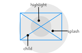 |
|---|
| 250 | /// |
|---|
| 251 | /// The second diagram shows how it looks if the [InkResponse] is small: |
|---|
| 252 | /// |
|---|
| 253 | /// 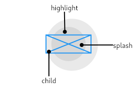 |
|---|
| 254 | /// |
|---|
| 255 | /// The main thing to notice from these diagrams is that the splashes happily |
|---|
| 256 | /// exceed the bounds of the widget (because [containedInkWell] is false). |
|---|
| 257 | /// |
|---|
| 258 | /// The following diagram shows the effect when the [InkResponse] has a |
|---|
| 259 | /// [highlightShape] of [BoxShape.rectangle] with [containedInkWell] set to |
|---|
| 260 | /// true. These are the values used by [InkWell]. |
|---|
| 261 | /// |
|---|
| 262 | /// 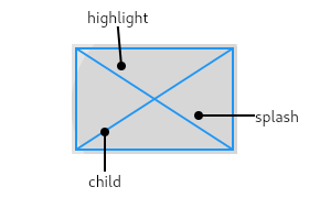 |
|---|
| 263 | /// |
|---|
| 264 | /// The [InkResponse] widget must have a [Material] widget as an ancestor. The |
|---|
| 265 | /// [Material] widget is where the ink reactions are actually painted. This |
|---|
| 266 | /// matches the Material Design premise wherein the [Material] is what is |
|---|
| 267 | /// actually reacting to touches by spreading ink. |
|---|
| 268 | /// |
|---|
| 269 | /// If a Widget uses this class directly, it should include the following line |
|---|
| 270 | /// at the top of its build function to call [debugCheckHasMaterial]: |
|---|
| 271 | /// |
|---|
| 272 | /// ```dart |
|---|
| 273 | /// assert(debugCheckHasMaterial(context)); |
|---|
| 274 | /// ``` |
|---|
| 275 | /// |
|---|
| 276 | /// ## Troubleshooting |
|---|
| 277 | /// |
|---|
| 278 | /// ### The ink splashes aren't visible! |
|---|
| 279 | /// |
|---|
| 280 | /// If there is an opaque graphic, e.g. painted using a [Container], [Image], or |
|---|
| 281 | /// [DecoratedBox], between the [Material] widget and the [InkResponse] widget, |
|---|
| 282 | /// then the splash won't be visible because it will be under the opaque graphic. |
|---|
| 283 | /// This is because ink splashes draw on the underlying [Material] itself, as |
|---|
| 284 | /// if the ink was spreading inside the material. |
|---|
| 285 | /// |
|---|
| 286 | /// The [Ink] widget can be used as a replacement for [Image], [Container], or |
|---|
| 287 | /// [DecoratedBox] to ensure that the image or decoration also paints in the |
|---|
| 288 | /// [Material] itself, below the ink. |
|---|
| 289 | /// |
|---|
| 290 | /// If this is not possible for some reason, e.g. because you are using an |
|---|
| 291 | /// opaque [CustomPaint] widget, alternatively consider using a second |
|---|
| 292 | /// [Material] above the opaque widget but below the [InkResponse] (as an |
|---|
| 293 | /// ancestor to the ink response). The [MaterialType.transparency] material |
|---|
| 294 | /// kind can be used for this purpose. |
|---|
| 295 | /// |
|---|
| 296 | /// See also: |
|---|
| 297 | /// |
|---|
| 298 | /// * [GestureDetector], for listening for gestures without ink splashes. |
|---|
| 299 | /// * [ElevatedButton] and [TextButton], two kinds of buttons in Material Design. |
|---|
| 300 | /// * [IconButton], which combines [InkResponse] with an [Icon]. |
|---|
| 301 | class InkResponse extends StatelessWidget { |
|---|
| 302 | /// Creates an area of a [Material] that responds to touch. |
|---|
| 303 | /// |
|---|
| 304 | /// Must have an ancestor [Material] widget in which to cause ink reactions. |
|---|
| 305 | const InkResponse({ |
|---|
| 306 | super.key, |
|---|
| 307 | this.child, |
|---|
| 308 | this.onTap, |
|---|
| 309 | this.onTapDown, |
|---|
| 310 | this.onTapUp, |
|---|
| 311 | this.onTapCancel, |
|---|
| 312 | this.onDoubleTap, |
|---|
| 313 | this.onLongPress, |
|---|
| 314 | this.onSecondaryTap, |
|---|
| 315 | this.onSecondaryTapUp, |
|---|
| 316 | this.onSecondaryTapDown, |
|---|
| 317 | this.onSecondaryTapCancel, |
|---|
| 318 | this.onHighlightChanged, |
|---|
| 319 | this.onHover, |
|---|
| 320 | this.mouseCursor, |
|---|
| 321 | this.containedInkWell = false, |
|---|
| 322 | this.highlightShape = BoxShape.circle, |
|---|
| 323 | this.radius, |
|---|
| 324 | this.borderRadius, |
|---|
| 325 | this.customBorder, |
|---|
| 326 | this.focusColor, |
|---|
| 327 | this.hoverColor, |
|---|
| 328 | this.highlightColor, |
|---|
| 329 | this.overlayColor, |
|---|
| 330 | this.splashColor, |
|---|
| 331 | this.splashFactory, |
|---|
| 332 | this.enableFeedback = true, |
|---|
| 333 | this.excludeFromSemantics = false, |
|---|
| 334 | this.focusNode, |
|---|
| 335 | this.canRequestFocus = true, |
|---|
| 336 | this.onFocusChange, |
|---|
| 337 | this.autofocus = false, |
|---|
| 338 | this.statesController, |
|---|
| 339 | this.hoverDuration, |
|---|
| 340 | }); |
|---|
| 341 | |
|---|
| 342 | /// The widget below this widget in the tree. |
|---|
| 343 | /// |
|---|
| 344 | /// {@macro flutter.widgets.ProxyWidget.child} |
|---|
| 345 | final Widget? child; |
|---|
| 346 | |
|---|
| 347 | /// Called when the user taps this part of the material. |
|---|
| 348 | final GestureTapCallback? onTap; |
|---|
| 349 | |
|---|
| 350 | /// Called when the user taps down this part of the material. |
|---|
| 351 | final GestureTapDownCallback? onTapDown; |
|---|
| 352 | |
|---|
| 353 | /// Called when the user releases a tap that was started on this part of the |
|---|
| 354 | /// material. [onTap] is called immediately after. |
|---|
| 355 | final GestureTapUpCallback? onTapUp; |
|---|
| 356 | |
|---|
| 357 | /// Called when the user cancels a tap that was started on this part of the |
|---|
| 358 | /// material. |
|---|
| 359 | final GestureTapCallback? onTapCancel; |
|---|
| 360 | |
|---|
| 361 | /// Called when the user double taps this part of the material. |
|---|
| 362 | final GestureTapCallback? onDoubleTap; |
|---|
| 363 | |
|---|
| 364 | /// Called when the user long-presses on this part of the material. |
|---|
| 365 | final GestureLongPressCallback? onLongPress; |
|---|
| 366 | |
|---|
| 367 | /// Called when the user taps this part of the material with a secondary button. |
|---|
| 368 | /// |
|---|
| 369 | /// See also: |
|---|
| 370 | /// |
|---|
| 371 | /// * [kSecondaryButton], the button this callback responds to. |
|---|
| 372 | final GestureTapCallback? onSecondaryTap; |
|---|
| 373 | |
|---|
| 374 | /// Called when the user taps down on this part of the material with a |
|---|
| 375 | /// secondary button. |
|---|
| 376 | /// |
|---|
| 377 | /// See also: |
|---|
| 378 | /// |
|---|
| 379 | /// * [kSecondaryButton], the button this callback responds to. |
|---|
| 380 | final GestureTapDownCallback? onSecondaryTapDown; |
|---|
| 381 | |
|---|
| 382 | /// Called when the user releases a secondary button tap that was started on |
|---|
| 383 | /// this part of the material. [onSecondaryTap] is called immediately after. |
|---|
| 384 | /// |
|---|
| 385 | /// See also: |
|---|
| 386 | /// |
|---|
| 387 | /// * [onSecondaryTap], a handler triggered right after this one that doesn't |
|---|
| 388 | /// pass any details about the tap. |
|---|
| 389 | /// * [kSecondaryButton], the button this callback responds to. |
|---|
| 390 | final GestureTapUpCallback? onSecondaryTapUp; |
|---|
| 391 | |
|---|
| 392 | /// Called when the user cancels a secondary button tap that was started on |
|---|
| 393 | /// this part of the material. |
|---|
| 394 | /// |
|---|
| 395 | /// See also: |
|---|
| 396 | /// |
|---|
| 397 | /// * [kSecondaryButton], the button this callback responds to. |
|---|
| 398 | final GestureTapCallback? onSecondaryTapCancel; |
|---|
| 399 | |
|---|
| 400 | /// Called when this part of the material either becomes highlighted or stops |
|---|
| 401 | /// being highlighted. |
|---|
| 402 | /// |
|---|
| 403 | /// The value passed to the callback is true if this part of the material has |
|---|
| 404 | /// become highlighted and false if this part of the material has stopped |
|---|
| 405 | /// being highlighted. |
|---|
| 406 | /// |
|---|
| 407 | /// If all of [onTap], [onDoubleTap], and [onLongPress] become null while a |
|---|
| 408 | /// gesture is ongoing, then [onTapCancel] will be fired and |
|---|
| 409 | /// [onHighlightChanged] will be fired with the value false _during the |
|---|
| 410 | /// build_. This means, for instance, that in that scenario [State.setState] |
|---|
| 411 | /// cannot be called. |
|---|
| 412 | final ValueChanged<bool>? onHighlightChanged; |
|---|
| 413 | |
|---|
| 414 | /// Called when a pointer enters or exits the ink response area. |
|---|
| 415 | /// |
|---|
| 416 | /// The value passed to the callback is true if a pointer has entered this |
|---|
| 417 | /// part of the material and false if a pointer has exited this part of the |
|---|
| 418 | /// material. |
|---|
| 419 | final ValueChanged<bool>? onHover; |
|---|
| 420 | |
|---|
| 421 | /// The cursor for a mouse pointer when it enters or is hovering over the |
|---|
| 422 | /// widget. |
|---|
| 423 | /// |
|---|
| 424 | /// If [mouseCursor] is a [WidgetStateMouseCursor], |
|---|
| 425 | /// [WidgetStateProperty.resolve] is used for the following [WidgetState]s: |
|---|
| 426 | /// |
|---|
| 427 | /// * [WidgetState.hovered]. |
|---|
| 428 | /// * [WidgetState.focused]. |
|---|
| 429 | /// * [WidgetState.disabled]. |
|---|
| 430 | /// |
|---|
| 431 | /// If this property is null, [WidgetStateMouseCursor.clickable] will be used. |
|---|
| 432 | final MouseCursor? mouseCursor; |
|---|
| 433 | |
|---|
| 434 | /// Whether this ink response should be clipped its bounds. |
|---|
| 435 | /// |
|---|
| 436 | /// This flag also controls whether the splash migrates to the center of the |
|---|
| 437 | /// [InkResponse] or not. If [containedInkWell] is true, the splash remains |
|---|
| 438 | /// centered around the tap location. If it is false, the splash migrates to |
|---|
| 439 | /// the center of the [InkResponse] as it grows. |
|---|
| 440 | /// |
|---|
| 441 | /// See also: |
|---|
| 442 | /// |
|---|
| 443 | /// * [highlightShape], the shape of the focus, hover, and pressed |
|---|
| 444 | /// highlights. |
|---|
| 445 | /// * [borderRadius], which controls the corners when the box is a rectangle. |
|---|
| 446 | /// * [getRectCallback], which controls the size and position of the box when |
|---|
| 447 | /// it is a rectangle. |
|---|
| 448 | final bool containedInkWell; |
|---|
| 449 | |
|---|
| 450 | /// The shape (e.g., circle, rectangle) to use for the highlight drawn around |
|---|
| 451 | /// this part of the material when pressed, hovered over, or focused. |
|---|
| 452 | /// |
|---|
| 453 | /// The same shape is used for the pressed highlight (see [highlightColor]), |
|---|
| 454 | /// the focus highlight (see [focusColor]), and the hover highlight (see |
|---|
| 455 | /// [hoverColor]). |
|---|
| 456 | /// |
|---|
| 457 | /// If the shape is [BoxShape.circle], then the highlight is centered on the |
|---|
| 458 | /// [InkResponse]. If the shape is [BoxShape.rectangle], then the highlight |
|---|
| 459 | /// fills the [InkResponse], or the rectangle provided by [getRectCallback] if |
|---|
| 460 | /// the callback is specified. |
|---|
| 461 | /// |
|---|
| 462 | /// See also: |
|---|
| 463 | /// |
|---|
| 464 | /// * [containedInkWell], which controls clipping behavior. |
|---|
| 465 | /// * [borderRadius], which controls the corners when the box is a rectangle. |
|---|
| 466 | /// * [highlightColor], the color of the highlight. |
|---|
| 467 | /// * [getRectCallback], which controls the size and position of the box when |
|---|
| 468 | /// it is a rectangle. |
|---|
| 469 | final BoxShape highlightShape; |
|---|
| 470 | |
|---|
| 471 | /// The radius of the ink splash. |
|---|
| 472 | /// |
|---|
| 473 | /// Splashes grow up to this size. By default, this size is determined from |
|---|
| 474 | /// the size of the rectangle provided by [getRectCallback], or the size of |
|---|
| 475 | /// the [InkResponse] itself. |
|---|
| 476 | /// |
|---|
| 477 | /// See also: |
|---|
| 478 | /// |
|---|
| 479 | /// * [splashColor], the color of the splash. |
|---|
| 480 | /// * [splashFactory], which defines the appearance of the splash. |
|---|
| 481 | final double? radius; |
|---|
| 482 | |
|---|
| 483 | /// The border radius of the containing rectangle. This is effective only if |
|---|
| 484 | /// [highlightShape] is [BoxShape.rectangle]. |
|---|
| 485 | /// |
|---|
| 486 | /// If this is null, it is interpreted as [BorderRadius.zero]. |
|---|
| 487 | final BorderRadius? borderRadius; |
|---|
| 488 | |
|---|
| 489 | /// The custom clip border. |
|---|
| 490 | /// |
|---|
| 491 | /// If this is null, the ink response will not clip its content. |
|---|
| 492 | final ShapeBorder? customBorder; |
|---|
| 493 | |
|---|
| 494 | /// The color of the ink response when the parent widget is focused. If this |
|---|
| 495 | /// property is null then the focus color of the theme, |
|---|
| 496 | /// [ThemeData.focusColor], will be used. |
|---|
| 497 | /// |
|---|
| 498 | /// See also: |
|---|
| 499 | /// |
|---|
| 500 | /// * [highlightShape], the shape of the focus, hover, and pressed |
|---|
| 501 | /// highlights. |
|---|
| 502 | /// * [hoverColor], the color of the hover highlight. |
|---|
| 503 | /// * [splashColor], the color of the splash. |
|---|
| 504 | /// * [splashFactory], which defines the appearance of the splash. |
|---|
| 505 | final Color? focusColor; |
|---|
| 506 | |
|---|
| 507 | /// The color of the ink response when a pointer is hovering over it. If this |
|---|
| 508 | /// property is null then the hover color of the theme, |
|---|
| 509 | /// [ThemeData.hoverColor], will be used. |
|---|
| 510 | /// |
|---|
| 511 | /// See also: |
|---|
| 512 | /// |
|---|
| 513 | /// * [highlightShape], the shape of the focus, hover, and pressed |
|---|
| 514 | /// highlights. |
|---|
| 515 | /// * [highlightColor], the color of the pressed highlight. |
|---|
| 516 | /// * [focusColor], the color of the focus highlight. |
|---|
| 517 | /// * [splashColor], the color of the splash. |
|---|
| 518 | /// * [splashFactory], which defines the appearance of the splash. |
|---|
| 519 | final Color? hoverColor; |
|---|
| 520 | |
|---|
| 521 | /// The highlight color of the ink response when pressed. If this property is |
|---|
| 522 | /// null then the highlight color of the theme, [ThemeData.highlightColor], |
|---|
| 523 | /// will be used. |
|---|
| 524 | /// |
|---|
| 525 | /// See also: |
|---|
| 526 | /// |
|---|
| 527 | /// * [hoverColor], the color of the hover highlight. |
|---|
| 528 | /// * [focusColor], the color of the focus highlight. |
|---|
| 529 | /// * [highlightShape], the shape of the focus, hover, and pressed |
|---|
| 530 | /// highlights. |
|---|
| 531 | /// * [splashColor], the color of the splash. |
|---|
| 532 | /// * [splashFactory], which defines the appearance of the splash. |
|---|
| 533 | final Color? highlightColor; |
|---|
| 534 | |
|---|
| 535 | /// Defines the ink response focus, hover, and splash colors. |
|---|
| 536 | /// |
|---|
| 537 | /// This default null property can be used as an alternative to |
|---|
| 538 | /// [focusColor], [hoverColor], [highlightColor], and |
|---|
| 539 | /// [splashColor]. If non-null, it is resolved against one of |
|---|
| 540 | /// [WidgetState.focused], [WidgetState.hovered], and |
|---|
| 541 | /// [WidgetState.pressed]. It's convenient to use when the parent |
|---|
| 542 | /// widget can pass along its own WidgetStateProperty value for |
|---|
| 543 | /// the overlay color. |
|---|
| 544 | /// |
|---|
| 545 | /// [WidgetState.pressed] triggers a ripple (an ink splash), per |
|---|
| 546 | /// the current Material Design spec. The [overlayColor] doesn't map |
|---|
| 547 | /// a state to [highlightColor] because a separate highlight is not |
|---|
| 548 | /// used by the current design guidelines. See |
|---|
| 549 | /// https://material.io/design/interaction/states.html#pressed |
|---|
| 550 | /// |
|---|
| 551 | /// If the overlay color is null or resolves to null, then [focusColor], |
|---|
| 552 | /// [hoverColor], [splashColor] and their defaults are used instead. |
|---|
| 553 | /// |
|---|
| 554 | /// See also: |
|---|
| 555 | /// |
|---|
| 556 | /// * The Material Design specification for overlay colors and how they |
|---|
| 557 | /// match a component's state: |
|---|
| 558 | /// <https://material.io/design/interaction/states.html#anatomy>. |
|---|
| 559 | final MaterialStateProperty<Color?>? overlayColor; |
|---|
| 560 | |
|---|
| 561 | /// The splash color of the ink response. If this property is null then the |
|---|
| 562 | /// splash color of the theme, [ThemeData.splashColor], will be used. |
|---|
| 563 | /// |
|---|
| 564 | /// See also: |
|---|
| 565 | /// |
|---|
| 566 | /// * [splashFactory], which defines the appearance of the splash. |
|---|
| 567 | /// * [radius], the (maximum) size of the ink splash. |
|---|
| 568 | /// * [highlightColor], the color of the highlight. |
|---|
| 569 | final Color? splashColor; |
|---|
| 570 | |
|---|
| 571 | /// Defines the appearance of the splash. |
|---|
| 572 | /// |
|---|
| 573 | /// Defaults to the value of the theme's splash factory: [ThemeData.splashFactory]. |
|---|
| 574 | /// |
|---|
| 575 | /// See also: |
|---|
| 576 | /// |
|---|
| 577 | /// * [radius], the (maximum) size of the ink splash. |
|---|
| 578 | /// * [splashColor], the color of the splash. |
|---|
| 579 | /// * [highlightColor], the color of the highlight. |
|---|
| 580 | /// * [InkSplash.splashFactory], which defines the default splash. |
|---|
| 581 | /// * [InkRipple.splashFactory], which defines a splash that spreads out |
|---|
| 582 | /// more aggressively than the default. |
|---|
| 583 | final InteractiveInkFeatureFactory? splashFactory; |
|---|
| 584 | |
|---|
| 585 | /// Whether detected gestures should provide acoustic and/or haptic feedback. |
|---|
| 586 | /// |
|---|
| 587 | /// For example, on Android a tap will produce a clicking sound and a |
|---|
| 588 | /// long-press will produce a short vibration, when feedback is enabled. |
|---|
| 589 | /// |
|---|
| 590 | /// See also: |
|---|
| 591 | /// |
|---|
| 592 | /// * [Feedback] for providing platform-specific feedback to certain actions. |
|---|
| 593 | final bool enableFeedback; |
|---|
| 594 | |
|---|
| 595 | /// Whether to exclude the gestures introduced by this widget from the |
|---|
| 596 | /// semantics tree. |
|---|
| 597 | /// |
|---|
| 598 | /// For example, a long-press gesture for showing a tooltip is usually |
|---|
| 599 | /// excluded because the tooltip itself is included in the semantics |
|---|
| 600 | /// tree directly and so having a gesture to show it would result in |
|---|
| 601 | /// duplication of information. |
|---|
| 602 | final bool excludeFromSemantics; |
|---|
| 603 | |
|---|
| 604 | /// {@template flutter.material.inkwell.onFocusChange} |
|---|
| 605 | /// Handler called when the focus changes. |
|---|
| 606 | /// |
|---|
| 607 | /// Called with true if this widget's node gains focus, and false if it loses |
|---|
| 608 | /// focus. |
|---|
| 609 | /// {@endtemplate} |
|---|
| 610 | final ValueChanged<bool>? onFocusChange; |
|---|
| 611 | |
|---|
| 612 | /// {@macro flutter.widgets.Focus.autofocus} |
|---|
| 613 | final bool autofocus; |
|---|
| 614 | |
|---|
| 615 | /// {@macro flutter.widgets.Focus.focusNode} |
|---|
| 616 | final FocusNode? focusNode; |
|---|
| 617 | |
|---|
| 618 | /// {@macro flutter.widgets.Focus.canRequestFocus} |
|---|
| 619 | final bool canRequestFocus; |
|---|
| 620 | |
|---|
| 621 | /// The rectangle to use for the highlight effect and for clipping |
|---|
| 622 | /// the splash effects if [containedInkWell] is true. |
|---|
| 623 | /// |
|---|
| 624 | /// This method is intended to be overridden by descendants that |
|---|
| 625 | /// specialize [InkResponse] for unusual cases. For example, |
|---|
| 626 | /// [TableRowInkWell] implements this method to return the rectangle |
|---|
| 627 | /// corresponding to the row that the widget is in. |
|---|
| 628 | /// |
|---|
| 629 | /// The default behavior returns null, which is equivalent to |
|---|
| 630 | /// returning the referenceBox argument's bounding box (though |
|---|
| 631 | /// slightly more efficient). |
|---|
| 632 | RectCallback? getRectCallback(RenderBox referenceBox) => null; |
|---|
| 633 | |
|---|
| 634 | /// {@template flutter.material.inkwell.statesController} |
|---|
| 635 | /// Represents the interactive "state" of this widget in terms of |
|---|
| 636 | /// a set of [WidgetState]s, like [WidgetState.pressed] and |
|---|
| 637 | /// [WidgetState.focused]. |
|---|
| 638 | /// |
|---|
| 639 | /// Classes based on this one can provide their own |
|---|
| 640 | /// [WidgetStatesController] to which they've added listeners. |
|---|
| 641 | /// They can also update the controller's [WidgetStatesController.value] |
|---|
| 642 | /// however, this may only be done when it's safe to call |
|---|
| 643 | /// [State.setState], like in an event handler. |
|---|
| 644 | /// {@endtemplate} |
|---|
| 645 | final MaterialStatesController? statesController; |
|---|
| 646 | |
|---|
| 647 | /// The duration of the animation that animates the hover effect. |
|---|
| 648 | /// |
|---|
| 649 | /// The default is 50ms. |
|---|
| 650 | final Duration? hoverDuration; |
|---|
| 651 | |
|---|
| 652 | @override |
|---|
| 653 | Widget build(BuildContext context) { |
|---|
| 654 | final _ParentInkResponseState? parentState = _ParentInkResponseProvider.maybeOf(context); |
|---|
| 655 | return _InkResponseStateWidget( |
|---|
| 656 | onTap: onTap, |
|---|
| 657 | onTapDown: onTapDown, |
|---|
| 658 | onTapUp: onTapUp, |
|---|
| 659 | onTapCancel: onTapCancel, |
|---|
| 660 | onDoubleTap: onDoubleTap, |
|---|
| 661 | onLongPress: onLongPress, |
|---|
| 662 | onSecondaryTap: onSecondaryTap, |
|---|
| 663 | onSecondaryTapUp: onSecondaryTapUp, |
|---|
| 664 | onSecondaryTapDown: onSecondaryTapDown, |
|---|
| 665 | onSecondaryTapCancel: onSecondaryTapCancel, |
|---|
| 666 | onHighlightChanged: onHighlightChanged, |
|---|
| 667 | onHover: onHover, |
|---|
| 668 | mouseCursor: mouseCursor, |
|---|
| 669 | containedInkWell: containedInkWell, |
|---|
| 670 | highlightShape: highlightShape, |
|---|
| 671 | radius: radius, |
|---|
| 672 | borderRadius: borderRadius, |
|---|
| 673 | customBorder: customBorder, |
|---|
| 674 | focusColor: focusColor, |
|---|
| 675 | hoverColor: hoverColor, |
|---|
| 676 | highlightColor: highlightColor, |
|---|
| 677 | overlayColor: overlayColor, |
|---|
| 678 | splashColor: splashColor, |
|---|
| 679 | splashFactory: splashFactory, |
|---|
| 680 | enableFeedback: enableFeedback, |
|---|
| 681 | excludeFromSemantics: excludeFromSemantics, |
|---|
| 682 | focusNode: focusNode, |
|---|
| 683 | canRequestFocus: canRequestFocus, |
|---|
| 684 | onFocusChange: onFocusChange, |
|---|
| 685 | autofocus: autofocus, |
|---|
| 686 | parentState: parentState, |
|---|
| 687 | getRectCallback: getRectCallback, |
|---|
| 688 | debugCheckContext: debugCheckContext, |
|---|
| 689 | statesController: statesController, |
|---|
| 690 | hoverDuration: hoverDuration, |
|---|
| 691 | child: child, |
|---|
| 692 | ); |
|---|
| 693 | } |
|---|
| 694 | |
|---|
| 695 | /// Asserts that the given context satisfies the prerequisites for |
|---|
| 696 | /// this class. |
|---|
| 697 | /// |
|---|
| 698 | /// This method is intended to be overridden by descendants that |
|---|
| 699 | /// specialize [InkResponse] for unusual cases. For example, |
|---|
| 700 | /// [TableRowInkWell] implements this method to verify that the widget is |
|---|
| 701 | /// in a table. |
|---|
| 702 | @mustCallSuper |
|---|
| 703 | bool debugCheckContext(BuildContext context) { |
|---|
| 704 | assert(debugCheckHasMaterial(context)); |
|---|
| 705 | assert(debugCheckHasDirectionality(context)); |
|---|
| 706 | return true; |
|---|
| 707 | } |
|---|
| 708 | } |
|---|
| 709 | |
|---|
| 710 | class _InkResponseStateWidget extends StatefulWidget { |
|---|
| 711 | const _InkResponseStateWidget({ |
|---|
| 712 | this.child, |
|---|
| 713 | this.onTap, |
|---|
| 714 | this.onTapDown, |
|---|
| 715 | this.onTapUp, |
|---|
| 716 | this.onTapCancel, |
|---|
| 717 | this.onDoubleTap, |
|---|
| 718 | this.onLongPress, |
|---|
| 719 | this.onSecondaryTap, |
|---|
| 720 | this.onSecondaryTapUp, |
|---|
| 721 | this.onSecondaryTapDown, |
|---|
| 722 | this.onSecondaryTapCancel, |
|---|
| 723 | this.onHighlightChanged, |
|---|
| 724 | this.onHover, |
|---|
| 725 | this.mouseCursor, |
|---|
| 726 | this.containedInkWell = false, |
|---|
| 727 | this.highlightShape = BoxShape.circle, |
|---|
| 728 | this.radius, |
|---|
| 729 | this.borderRadius, |
|---|
| 730 | this.customBorder, |
|---|
| 731 | this.focusColor, |
|---|
| 732 | this.hoverColor, |
|---|
| 733 | this.highlightColor, |
|---|
| 734 | this.overlayColor, |
|---|
| 735 | this.splashColor, |
|---|
| 736 | this.splashFactory, |
|---|
| 737 | this.enableFeedback = true, |
|---|
| 738 | this.excludeFromSemantics = false, |
|---|
| 739 | this.focusNode, |
|---|
| 740 | this.canRequestFocus = true, |
|---|
| 741 | this.onFocusChange, |
|---|
| 742 | this.autofocus = false, |
|---|
| 743 | this.parentState, |
|---|
| 744 | this.getRectCallback, |
|---|
| 745 | required this.debugCheckContext, |
|---|
| 746 | this.statesController, |
|---|
| 747 | this.hoverDuration, |
|---|
| 748 | }); |
|---|
| 749 | |
|---|
| 750 | final Widget? child; |
|---|
| 751 | final GestureTapCallback? onTap; |
|---|
| 752 | final GestureTapDownCallback? onTapDown; |
|---|
| 753 | final GestureTapUpCallback? onTapUp; |
|---|
| 754 | final GestureTapCallback? onTapCancel; |
|---|
| 755 | final GestureTapCallback? onDoubleTap; |
|---|
| 756 | final GestureLongPressCallback? onLongPress; |
|---|
| 757 | final GestureTapCallback? onSecondaryTap; |
|---|
| 758 | final GestureTapUpCallback? onSecondaryTapUp; |
|---|
| 759 | final GestureTapDownCallback? onSecondaryTapDown; |
|---|
| 760 | final GestureTapCallback? onSecondaryTapCancel; |
|---|
| 761 | final ValueChanged<bool>? onHighlightChanged; |
|---|
| 762 | final ValueChanged<bool>? onHover; |
|---|
| 763 | final MouseCursor? mouseCursor; |
|---|
| 764 | final bool containedInkWell; |
|---|
| 765 | final BoxShape highlightShape; |
|---|
| 766 | final double? radius; |
|---|
| 767 | final BorderRadius? borderRadius; |
|---|
| 768 | final ShapeBorder? customBorder; |
|---|
| 769 | final Color? focusColor; |
|---|
| 770 | final Color? hoverColor; |
|---|
| 771 | final Color? highlightColor; |
|---|
| 772 | final MaterialStateProperty<Color?>? overlayColor; |
|---|
| 773 | final Color? splashColor; |
|---|
| 774 | final InteractiveInkFeatureFactory? splashFactory; |
|---|
| 775 | final bool enableFeedback; |
|---|
| 776 | final bool excludeFromSemantics; |
|---|
| 777 | final ValueChanged<bool>? onFocusChange; |
|---|
| 778 | final bool autofocus; |
|---|
| 779 | final FocusNode? focusNode; |
|---|
| 780 | final bool canRequestFocus; |
|---|
| 781 | final _ParentInkResponseState? parentState; |
|---|
| 782 | final _GetRectCallback? getRectCallback; |
|---|
| 783 | final _CheckContext debugCheckContext; |
|---|
| 784 | final MaterialStatesController? statesController; |
|---|
| 785 | final Duration? hoverDuration; |
|---|
| 786 | |
|---|
| 787 | @override |
|---|
| 788 | _InkResponseState createState() => _InkResponseState(); |
|---|
| 789 | |
|---|
| 790 | @override |
|---|
| 791 | void debugFillProperties(DiagnosticPropertiesBuilder properties) { |
|---|
| 792 | super.debugFillProperties(properties); |
|---|
| 793 | final List<String> gestures = <String>[ |
|---|
| 794 | if (onTap != null) 'tap' , |
|---|
| 795 | if (onDoubleTap != null) 'double tap' , |
|---|
| 796 | if (onLongPress != null) 'long press' , |
|---|
| 797 | if (onTapDown != null) 'tap down' , |
|---|
| 798 | if (onTapUp != null) 'tap up' , |
|---|
| 799 | if (onTapCancel != null) 'tap cancel' , |
|---|
| 800 | if (onSecondaryTap != null) 'secondary tap' , |
|---|
| 801 | if (onSecondaryTapUp != null) 'secondary tap up' , |
|---|
| 802 | if (onSecondaryTapDown != null) 'secondary tap down' , |
|---|
| 803 | if (onSecondaryTapCancel != null) 'secondary tap cancel' , |
|---|
| 804 | ]; |
|---|
| 805 | properties.add(IterableProperty<String>('gestures' , gestures, ifEmpty: '<none>' )); |
|---|
| 806 | properties.add(DiagnosticsProperty<MouseCursor>('mouseCursor' , mouseCursor)); |
|---|
| 807 | properties.add( |
|---|
| 808 | DiagnosticsProperty<bool>('containedInkWell' , containedInkWell, level: DiagnosticLevel.fine), |
|---|
| 809 | ); |
|---|
| 810 | properties.add( |
|---|
| 811 | DiagnosticsProperty<BoxShape>( |
|---|
| 812 | 'highlightShape' , |
|---|
| 813 | highlightShape, |
|---|
| 814 | description: ' ${containedInkWell ? "clipped to " : "" }$highlightShape' , |
|---|
| 815 | showName: false, |
|---|
| 816 | ), |
|---|
| 817 | ); |
|---|
| 818 | } |
|---|
| 819 | } |
|---|
| 820 | |
|---|
| 821 | /// Used to index the allocated highlights for the different types of highlights |
|---|
| 822 | /// in [_InkResponseState]. |
|---|
| 823 | enum _HighlightType { pressed, hover, focus } |
|---|
| 824 | |
|---|
| 825 | class _InkResponseState extends State<_InkResponseStateWidget> |
|---|
| 826 | with AutomaticKeepAliveClientMixin<_InkResponseStateWidget> |
|---|
| 827 | implements _ParentInkResponseState { |
|---|
| 828 | Set<InteractiveInkFeature>? _splashes; |
|---|
| 829 | InteractiveInkFeature? _currentSplash; |
|---|
| 830 | bool _hovering = false; |
|---|
| 831 | final Map<_HighlightType, InkHighlight?> _highlights = <_HighlightType, InkHighlight?>{}; |
|---|
| 832 | late final Map<Type, Action<Intent>> _actionMap = <Type, Action<Intent>>{ |
|---|
| 833 | ActivateIntent: CallbackAction<ActivateIntent>(onInvoke: activateOnIntent), |
|---|
| 834 | ButtonActivateIntent: CallbackAction<ButtonActivateIntent>(onInvoke: activateOnIntent), |
|---|
| 835 | }; |
|---|
| 836 | MaterialStatesController? internalStatesController; |
|---|
| 837 | |
|---|
| 838 | bool get highlightsExist => |
|---|
| 839 | _highlights.values.where((InkHighlight? highlight) => highlight != null).isNotEmpty; |
|---|
| 840 | |
|---|
| 841 | final ObserverList<_ParentInkResponseState> _activeChildren = |
|---|
| 842 | ObserverList<_ParentInkResponseState>(); |
|---|
| 843 | |
|---|
| 844 | static const Duration _activationDuration = Duration(milliseconds: 100); |
|---|
| 845 | Timer? _activationTimer; |
|---|
| 846 | |
|---|
| 847 | @override |
|---|
| 848 | void markChildInkResponsePressed(_ParentInkResponseState childState, bool value) { |
|---|
| 849 | final bool lastAnyPressed = _anyChildInkResponsePressed; |
|---|
| 850 | if (value) { |
|---|
| 851 | _activeChildren.add(childState); |
|---|
| 852 | } else { |
|---|
| 853 | _activeChildren.remove(childState); |
|---|
| 854 | } |
|---|
| 855 | final bool nowAnyPressed = _anyChildInkResponsePressed; |
|---|
| 856 | if (nowAnyPressed != lastAnyPressed) { |
|---|
| 857 | widget.parentState?.markChildInkResponsePressed(this, nowAnyPressed); |
|---|
| 858 | } |
|---|
| 859 | } |
|---|
| 860 | |
|---|
| 861 | bool get _anyChildInkResponsePressed => _activeChildren.isNotEmpty; |
|---|
| 862 | |
|---|
| 863 | void activateOnIntent(Intent? intent) { |
|---|
| 864 | _activationTimer?.cancel(); |
|---|
| 865 | _activationTimer = null; |
|---|
| 866 | _startNewSplash(context: context); |
|---|
| 867 | _currentSplash?.confirm(); |
|---|
| 868 | _currentSplash = null; |
|---|
| 869 | if (widget.onTap != null) { |
|---|
| 870 | if (widget.enableFeedback) { |
|---|
| 871 | Feedback.forTap(context); |
|---|
| 872 | } |
|---|
| 873 | widget.onTap?.call(); |
|---|
| 874 | } |
|---|
| 875 | // Delay the call to `updateHighlight` to simulate a pressed delay |
|---|
| 876 | // and give MaterialStatesController listeners a chance to react. |
|---|
| 877 | _activationTimer = Timer(_activationDuration, () { |
|---|
| 878 | updateHighlight(_HighlightType.pressed, value: false); |
|---|
| 879 | }); |
|---|
| 880 | } |
|---|
| 881 | |
|---|
| 882 | void simulateTap([Intent? intent]) { |
|---|
| 883 | _startNewSplash(context: context); |
|---|
| 884 | handleTap(); |
|---|
| 885 | } |
|---|
| 886 | |
|---|
| 887 | void simulateLongPress() { |
|---|
| 888 | _startNewSplash(context: context); |
|---|
| 889 | handleLongPress(); |
|---|
| 890 | } |
|---|
| 891 | |
|---|
| 892 | void handleStatesControllerChange() { |
|---|
| 893 | // Force a rebuild to resolve widget.overlayColor, widget.mouseCursor |
|---|
| 894 | setState(() {}); |
|---|
| 895 | } |
|---|
| 896 | |
|---|
| 897 | MaterialStatesController get statesController => |
|---|
| 898 | widget.statesController ?? internalStatesController!; |
|---|
| 899 | |
|---|
| 900 | void initStatesController() { |
|---|
| 901 | if (widget.statesController == null) { |
|---|
| 902 | internalStatesController = MaterialStatesController(); |
|---|
| 903 | } |
|---|
| 904 | statesController.update(MaterialState.disabled, !enabled); |
|---|
| 905 | statesController.addListener(handleStatesControllerChange); |
|---|
| 906 | } |
|---|
| 907 | |
|---|
| 908 | @override |
|---|
| 909 | void initState() { |
|---|
| 910 | super.initState(); |
|---|
| 911 | initStatesController(); |
|---|
| 912 | FocusManager.instance.addHighlightModeListener(handleFocusHighlightModeChange); |
|---|
| 913 | } |
|---|
| 914 | |
|---|
| 915 | @override |
|---|
| 916 | void didUpdateWidget(_InkResponseStateWidget oldWidget) { |
|---|
| 917 | super.didUpdateWidget(oldWidget); |
|---|
| 918 | if (widget.statesController != oldWidget.statesController) { |
|---|
| 919 | oldWidget.statesController?.removeListener(handleStatesControllerChange); |
|---|
| 920 | if (widget.statesController != null) { |
|---|
| 921 | internalStatesController?.dispose(); |
|---|
| 922 | internalStatesController = null; |
|---|
| 923 | } |
|---|
| 924 | initStatesController(); |
|---|
| 925 | } |
|---|
| 926 | if (widget.radius != oldWidget.radius || |
|---|
| 927 | widget.highlightShape != oldWidget.highlightShape || |
|---|
| 928 | widget.borderRadius != oldWidget.borderRadius) { |
|---|
| 929 | final InkHighlight? hoverHighlight = _highlights[_HighlightType.hover]; |
|---|
| 930 | if (hoverHighlight != null) { |
|---|
| 931 | hoverHighlight.dispose(); |
|---|
| 932 | updateHighlight(_HighlightType.hover, value: _hovering, callOnHover: false); |
|---|
| 933 | } |
|---|
| 934 | final InkHighlight? focusHighlight = _highlights[_HighlightType.focus]; |
|---|
| 935 | if (focusHighlight != null) { |
|---|
| 936 | focusHighlight.dispose(); |
|---|
| 937 | // Do not call updateFocusHighlights() here because it is called below |
|---|
| 938 | } |
|---|
| 939 | } |
|---|
| 940 | if (widget.customBorder != oldWidget.customBorder) { |
|---|
| 941 | _updateHighlightsAndSplashes(); |
|---|
| 942 | } |
|---|
| 943 | if (enabled != isWidgetEnabled(oldWidget)) { |
|---|
| 944 | statesController.update(MaterialState.disabled, !enabled); |
|---|
| 945 | if (!enabled) { |
|---|
| 946 | statesController.update(MaterialState.pressed, false); |
|---|
| 947 | // Remove the existing hover highlight immediately when enabled is false. |
|---|
| 948 | // Do not rely on updateHighlight or InkHighlight.deactivate to not break |
|---|
| 949 | // the expected lifecycle which is updating _hovering when the mouse exit. |
|---|
| 950 | // Manually updating _hovering here or calling InkHighlight.deactivate |
|---|
| 951 | // will lead to onHover not being called or call when it is not allowed. |
|---|
| 952 | final InkHighlight? hoverHighlight = _highlights[_HighlightType.hover]; |
|---|
| 953 | hoverHighlight?.dispose(); |
|---|
| 954 | } |
|---|
| 955 | // Don't call widget.onHover because many widgets, including the button |
|---|
| 956 | // widgets, apply setState to an ancestor context from onHover. |
|---|
| 957 | updateHighlight(_HighlightType.hover, value: _hovering, callOnHover: false); |
|---|
| 958 | } |
|---|
| 959 | updateFocusHighlights(); |
|---|
| 960 | } |
|---|
| 961 | |
|---|
| 962 | @override |
|---|
| 963 | void dispose() { |
|---|
| 964 | FocusManager.instance.removeHighlightModeListener(handleFocusHighlightModeChange); |
|---|
| 965 | statesController.removeListener(handleStatesControllerChange); |
|---|
| 966 | internalStatesController?.dispose(); |
|---|
| 967 | _activationTimer?.cancel(); |
|---|
| 968 | _activationTimer = null; |
|---|
| 969 | super.dispose(); |
|---|
| 970 | } |
|---|
| 971 | |
|---|
| 972 | @override |
|---|
| 973 | bool get wantKeepAlive => highlightsExist || (_splashes != null && _splashes!.isNotEmpty); |
|---|
| 974 | |
|---|
| 975 | Duration getFadeDurationForType(_HighlightType type) { |
|---|
| 976 | switch (type) { |
|---|
| 977 | case _HighlightType.pressed: |
|---|
| 978 | return const Duration(milliseconds: 200); |
|---|
| 979 | case _HighlightType.hover: |
|---|
| 980 | case _HighlightType.focus: |
|---|
| 981 | return widget.hoverDuration ?? const Duration(milliseconds: 50); |
|---|
| 982 | } |
|---|
| 983 | } |
|---|
| 984 | |
|---|
| 985 | void updateHighlight(_HighlightType type, {required bool value, bool callOnHover = true}) { |
|---|
| 986 | final InkHighlight? highlight = _highlights[type]; |
|---|
| 987 | void handleInkRemoval() { |
|---|
| 988 | assert(_highlights[type] != null); |
|---|
| 989 | _highlights[type] = null; |
|---|
| 990 | updateKeepAlive(); |
|---|
| 991 | } |
|---|
| 992 | |
|---|
| 993 | switch (type) { |
|---|
| 994 | case _HighlightType.pressed: |
|---|
| 995 | statesController.update(MaterialState.pressed, value); |
|---|
| 996 | case _HighlightType.hover: |
|---|
| 997 | if (callOnHover) { |
|---|
| 998 | statesController.update(MaterialState.hovered, value); |
|---|
| 999 | } |
|---|
| 1000 | case _HighlightType.focus: |
|---|
| 1001 | // see handleFocusUpdate() |
|---|
| 1002 | break; |
|---|
| 1003 | } |
|---|
| 1004 | |
|---|
| 1005 | if (type == _HighlightType.pressed) { |
|---|
| 1006 | widget.parentState?.markChildInkResponsePressed(this, value); |
|---|
| 1007 | } |
|---|
| 1008 | if (value == (highlight != null && highlight.active)) { |
|---|
| 1009 | return; |
|---|
| 1010 | } |
|---|
| 1011 | |
|---|
| 1012 | if (value) { |
|---|
| 1013 | if (highlight == null) { |
|---|
| 1014 | final Color resolvedOverlayColor = |
|---|
| 1015 | widget.overlayColor?.resolve(statesController.value) ?? |
|---|
| 1016 | switch (type) { |
|---|
| 1017 | // Use the backwards compatible defaults |
|---|
| 1018 | _HighlightType.pressed => widget.highlightColor ?? Theme.of(context).highlightColor, |
|---|
| 1019 | _HighlightType.focus => widget.focusColor ?? Theme.of(context).focusColor, |
|---|
| 1020 | _HighlightType.hover => widget.hoverColor ?? Theme.of(context).hoverColor, |
|---|
| 1021 | }; |
|---|
| 1022 | final RenderBox referenceBox = context.findRenderObject()! as RenderBox; |
|---|
| 1023 | _highlights[type] = InkHighlight( |
|---|
| 1024 | controller: Material.of(context), |
|---|
| 1025 | referenceBox: referenceBox, |
|---|
| 1026 | color: enabled ? resolvedOverlayColor : resolvedOverlayColor.withAlpha(0), |
|---|
| 1027 | shape: widget.highlightShape, |
|---|
| 1028 | radius: widget.radius, |
|---|
| 1029 | borderRadius: widget.borderRadius, |
|---|
| 1030 | customBorder: widget.customBorder, |
|---|
| 1031 | rectCallback: widget.getRectCallback!(referenceBox), |
|---|
| 1032 | onRemoved: handleInkRemoval, |
|---|
| 1033 | textDirection: Directionality.of(context), |
|---|
| 1034 | fadeDuration: getFadeDurationForType(type), |
|---|
| 1035 | ); |
|---|
| 1036 | updateKeepAlive(); |
|---|
| 1037 | } else { |
|---|
| 1038 | highlight.activate(); |
|---|
| 1039 | } |
|---|
| 1040 | } else { |
|---|
| 1041 | highlight!.deactivate(); |
|---|
| 1042 | } |
|---|
| 1043 | assert(value == (_highlights[type] != null && _highlights[type]!.active)); |
|---|
| 1044 | |
|---|
| 1045 | switch (type) { |
|---|
| 1046 | case _HighlightType.pressed: |
|---|
| 1047 | widget.onHighlightChanged?.call(value); |
|---|
| 1048 | case _HighlightType.hover: |
|---|
| 1049 | if (callOnHover) { |
|---|
| 1050 | widget.onHover?.call(value); |
|---|
| 1051 | } |
|---|
| 1052 | case _HighlightType.focus: |
|---|
| 1053 | break; |
|---|
| 1054 | } |
|---|
| 1055 | } |
|---|
| 1056 | |
|---|
| 1057 | void _updateHighlightsAndSplashes() { |
|---|
| 1058 | for (final InkHighlight? highlight in _highlights.values) { |
|---|
| 1059 | highlight?.customBorder = widget.customBorder; |
|---|
| 1060 | } |
|---|
| 1061 | _currentSplash?.customBorder = widget.customBorder; |
|---|
| 1062 | |
|---|
| 1063 | if (_splashes != null && _splashes!.isNotEmpty) { |
|---|
| 1064 | for (final InteractiveInkFeature inkFeature in _splashes!) { |
|---|
| 1065 | inkFeature.customBorder = widget.customBorder; |
|---|
| 1066 | } |
|---|
| 1067 | } |
|---|
| 1068 | } |
|---|
| 1069 | |
|---|
| 1070 | InteractiveInkFeature _createSplash(Offset globalPosition) { |
|---|
| 1071 | final MaterialInkController inkController = Material.of(context); |
|---|
| 1072 | final RenderBox referenceBox = context.findRenderObject()! as RenderBox; |
|---|
| 1073 | final Offset position = referenceBox.globalToLocal(globalPosition); |
|---|
| 1074 | final Color color = |
|---|
| 1075 | widget.overlayColor?.resolve(statesController.value) ?? |
|---|
| 1076 | widget.splashColor ?? |
|---|
| 1077 | Theme.of(context).splashColor; |
|---|
| 1078 | final RectCallback? rectCallback = widget.containedInkWell |
|---|
| 1079 | ? widget.getRectCallback!(referenceBox) |
|---|
| 1080 | : null; |
|---|
| 1081 | final BorderRadius? borderRadius = widget.borderRadius; |
|---|
| 1082 | final ShapeBorder? customBorder = widget.customBorder; |
|---|
| 1083 | |
|---|
| 1084 | InteractiveInkFeature? splash; |
|---|
| 1085 | void onRemoved() { |
|---|
| 1086 | if (_splashes != null) { |
|---|
| 1087 | assert(_splashes!.contains(splash)); |
|---|
| 1088 | _splashes!.remove(splash); |
|---|
| 1089 | if (_currentSplash == splash) { |
|---|
| 1090 | _currentSplash = null; |
|---|
| 1091 | } |
|---|
| 1092 | updateKeepAlive(); |
|---|
| 1093 | } // else we're probably in deactivate() |
|---|
| 1094 | } |
|---|
| 1095 | |
|---|
| 1096 | splash = (widget.splashFactory ?? Theme.of(context).splashFactory).create( |
|---|
| 1097 | controller: inkController, |
|---|
| 1098 | referenceBox: referenceBox, |
|---|
| 1099 | position: position, |
|---|
| 1100 | color: color, |
|---|
| 1101 | containedInkWell: widget.containedInkWell, |
|---|
| 1102 | rectCallback: rectCallback, |
|---|
| 1103 | radius: widget.radius, |
|---|
| 1104 | borderRadius: borderRadius, |
|---|
| 1105 | customBorder: customBorder, |
|---|
| 1106 | onRemoved: onRemoved, |
|---|
| 1107 | textDirection: Directionality.of(context), |
|---|
| 1108 | ); |
|---|
| 1109 | |
|---|
| 1110 | return splash; |
|---|
| 1111 | } |
|---|
| 1112 | |
|---|
| 1113 | void handleFocusHighlightModeChange(FocusHighlightMode mode) { |
|---|
| 1114 | if (!mounted) { |
|---|
| 1115 | return; |
|---|
| 1116 | } |
|---|
| 1117 | setState(() { |
|---|
| 1118 | updateFocusHighlights(); |
|---|
| 1119 | }); |
|---|
| 1120 | } |
|---|
| 1121 | |
|---|
| 1122 | bool get _shouldShowFocus => switch (MediaQuery.maybeNavigationModeOf(context)) { |
|---|
| 1123 | NavigationMode.traditional || null => enabled && _hasFocus, |
|---|
| 1124 | NavigationMode.directional => _hasFocus, |
|---|
| 1125 | }; |
|---|
| 1126 | |
|---|
| 1127 | void updateFocusHighlights() { |
|---|
| 1128 | final bool showFocus = switch (FocusManager.instance.highlightMode) { |
|---|
| 1129 | FocusHighlightMode.touch => false, |
|---|
| 1130 | FocusHighlightMode.traditional => _shouldShowFocus, |
|---|
| 1131 | }; |
|---|
| 1132 | updateHighlight(_HighlightType.focus, value: showFocus); |
|---|
| 1133 | } |
|---|
| 1134 | |
|---|
| 1135 | bool _hasFocus = false; |
|---|
| 1136 | void handleFocusUpdate(bool hasFocus) { |
|---|
| 1137 | _hasFocus = hasFocus; |
|---|
| 1138 | // Set here rather than updateHighlight because this widget's |
|---|
| 1139 | // (MaterialState) states include MaterialState.focused if |
|---|
| 1140 | // the InkWell _has_ the focus, rather than if it's showing |
|---|
| 1141 | // the focus per FocusManager.instance.highlightMode. |
|---|
| 1142 | statesController.update(MaterialState.focused, hasFocus); |
|---|
| 1143 | updateFocusHighlights(); |
|---|
| 1144 | widget.onFocusChange?.call(hasFocus); |
|---|
| 1145 | } |
|---|
| 1146 | |
|---|
| 1147 | void handleAnyTapDown(TapDownDetails details) { |
|---|
| 1148 | if (_anyChildInkResponsePressed) { |
|---|
| 1149 | return; |
|---|
| 1150 | } |
|---|
| 1151 | _startNewSplash(details: details); |
|---|
| 1152 | } |
|---|
| 1153 | |
|---|
| 1154 | void handleTapDown(TapDownDetails details) { |
|---|
| 1155 | handleAnyTapDown(details); |
|---|
| 1156 | widget.onTapDown?.call(details); |
|---|
| 1157 | } |
|---|
| 1158 | |
|---|
| 1159 | void handleTapUp(TapUpDetails details) { |
|---|
| 1160 | widget.onTapUp?.call(details); |
|---|
| 1161 | } |
|---|
| 1162 | |
|---|
| 1163 | void handleSecondaryTapDown(TapDownDetails details) { |
|---|
| 1164 | handleAnyTapDown(details); |
|---|
| 1165 | widget.onSecondaryTapDown?.call(details); |
|---|
| 1166 | } |
|---|
| 1167 | |
|---|
| 1168 | void handleSecondaryTapUp(TapUpDetails details) { |
|---|
| 1169 | widget.onSecondaryTapUp?.call(details); |
|---|
| 1170 | } |
|---|
| 1171 | |
|---|
| 1172 | void _startNewSplash({TapDownDetails? details, BuildContext? context}) { |
|---|
| 1173 | assert(details != null || context != null); |
|---|
| 1174 | |
|---|
| 1175 | final Offset globalPosition; |
|---|
| 1176 | if (context != null) { |
|---|
| 1177 | final RenderBox referenceBox = context.findRenderObject()! as RenderBox; |
|---|
| 1178 | assert( |
|---|
| 1179 | referenceBox.hasSize, |
|---|
| 1180 | 'InkResponse must be done with layout before starting a splash.' , |
|---|
| 1181 | ); |
|---|
| 1182 | globalPosition = referenceBox.localToGlobal(referenceBox.paintBounds.center); |
|---|
| 1183 | } else { |
|---|
| 1184 | globalPosition = details!.globalPosition; |
|---|
| 1185 | } |
|---|
| 1186 | statesController.update(MaterialState.pressed, true); // ... before creating the splash |
|---|
| 1187 | final InteractiveInkFeature splash = _createSplash(globalPosition); |
|---|
| 1188 | _splashes ??= HashSet<InteractiveInkFeature>(); |
|---|
| 1189 | _splashes!.add(splash); |
|---|
| 1190 | _currentSplash?.cancel(); |
|---|
| 1191 | _currentSplash = splash; |
|---|
| 1192 | updateKeepAlive(); |
|---|
| 1193 | updateHighlight(_HighlightType.pressed, value: true); |
|---|
| 1194 | } |
|---|
| 1195 | |
|---|
| 1196 | void handleTap() { |
|---|
| 1197 | _currentSplash?.confirm(); |
|---|
| 1198 | _currentSplash = null; |
|---|
| 1199 | updateHighlight(_HighlightType.pressed, value: false); |
|---|
| 1200 | if (widget.onTap != null) { |
|---|
| 1201 | if (widget.enableFeedback) { |
|---|
| 1202 | Feedback.forTap(context); |
|---|
| 1203 | } |
|---|
| 1204 | widget.onTap?.call(); |
|---|
| 1205 | } |
|---|
| 1206 | } |
|---|
| 1207 | |
|---|
| 1208 | void handleTapCancel() { |
|---|
| 1209 | _currentSplash?.cancel(); |
|---|
| 1210 | _currentSplash = null; |
|---|
| 1211 | widget.onTapCancel?.call(); |
|---|
| 1212 | updateHighlight(_HighlightType.pressed, value: false); |
|---|
| 1213 | } |
|---|
| 1214 | |
|---|
| 1215 | void handleDoubleTap() { |
|---|
| 1216 | _currentSplash?.confirm(); |
|---|
| 1217 | _currentSplash = null; |
|---|
| 1218 | updateHighlight(_HighlightType.pressed, value: false); |
|---|
| 1219 | widget.onDoubleTap?.call(); |
|---|
| 1220 | } |
|---|
| 1221 | |
|---|
| 1222 | void handleLongPress() { |
|---|
| 1223 | _currentSplash?.confirm(); |
|---|
| 1224 | _currentSplash = null; |
|---|
| 1225 | if (widget.onLongPress != null) { |
|---|
| 1226 | if (widget.enableFeedback) { |
|---|
| 1227 | Feedback.forLongPress(context); |
|---|
| 1228 | } |
|---|
| 1229 | widget.onLongPress!(); |
|---|
| 1230 | } |
|---|
| 1231 | } |
|---|
| 1232 | |
|---|
| 1233 | void handleSecondaryTap() { |
|---|
| 1234 | _currentSplash?.confirm(); |
|---|
| 1235 | _currentSplash = null; |
|---|
| 1236 | updateHighlight(_HighlightType.pressed, value: false); |
|---|
| 1237 | widget.onSecondaryTap?.call(); |
|---|
| 1238 | } |
|---|
| 1239 | |
|---|
| 1240 | void handleSecondaryTapCancel() { |
|---|
| 1241 | _currentSplash?.cancel(); |
|---|
| 1242 | _currentSplash = null; |
|---|
| 1243 | widget.onSecondaryTapCancel?.call(); |
|---|
| 1244 | updateHighlight(_HighlightType.pressed, value: false); |
|---|
| 1245 | } |
|---|
| 1246 | |
|---|
| 1247 | @override |
|---|
| 1248 | void deactivate() { |
|---|
| 1249 | if (_splashes != null) { |
|---|
| 1250 | final Set<InteractiveInkFeature> splashes = _splashes!; |
|---|
| 1251 | _splashes = null; |
|---|
| 1252 | for (final InteractiveInkFeature splash in splashes) { |
|---|
| 1253 | splash.dispose(); |
|---|
| 1254 | } |
|---|
| 1255 | _currentSplash = null; |
|---|
| 1256 | } |
|---|
| 1257 | assert(_currentSplash == null); |
|---|
| 1258 | for (final _HighlightType highlight in _highlights.keys) { |
|---|
| 1259 | _highlights[highlight]?.dispose(); |
|---|
| 1260 | _highlights[highlight] = null; |
|---|
| 1261 | } |
|---|
| 1262 | widget.parentState?.markChildInkResponsePressed(this, false); |
|---|
| 1263 | super.deactivate(); |
|---|
| 1264 | } |
|---|
| 1265 | |
|---|
| 1266 | bool isWidgetEnabled(_InkResponseStateWidget widget) { |
|---|
| 1267 | return _primaryButtonEnabled(widget) || _secondaryButtonEnabled(widget); |
|---|
| 1268 | } |
|---|
| 1269 | |
|---|
| 1270 | bool _primaryButtonEnabled(_InkResponseStateWidget widget) { |
|---|
| 1271 | return widget.onTap != null || |
|---|
| 1272 | widget.onDoubleTap != null || |
|---|
| 1273 | widget.onLongPress != null || |
|---|
| 1274 | widget.onTapUp != null || |
|---|
| 1275 | widget.onTapDown != null; |
|---|
| 1276 | } |
|---|
| 1277 | |
|---|
| 1278 | bool _secondaryButtonEnabled(_InkResponseStateWidget widget) { |
|---|
| 1279 | return widget.onSecondaryTap != null || |
|---|
| 1280 | widget.onSecondaryTapUp != null || |
|---|
| 1281 | widget.onSecondaryTapDown != null; |
|---|
| 1282 | } |
|---|
| 1283 | |
|---|
| 1284 | bool get enabled => isWidgetEnabled(widget); |
|---|
| 1285 | bool get _primaryEnabled => _primaryButtonEnabled(widget); |
|---|
| 1286 | bool get _secondaryEnabled => _secondaryButtonEnabled(widget); |
|---|
| 1287 | |
|---|
| 1288 | void handleMouseEnter(PointerEnterEvent event) { |
|---|
| 1289 | _hovering = true; |
|---|
| 1290 | if (enabled) { |
|---|
| 1291 | handleHoverChange(); |
|---|
| 1292 | } |
|---|
| 1293 | } |
|---|
| 1294 | |
|---|
| 1295 | void handleMouseExit(PointerExitEvent event) { |
|---|
| 1296 | _hovering = false; |
|---|
| 1297 | // If the exit occurs after we've been disabled, we still |
|---|
| 1298 | // want to take down the highlights and run widget.onHover. |
|---|
| 1299 | handleHoverChange(); |
|---|
| 1300 | } |
|---|
| 1301 | |
|---|
| 1302 | void handleHoverChange() { |
|---|
| 1303 | updateHighlight(_HighlightType.hover, value: _hovering); |
|---|
| 1304 | } |
|---|
| 1305 | |
|---|
| 1306 | bool get _canRequestFocus => switch (MediaQuery.maybeNavigationModeOf(context)) { |
|---|
| 1307 | NavigationMode.traditional || null => enabled && widget.canRequestFocus, |
|---|
| 1308 | NavigationMode.directional => true, |
|---|
| 1309 | }; |
|---|
| 1310 | |
|---|
| 1311 | @override |
|---|
| 1312 | Widget build(BuildContext context) { |
|---|
| 1313 | assert(widget.debugCheckContext(context)); |
|---|
| 1314 | super.build(context); // See AutomaticKeepAliveClientMixin. |
|---|
| 1315 | |
|---|
| 1316 | final ThemeData theme = Theme.of(context); |
|---|
| 1317 | const Set<MaterialState> highlightableStates = <MaterialState>{ |
|---|
| 1318 | MaterialState.focused, |
|---|
| 1319 | MaterialState.hovered, |
|---|
| 1320 | MaterialState.pressed, |
|---|
| 1321 | }; |
|---|
| 1322 | final Set<MaterialState> nonHighlightableStates = statesController.value.difference( |
|---|
| 1323 | highlightableStates, |
|---|
| 1324 | ); |
|---|
| 1325 | // Each highlightable state will be resolved separately to get the corresponding color. |
|---|
| 1326 | // For this resolution to be correct, the non-highlightable states should be preserved. |
|---|
| 1327 | final Set<MaterialState> pressed = <MaterialState>{ |
|---|
| 1328 | ...nonHighlightableStates, |
|---|
| 1329 | MaterialState.pressed, |
|---|
| 1330 | }; |
|---|
| 1331 | final Set<MaterialState> focused = <MaterialState>{ |
|---|
| 1332 | ...nonHighlightableStates, |
|---|
| 1333 | MaterialState.focused, |
|---|
| 1334 | }; |
|---|
| 1335 | final Set<MaterialState> hovered = <MaterialState>{ |
|---|
| 1336 | ...nonHighlightableStates, |
|---|
| 1337 | MaterialState.hovered, |
|---|
| 1338 | }; |
|---|
| 1339 | |
|---|
| 1340 | Color getHighlightColorForType(_HighlightType type) { |
|---|
| 1341 | return switch (type) { |
|---|
| 1342 | // The pressed state triggers a ripple (ink splash), per the current |
|---|
| 1343 | // Material Design spec. A separate highlight is no longer used. |
|---|
| 1344 | // See https://material.io/design/interaction/states.html#pressed |
|---|
| 1345 | _HighlightType.pressed => |
|---|
| 1346 | widget.overlayColor?.resolve(pressed) ?? widget.highlightColor ?? theme.highlightColor, |
|---|
| 1347 | _HighlightType.focus => |
|---|
| 1348 | widget.overlayColor?.resolve(focused) ?? widget.focusColor ?? theme.focusColor, |
|---|
| 1349 | _HighlightType.hover => |
|---|
| 1350 | widget.overlayColor?.resolve(hovered) ?? widget.hoverColor ?? theme.hoverColor, |
|---|
| 1351 | }; |
|---|
| 1352 | } |
|---|
| 1353 | |
|---|
| 1354 | for (final _HighlightType type in _highlights.keys) { |
|---|
| 1355 | _highlights[type]?.color = getHighlightColorForType(type); |
|---|
| 1356 | } |
|---|
| 1357 | |
|---|
| 1358 | _currentSplash?.color = |
|---|
| 1359 | widget.overlayColor?.resolve(statesController.value) ?? |
|---|
| 1360 | widget.splashColor ?? |
|---|
| 1361 | Theme.of(context).splashColor; |
|---|
| 1362 | |
|---|
| 1363 | final MouseCursor effectiveMouseCursor = MaterialStateProperty.resolveAs<MouseCursor>( |
|---|
| 1364 | widget.mouseCursor ?? MaterialStateMouseCursor.clickable, |
|---|
| 1365 | statesController.value, |
|---|
| 1366 | ); |
|---|
| 1367 | |
|---|
| 1368 | return _ParentInkResponseProvider( |
|---|
| 1369 | state: this, |
|---|
| 1370 | child: Actions( |
|---|
| 1371 | actions: _actionMap, |
|---|
| 1372 | child: Focus( |
|---|
| 1373 | focusNode: widget.focusNode, |
|---|
| 1374 | canRequestFocus: _canRequestFocus, |
|---|
| 1375 | onFocusChange: handleFocusUpdate, |
|---|
| 1376 | autofocus: widget.autofocus, |
|---|
| 1377 | child: MouseRegion( |
|---|
| 1378 | cursor: effectiveMouseCursor, |
|---|
| 1379 | onEnter: handleMouseEnter, |
|---|
| 1380 | onExit: handleMouseExit, |
|---|
| 1381 | child: DefaultSelectionStyle.merge( |
|---|
| 1382 | mouseCursor: effectiveMouseCursor, |
|---|
| 1383 | child: Semantics( |
|---|
| 1384 | onTap: widget.excludeFromSemantics || widget.onTap == null ? null : simulateTap, |
|---|
| 1385 | onLongPress: widget.excludeFromSemantics || widget.onLongPress == null |
|---|
| 1386 | ? null |
|---|
| 1387 | : simulateLongPress, |
|---|
| 1388 | child: GestureDetector( |
|---|
| 1389 | onTapDown: _primaryEnabled ? handleTapDown : null, |
|---|
| 1390 | onTapUp: _primaryEnabled ? handleTapUp : null, |
|---|
| 1391 | onTap: _primaryEnabled ? handleTap : null, |
|---|
| 1392 | onTapCancel: _primaryEnabled ? handleTapCancel : null, |
|---|
| 1393 | onDoubleTap: widget.onDoubleTap != null ? handleDoubleTap : null, |
|---|
| 1394 | onLongPress: widget.onLongPress != null ? handleLongPress : null, |
|---|
| 1395 | onSecondaryTapDown: _secondaryEnabled ? handleSecondaryTapDown : null, |
|---|
| 1396 | onSecondaryTapUp: _secondaryEnabled ? handleSecondaryTapUp : null, |
|---|
| 1397 | onSecondaryTap: _secondaryEnabled ? handleSecondaryTap : null, |
|---|
| 1398 | onSecondaryTapCancel: _secondaryEnabled ? handleSecondaryTapCancel : null, |
|---|
| 1399 | behavior: HitTestBehavior.opaque, |
|---|
| 1400 | excludeFromSemantics: true, |
|---|
| 1401 | child: widget.child, |
|---|
| 1402 | ), |
|---|
| 1403 | ), |
|---|
| 1404 | ), |
|---|
| 1405 | ), |
|---|
| 1406 | ), |
|---|
| 1407 | ), |
|---|
| 1408 | ); |
|---|
| 1409 | } |
|---|
| 1410 | } |
|---|
| 1411 | |
|---|
| 1412 | /// A rectangular area of a [Material] that responds to touch. |
|---|
| 1413 | /// |
|---|
| 1414 | /// For a variant of this widget that does not clip splashes, see [InkResponse]. |
|---|
| 1415 | /// |
|---|
| 1416 | /// The following diagram shows how an [InkWell] looks when tapped, when using |
|---|
| 1417 | /// default values. |
|---|
| 1418 | /// |
|---|
| 1419 | ///  |
|---|
| 1420 | /// |
|---|
| 1421 | /// The [InkWell] widget must have a [Material] widget as an ancestor. The |
|---|
| 1422 | /// [Material] widget is where the ink reactions are actually painted. This |
|---|
| 1423 | /// matches the Material Design premise wherein the [Material] is what is |
|---|
| 1424 | /// actually reacting to touches by spreading ink. |
|---|
| 1425 | /// |
|---|
| 1426 | /// If a Widget uses this class directly, it should include the following line |
|---|
| 1427 | /// at the top of its build function to call [debugCheckHasMaterial]: |
|---|
| 1428 | /// |
|---|
| 1429 | /// ```dart |
|---|
| 1430 | /// assert(debugCheckHasMaterial(context)); |
|---|
| 1431 | /// ``` |
|---|
| 1432 | /// |
|---|
| 1433 | /// ## Troubleshooting |
|---|
| 1434 | /// |
|---|
| 1435 | /// ### The ink splashes aren't visible! |
|---|
| 1436 | /// |
|---|
| 1437 | /// If there is an opaque graphic, e.g. painted using a [Container], [Image], or |
|---|
| 1438 | /// [DecoratedBox], between the [Material] widget and the [InkWell] widget, then |
|---|
| 1439 | /// the splash won't be visible because it will be under the opaque graphic. |
|---|
| 1440 | /// This is because ink splashes draw on the underlying [Material] itself, as |
|---|
| 1441 | /// if the ink was spreading inside the material. |
|---|
| 1442 | /// |
|---|
| 1443 | /// The [Ink] widget can be used as a replacement for [Image], [Container], or |
|---|
| 1444 | /// [DecoratedBox] to ensure that the image or decoration also paints in the |
|---|
| 1445 | /// [Material] itself, below the ink. |
|---|
| 1446 | /// |
|---|
| 1447 | /// If this is not possible for some reason, e.g. because you are using an |
|---|
| 1448 | /// opaque [CustomPaint] widget, alternatively consider using a second |
|---|
| 1449 | /// [Material] above the opaque widget but below the [InkWell] (as an |
|---|
| 1450 | /// ancestor to the ink well). The [MaterialType.transparency] material |
|---|
| 1451 | /// kind can be used for this purpose. |
|---|
| 1452 | /// |
|---|
| 1453 | /// ### InkWell isn't clipping properly |
|---|
| 1454 | /// |
|---|
| 1455 | /// If you want to clip an InkWell or any [Ink] widgets you need to keep in mind |
|---|
| 1456 | /// that the [Material] that the Ink will be printed on is responsible for clipping. |
|---|
| 1457 | /// This means you can't wrap the [Ink] widget in a clipping widget directly, |
|---|
| 1458 | /// since this will leave the [Material] not clipped (and by extension the printed |
|---|
| 1459 | /// [Ink] widgets as well). |
|---|
| 1460 | /// |
|---|
| 1461 | /// An easy solution is to deliberately wrap the [Ink] widgets you want to clip |
|---|
| 1462 | /// in a [Material], and wrap that in a clipping widget instead. See [Ink] for |
|---|
| 1463 | /// an example. |
|---|
| 1464 | /// |
|---|
| 1465 | /// ### The ink splashes don't track the size of an animated container |
|---|
| 1466 | /// If the size of an InkWell's [Material] ancestor changes while the InkWell's |
|---|
| 1467 | /// splashes are expanding, you may notice that the splashes aren't clipped |
|---|
| 1468 | /// correctly. This can't be avoided. |
|---|
| 1469 | /// |
|---|
| 1470 | /// An example of this situation is as follows: |
|---|
| 1471 | /// |
|---|
| 1472 | /// {@tool dartpad} |
|---|
| 1473 | /// Tap the container to cause it to grow. Then, tap it again and hold before |
|---|
| 1474 | /// the widget reaches its maximum size to observe the clipped ink splash. |
|---|
| 1475 | /// |
|---|
| 1476 | /// ** See code in examples/api/lib/material/ink_well/ink_well.0.dart ** |
|---|
| 1477 | /// {@end-tool} |
|---|
| 1478 | /// |
|---|
| 1479 | /// An InkWell's splashes will not properly update to conform to changes if the |
|---|
| 1480 | /// size of its underlying [Material], where the splashes are rendered, changes |
|---|
| 1481 | /// during animation. You should avoid using InkWells within [Material] widgets |
|---|
| 1482 | /// that are changing size. |
|---|
| 1483 | /// |
|---|
| 1484 | /// See also: |
|---|
| 1485 | /// |
|---|
| 1486 | /// * [GestureDetector], for listening for gestures without ink splashes. |
|---|
| 1487 | /// * [ElevatedButton] and [TextButton], two kinds of buttons in Material Design. |
|---|
| 1488 | /// * [InkResponse], a variant of [InkWell] that doesn't force a rectangular |
|---|
| 1489 | /// shape on the ink reaction. |
|---|
| 1490 | class InkWell extends InkResponse { |
|---|
| 1491 | /// Creates an ink well. |
|---|
| 1492 | /// |
|---|
| 1493 | /// Must have an ancestor [Material] widget in which to cause ink reactions. |
|---|
| 1494 | const InkWell({ |
|---|
| 1495 | super.key, |
|---|
| 1496 | super.child, |
|---|
| 1497 | super.onTap, |
|---|
| 1498 | super.onDoubleTap, |
|---|
| 1499 | super.onLongPress, |
|---|
| 1500 | super.onTapDown, |
|---|
| 1501 | super.onTapUp, |
|---|
| 1502 | super.onTapCancel, |
|---|
| 1503 | super.onSecondaryTap, |
|---|
| 1504 | super.onSecondaryTapUp, |
|---|
| 1505 | super.onSecondaryTapDown, |
|---|
| 1506 | super.onSecondaryTapCancel, |
|---|
| 1507 | super.onHighlightChanged, |
|---|
| 1508 | super.onHover, |
|---|
| 1509 | super.mouseCursor, |
|---|
| 1510 | super.focusColor, |
|---|
| 1511 | super.hoverColor, |
|---|
| 1512 | super.highlightColor, |
|---|
| 1513 | super.overlayColor, |
|---|
| 1514 | super.splashColor, |
|---|
| 1515 | super.splashFactory, |
|---|
| 1516 | super.radius, |
|---|
| 1517 | super.borderRadius, |
|---|
| 1518 | super.customBorder, |
|---|
| 1519 | super.enableFeedback, |
|---|
| 1520 | super.excludeFromSemantics, |
|---|
| 1521 | super.focusNode, |
|---|
| 1522 | super.canRequestFocus, |
|---|
| 1523 | super.onFocusChange, |
|---|
| 1524 | super.autofocus, |
|---|
| 1525 | super.statesController, |
|---|
| 1526 | super.hoverDuration, |
|---|
| 1527 | }) : super(containedInkWell: true, highlightShape: BoxShape.rectangle); |
|---|
| 1528 | } |
|---|
| 1529 | |
|---|
